Exhibit, Event, Graphic, & Product Design.
I’ve worked on a lot of events, both large and small. Projects include: Diamond Jubilee Pageant, Qatar National Day, RSA Conferences, Centenary of the UK Territorial Army, and multiple horse based extravaganzas.
Graphic Design is an element present in most of my projects. I have also done projects where Graphic Design was my primary role. I’ve designed books, posters, maps, pitch documents, flyers, set scenery, building wraps, and advertising.
I trained as a product designer so I also do that. Most often developing bespoke parts for exhibitions like object cases, or display plinths.
I’m a multi-skilled designer with 31 years experience. In 2016 I moved from New York City to Sydney Australia. I’ve designed exhibitions ranging from museum exhibits to car launches across the UK, Europe, Middle East, Australia, China, and the USA.
I’ve worked on projects for the Queen of England, the Emir of Qatar, Microsoft, Intel, Ford, Nissan, Toyota, Audi, Volkswagen, Acura, Citroën, Skoda, Nokia, Bonhams, UK National Motor Museum, The Wallace Collection, the National Museum of Australia, and the Australian Museum, to name a few.
Scroll down or choose a category of work to view:
North Sydney Art Prize installation at the Coal Loader
I helped two artists, Annelies Jahn & Jane Burton Taylor with their installation titled ‘Bed Chamber’. I designed and built a square hanging system for the artists works. The space was challenging to work in because it had a very high ceiling and earth floor and rough rock wall. I started by lidar scanning the room to give us an accurate base 3d model to scale everything to. I designed and printed bespoke corner junctions for the hanging system. The system was designed so we could work on lighting and installing the drapes near ground level, and then raising the hanger to it’s 6m display height.
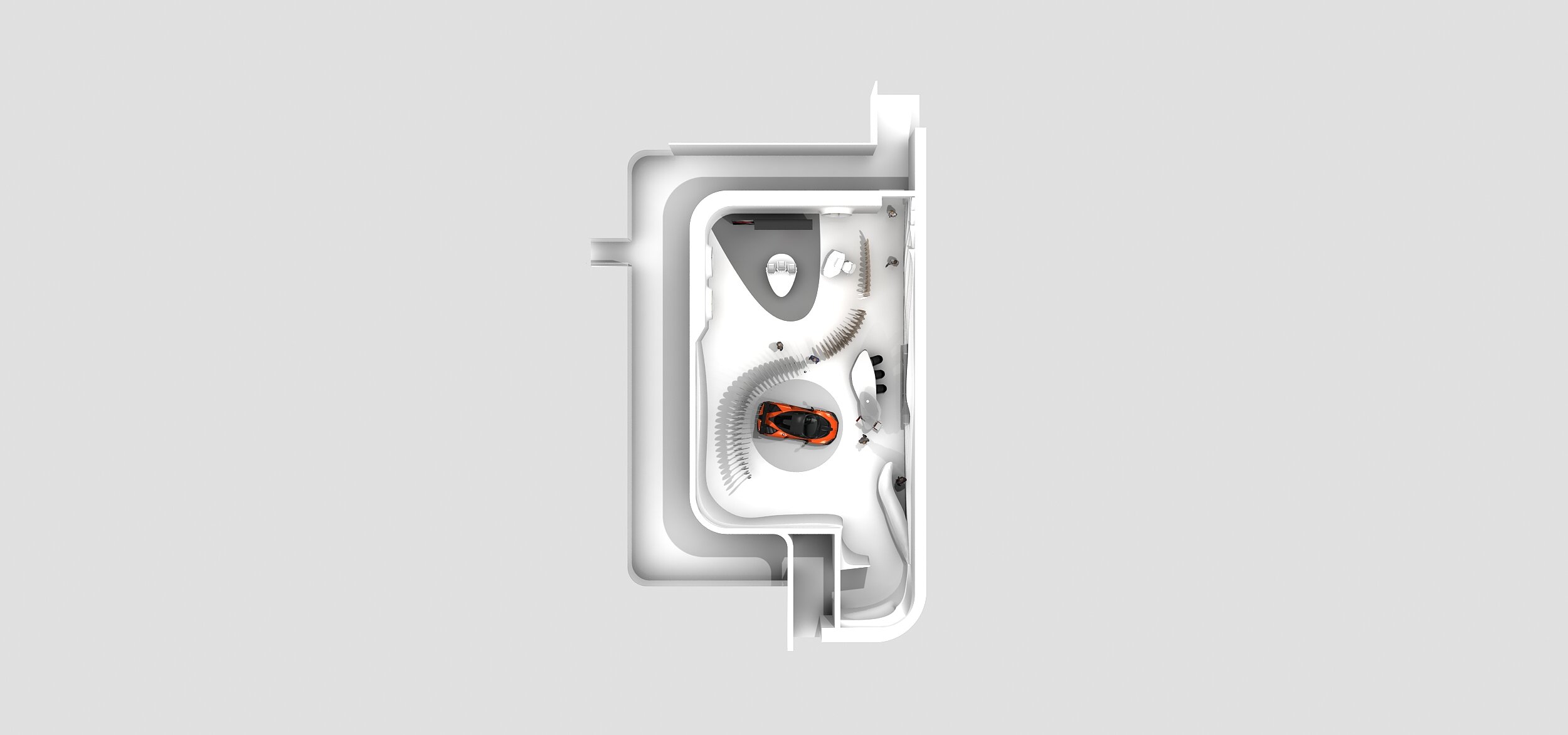
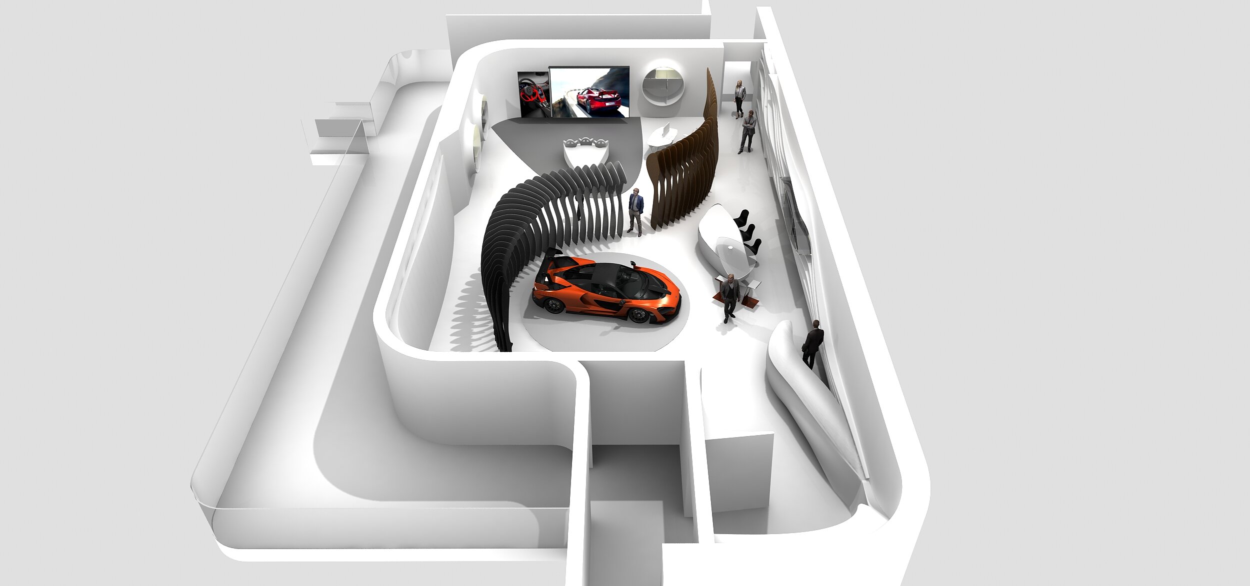
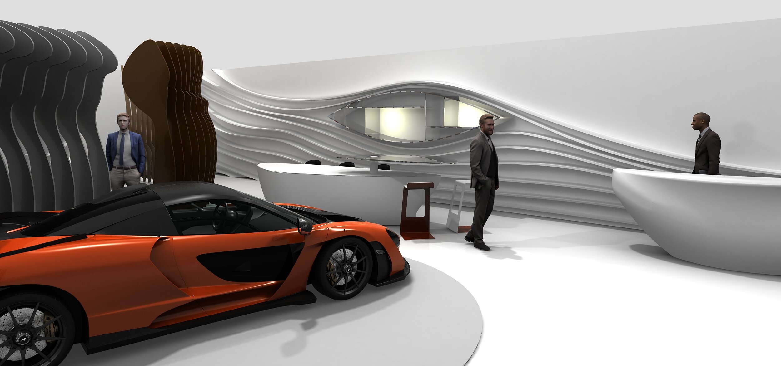
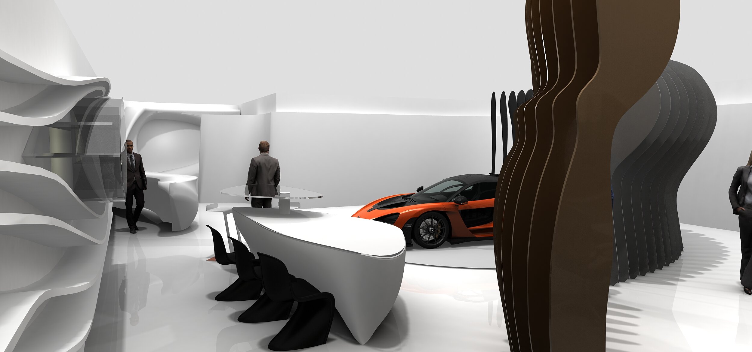
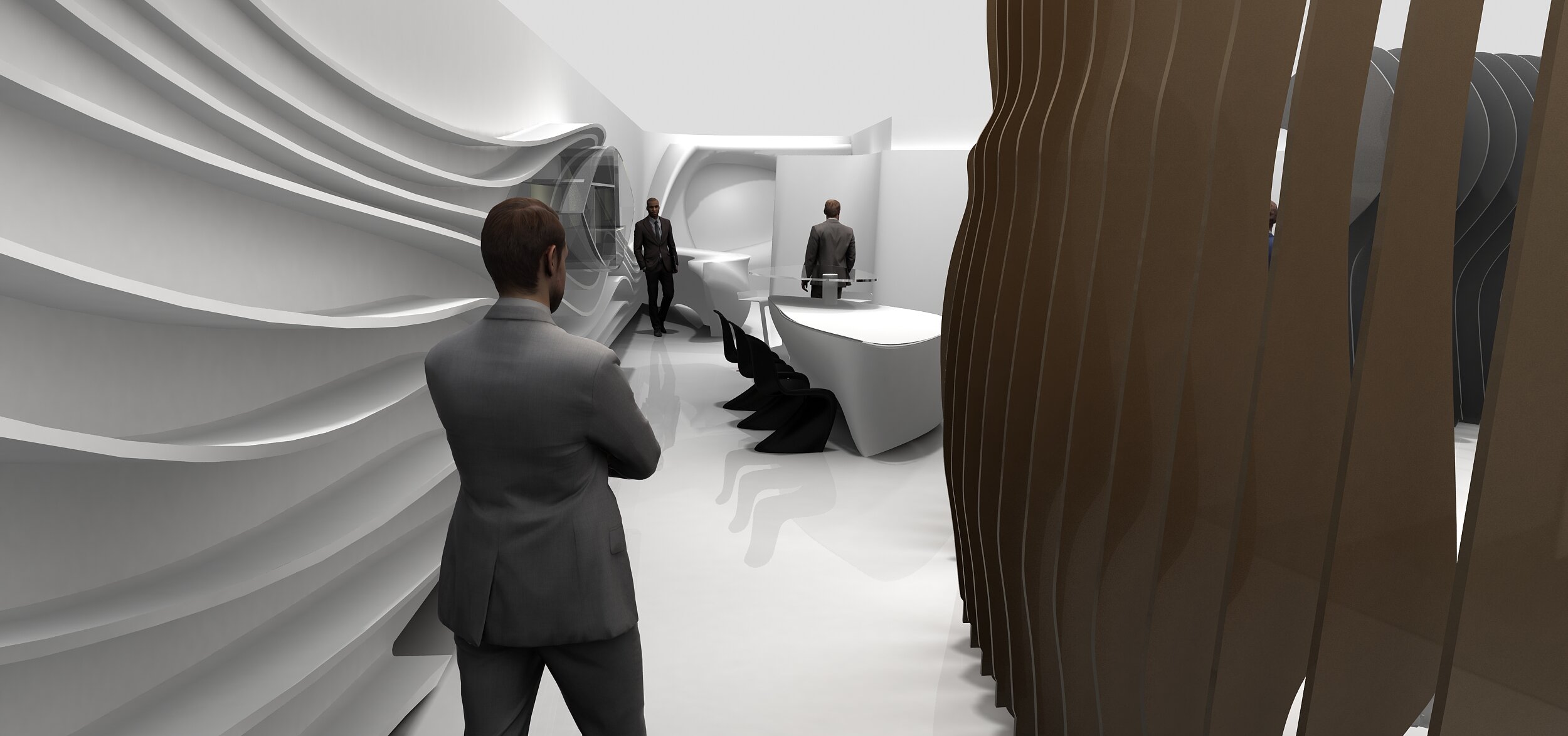
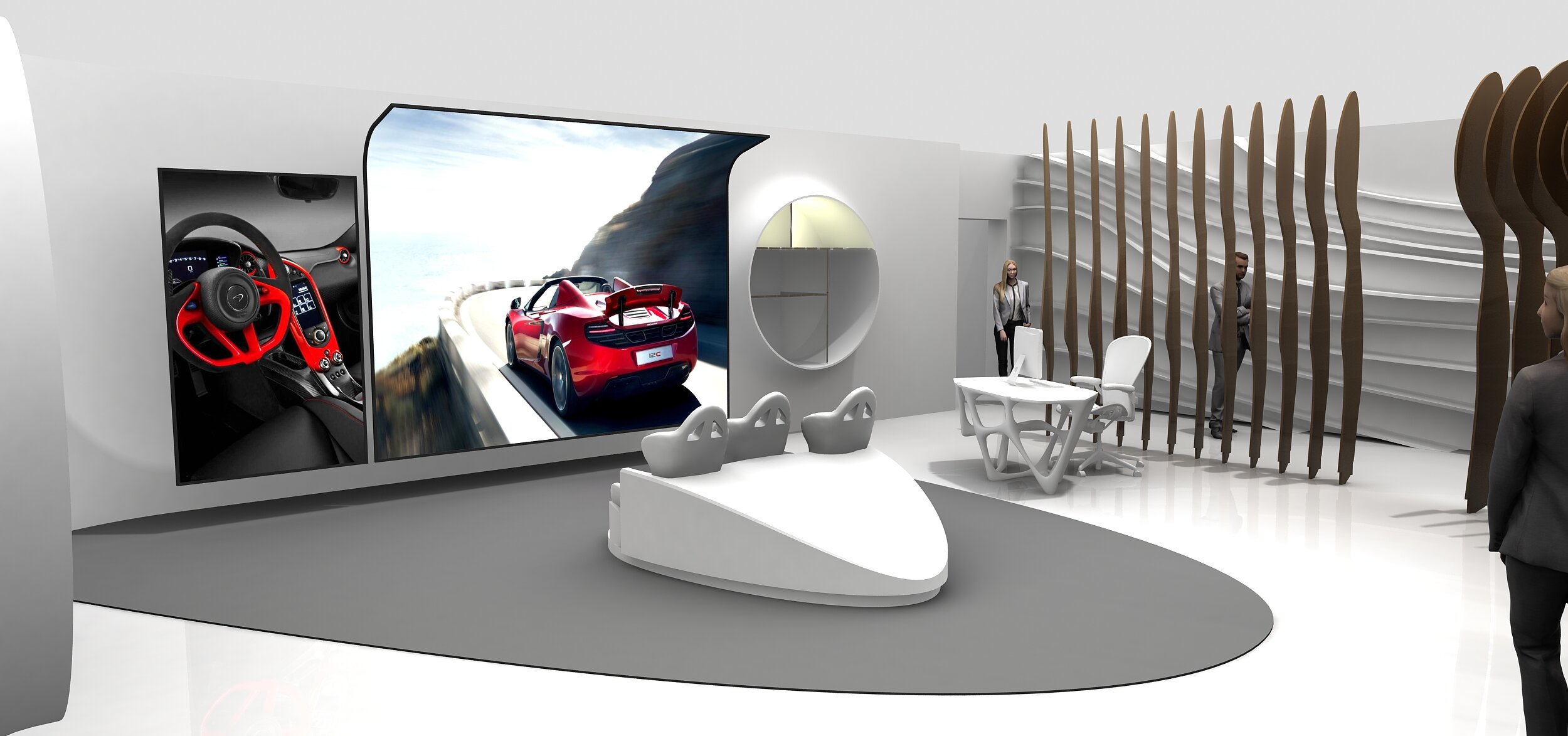
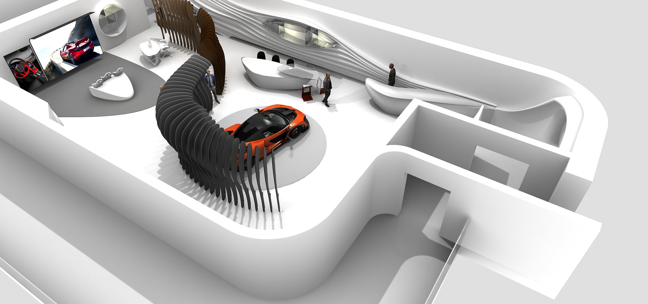
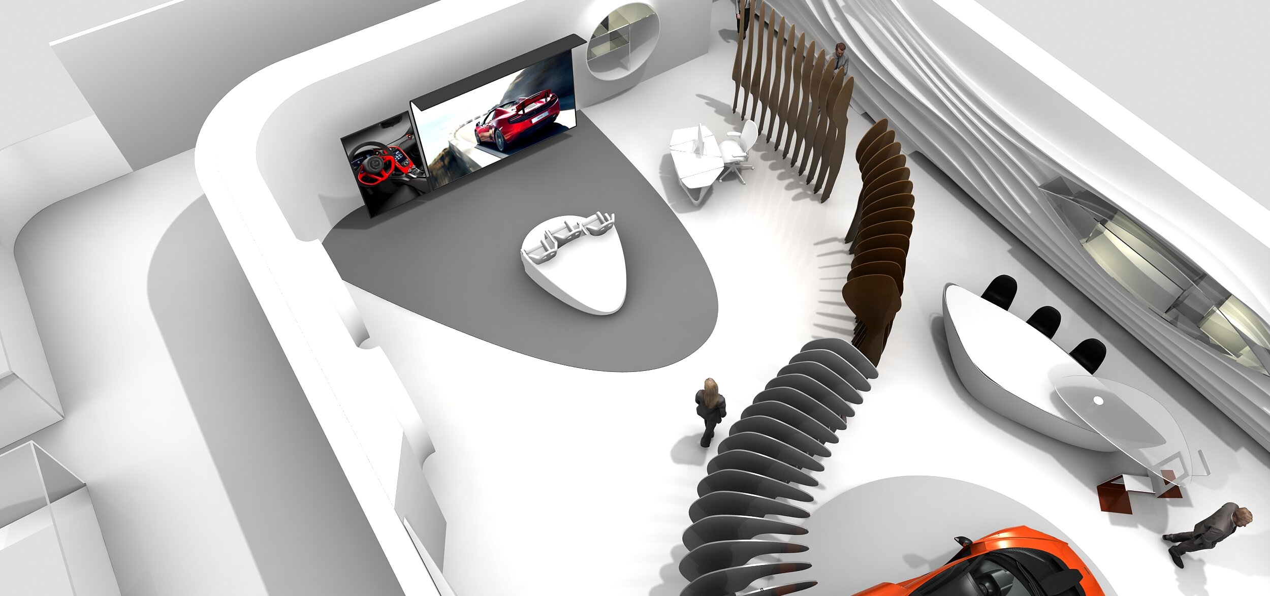
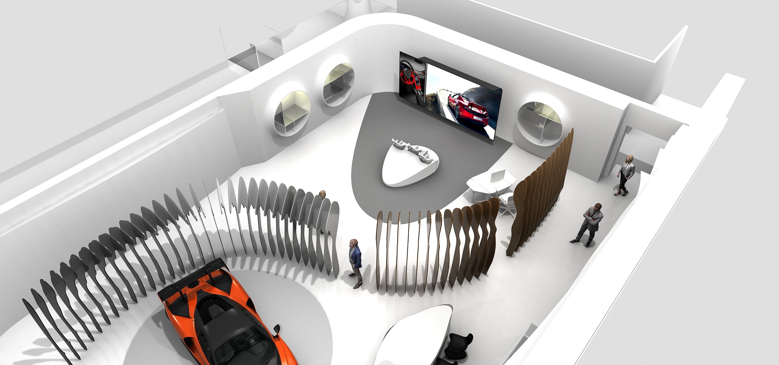
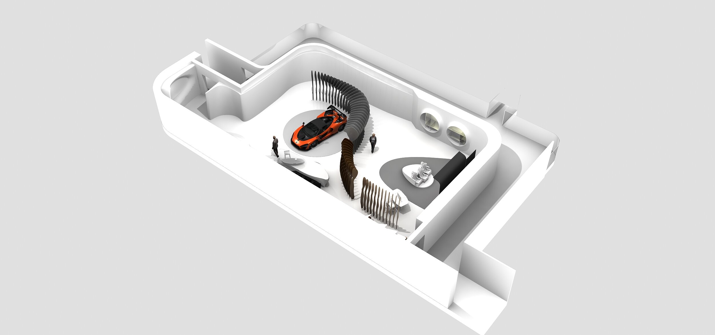
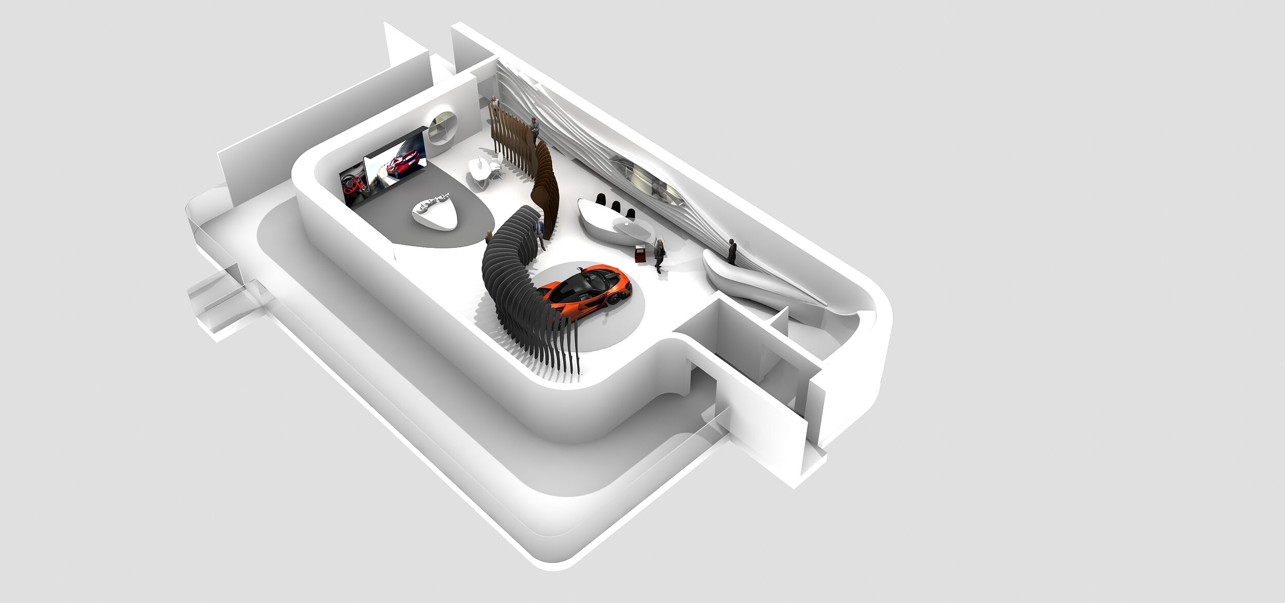
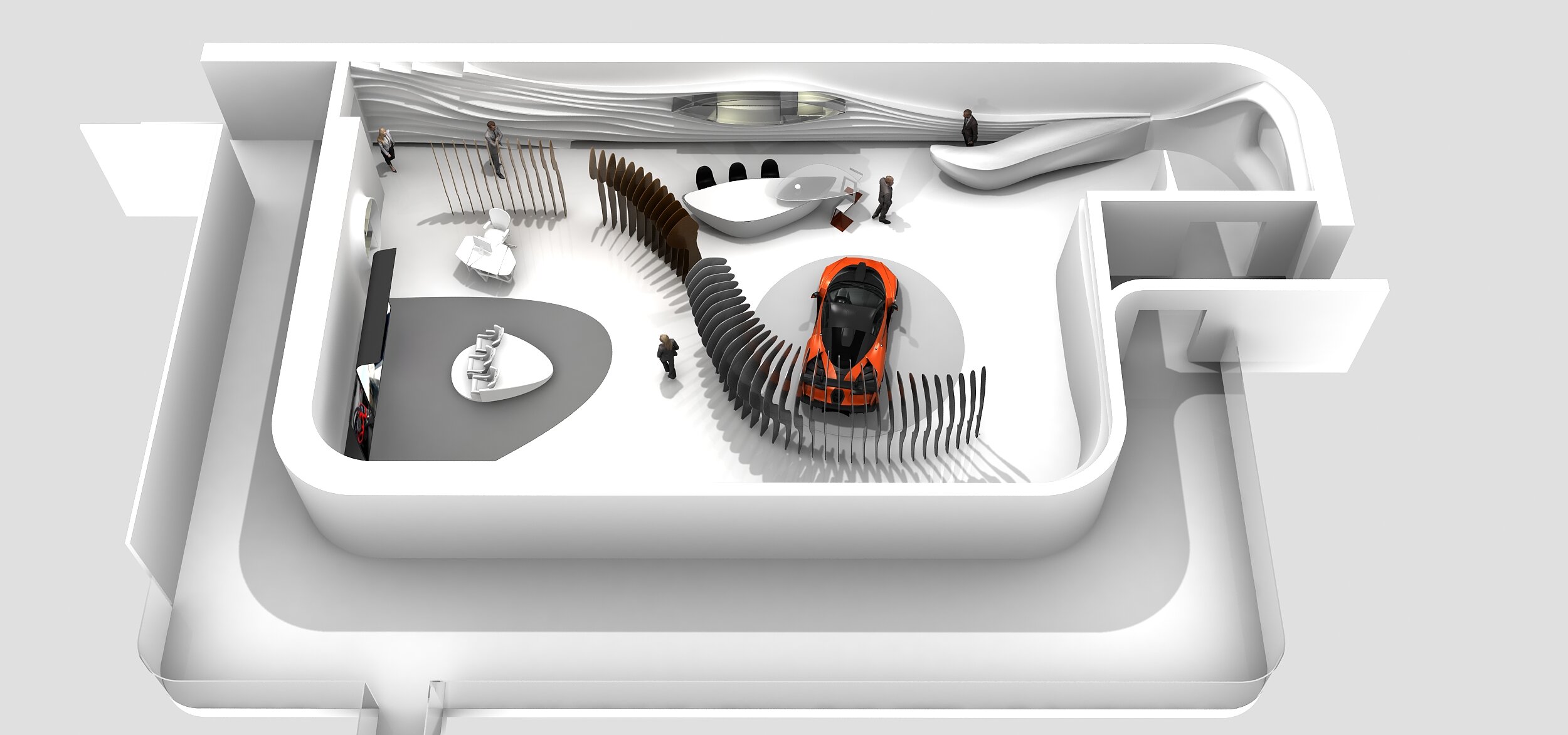
Exhibition stand for McLaren
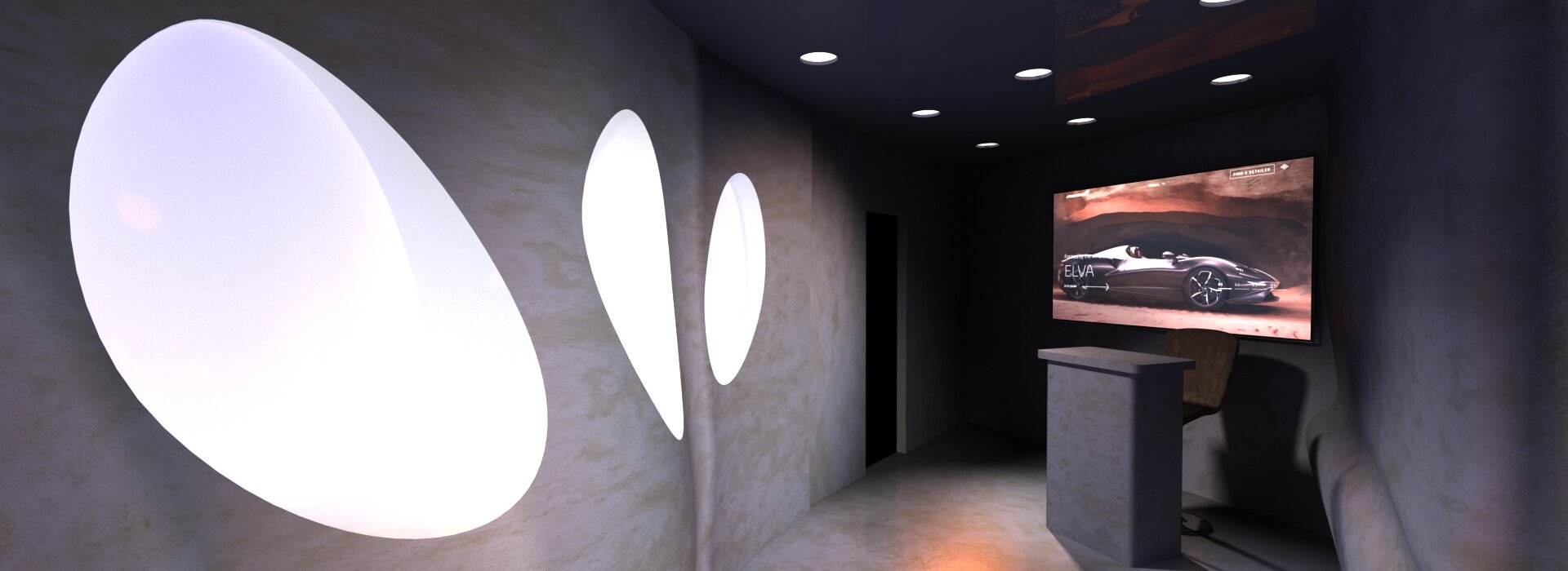
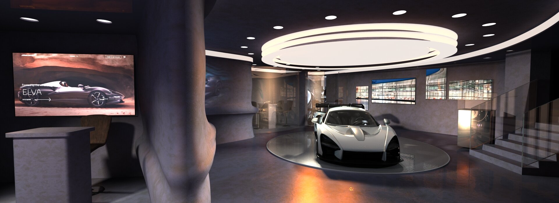
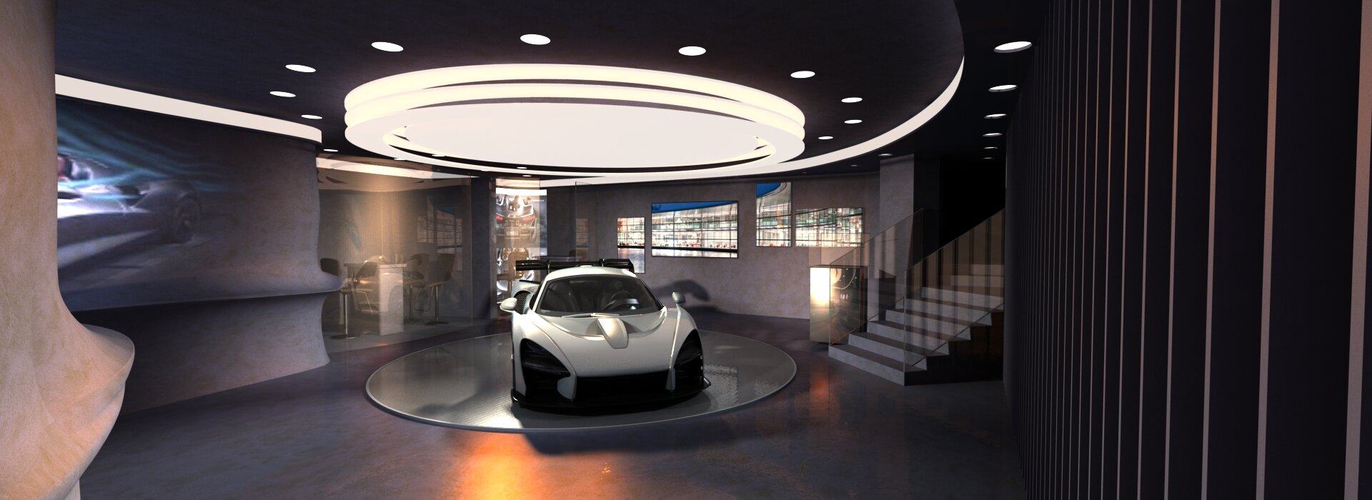
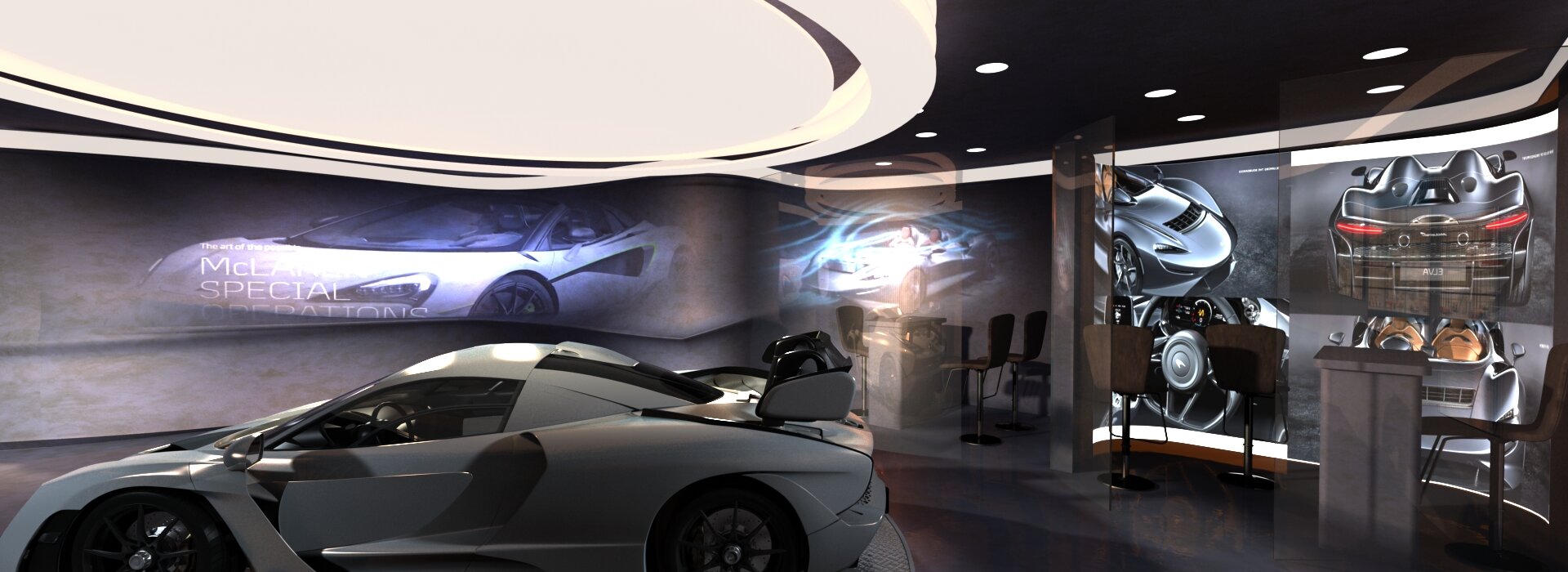
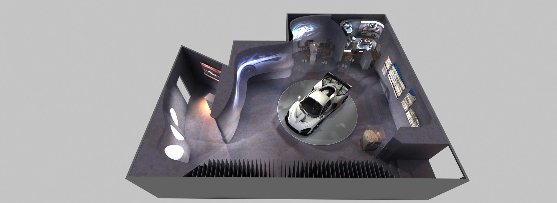
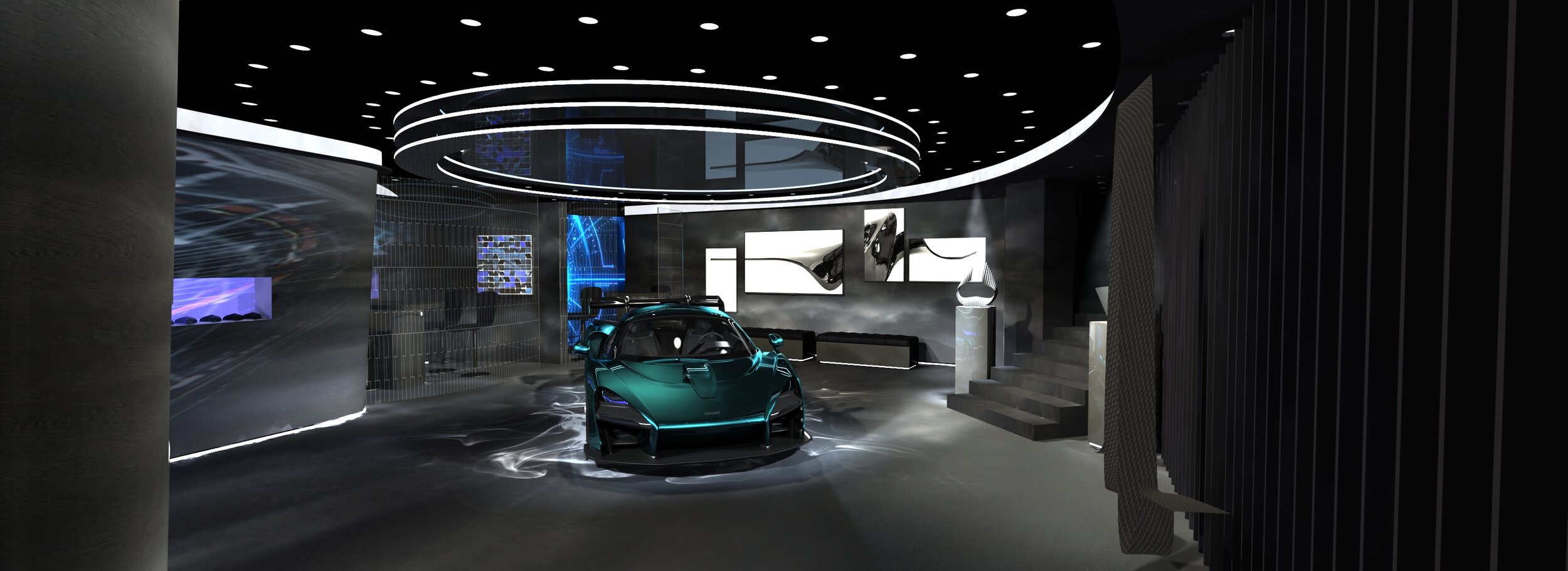
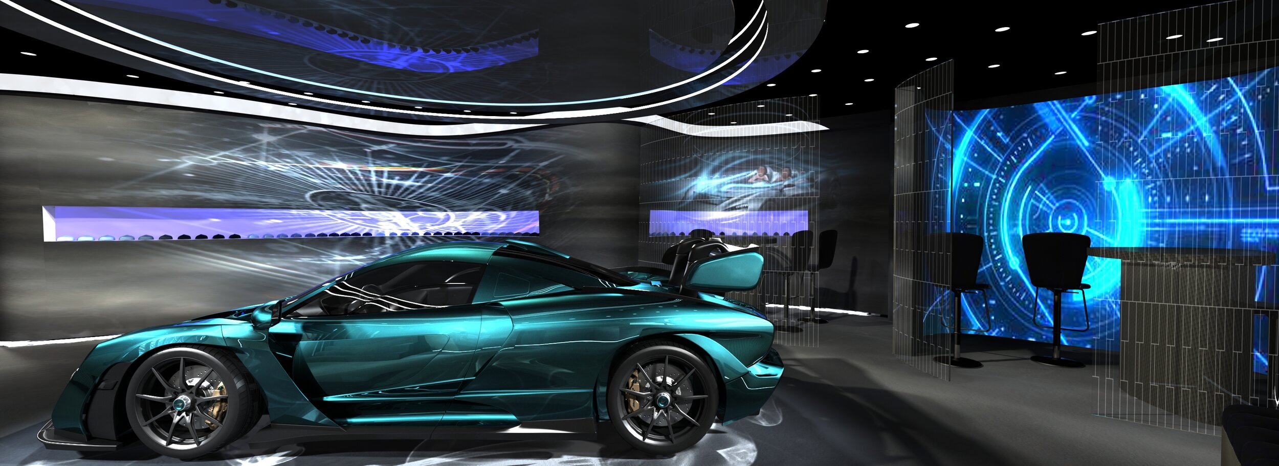
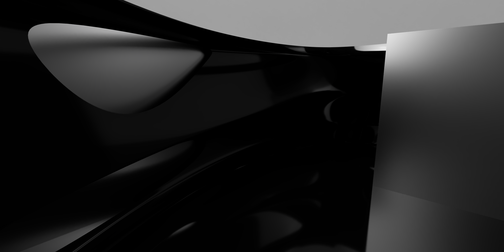
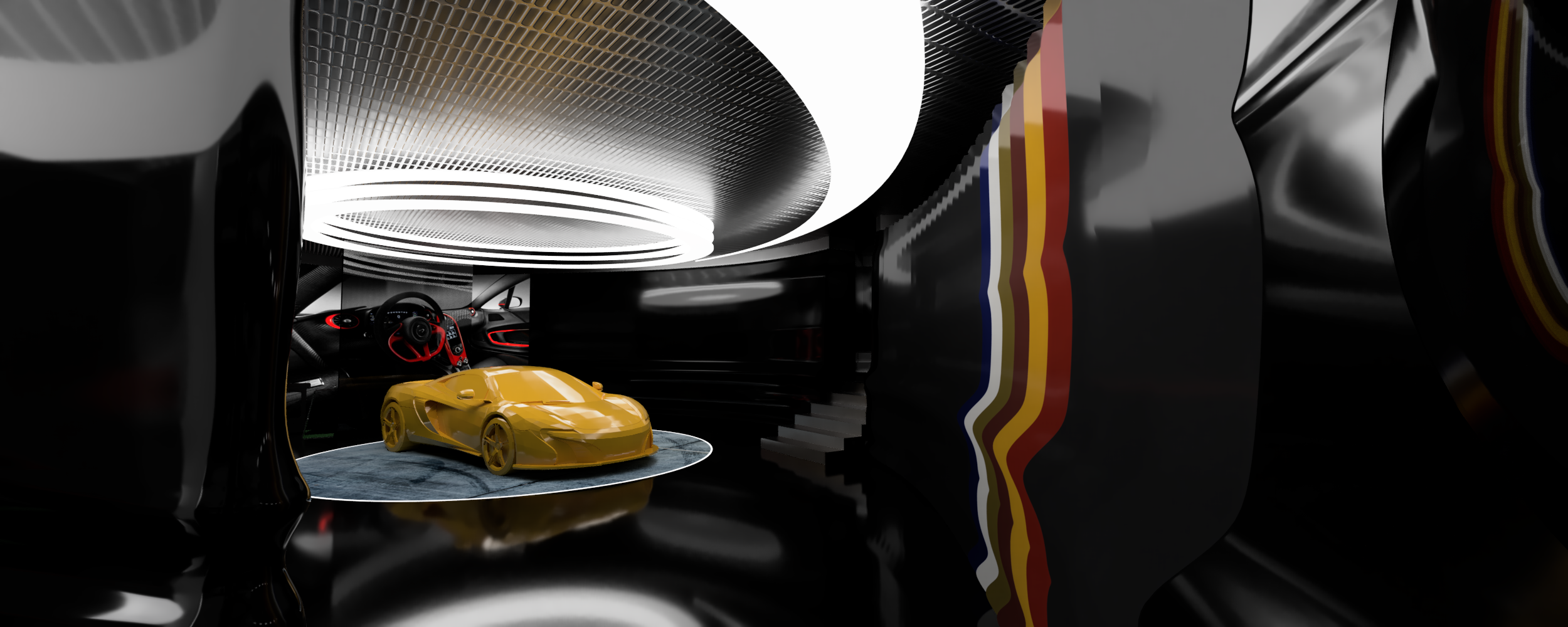
Exhibition stand for McLaren. Notionally, this was for the Geneva motor show. It’s an exclusive VIP zone. The forms took their queues from the very streamlined cars. The project went through many iterations. The visuals show various snapshots along the way.
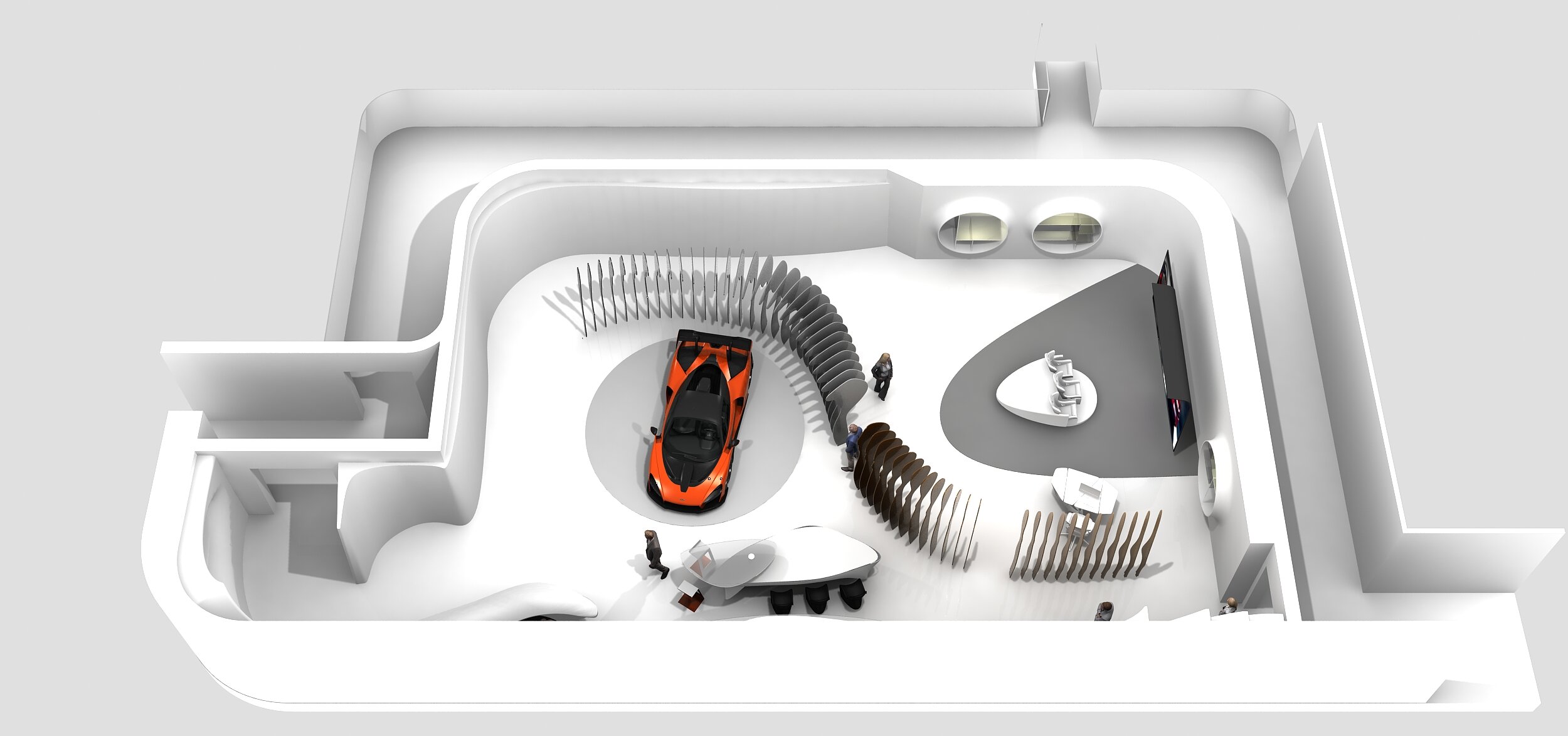
Interior for McLaren, UK


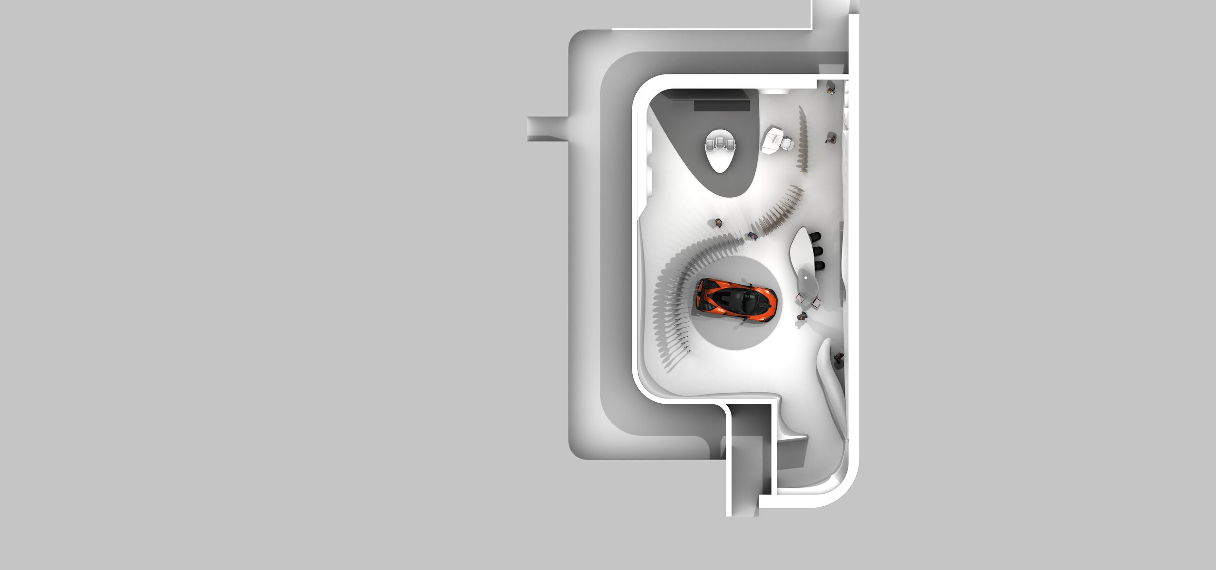
Interior for McLaren. The space is for customers to see the options and configure their cars. This project coincided with the release of the McLaren Speedtail. The forms took their queues from the very streamlined car. As usual the project considered different rooms, and went through many iterations. The visuals show two snapshots.
Samsung Global Product Launch American Stock Exchange, NYC
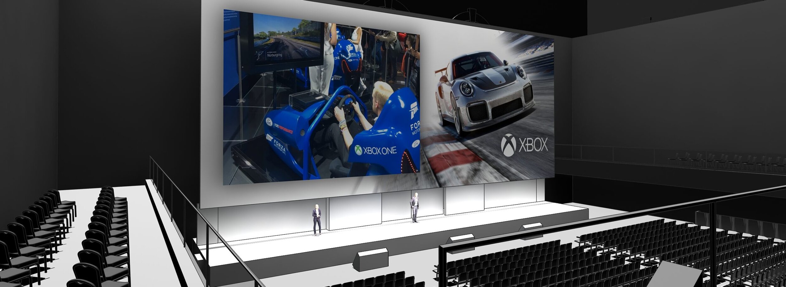
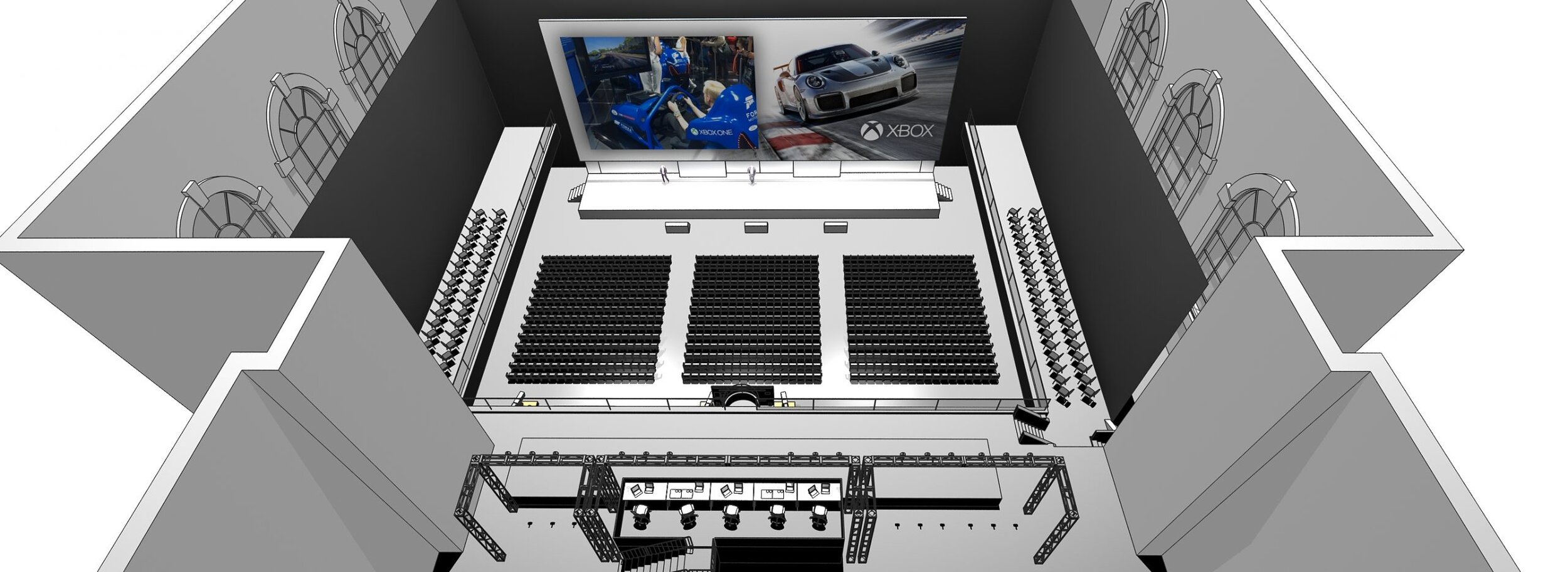
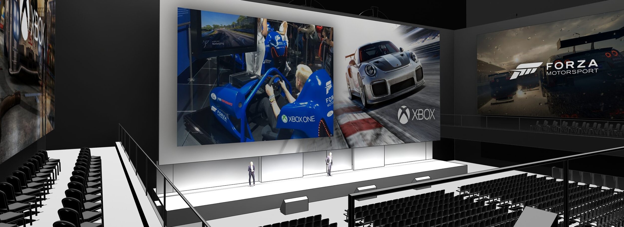
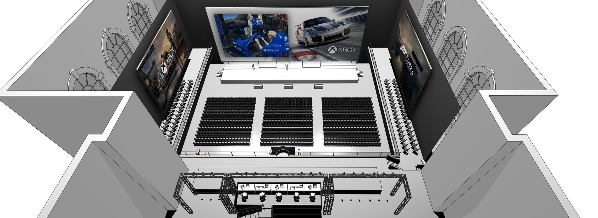
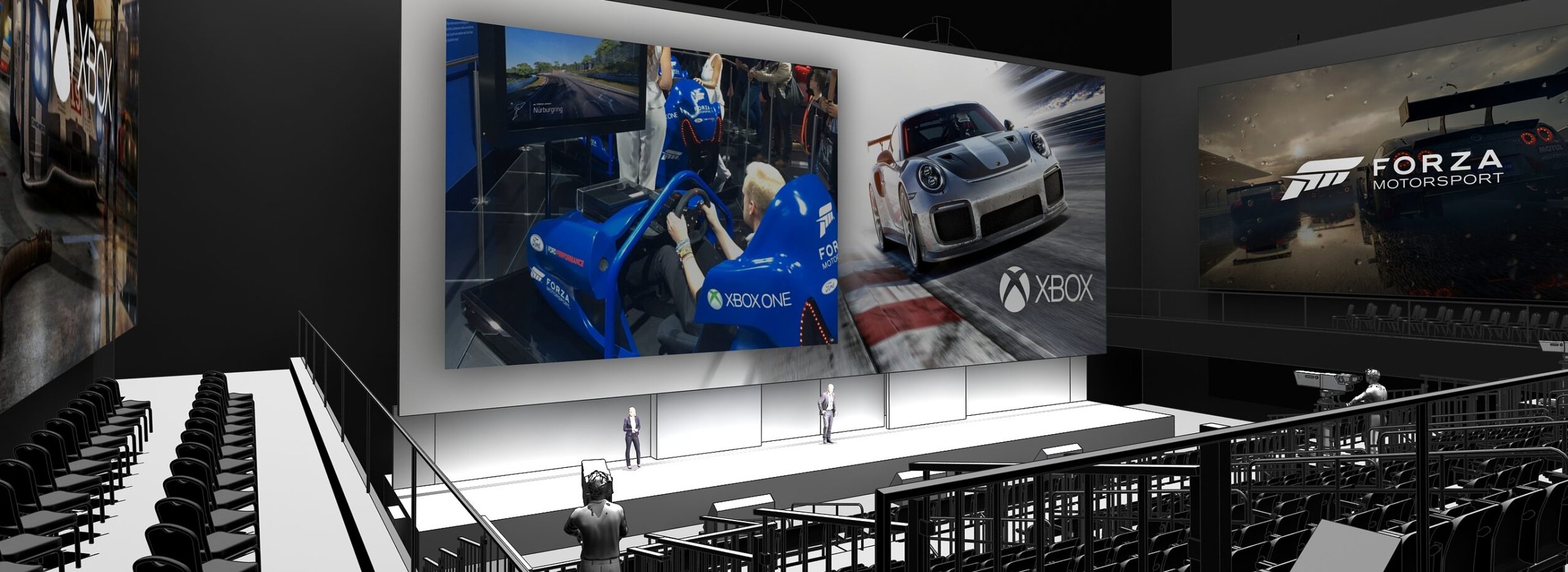
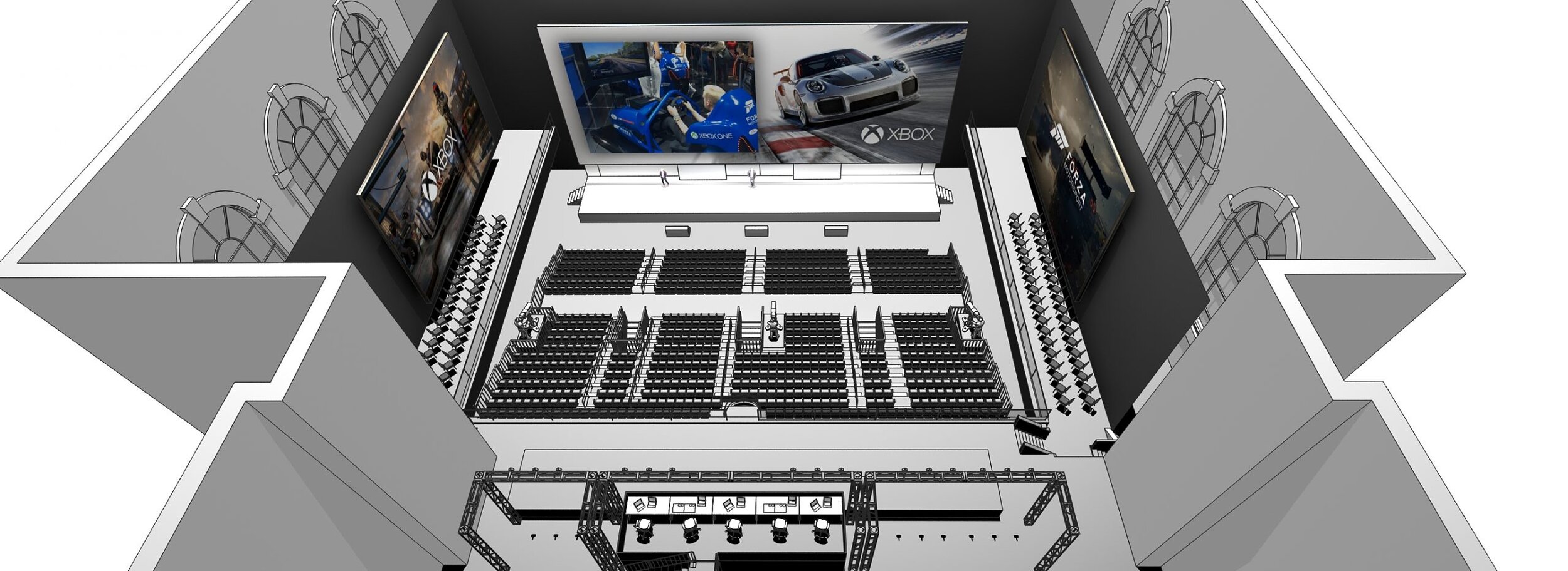
The American Stock Exchange on Wall Street has a lot of history and gravitas. For an event like this, that’s great, but it also means everything has to be built. How many people can you fit in? It depends on the build options and budget. That’s where the production design comes in. Sure, you need a great presentation, but you also need the right number of people seated correctly to view it. The visuals show a few of the options that were iterated for Samsung.
Activation for Samsung
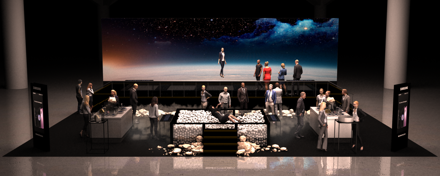
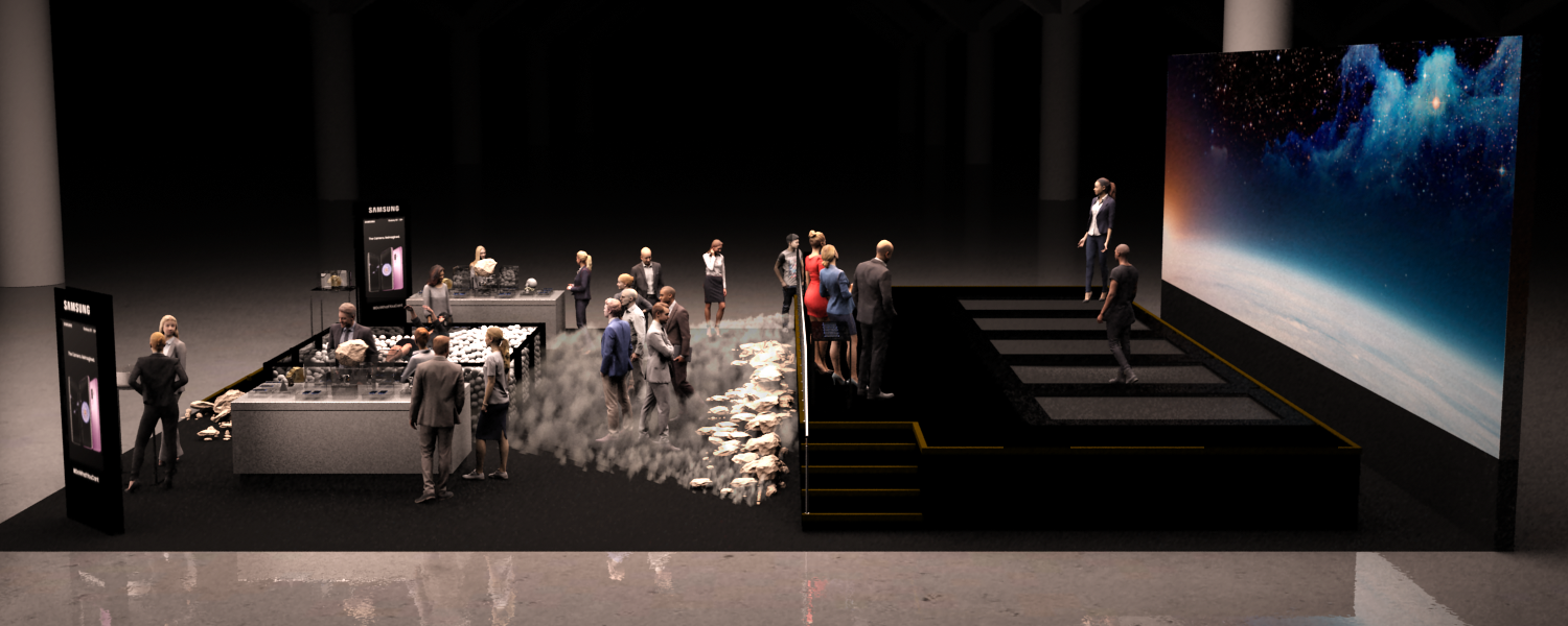
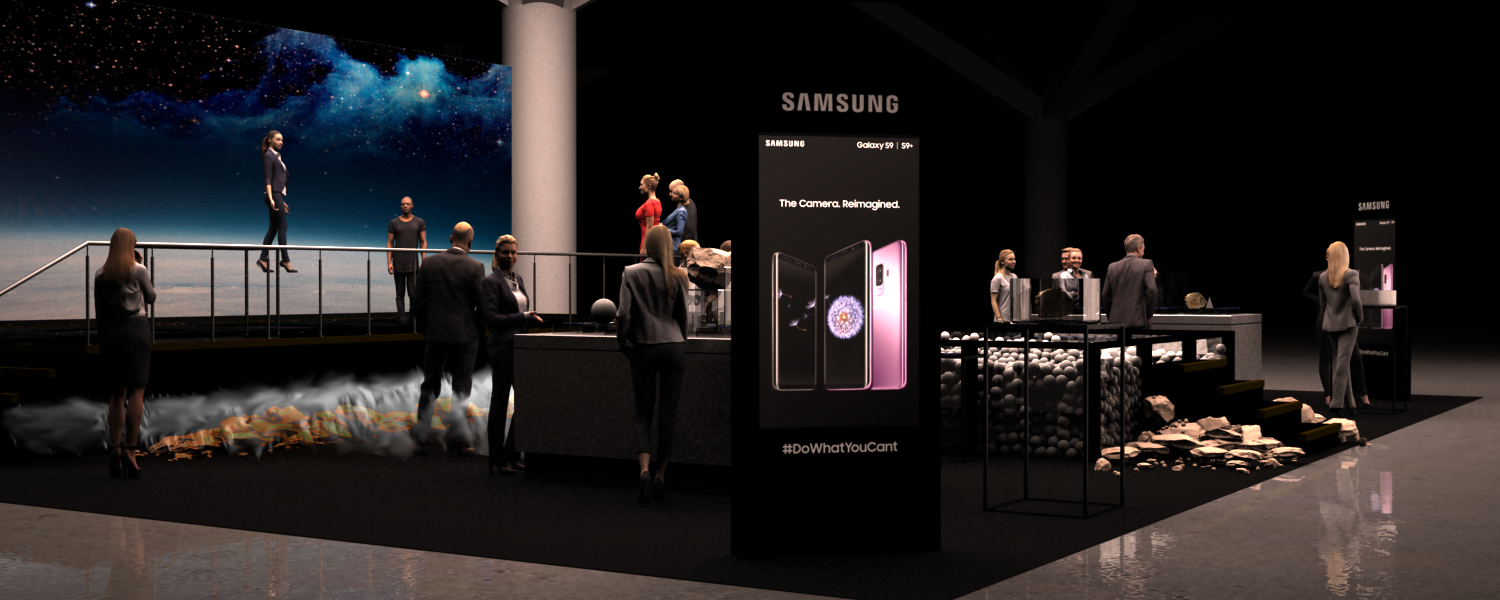
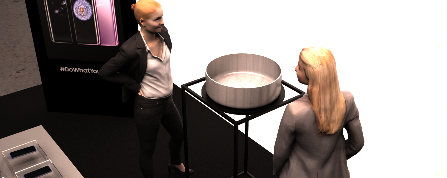
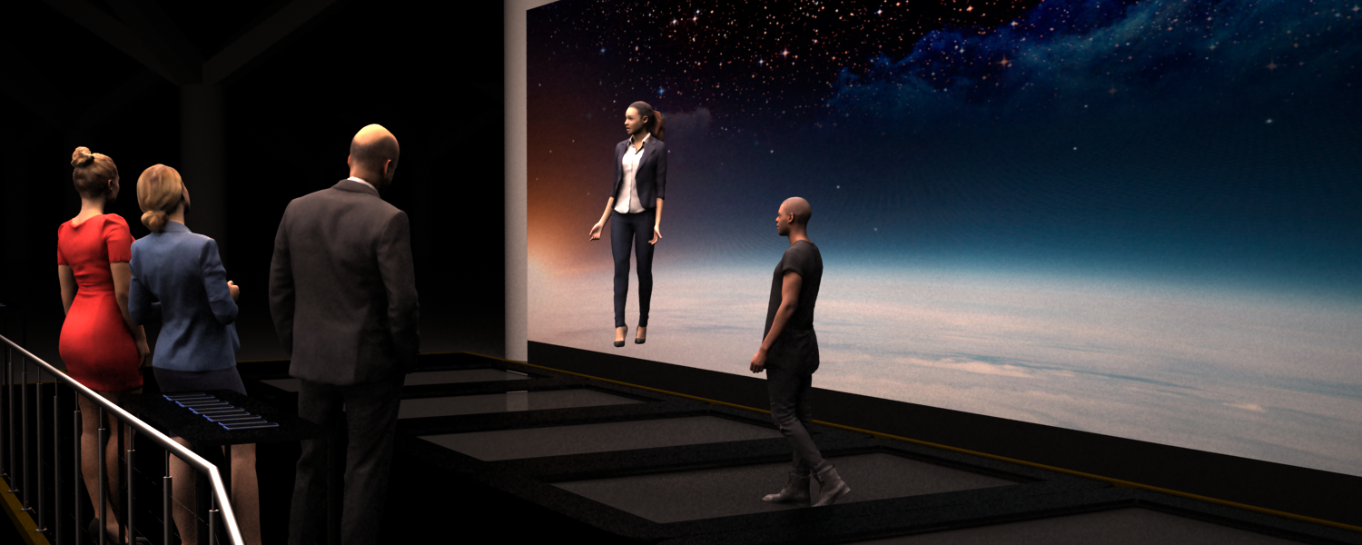
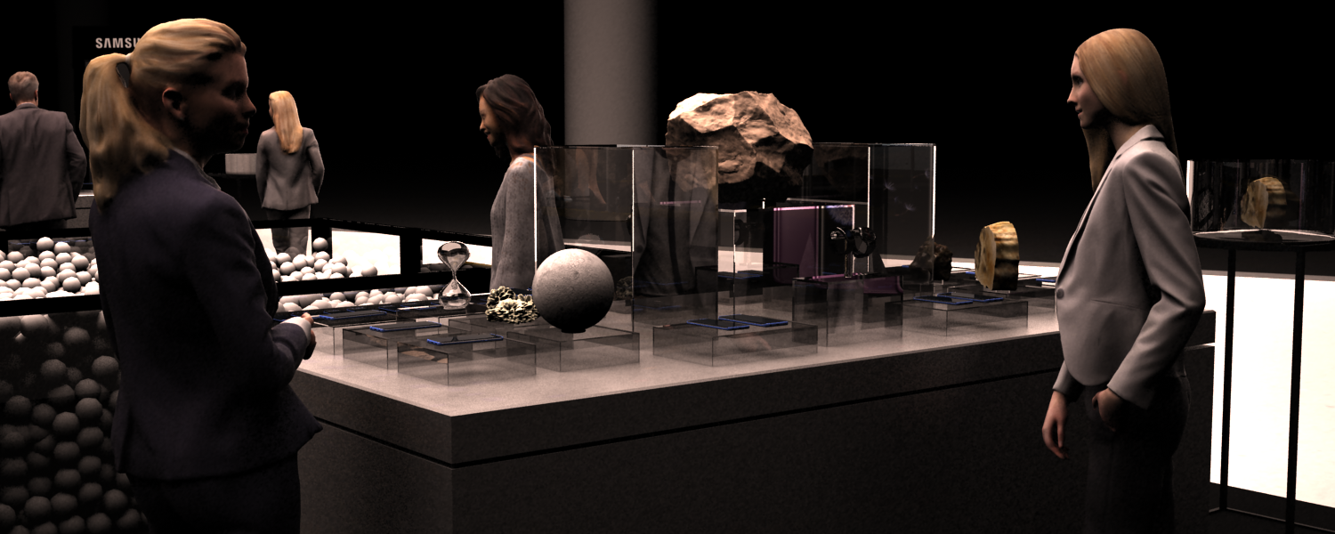
Activation for Samsung via the Projects, Sydney.
Samsung was launching a phone with a camera that had a frame rate so fast that everything was like it was filmed in slow-mo. it reminded everyone of the videos from moon landings. So, this is a moon-themed exhibit, with a ball pit, and trampoline stage. It’s set up for taking selfies with the new tech in slow-mo!
Activation for James Squire
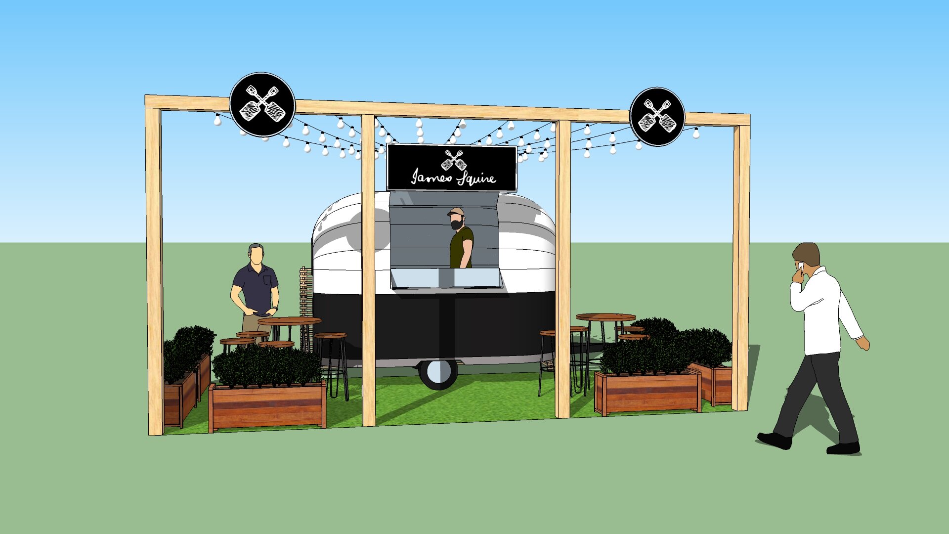
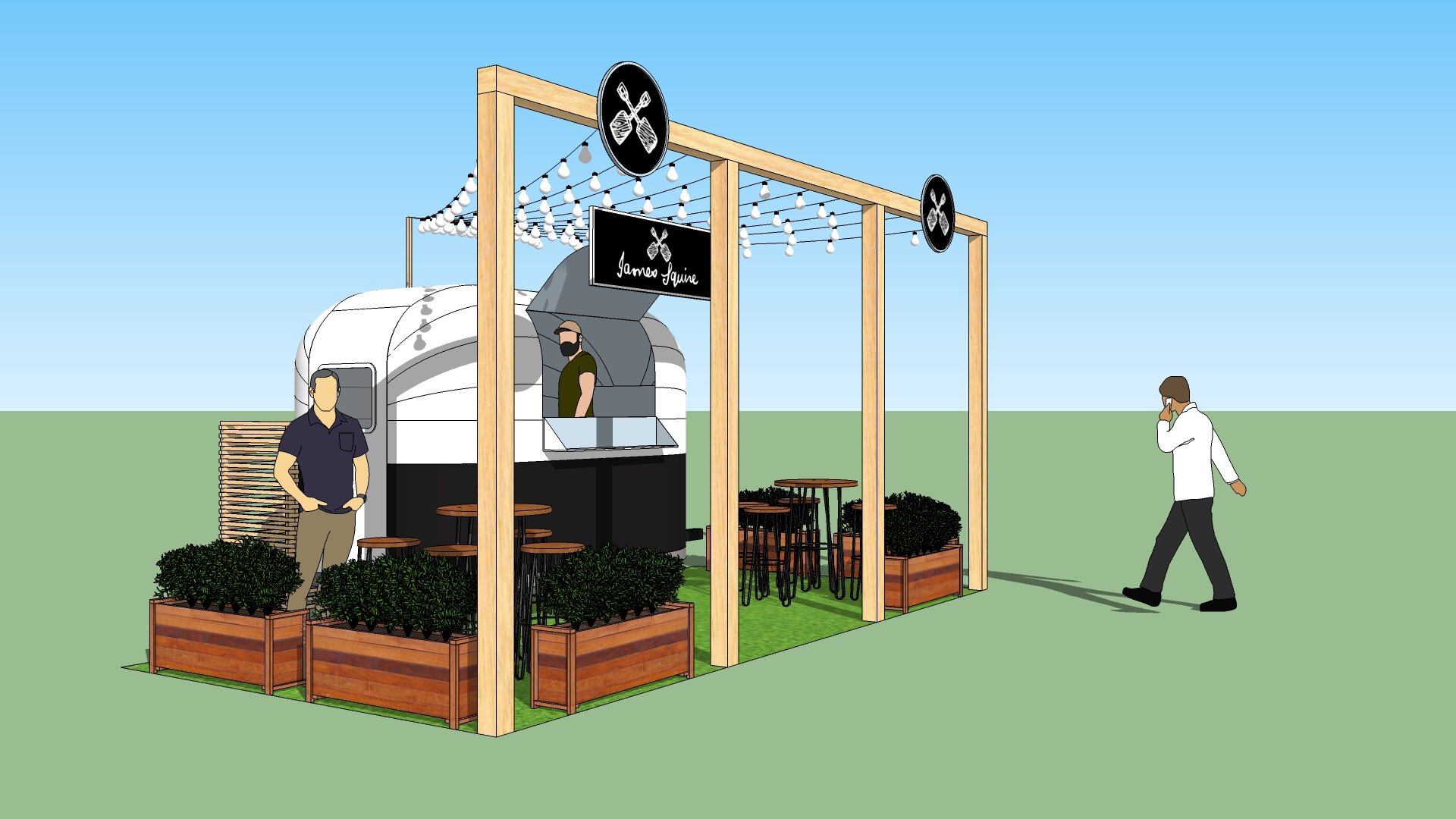

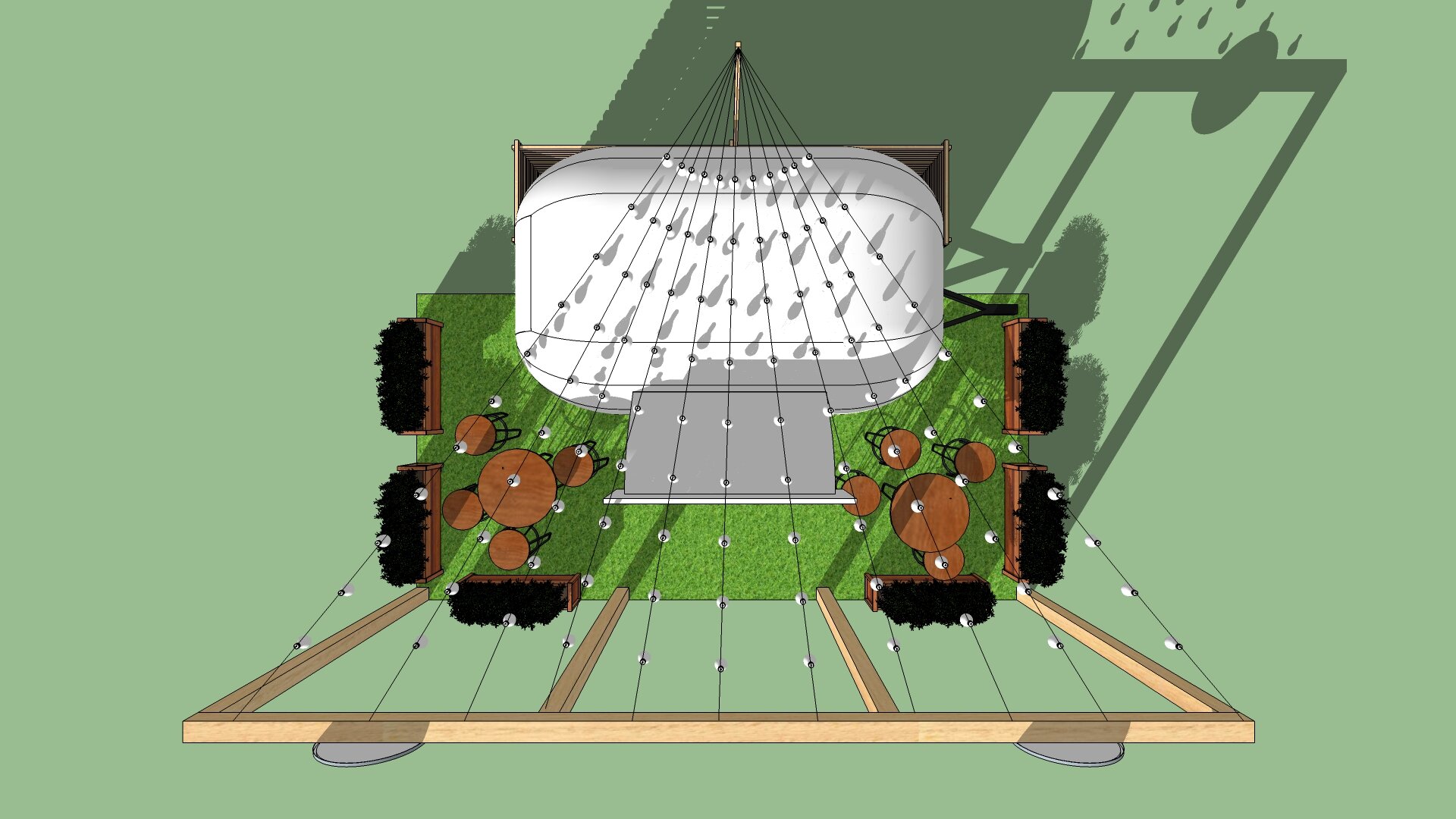
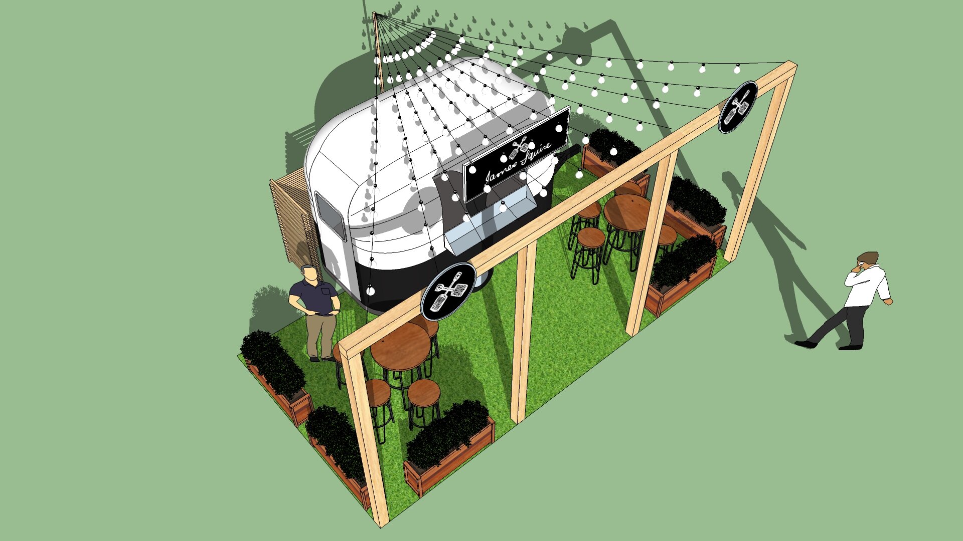
Activation for James Squire via the Projects, Sydney. Small activation for James Squire at a Sydney festival. The stand embodies elements from the brand but keeps build costs to a minimum.
Activation for Milo
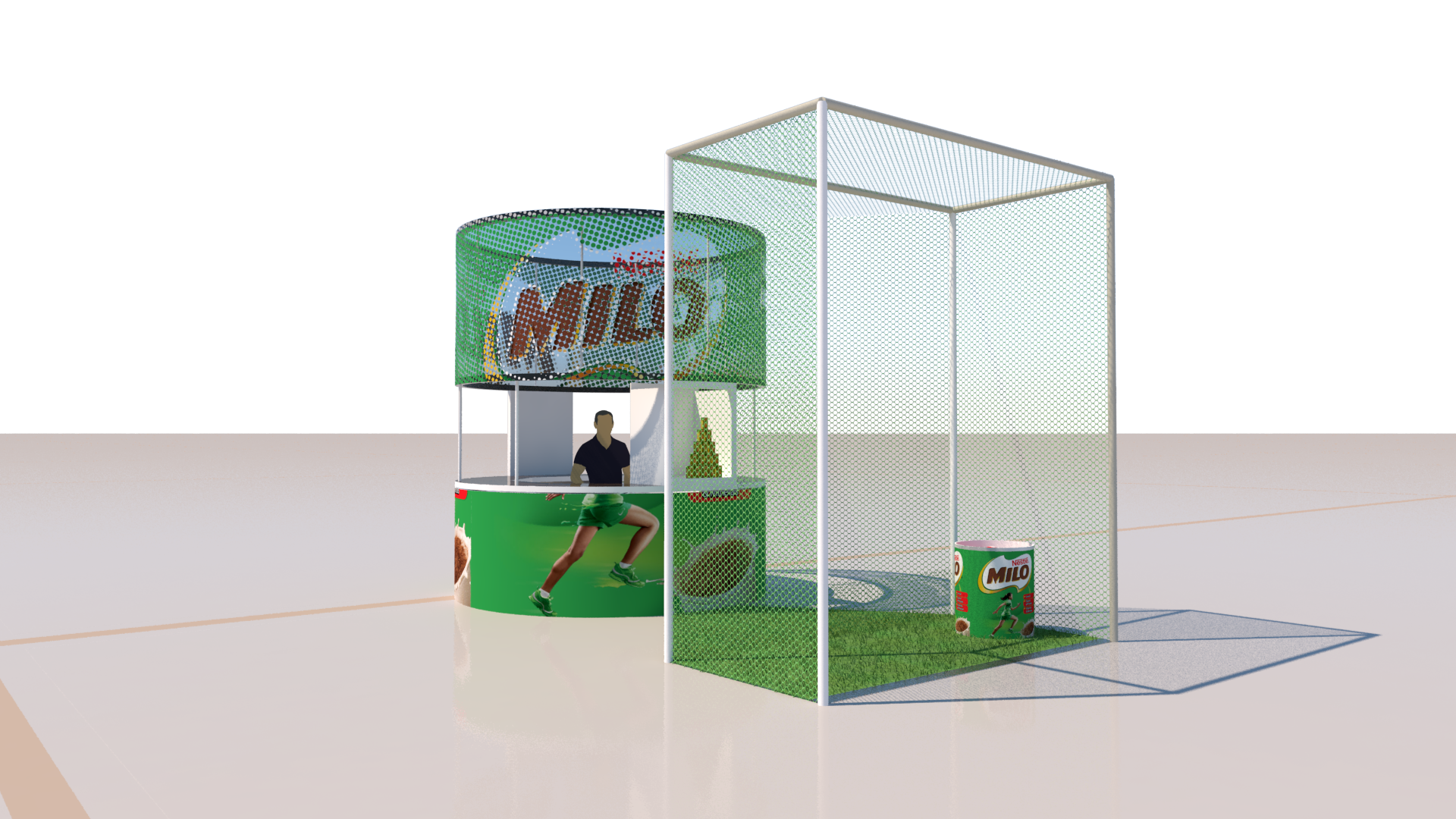
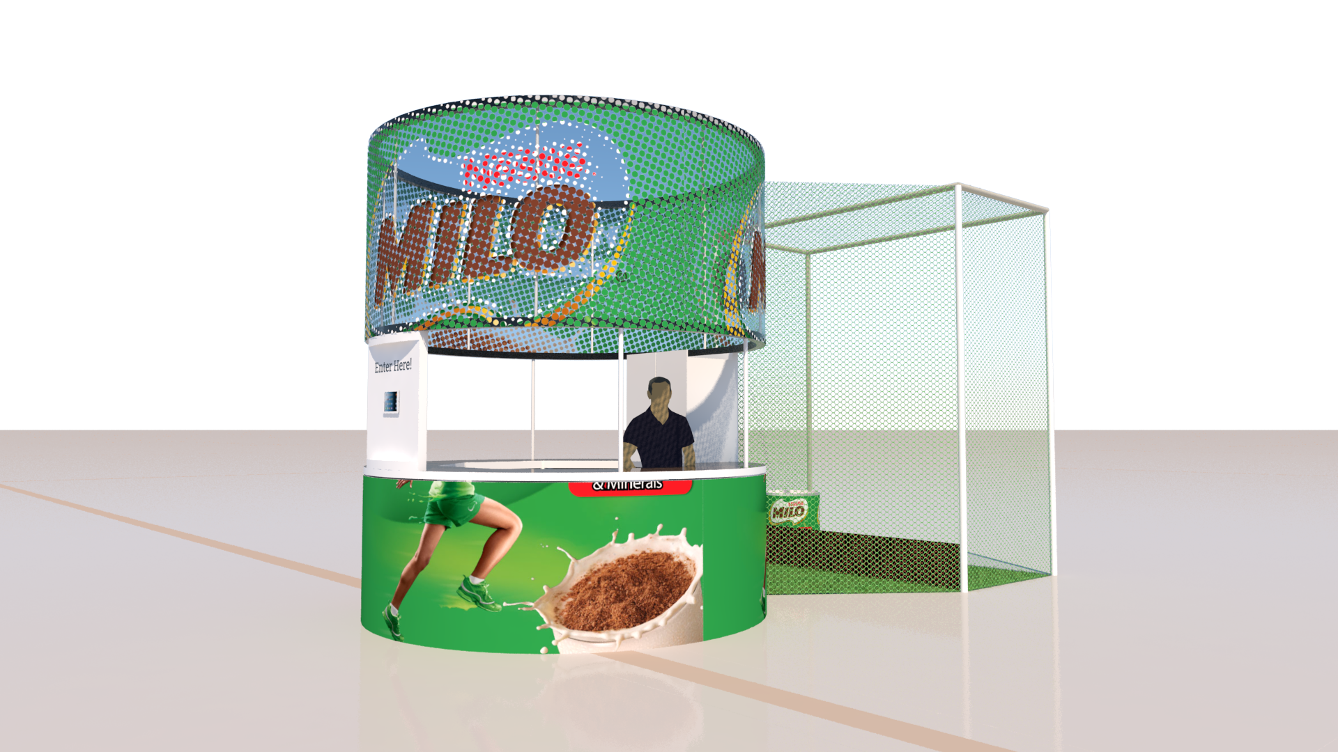
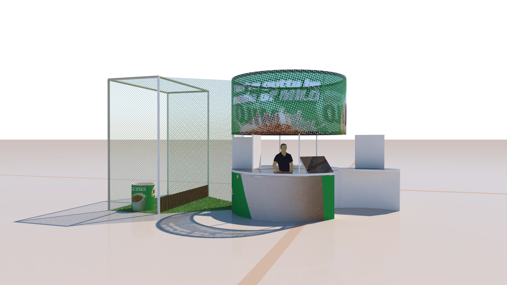
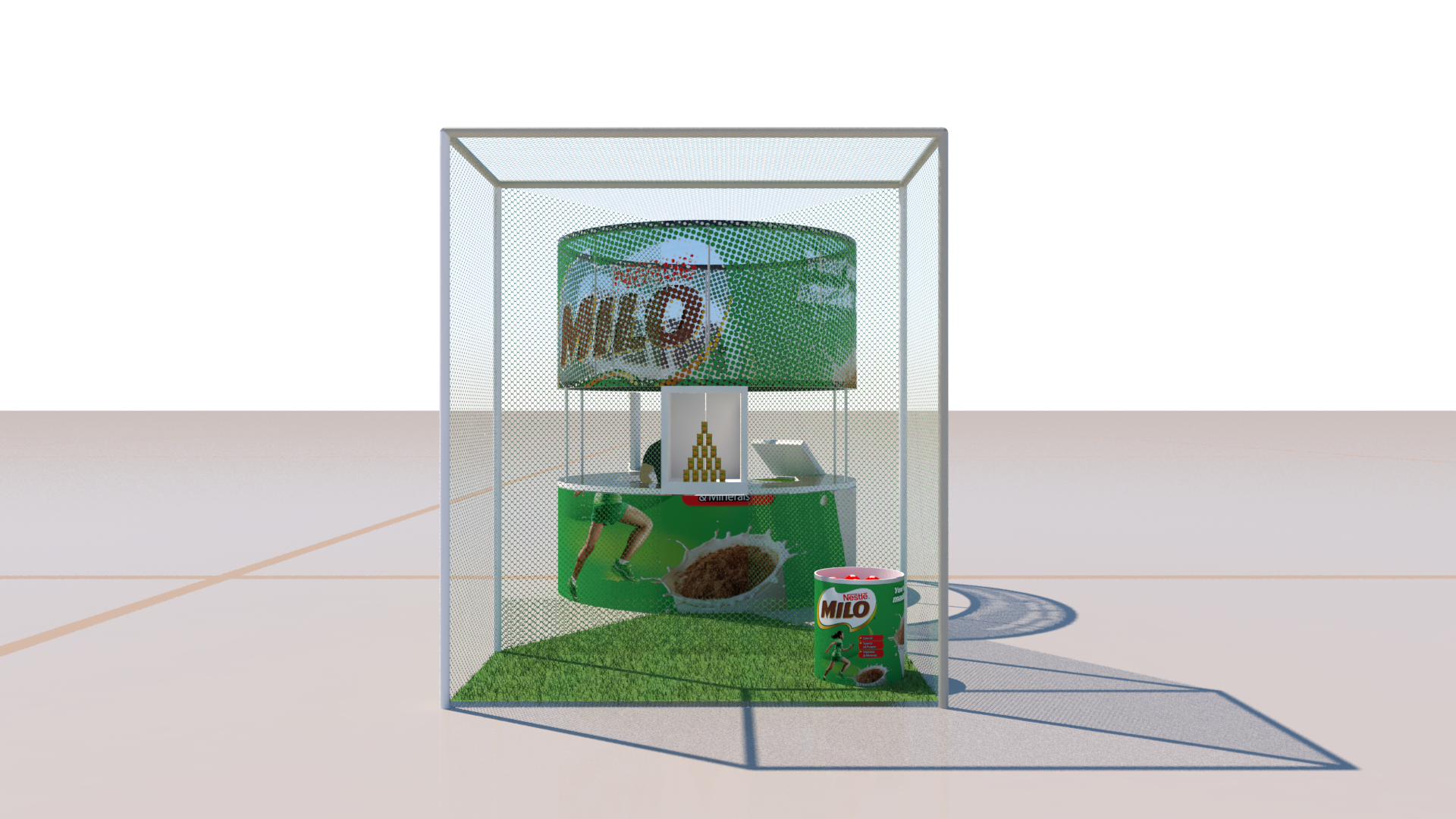
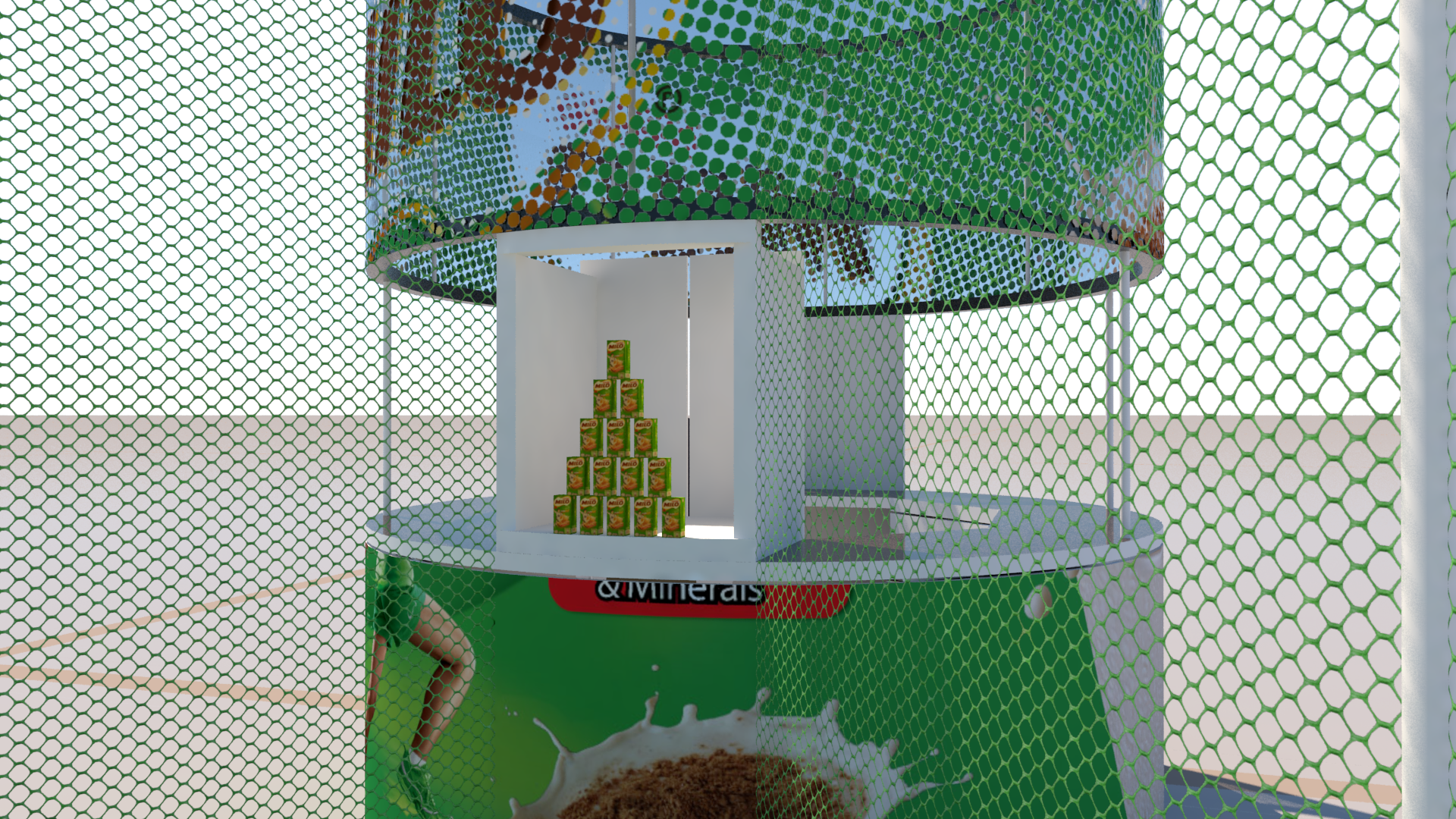
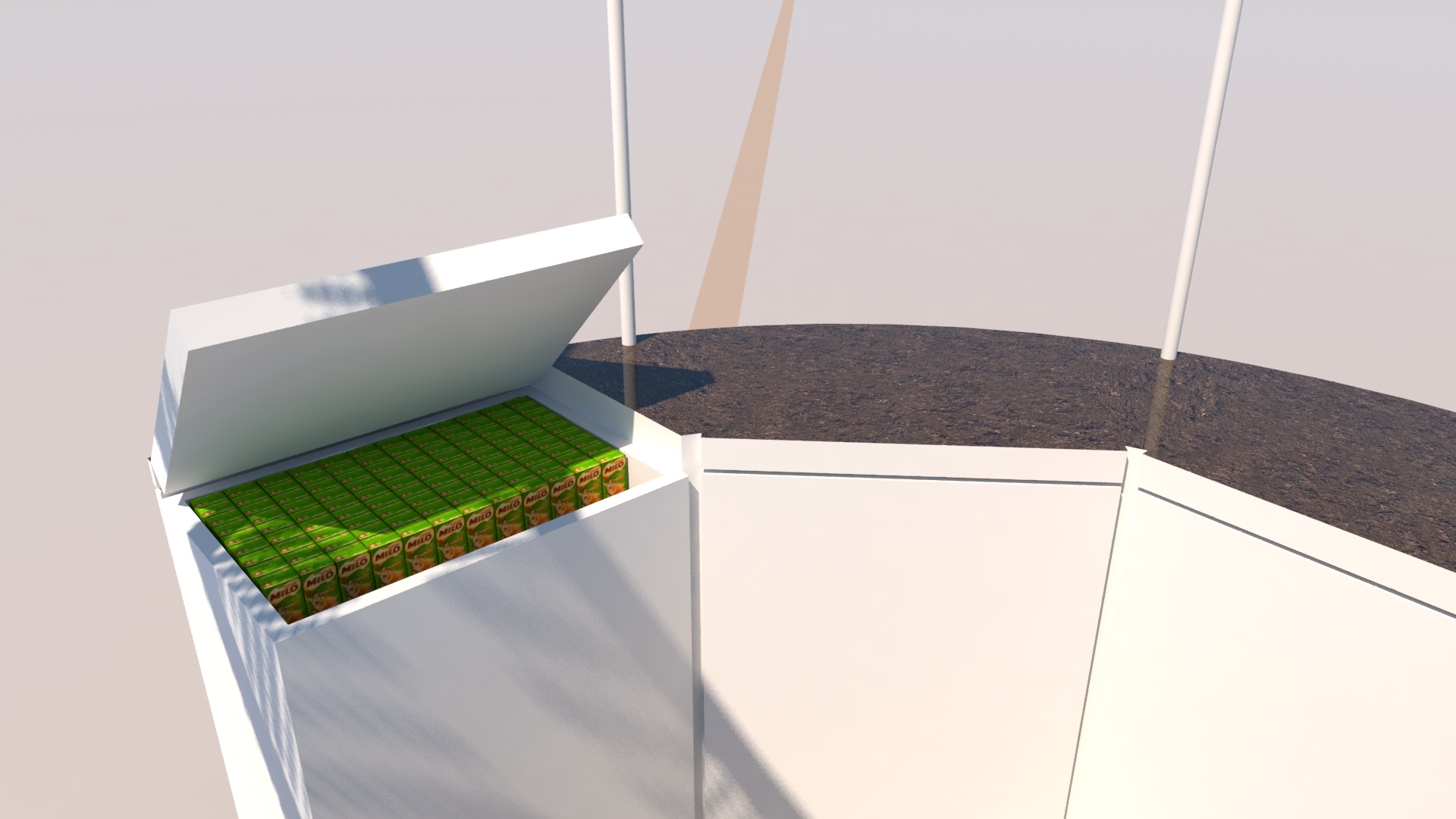
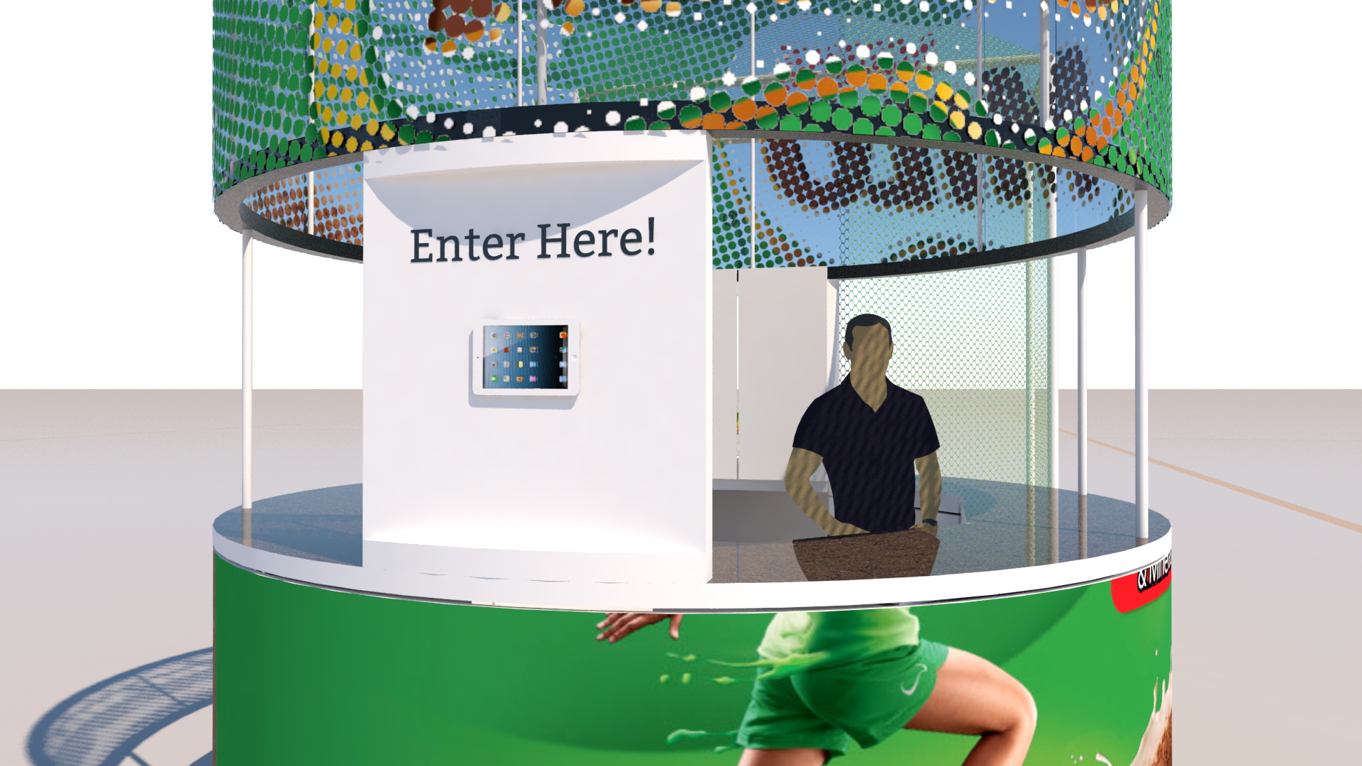
Activation for Milo via XPO brands Sydney. This is the result of a One-day concept to visuals project. It’s for a staffed exhibit in a shopping mall. It includes a knock-down-the-Milo-boxes game. The pyramid arrangement included a quick reset system using the back panel of the display box and cables attached to each prop-milo-box.
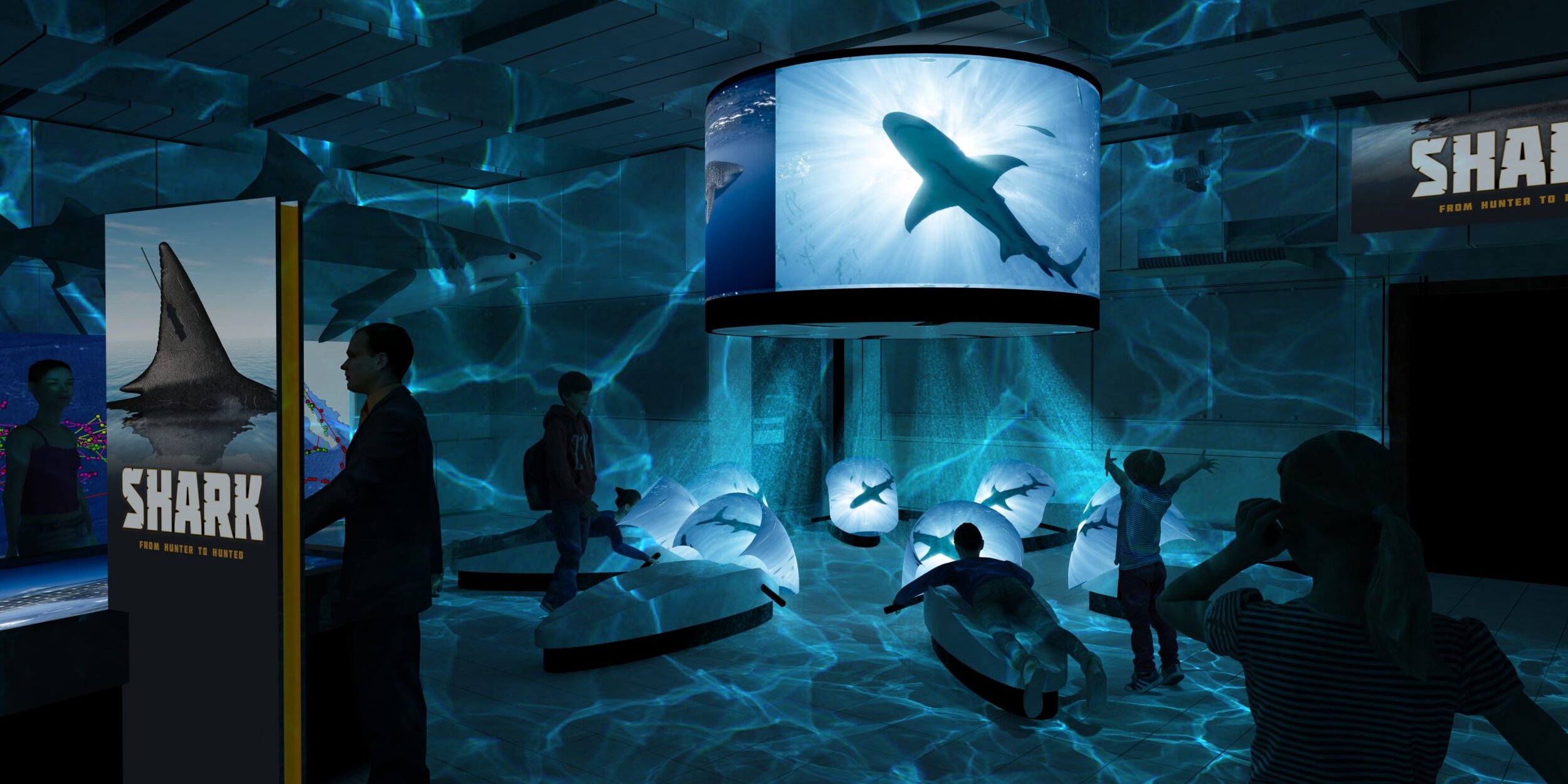
Exhibit concept, Australian Museum
With an extremely loose creative brief, and very tight deadline, this was an exercise in making something that looked like it could be a considered museum exhibit, without considering it very much at all… Heavy lighting effects and unsubtle images evoke a mood of the exhibit without getting bogged down in details.
Exhibit visualization, Australian Museum
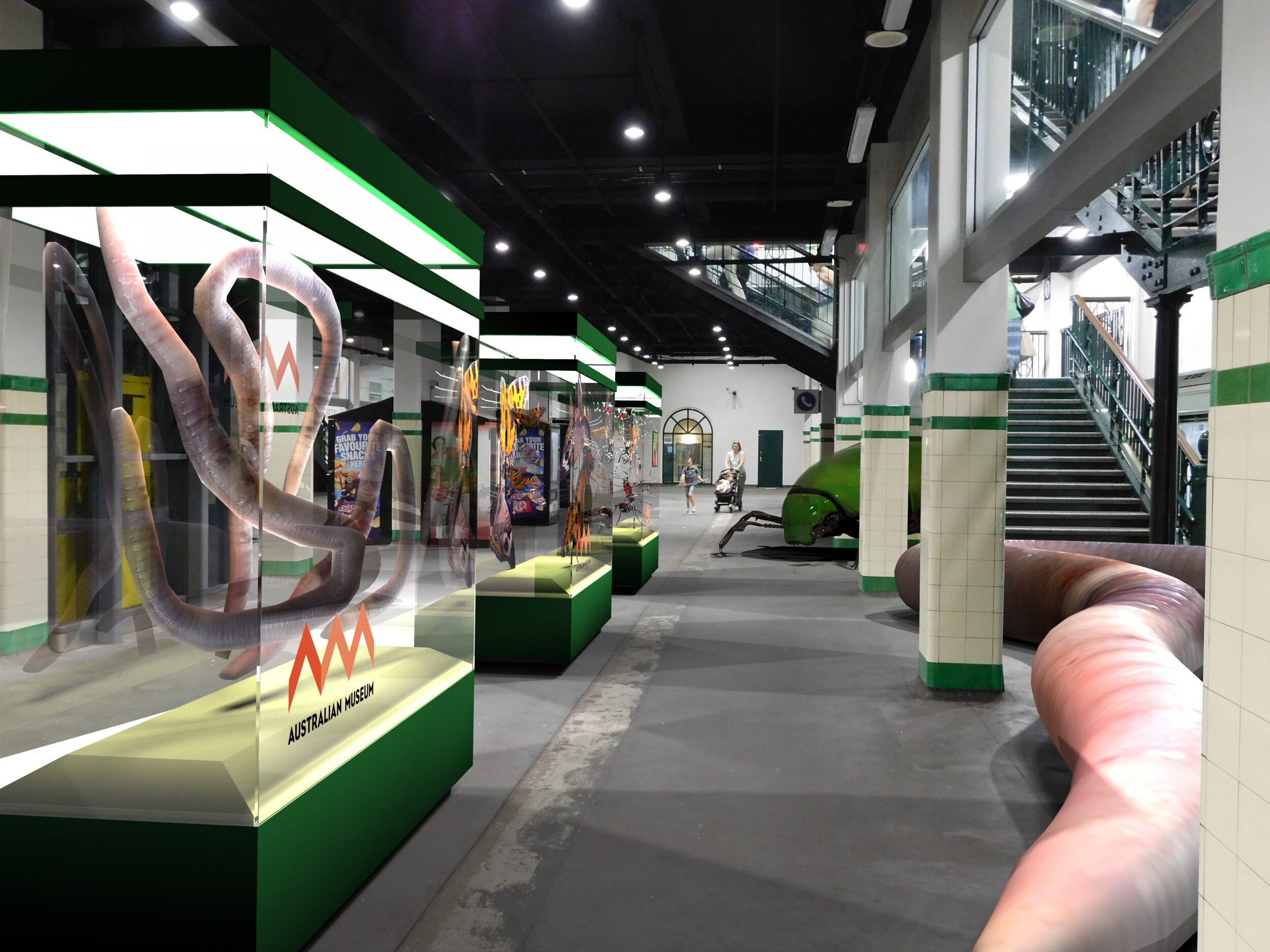
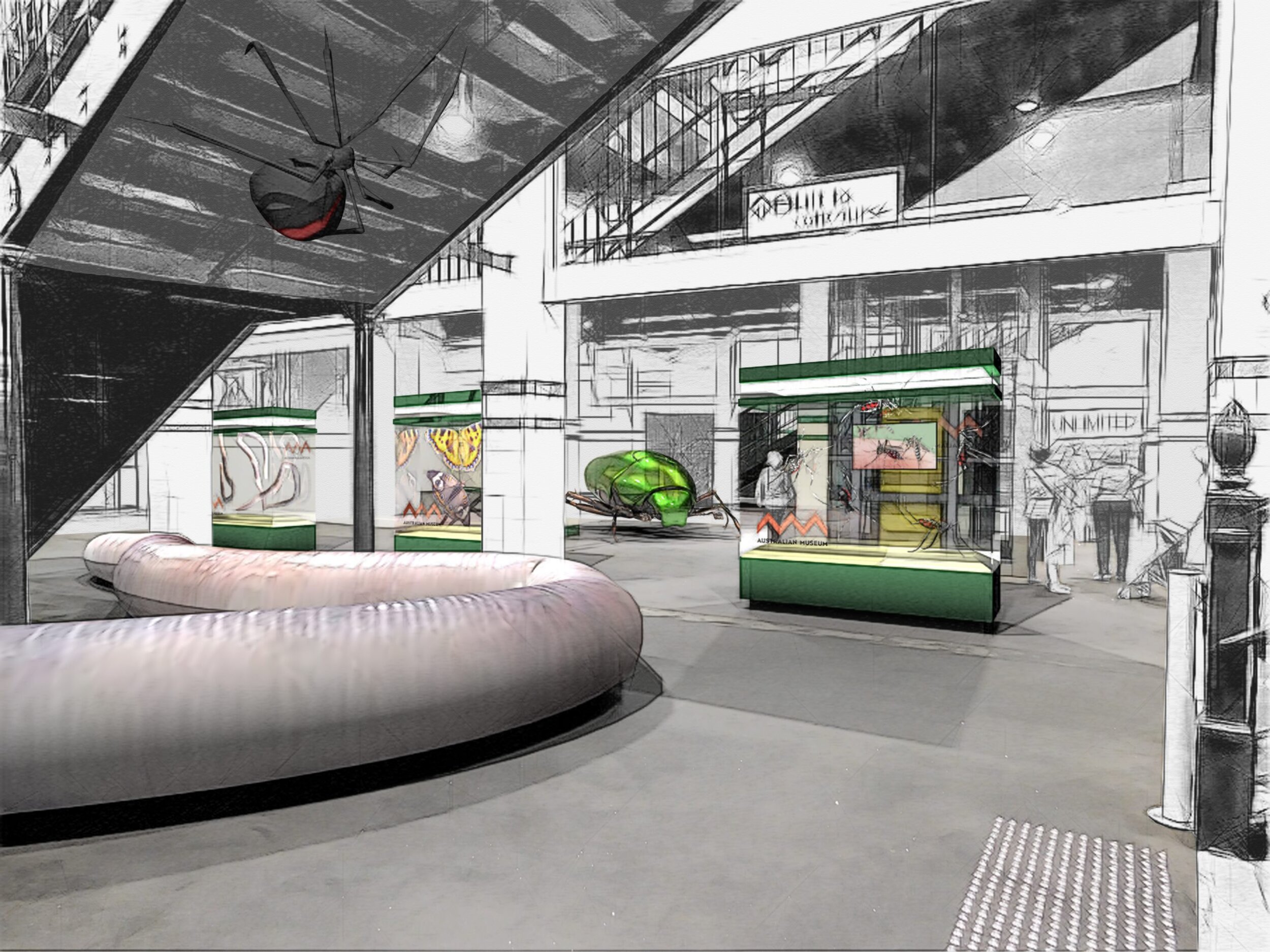
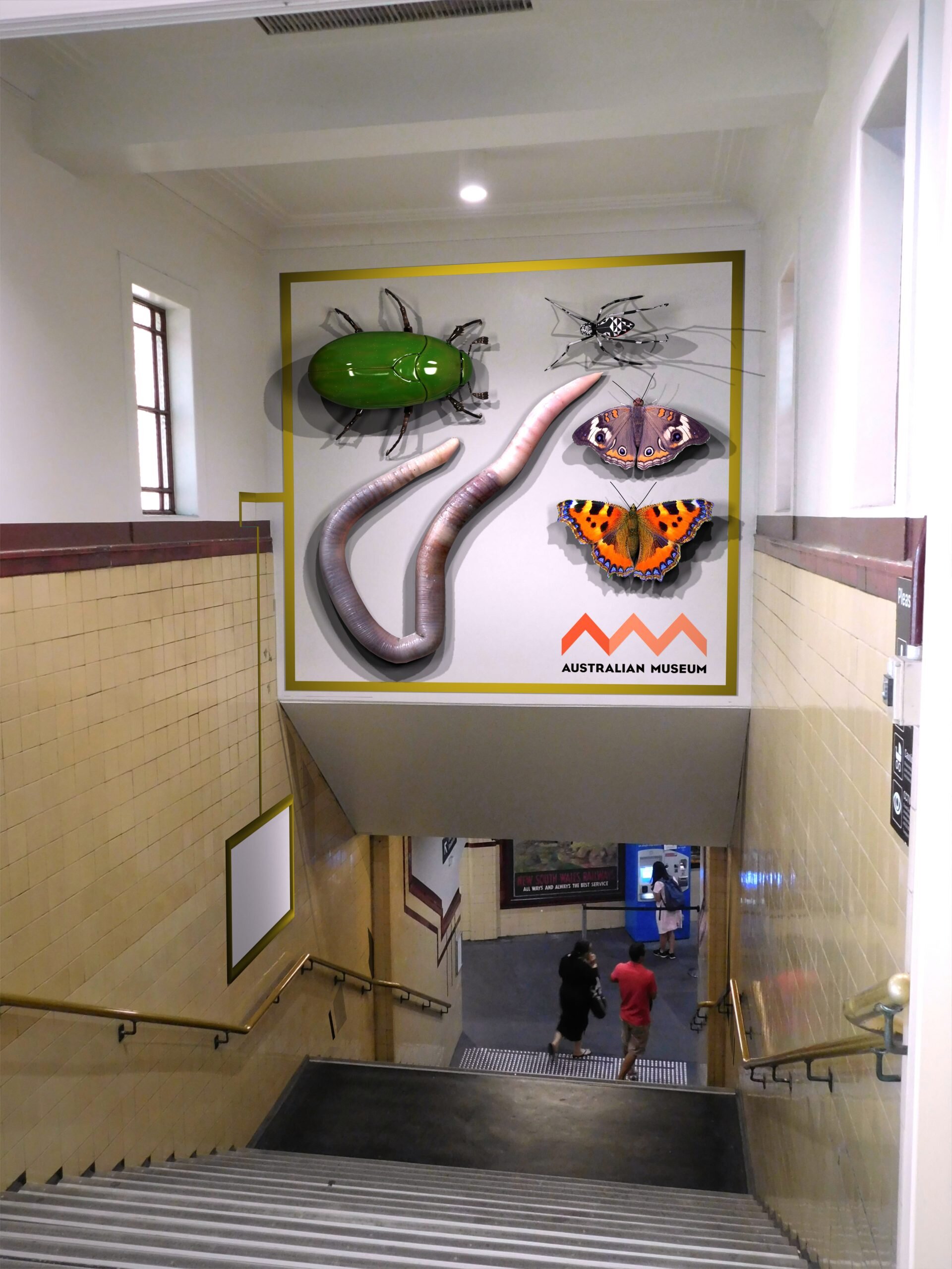
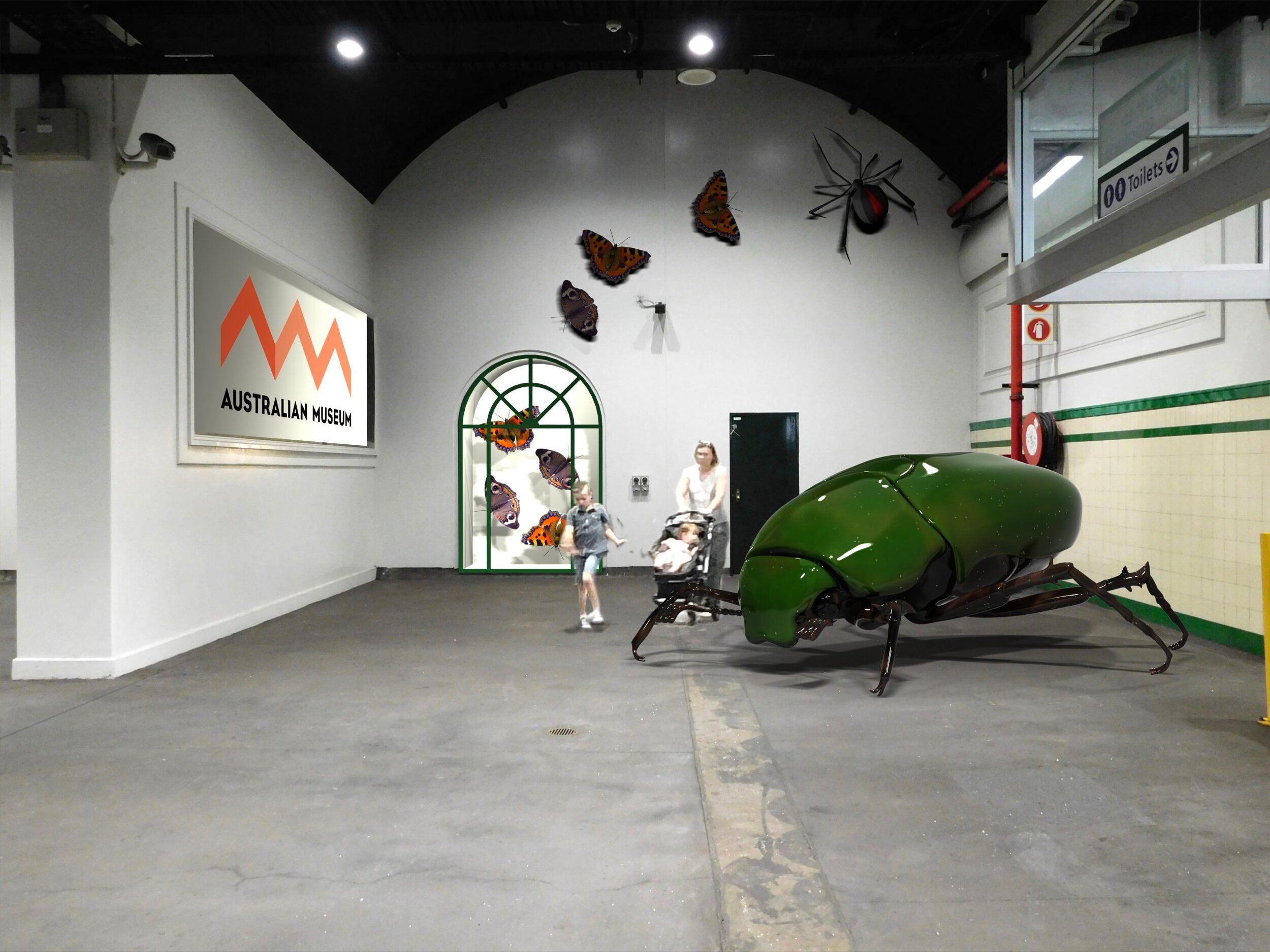
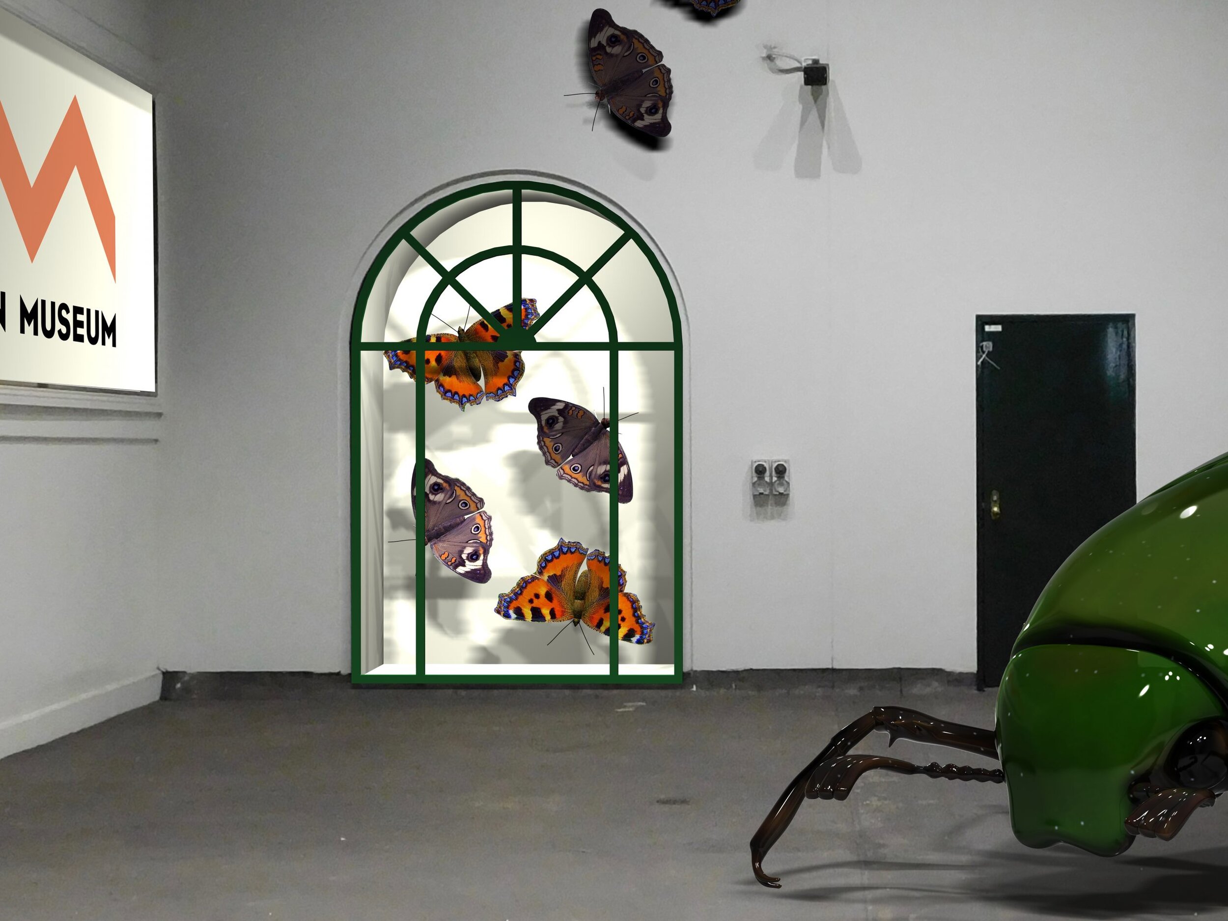
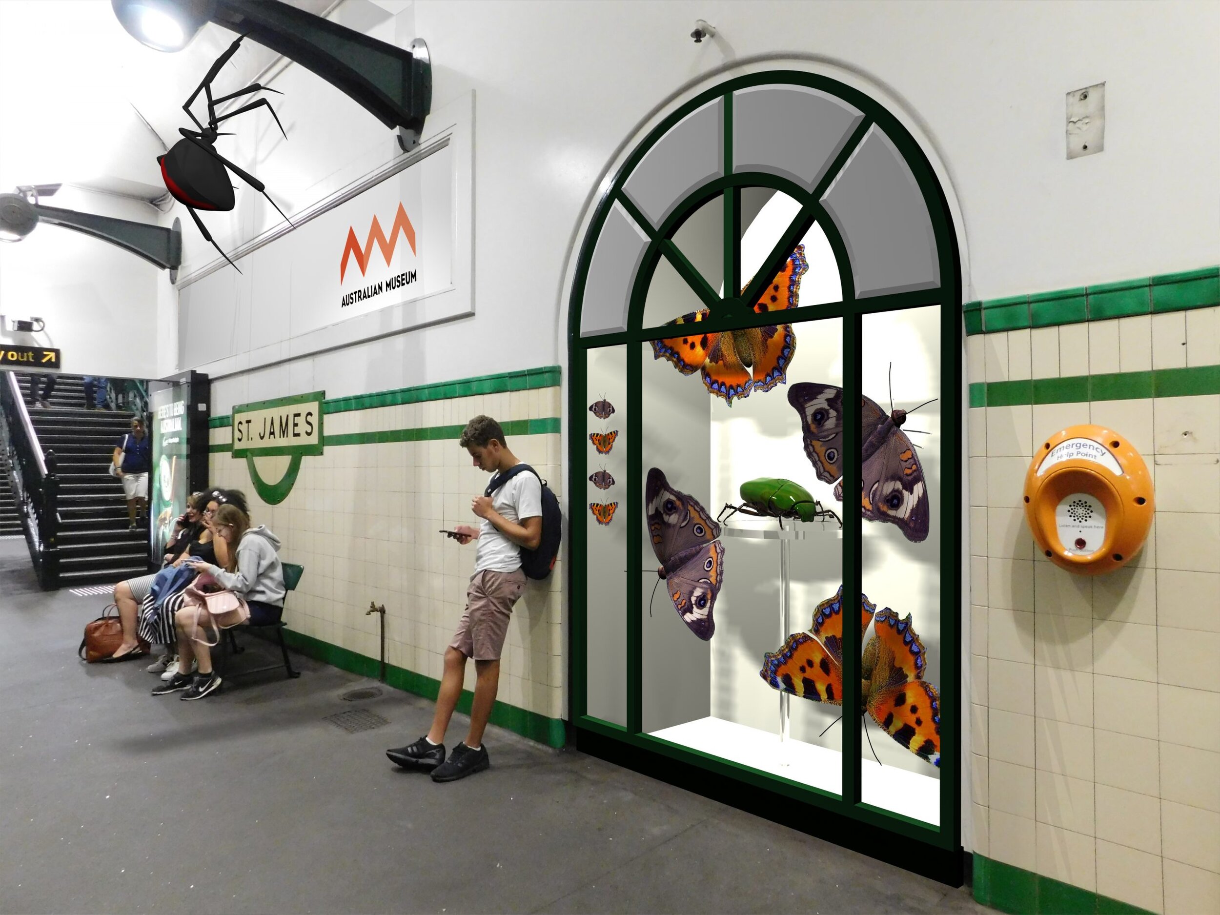
Pre-visualization for a pitch document:
With a very loose creative brief and tight deadline, this was an exercise in what might be. The images are perspective matched renders overlaid on photographs. As per the brief, I used a sketch photoshop plugin to loosen the result.
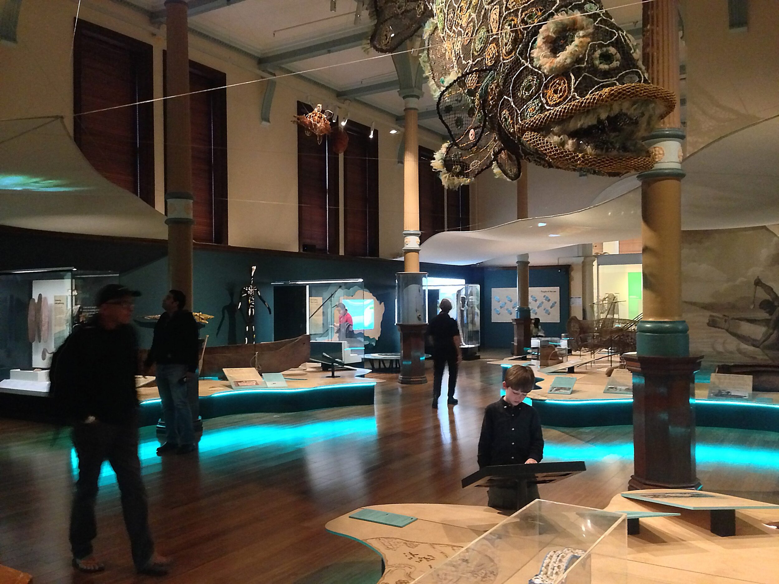
Exhibit for Australian Museum

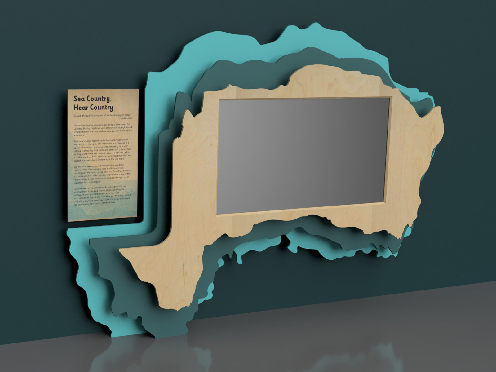
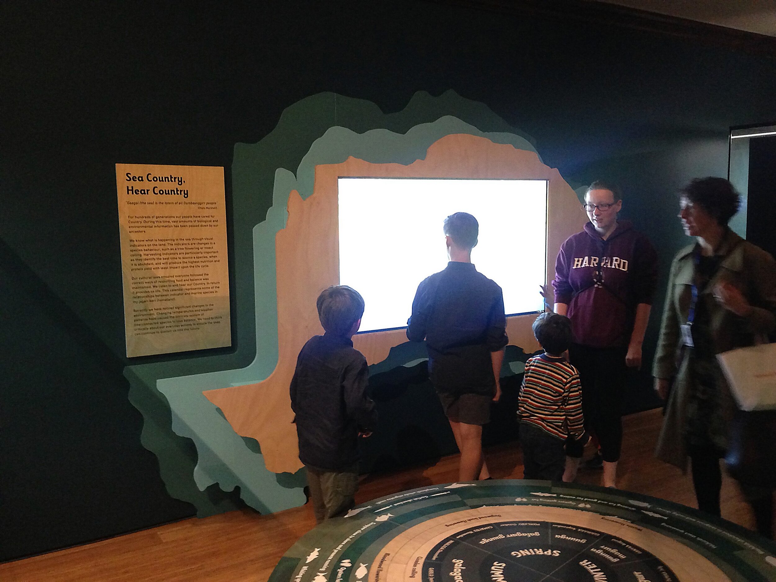

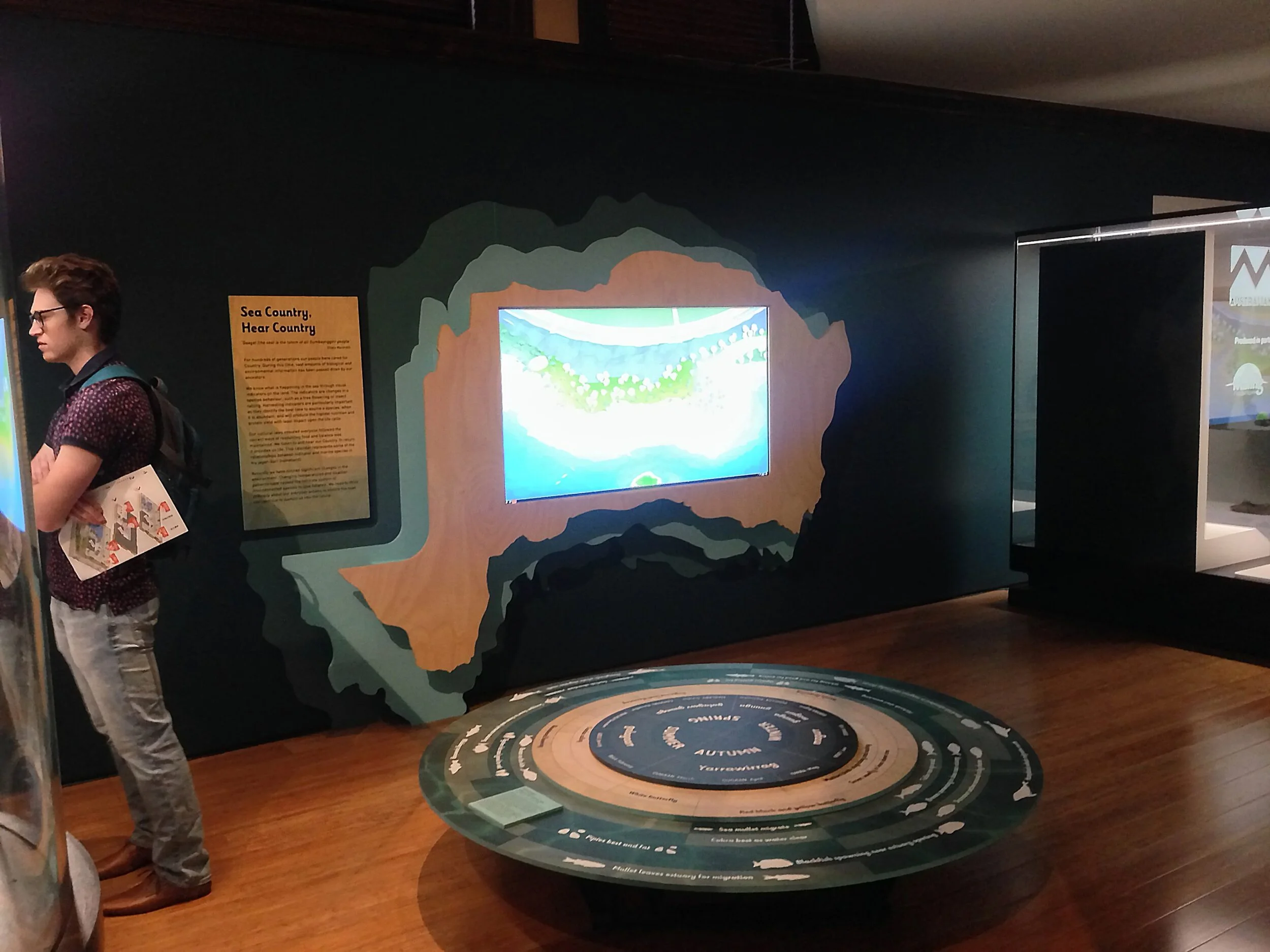
Calendar touchscreen interactive housing
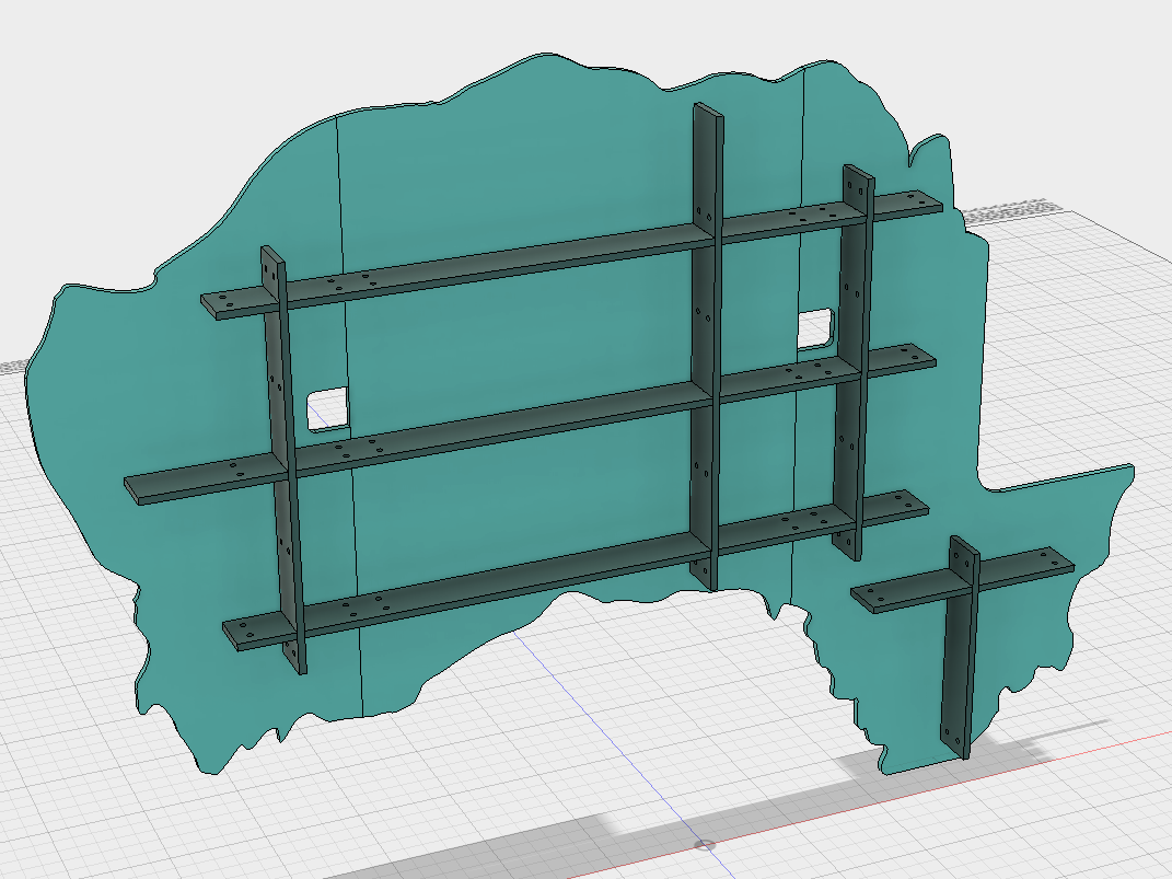
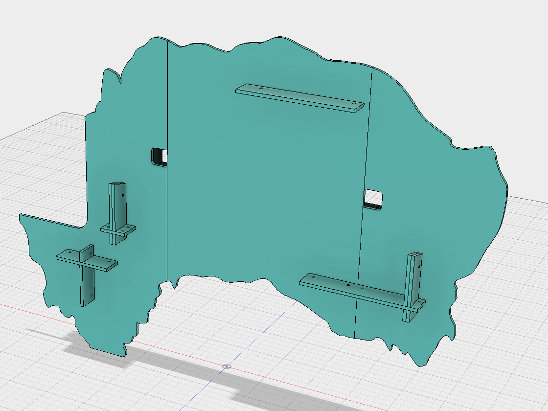
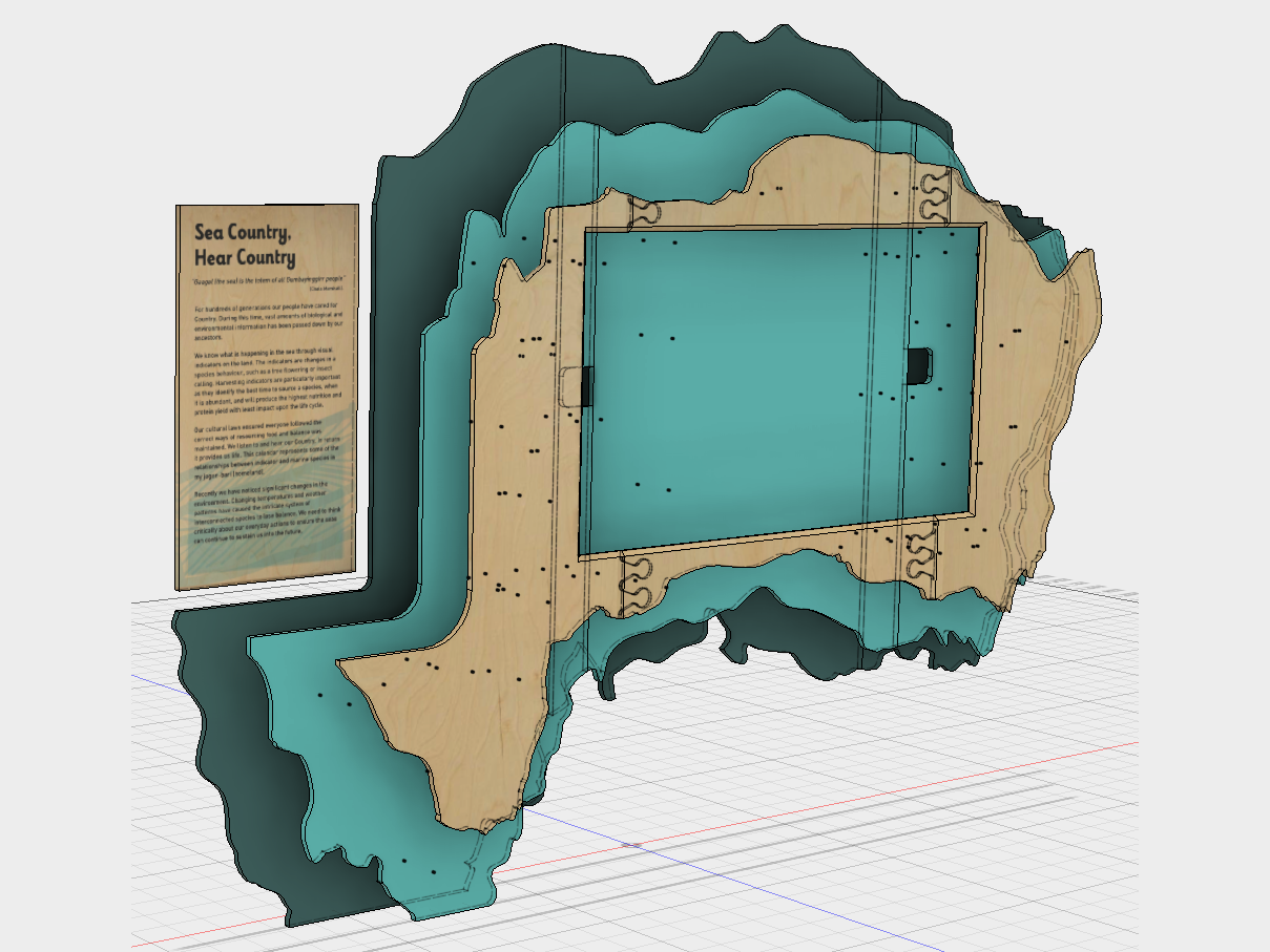
The shape is based on Muttonbird island, Coffs Harbour, NSW. Muttonbird island holds a special significance for some of the Aboriginal collaborators on the project. The three planes are derived from contours of the island. The island was 3D modelled, sliced into three planes, then detailed for CNC routing. A grid of battens hold the planes in space. The touchscreen is mounted to the middle plane.
Concept development, 3D modelling, Construction drawings, CNC toolpath linework.
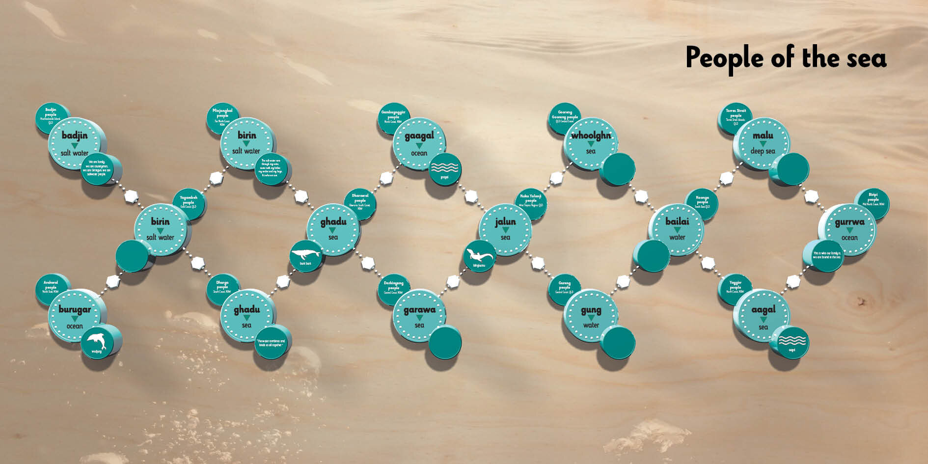
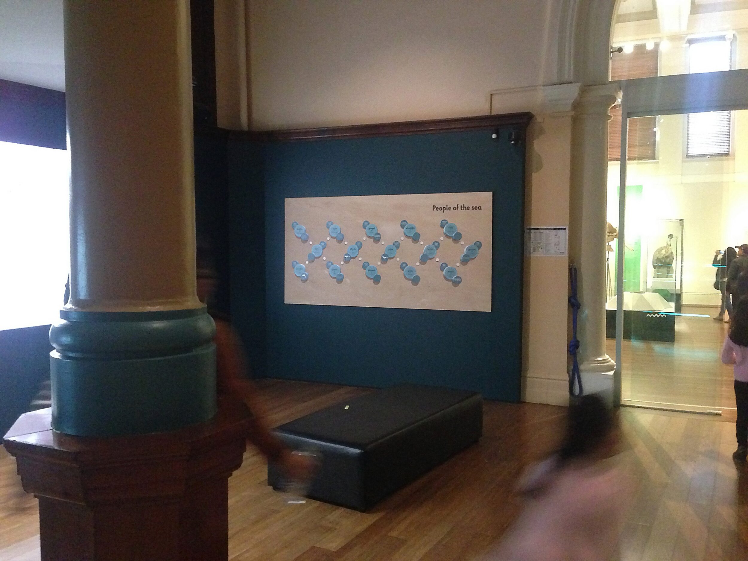
People of the sea graphic
This was a redesign of an existing gallery element that was displaced by the new interactive. The original element was made physically from multiple cnc routed parts and stuck on the wall. For budgetary and real-estate reasons, the new element is 2D. In order to preserve the original elements look as much as possible. The parts were 3D modelled and rendered to achieve a 2.5D result. Further, the piece is all about people’s connection to the sea, so a sea-scape water-mark image has been used to evoke that context for the original ‘DNA’ graphic. It’s direct printed onto hoop pine. The hoop pine plywood helps to tie it into the rest of the gallery.
Volkswagen Goodwood Festival of Speed UK
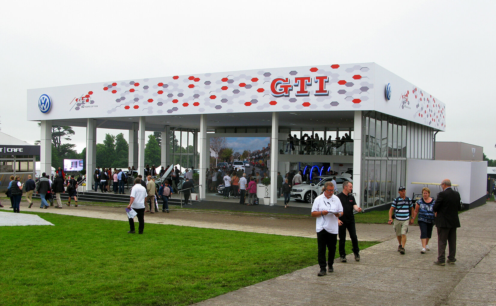
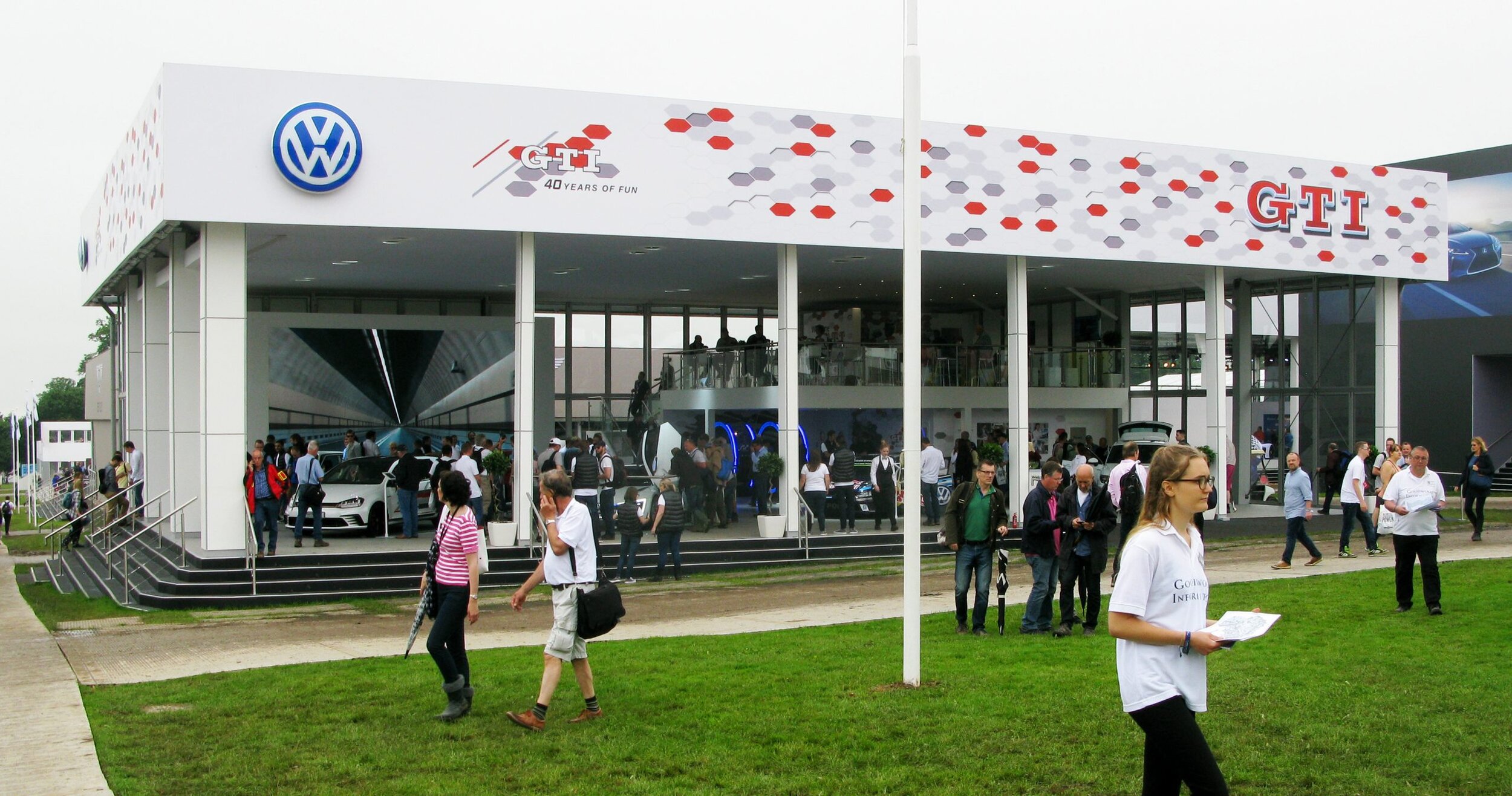
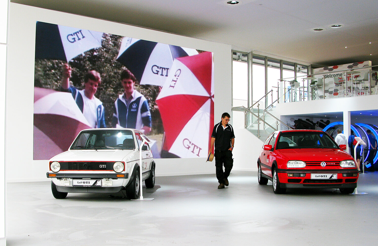
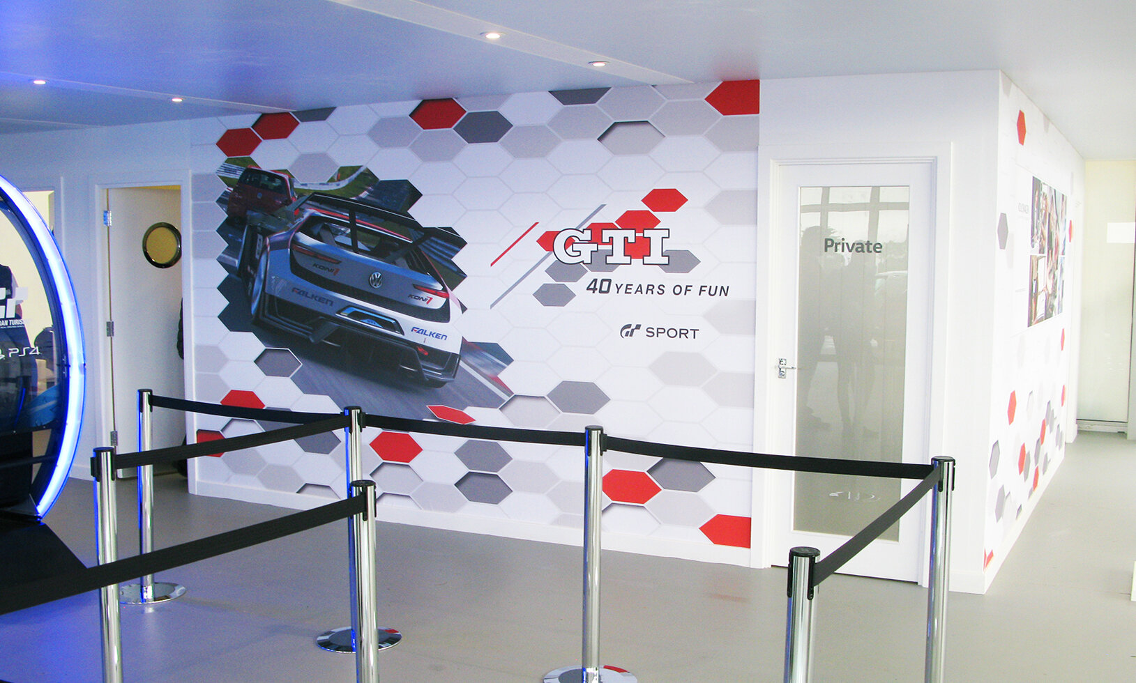
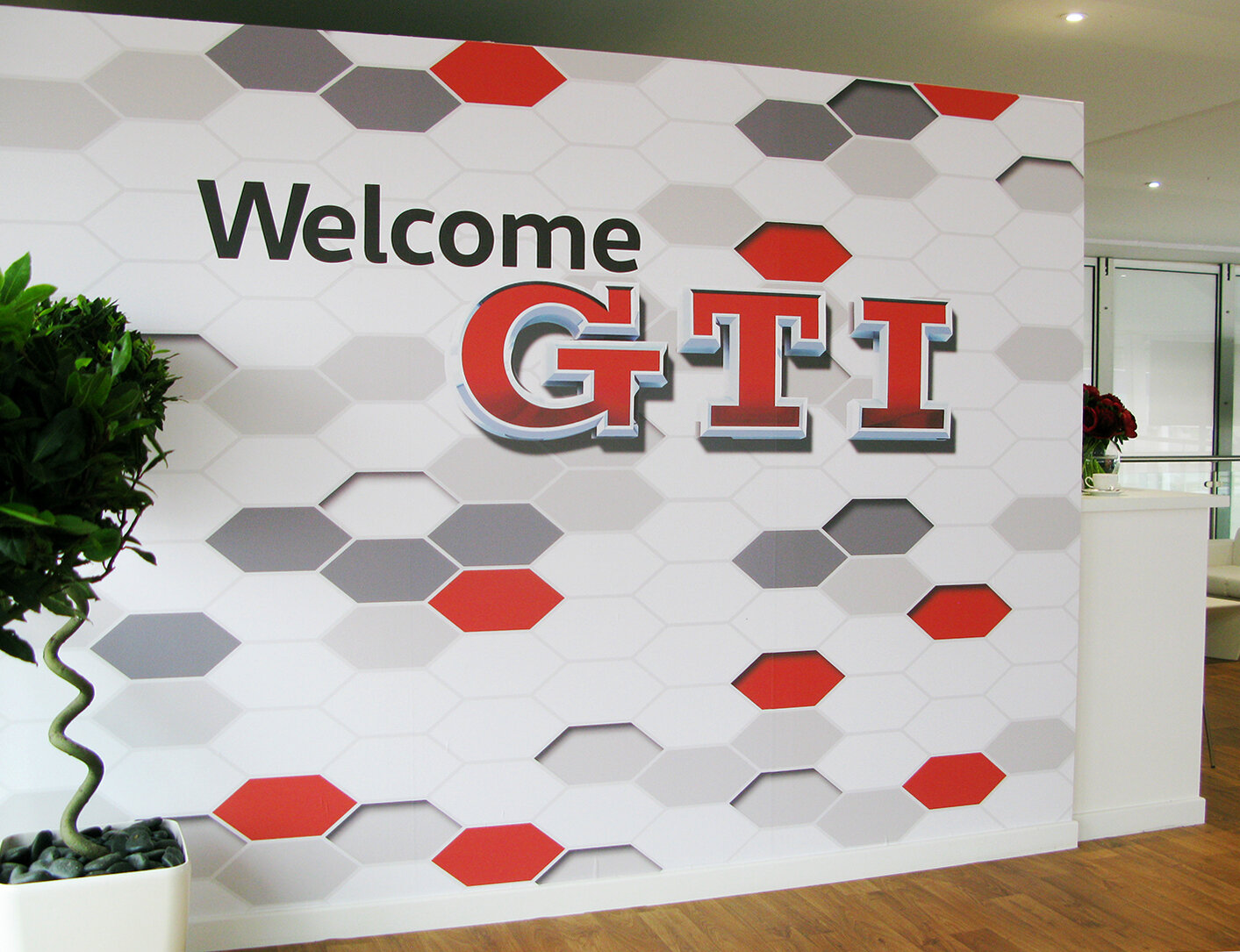
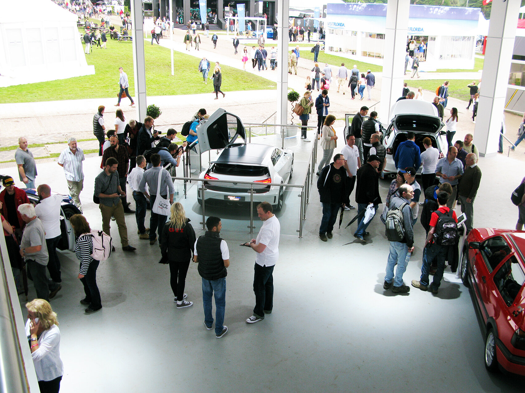
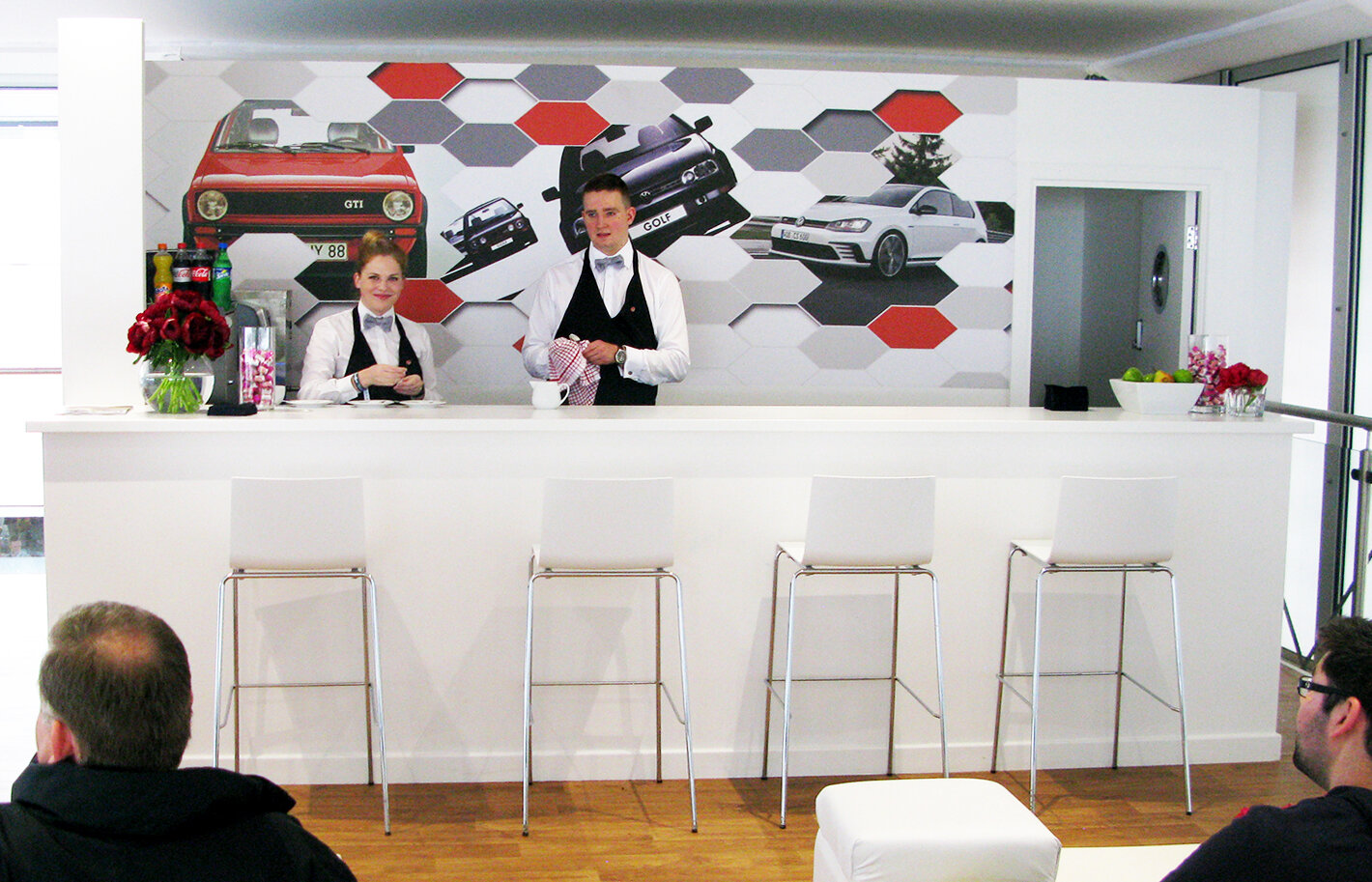
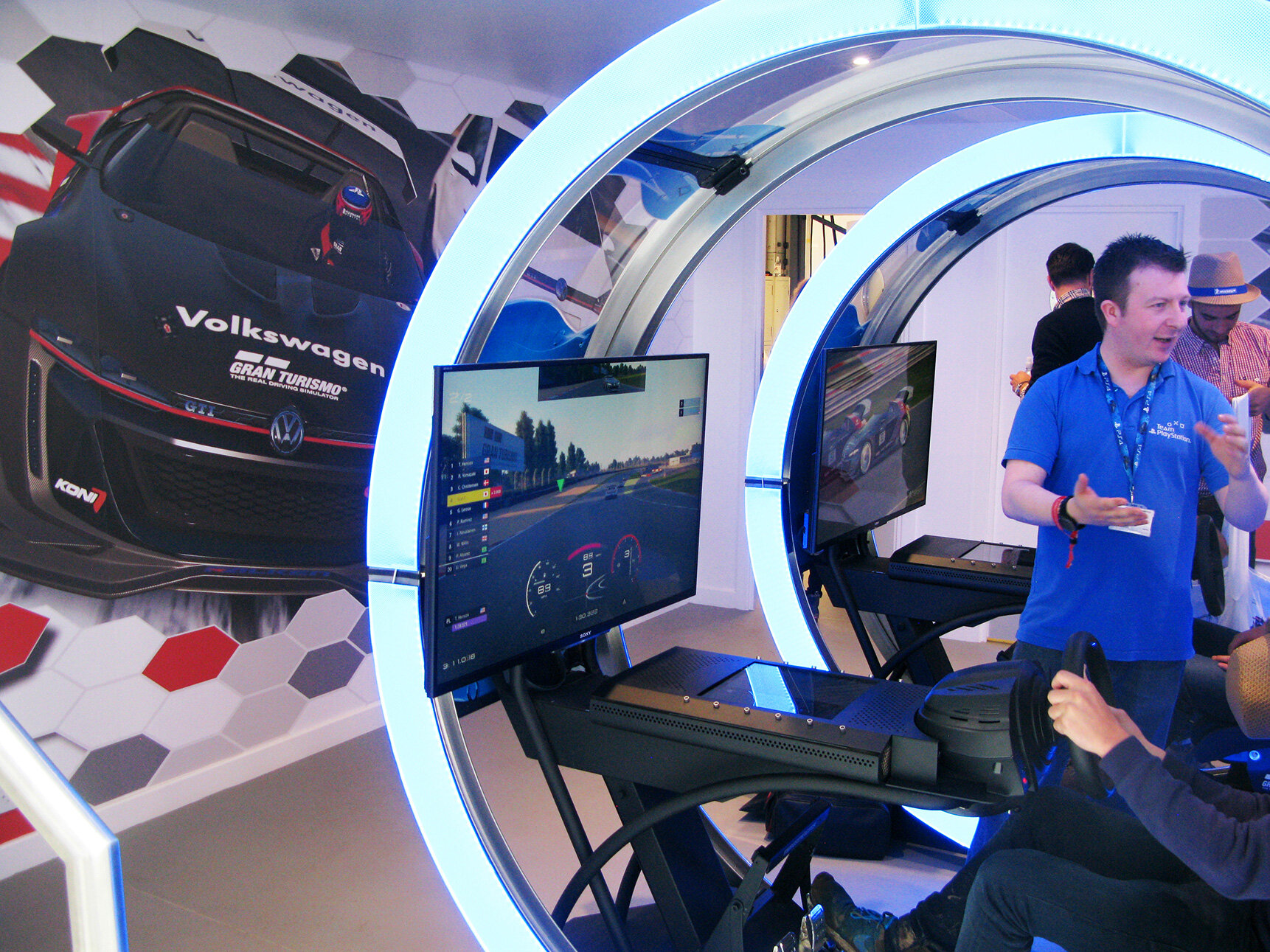
Volkswagen pavilion at the Goodwood Festival of Speed.
3D modelling & rendering of GTI logo, Facade graphics, simulator graphics, Bar Backing.
Audi Polo Event Cambridgeshire UK
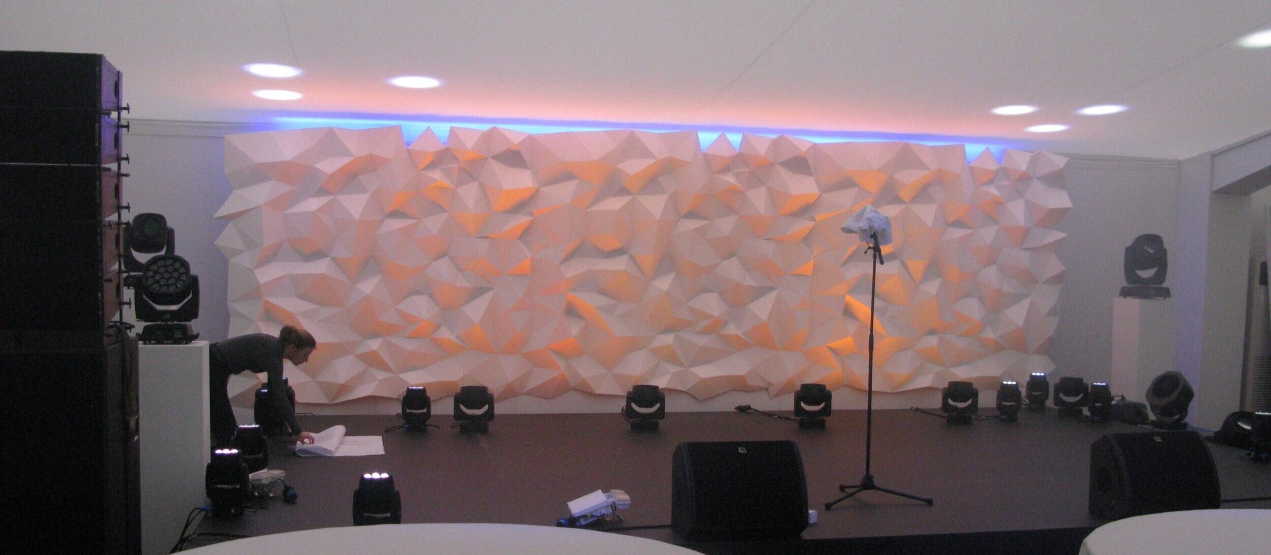
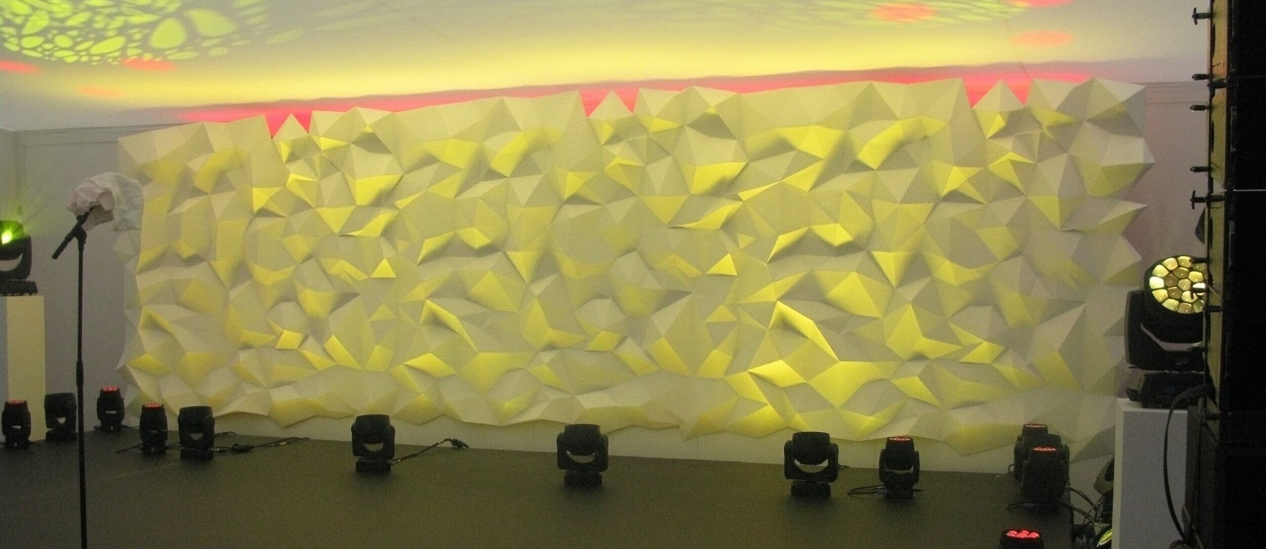
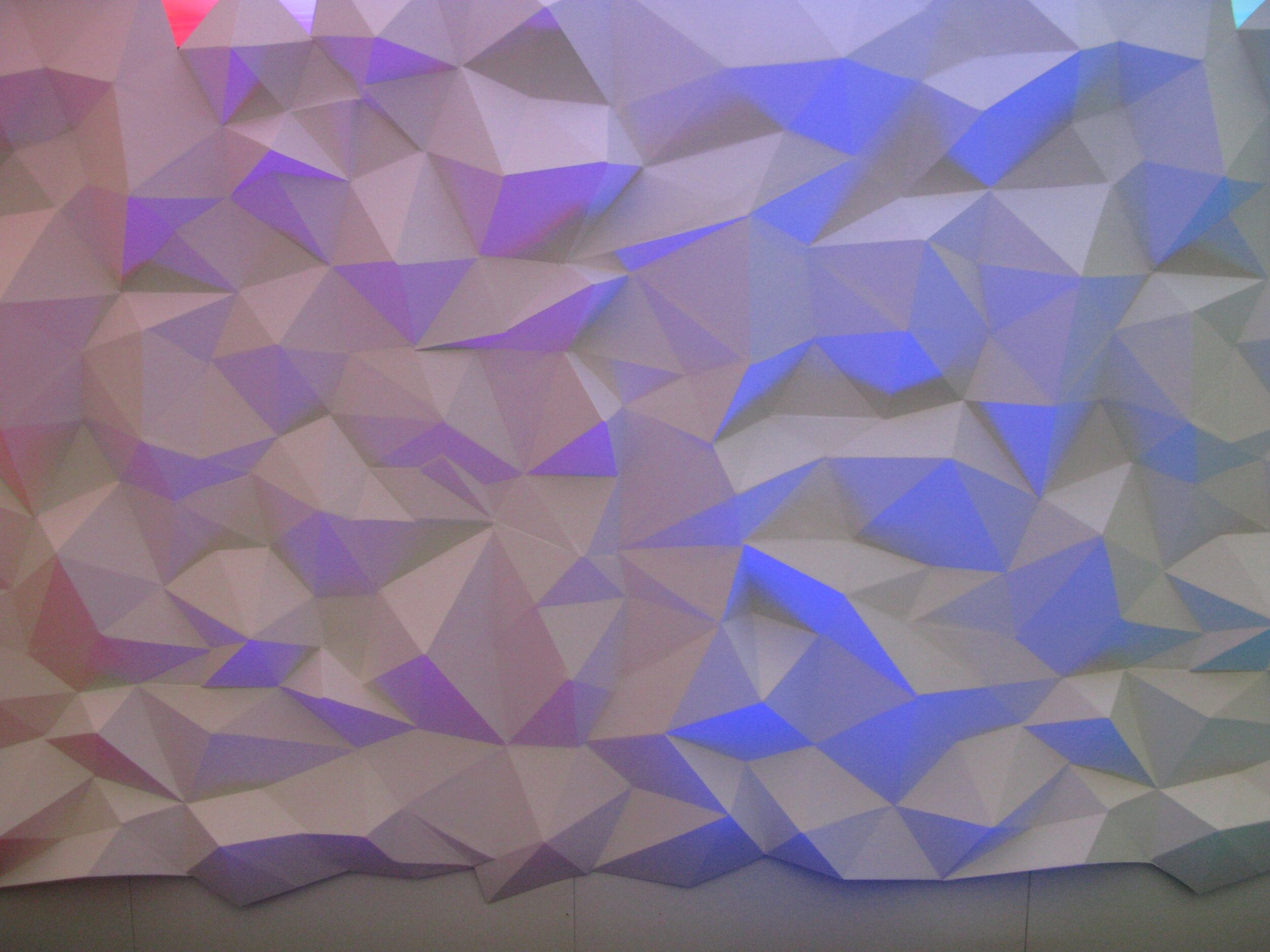
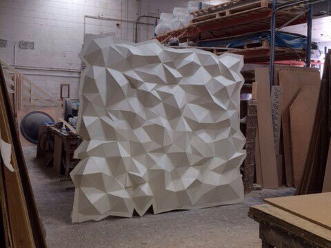
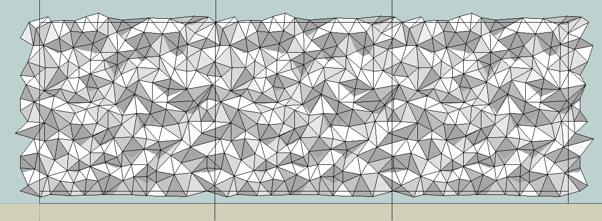
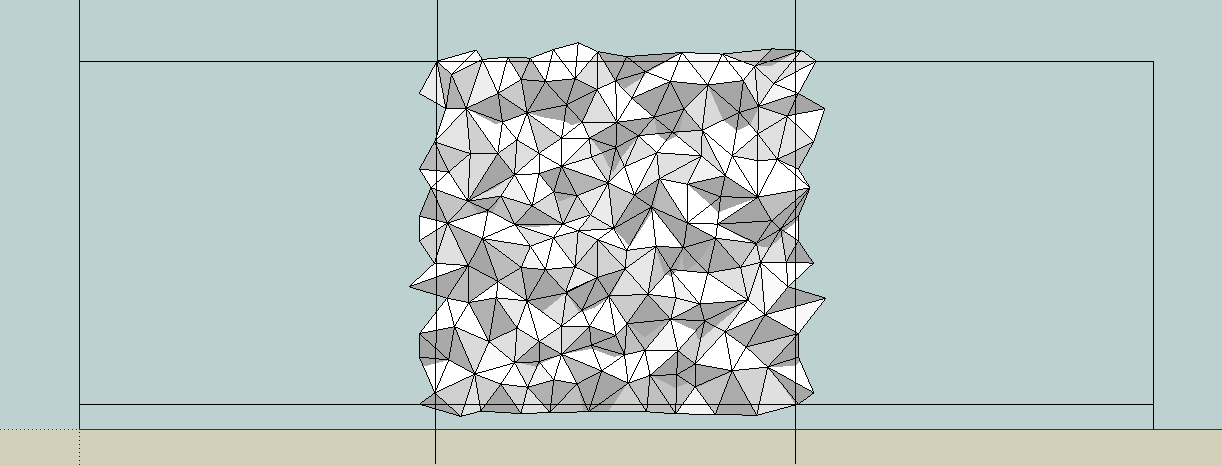
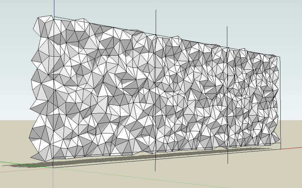
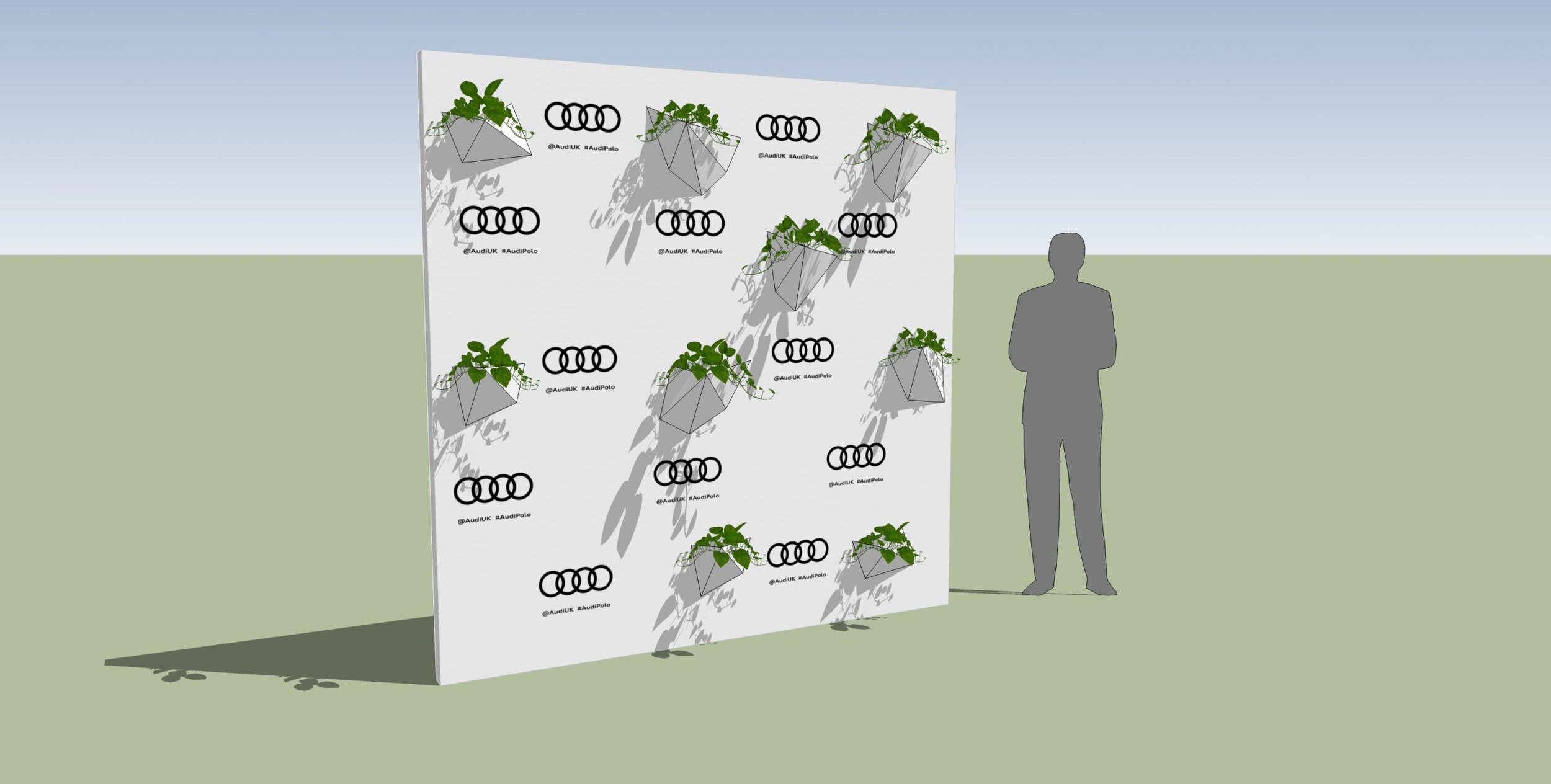
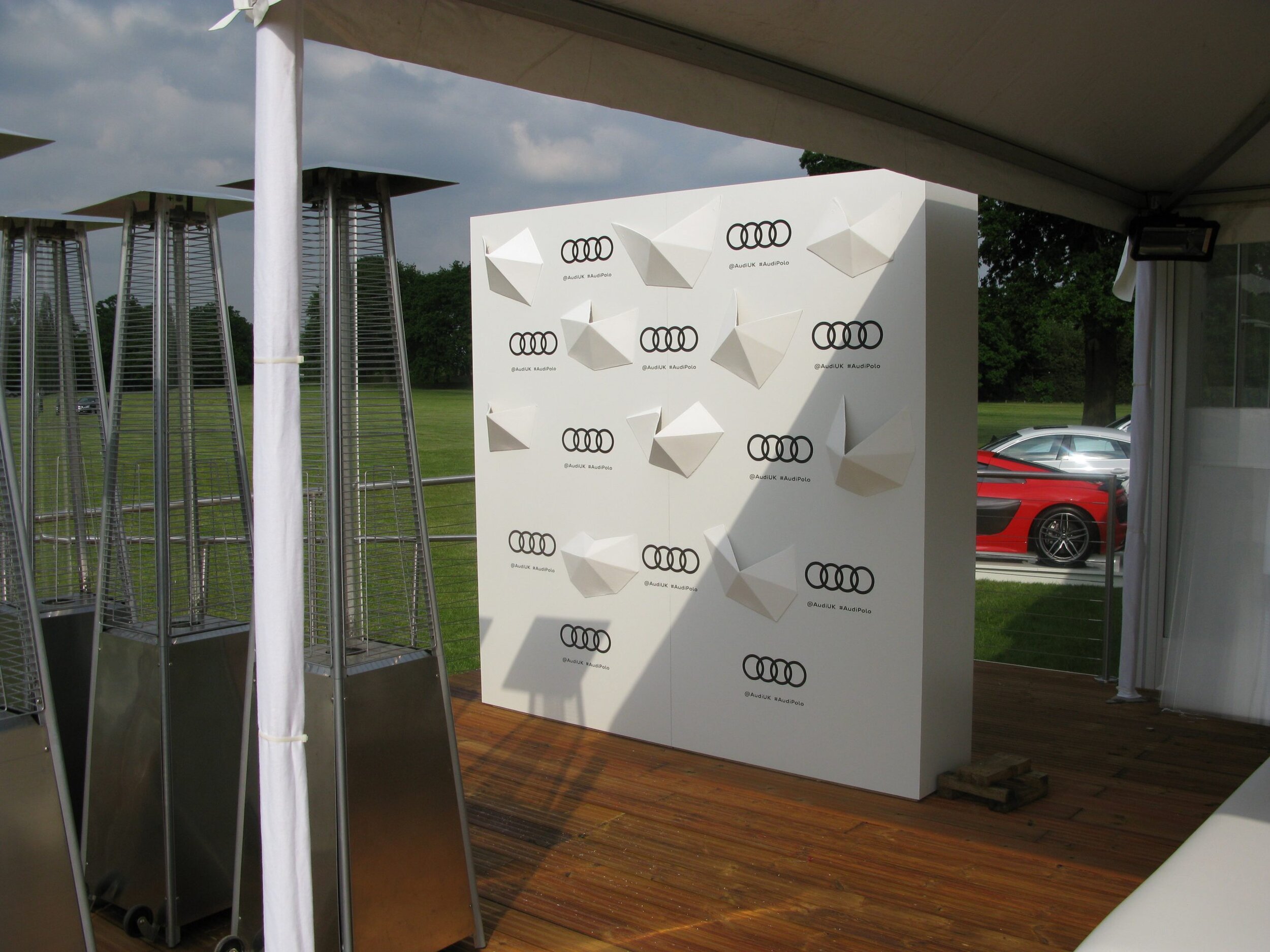
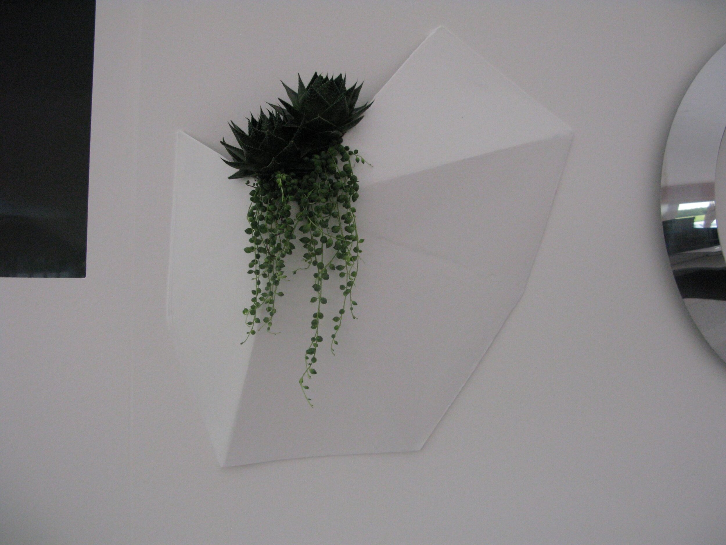
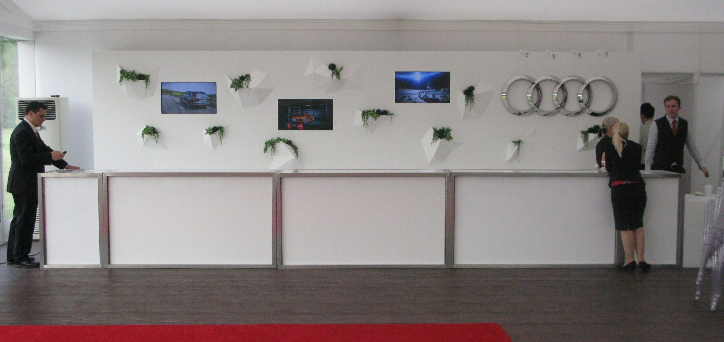
The stage set is made in three pieces. Three identical fibreglass parts were taken from a mold. Care was taken to reduce visible repetition in the polygon pattern. Edge polygons were kept whole so as to reduce the visual impact of the seams between the panels.
The design was refined using SketchUp. the initial panel was made into a component and copied twice more so visual impact of changes to the polygons could be assessed in real-time. Using this method you have a lot of confidence that the finished piece will fit together seamlessly and will turn out as you envisaged.
Stage set design, Media wall. Bar Backing.
Saint Symphorien Military Cemetery WW1 Centenary
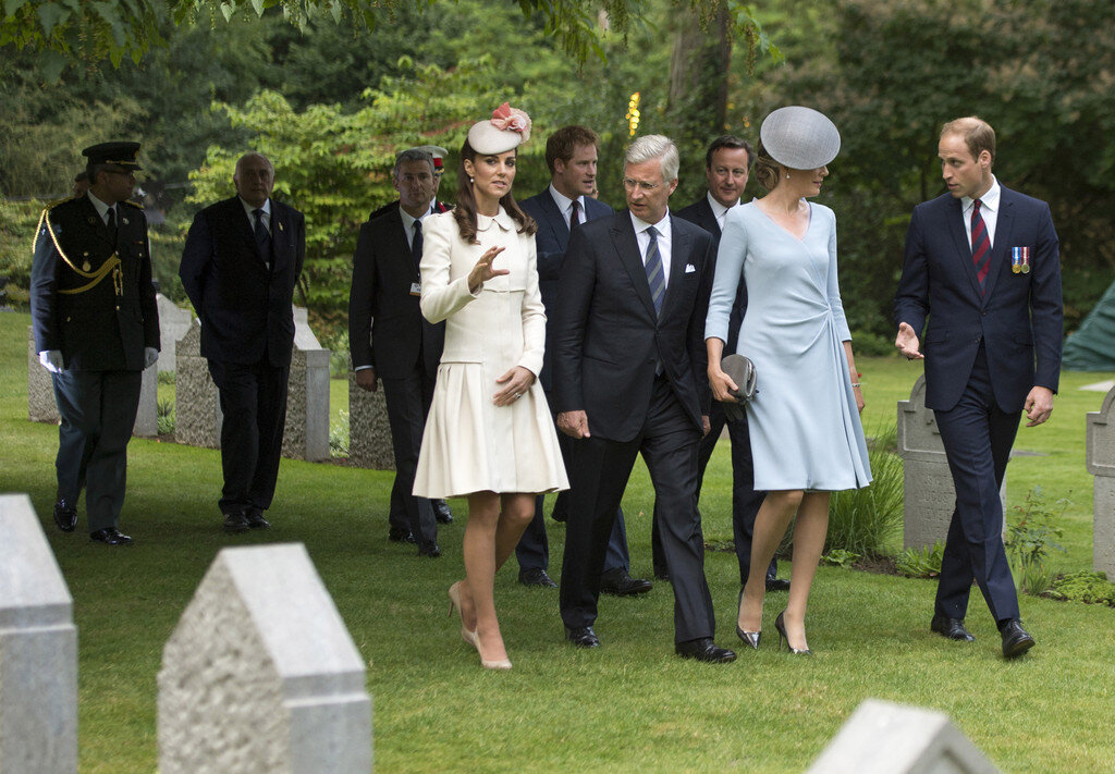
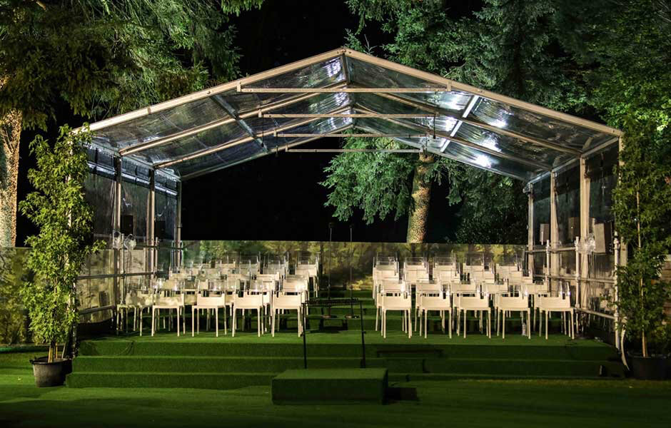
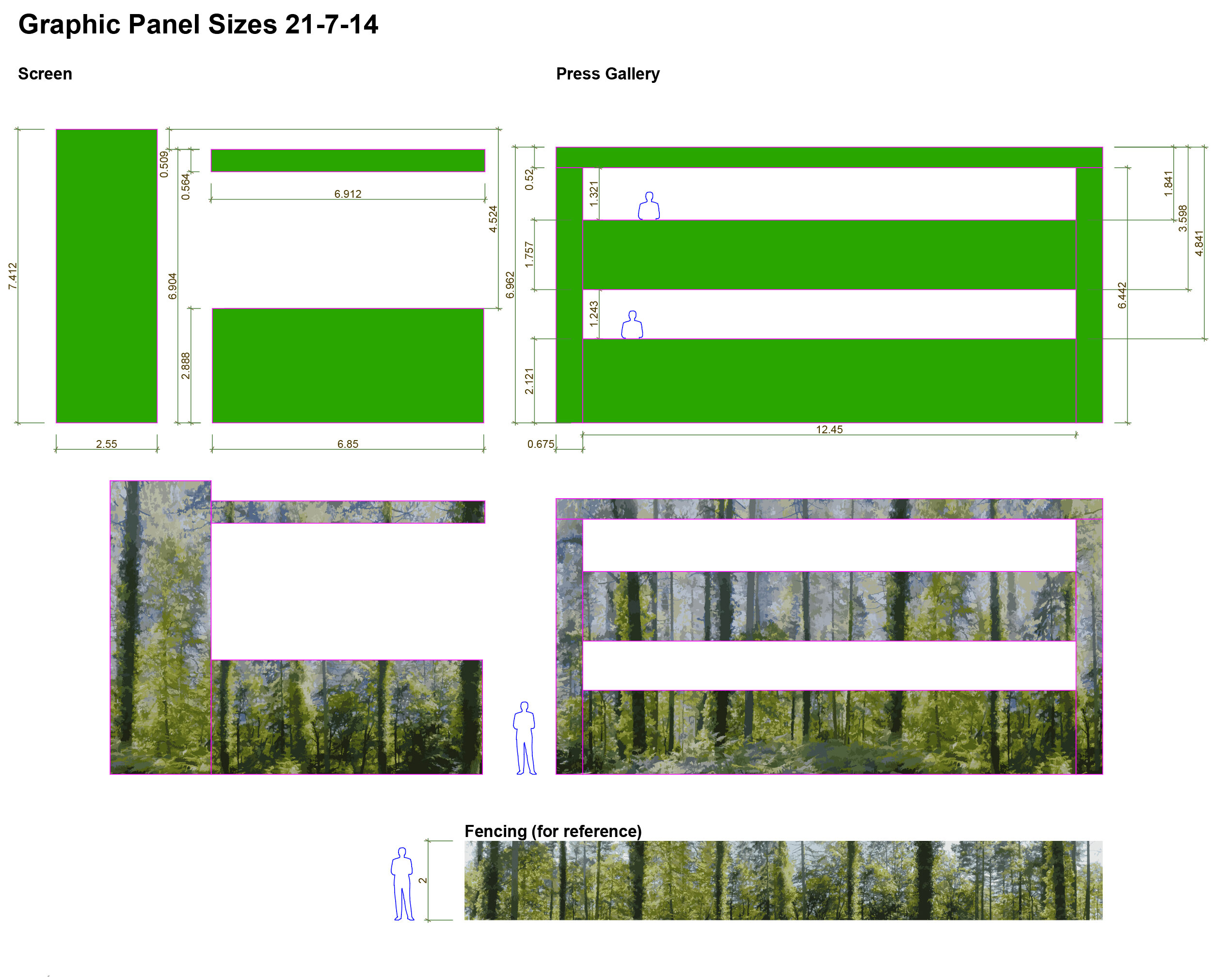

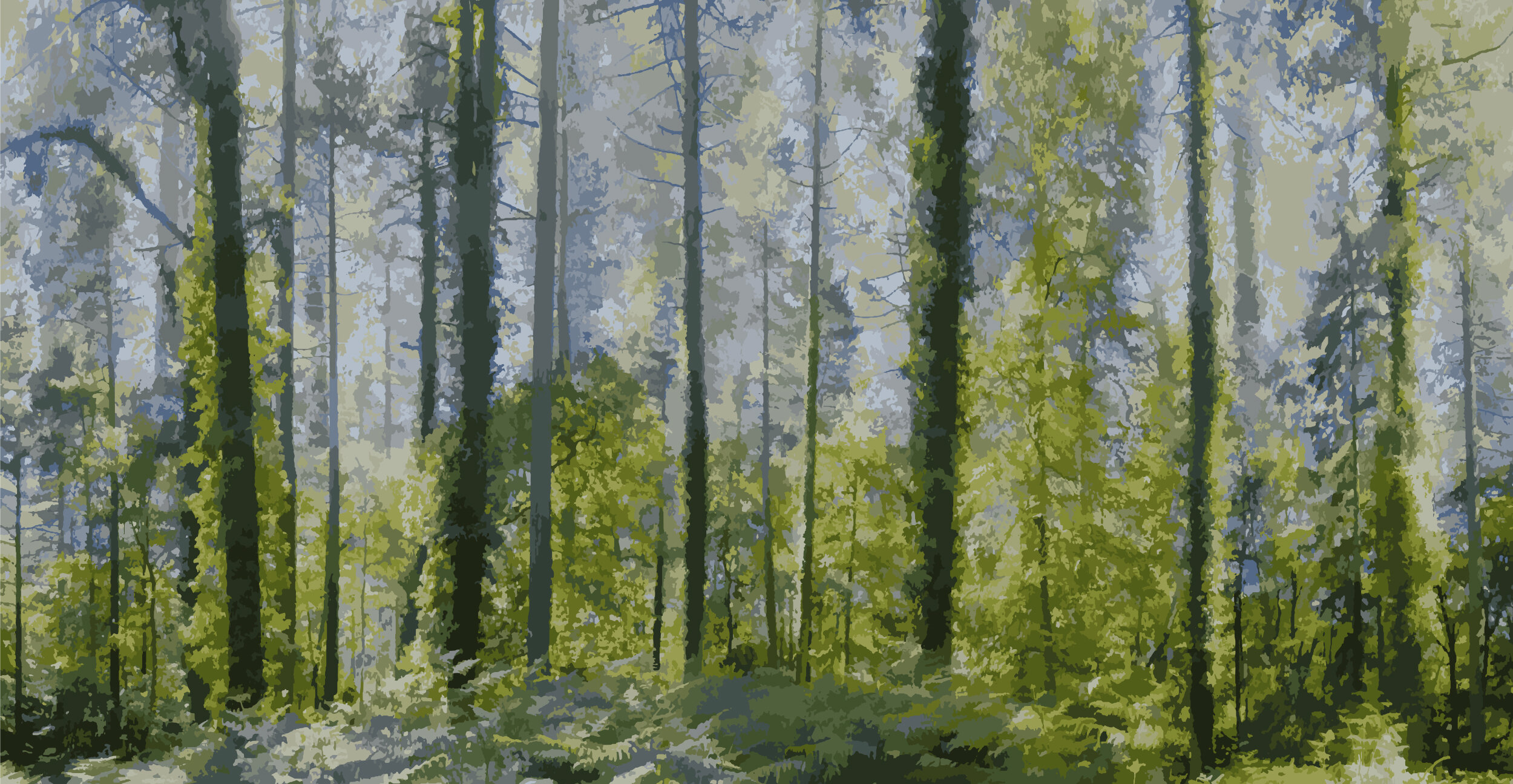
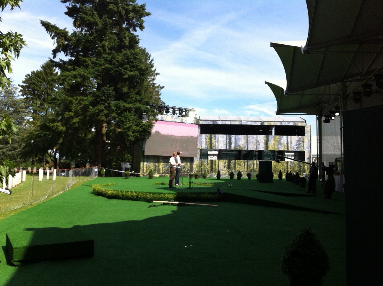
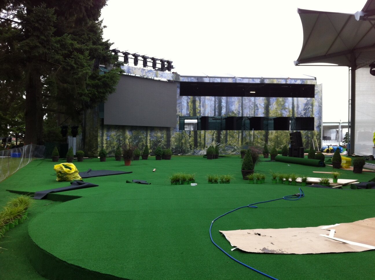
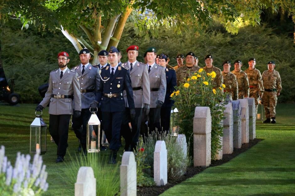
The Duke and Duchess of Cambridge, Prince Harry and David Cameron attended the ceremony, which marked 100-years since Britain joined WW1, a conflict that cost 17 million people their lives. St Symphorien Military Cemetery is unique: opened by the Germans in 1917, taken over by the British after the war, it holds more than 500 graves, roughly half German and half British and Commonwealth. It also holds the first and last British soldiers to have died in WW1.
The seamless tree graphic was developed from photographs taken in the New Forest, near Southampton, UK. The building-wrap effectively camouflaged the double-deck press gallery and other structures around the cemetery.
Pitch document, Photography, Graphic design, Building wrap.
Shanghai International Horse Cultural Festival
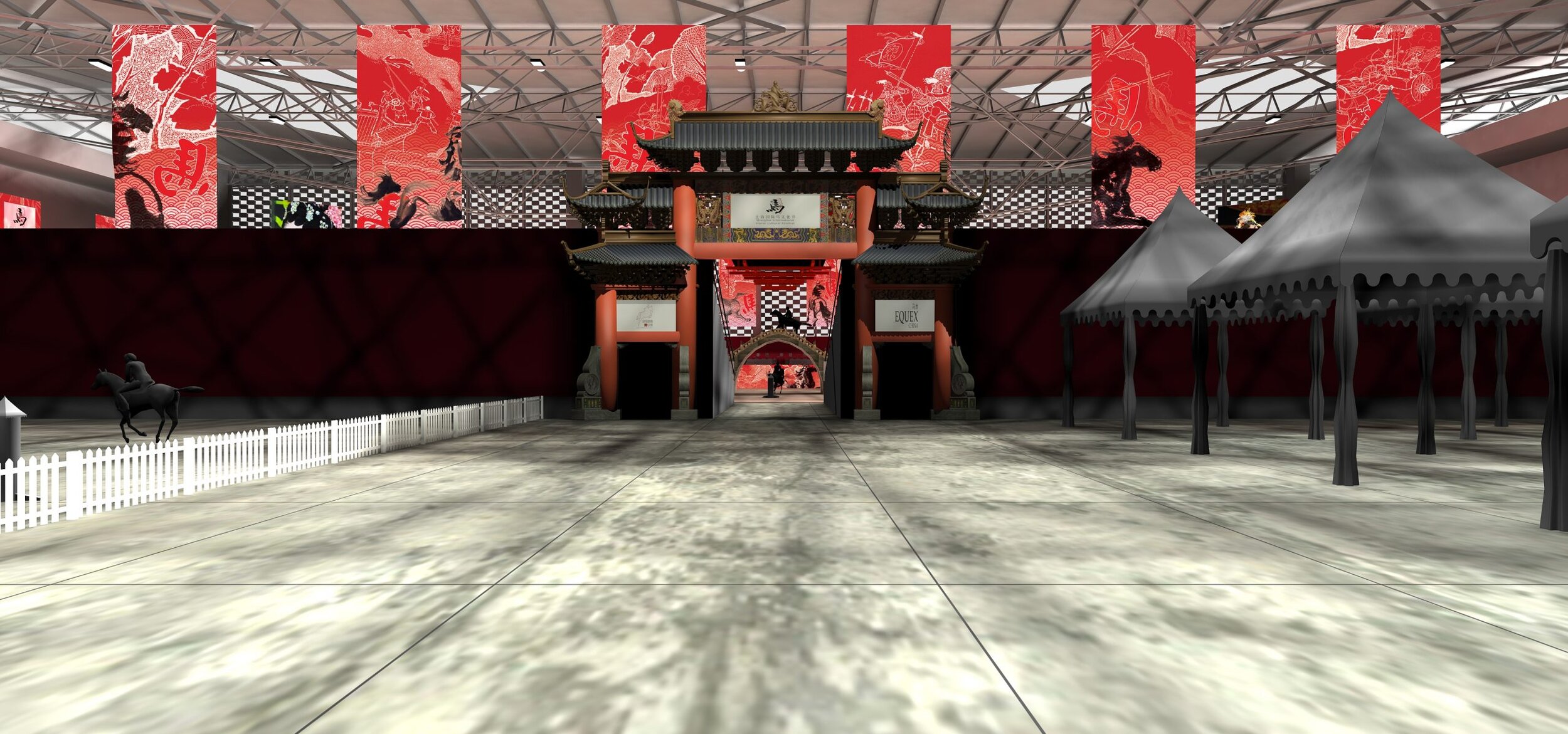
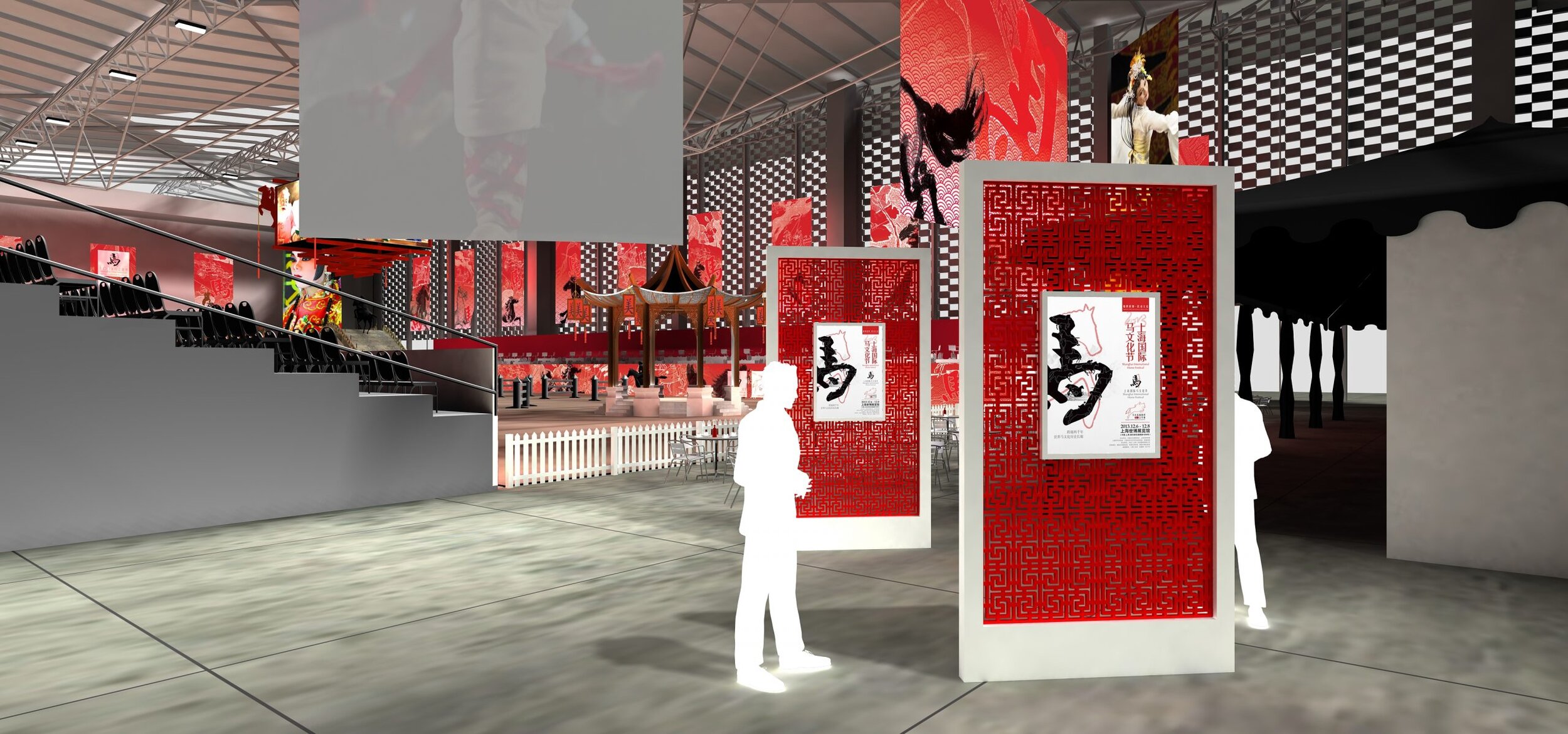
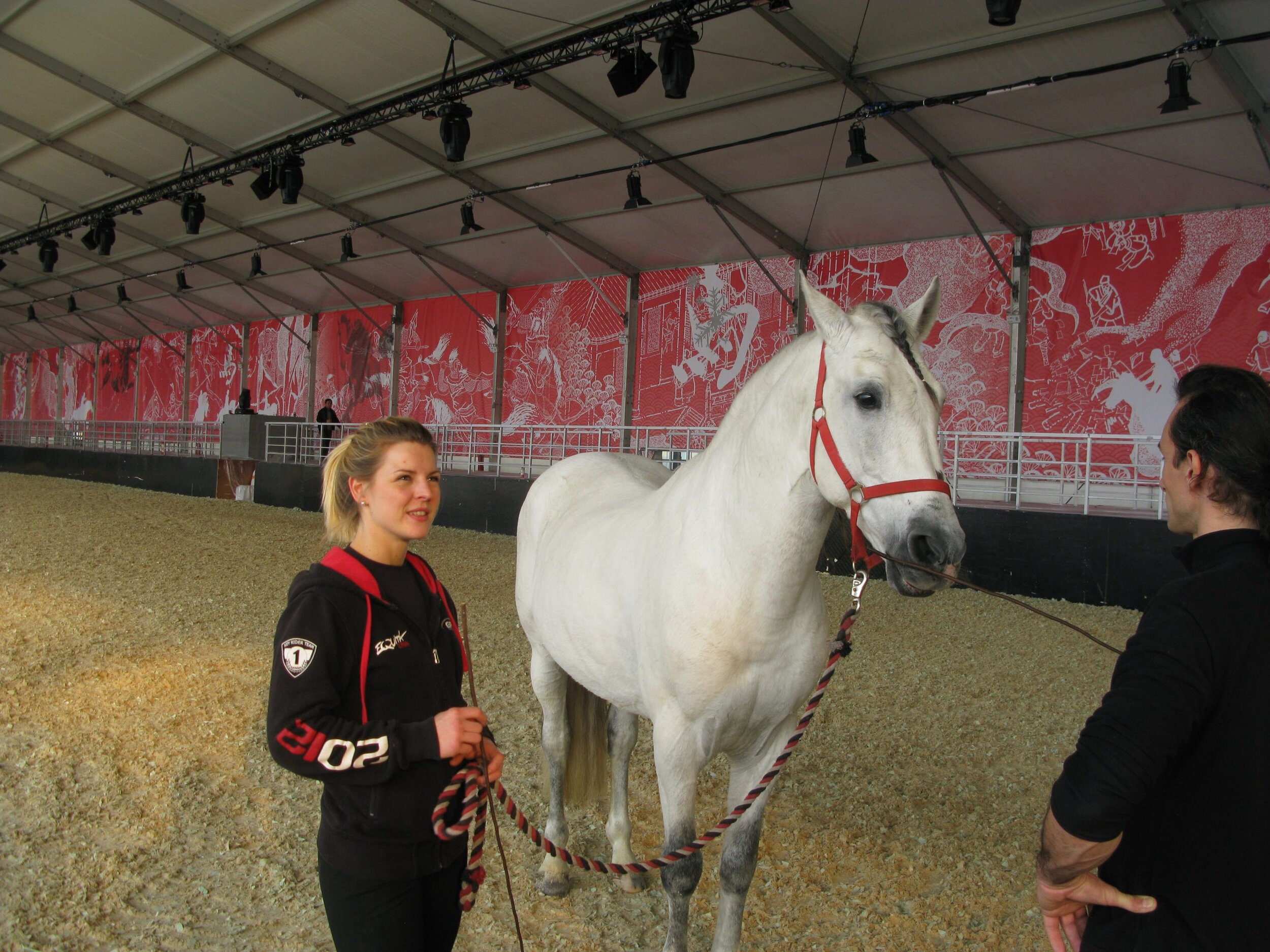
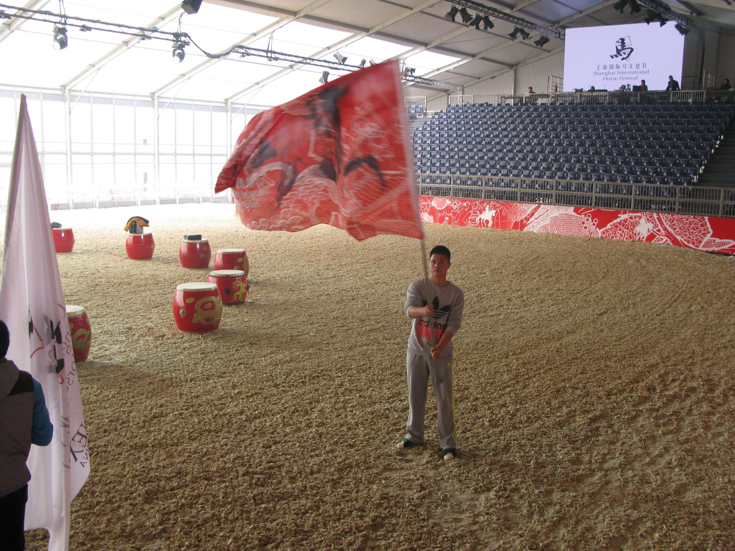
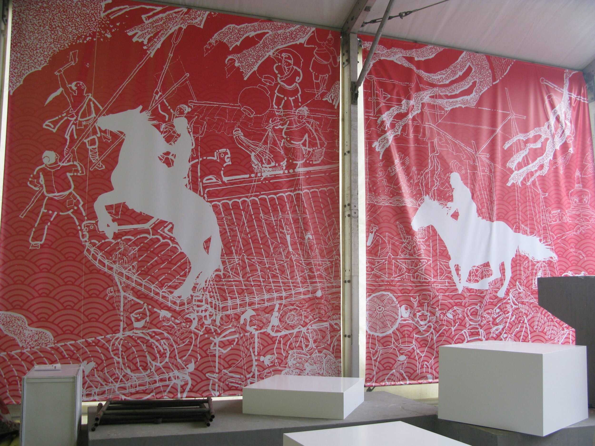
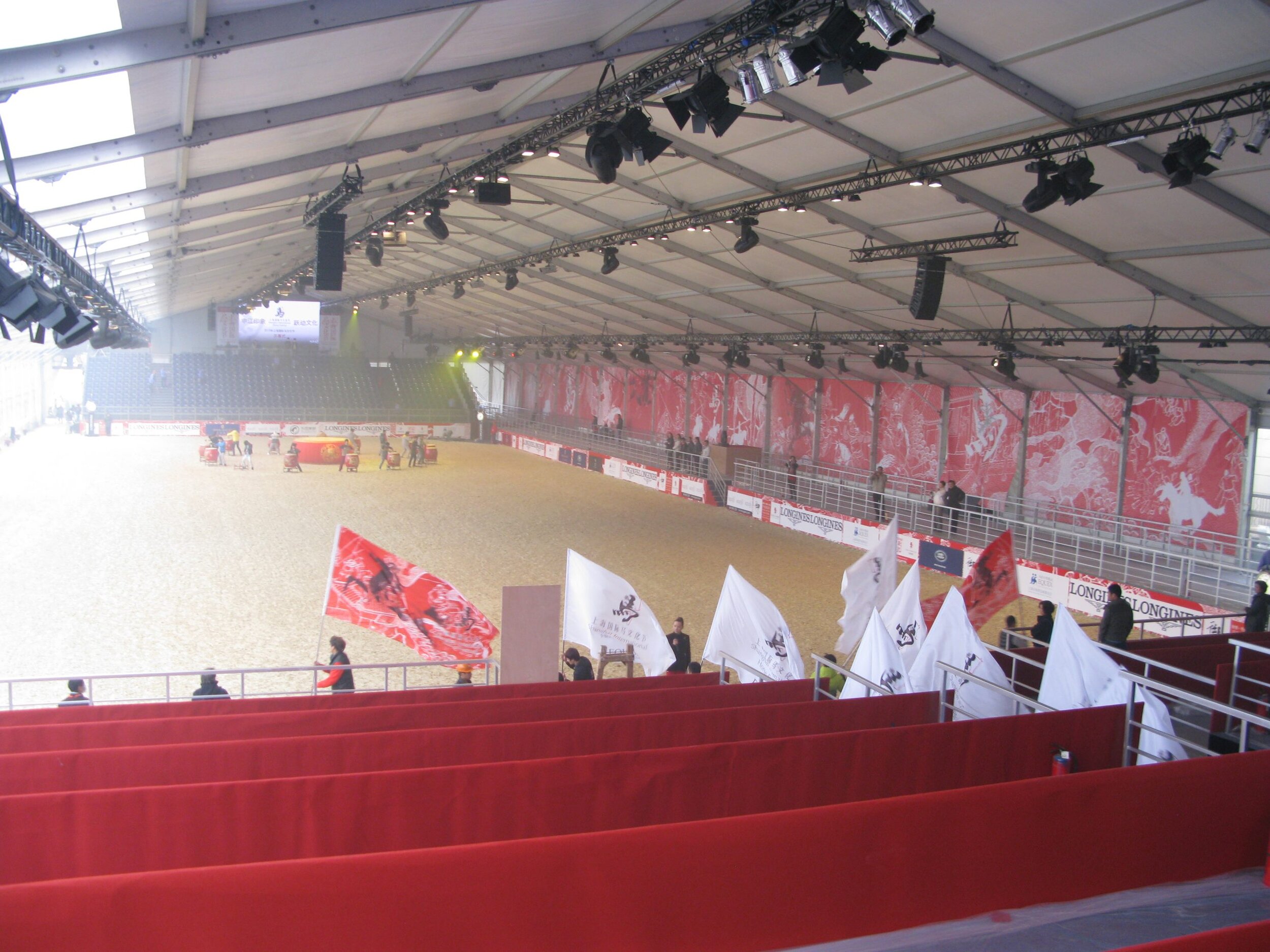
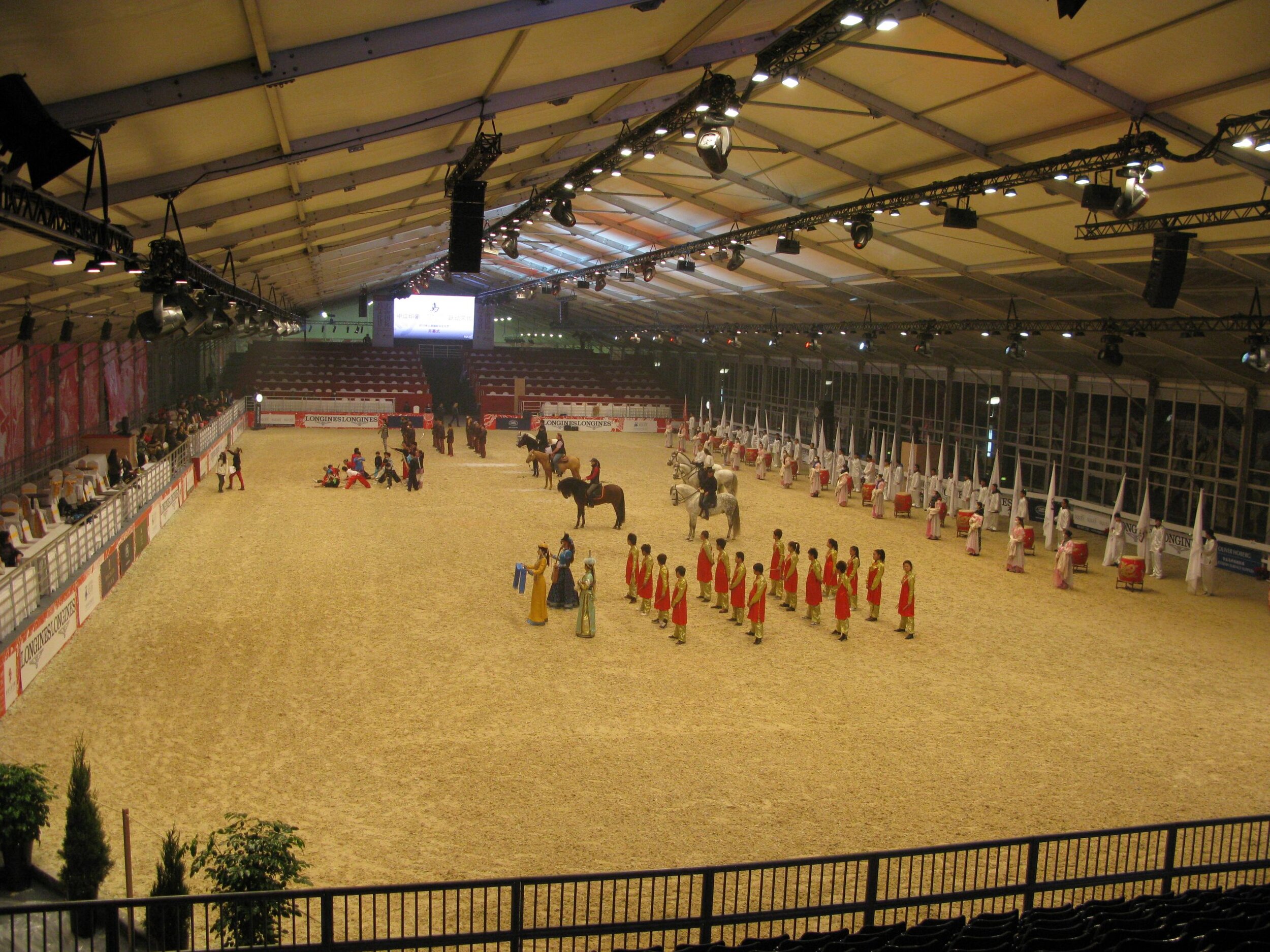
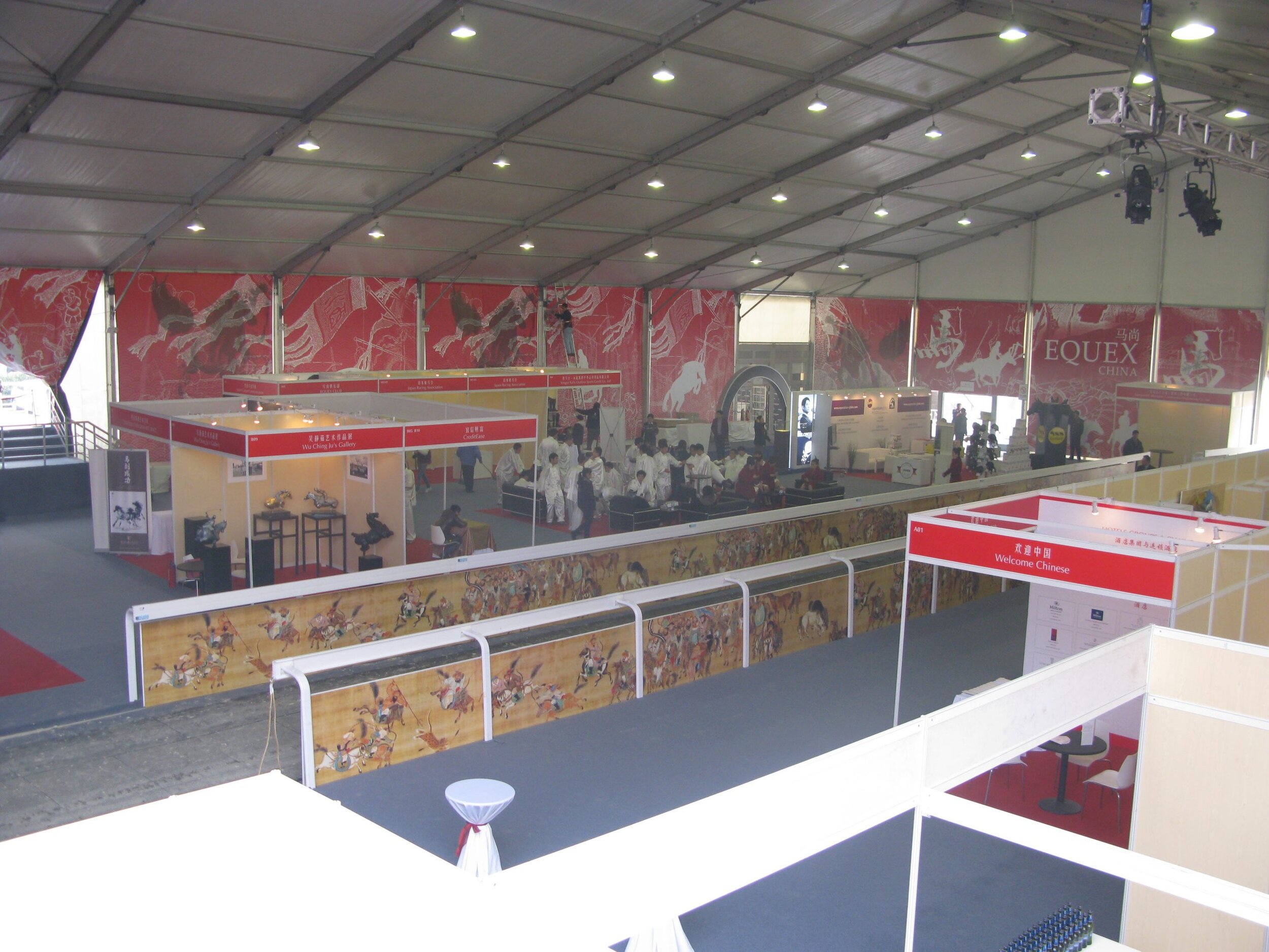
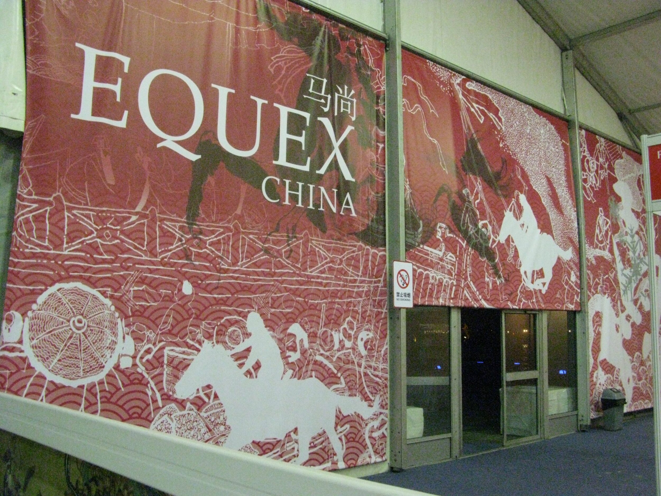
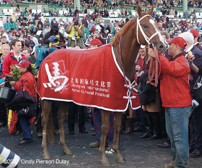
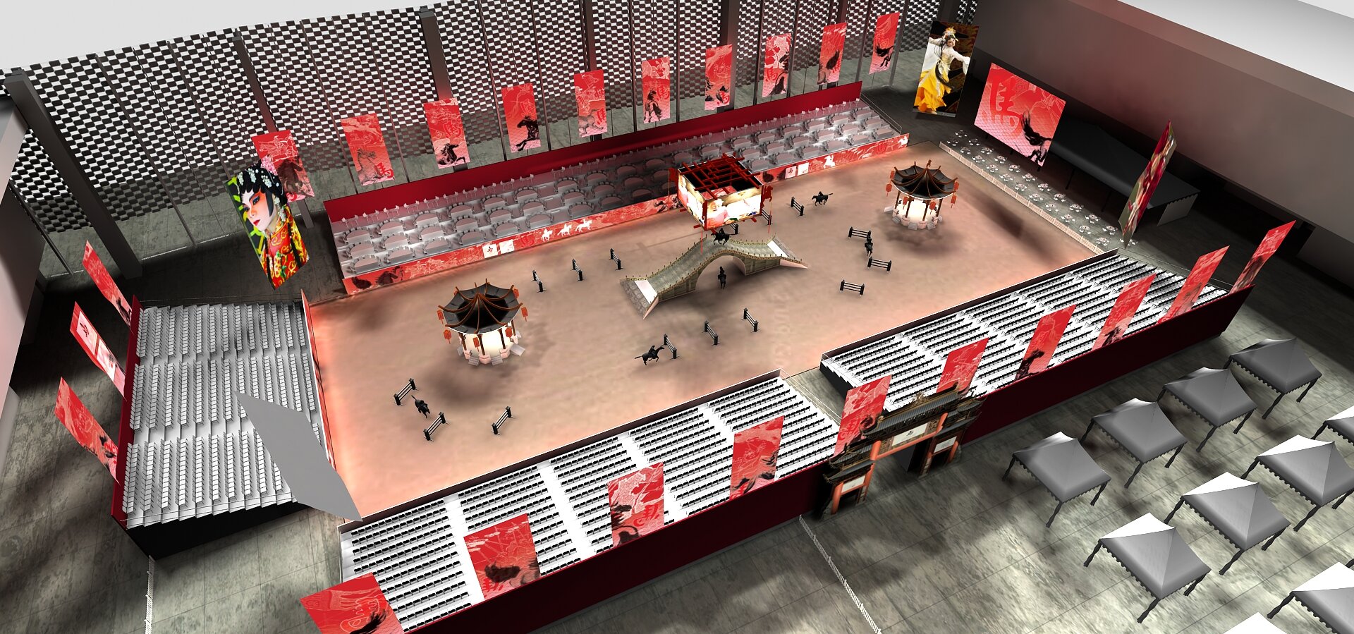
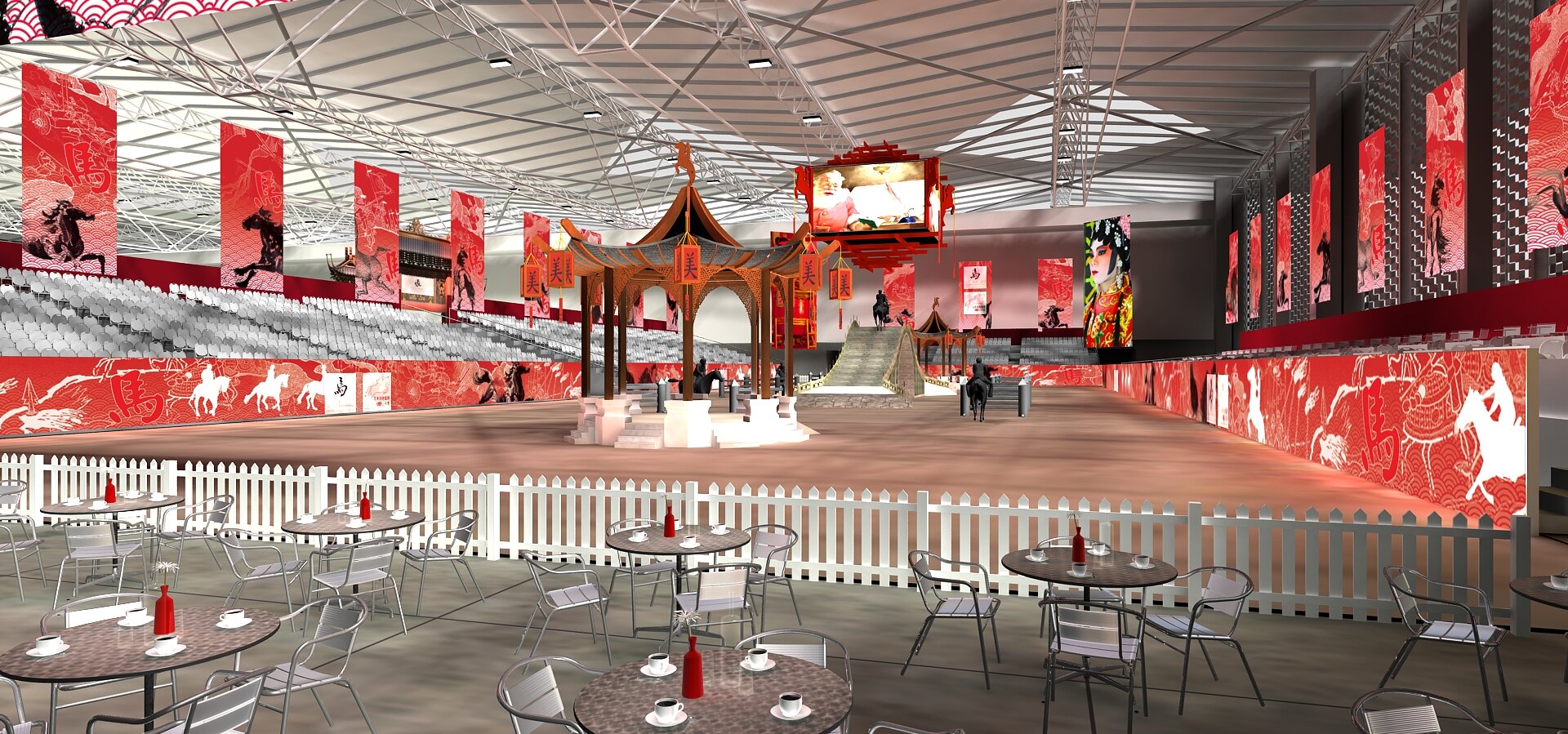
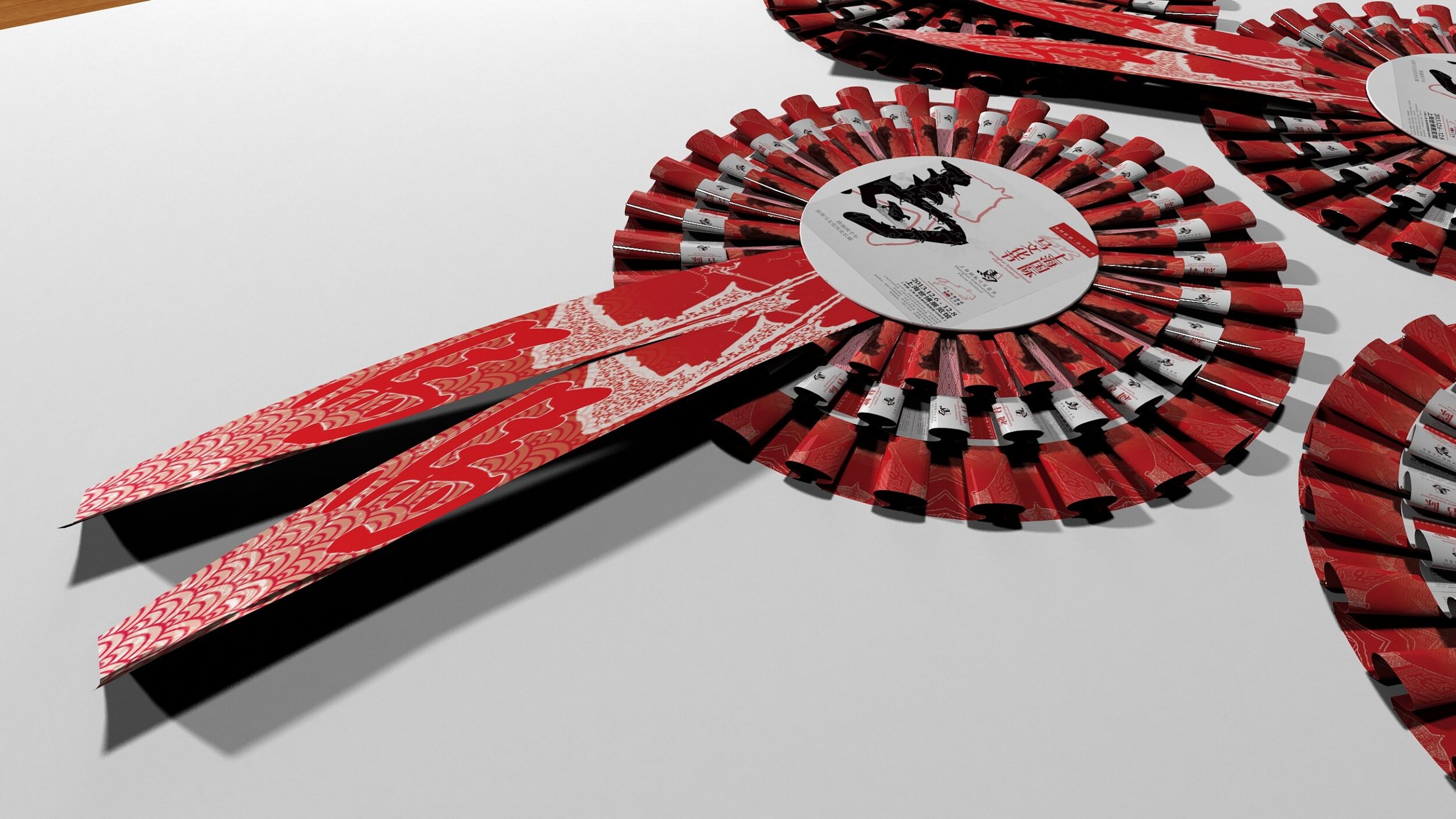
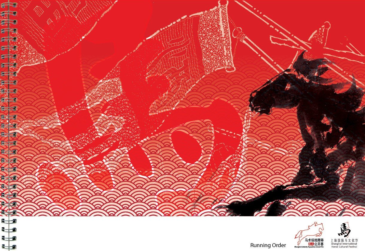
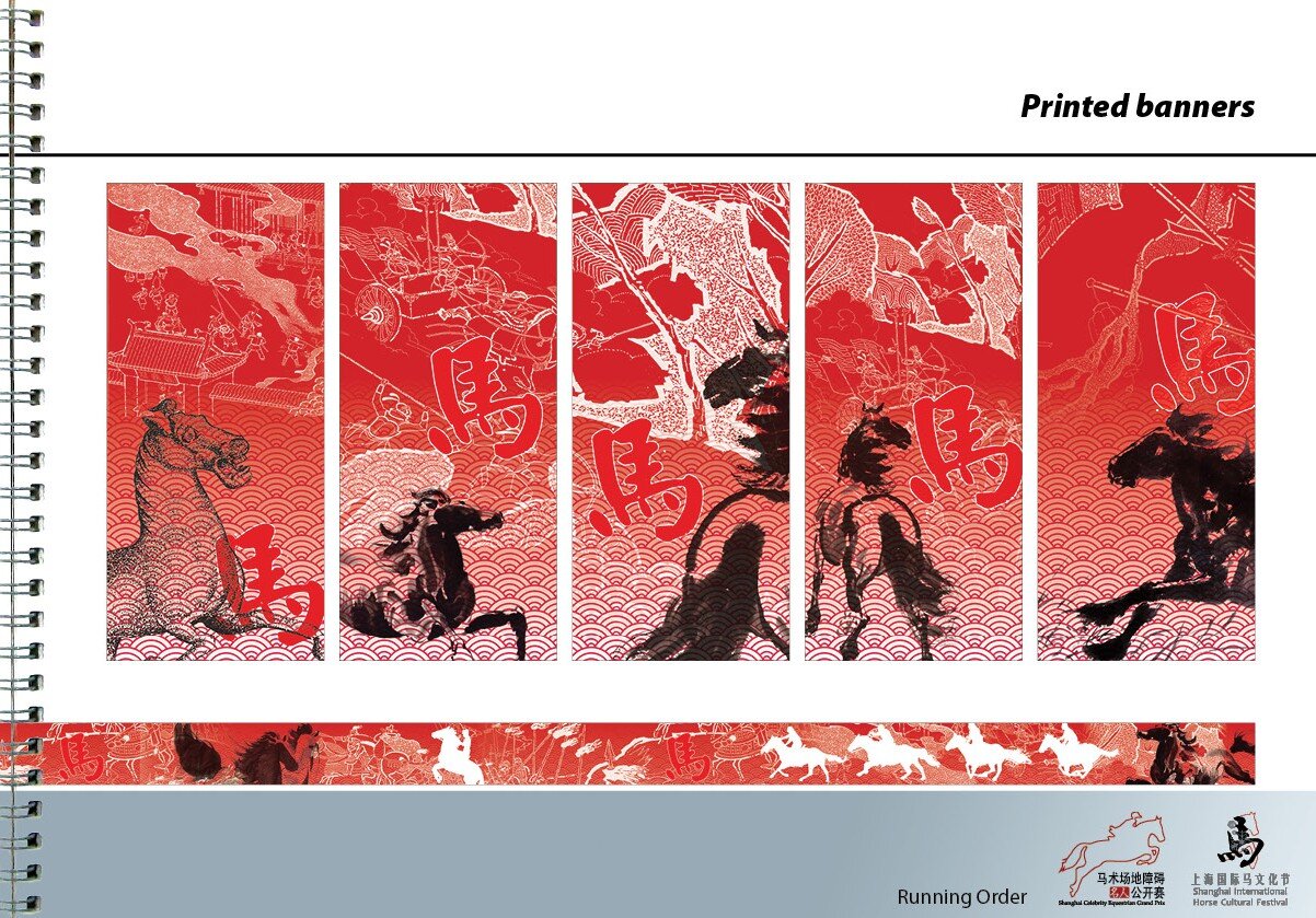
The show was staged on a disused dock on the Bund, Shanghai. All facilities were built for the show, and removed afterwards.
Production design for the show. There were considerable difficulties in fitting everything on the challenging site.
Visualization, Graphic design, banners, building wrap, trade show.
Royal Windsor Endurance
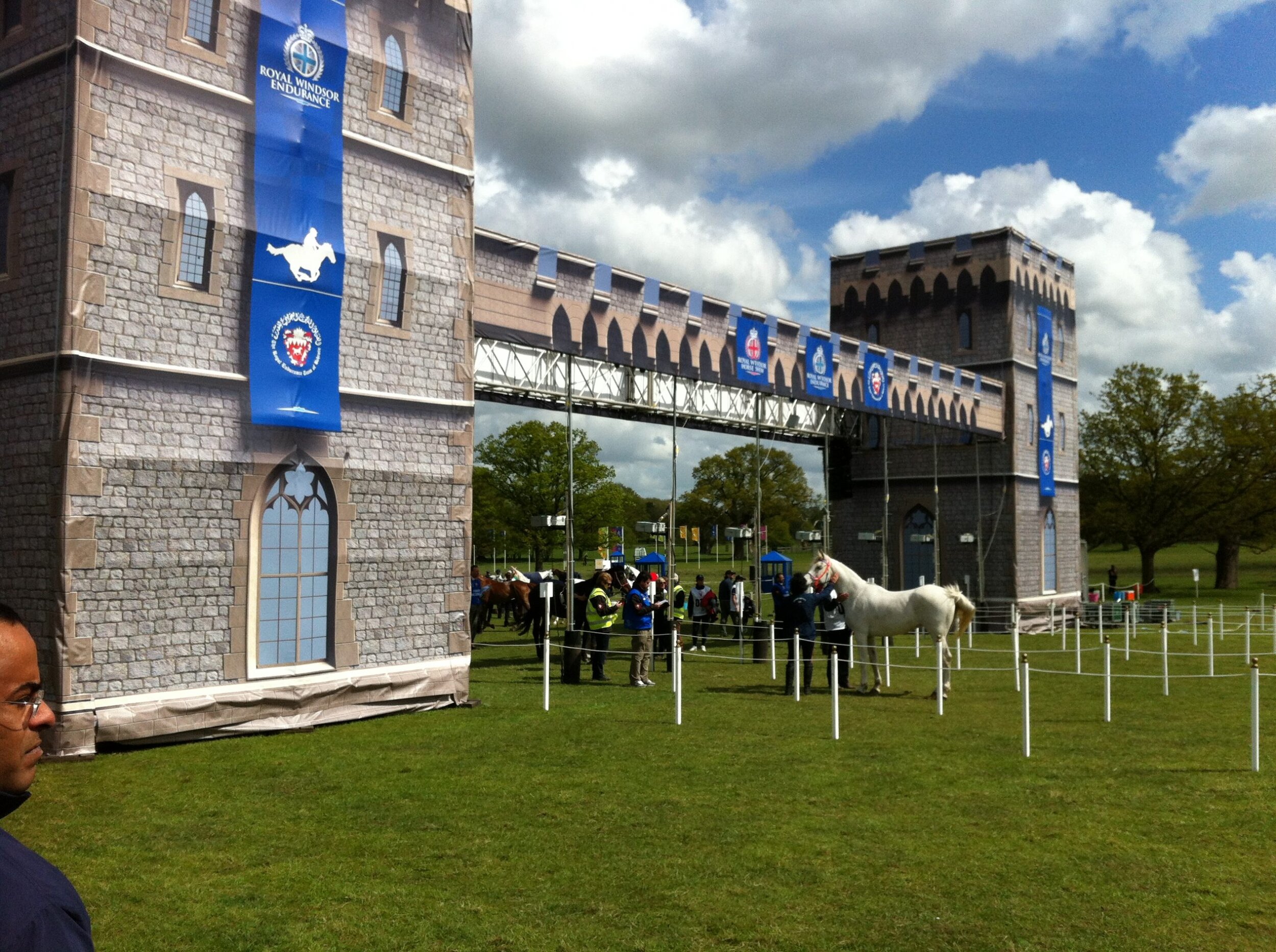
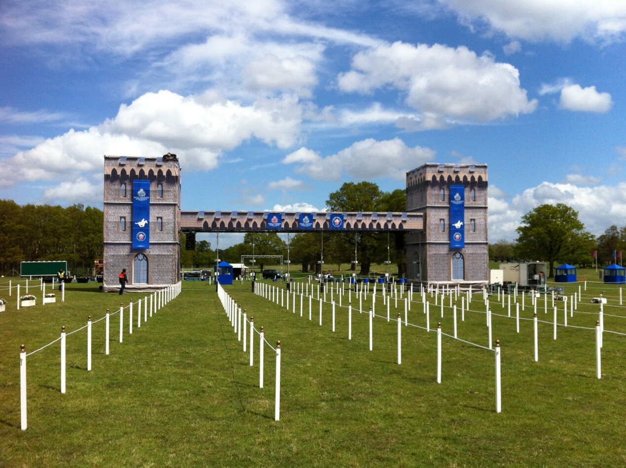
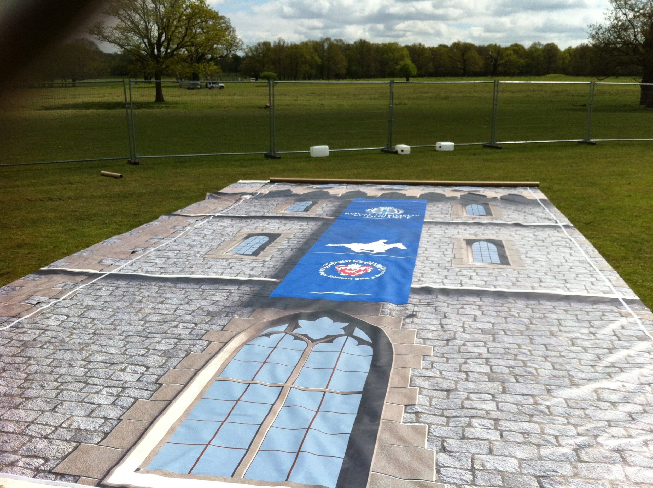
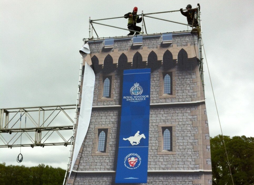
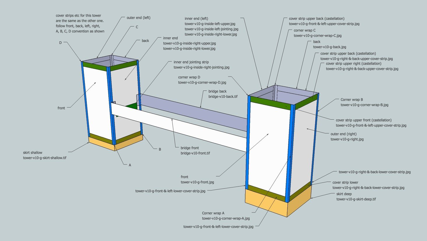
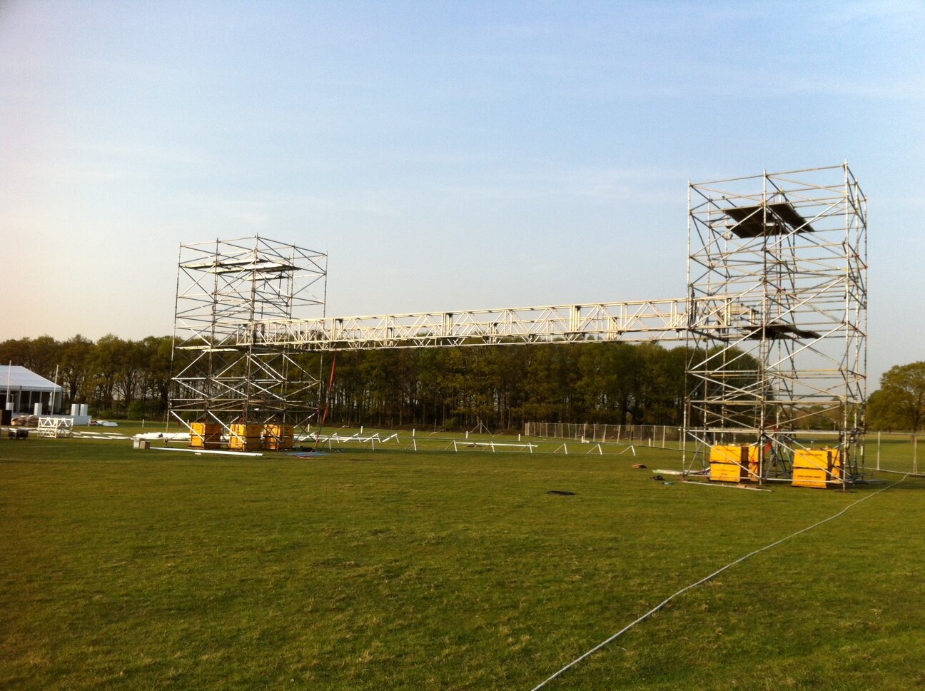
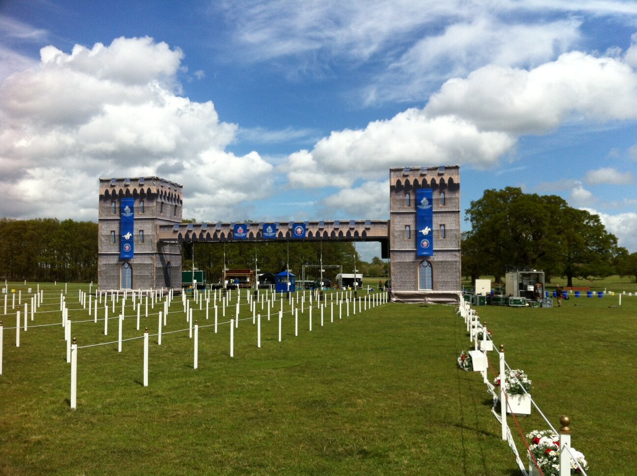
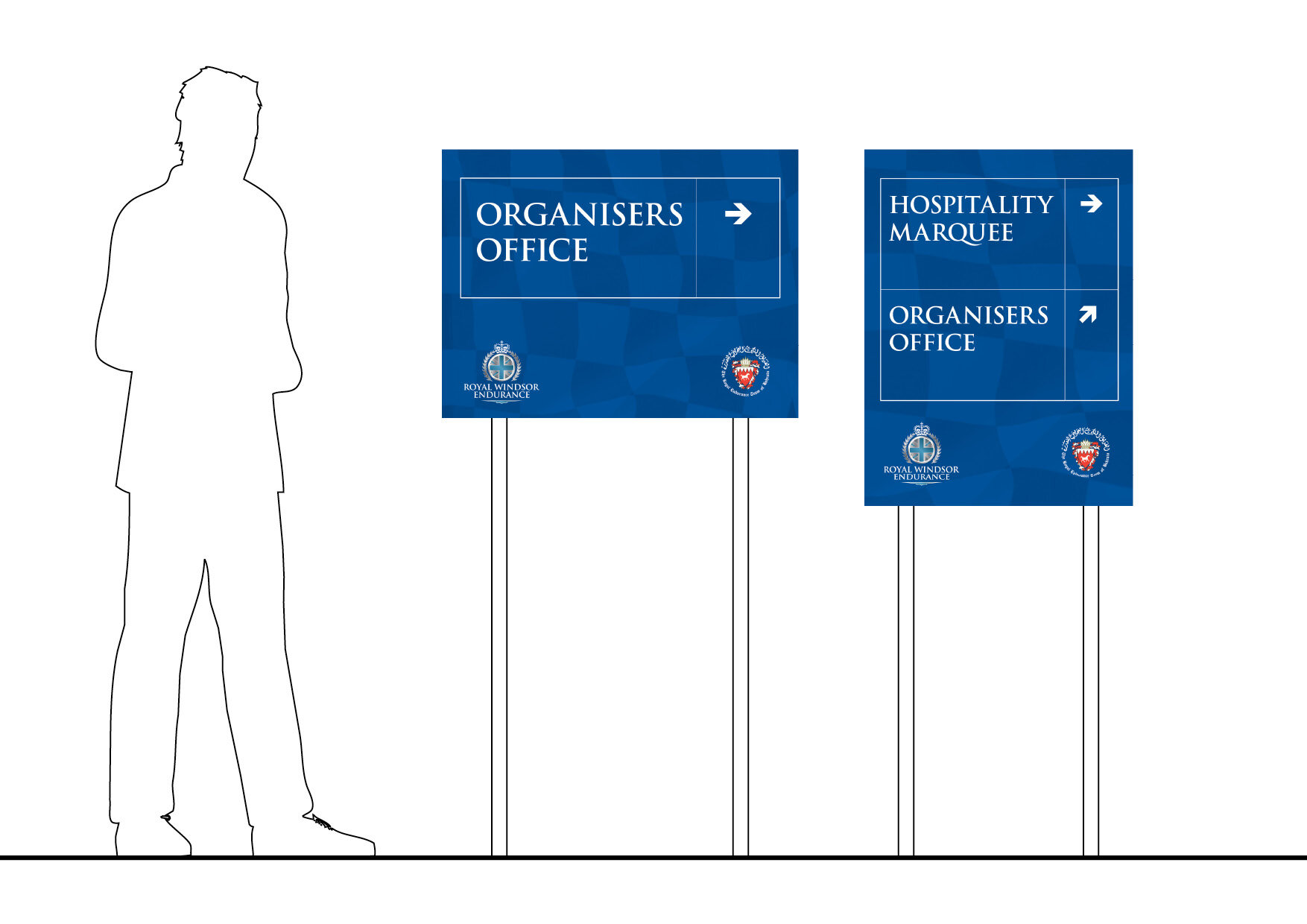
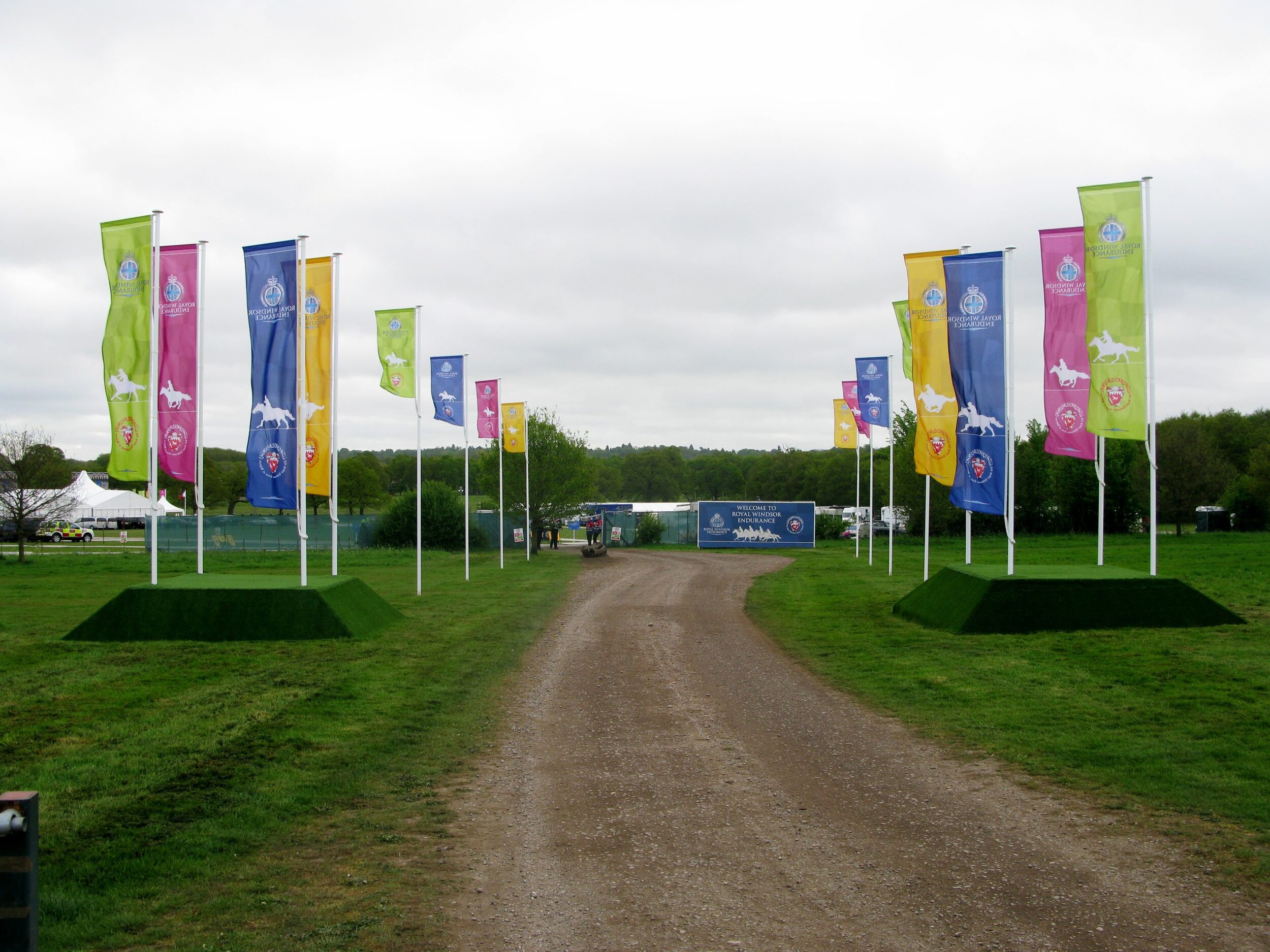
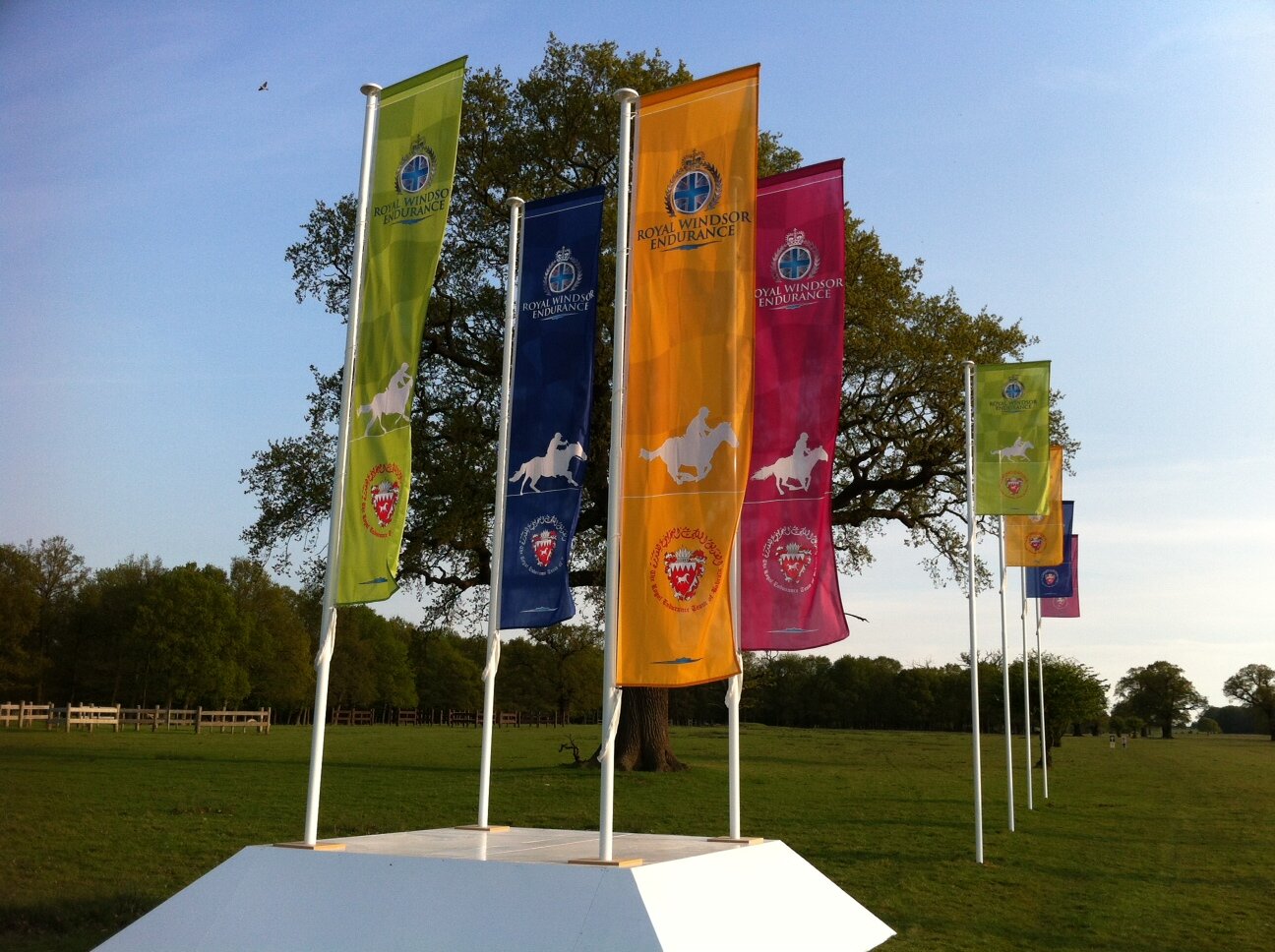
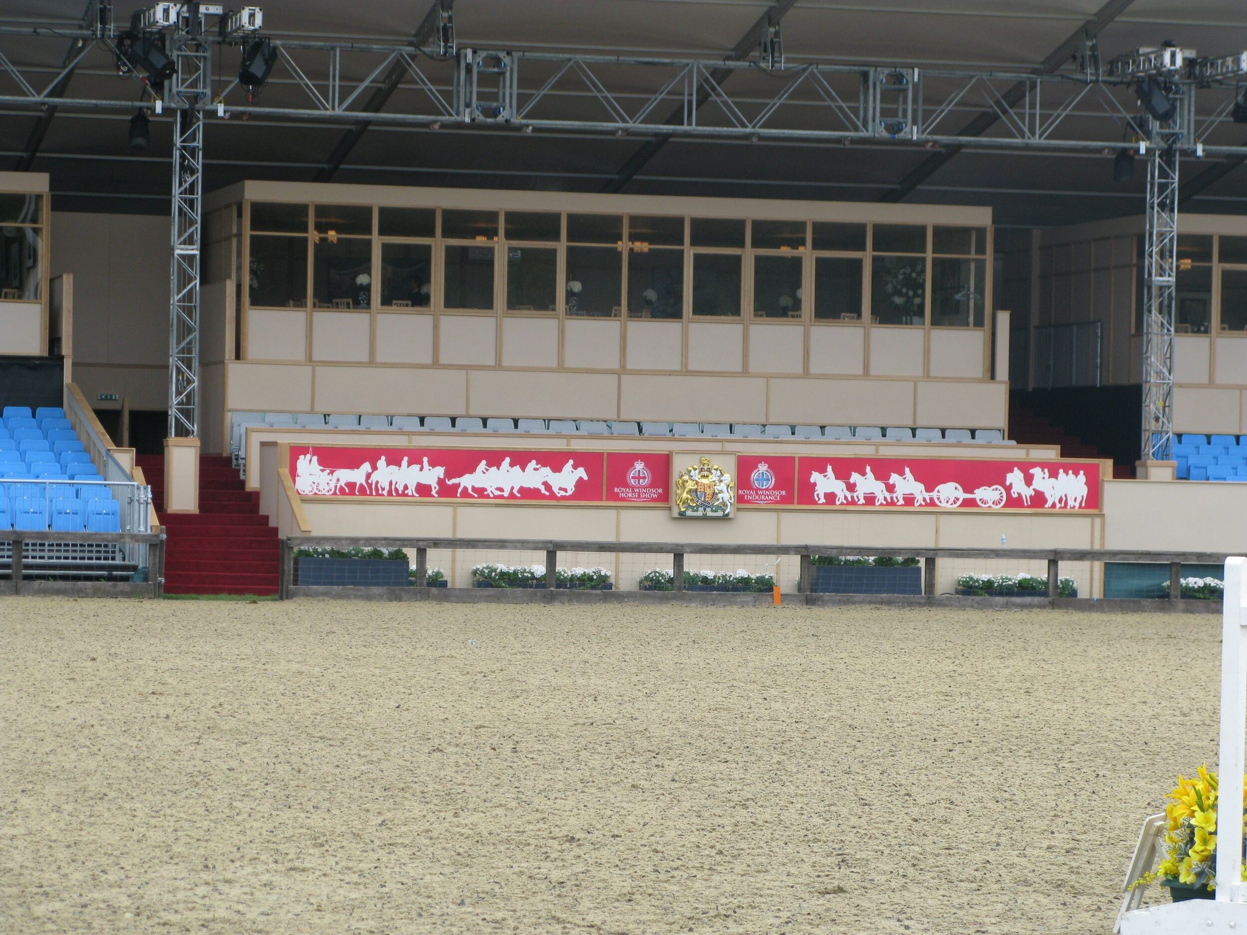
Set design & production. Graphic design for directional signage, banners, and Royal Box for the Royal Windsor Endurance Race.
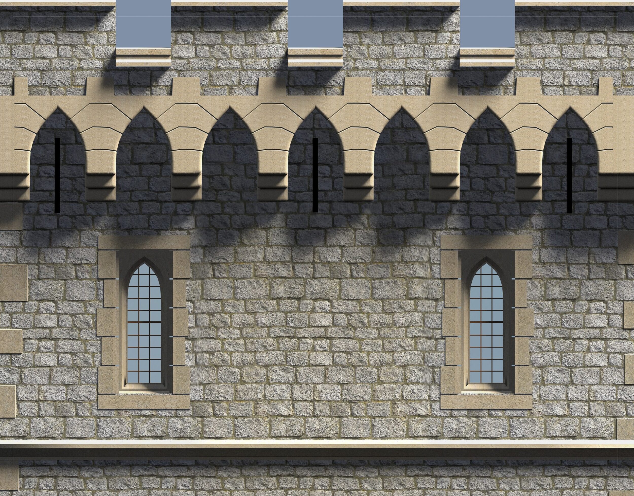
The castle consists of two 10m tall scaffold towers joined by a 20m bridge. The structure is wrapped in bespoke graphics printed on PVC. The graphics were developed from details from Windsor Castle. The towers were 3D modelled, lit and rendered to achieve the trompe l’oeil effect.
Pitch for G8 Summit in Northern Ireland
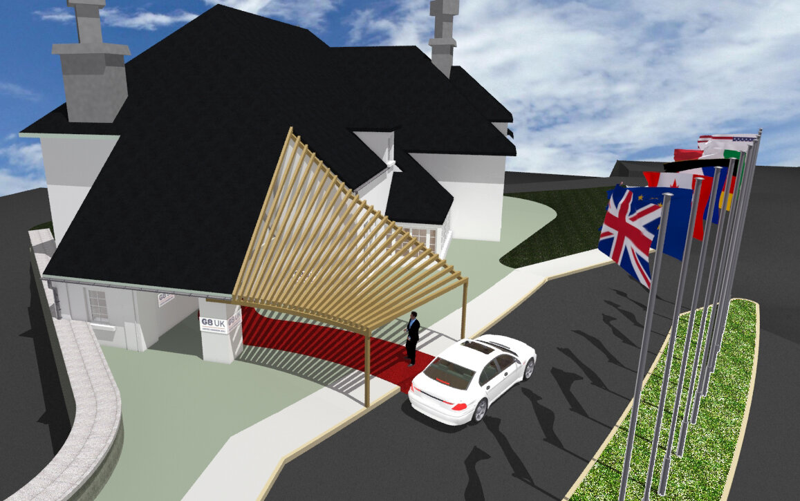
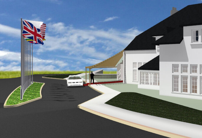
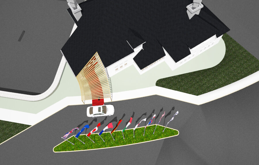
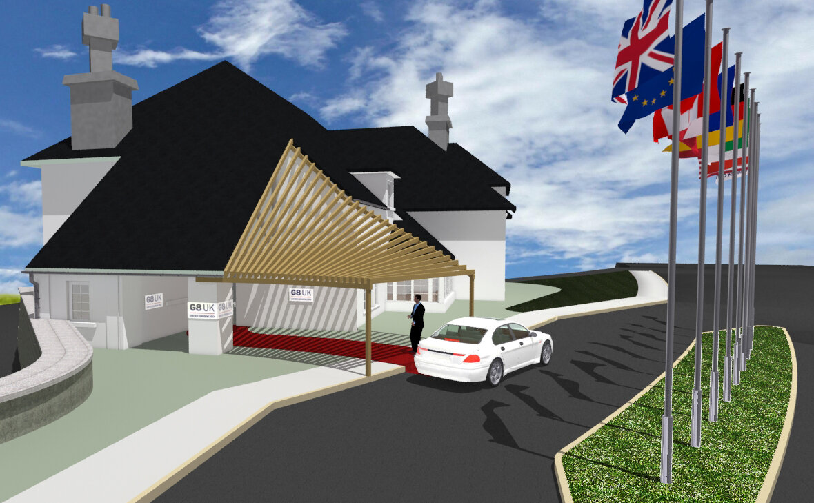
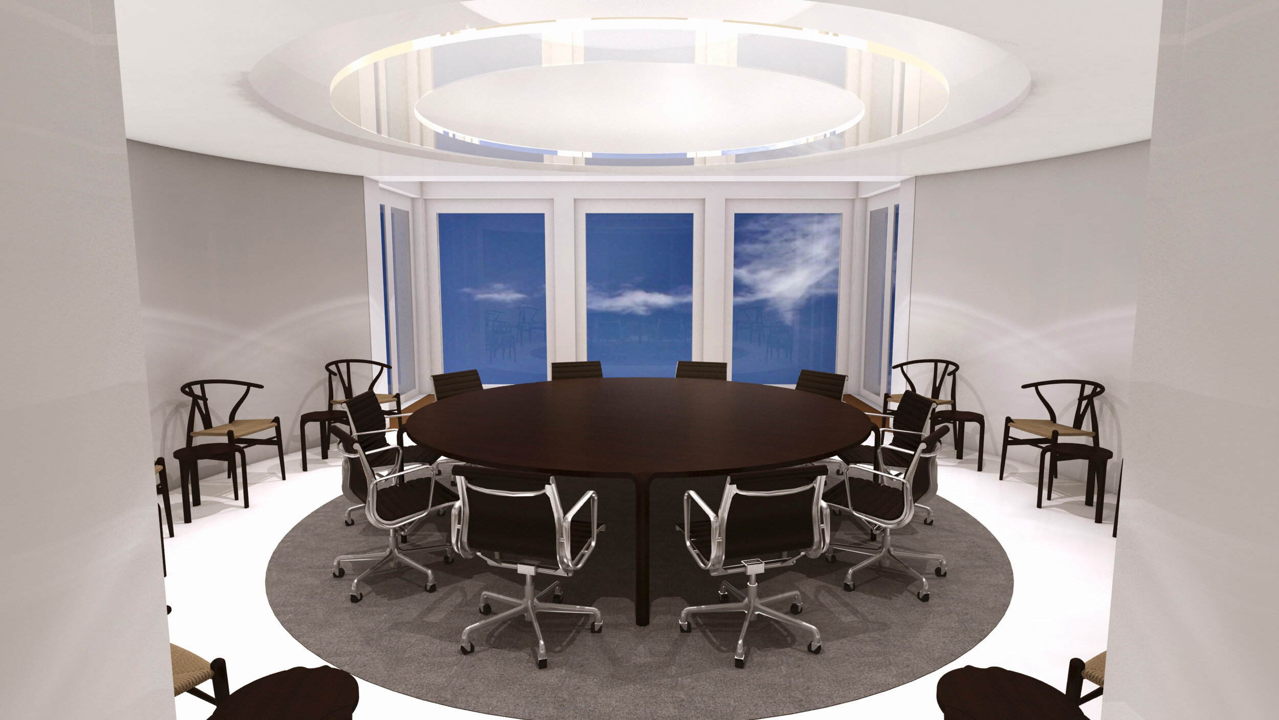
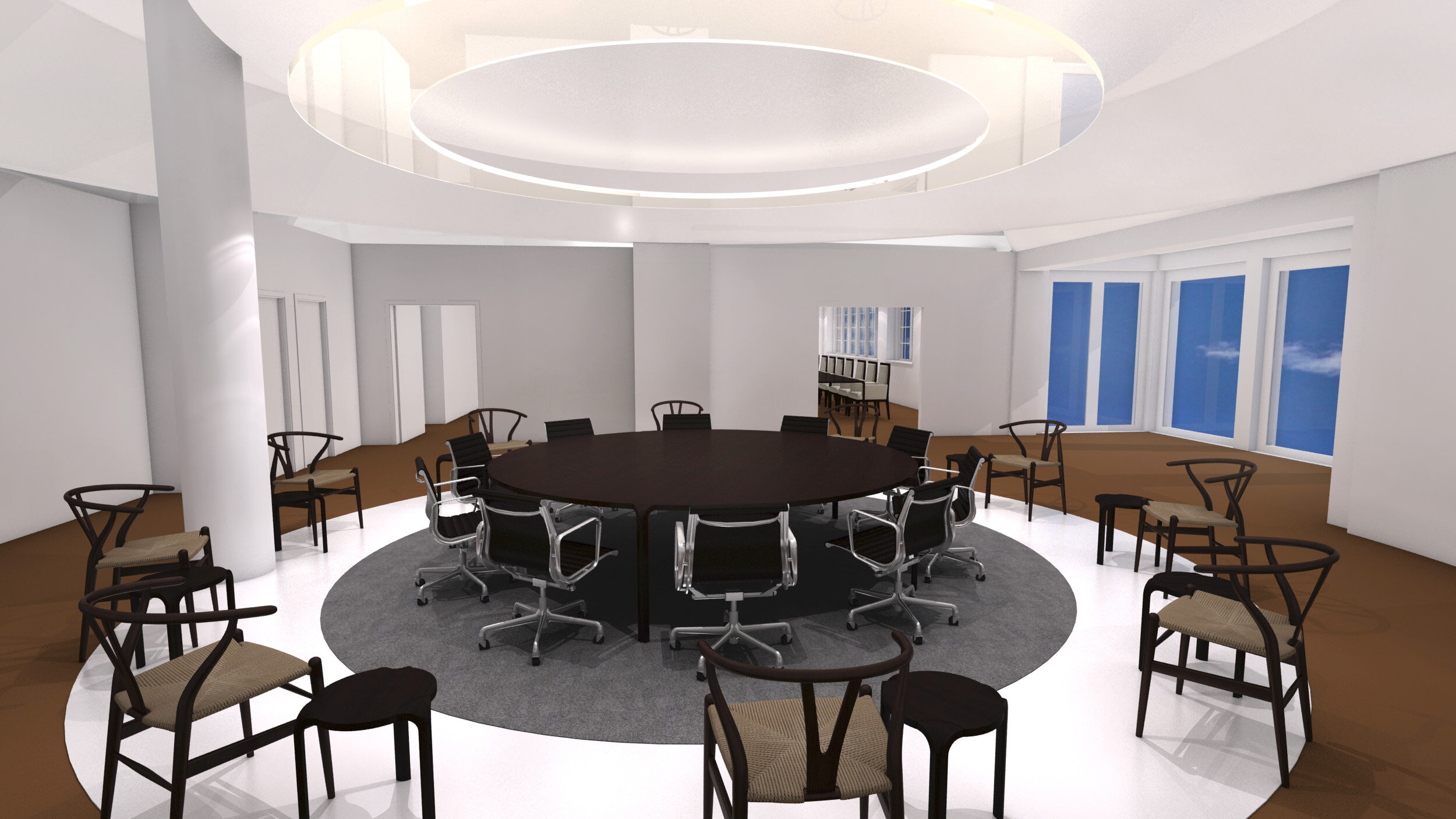
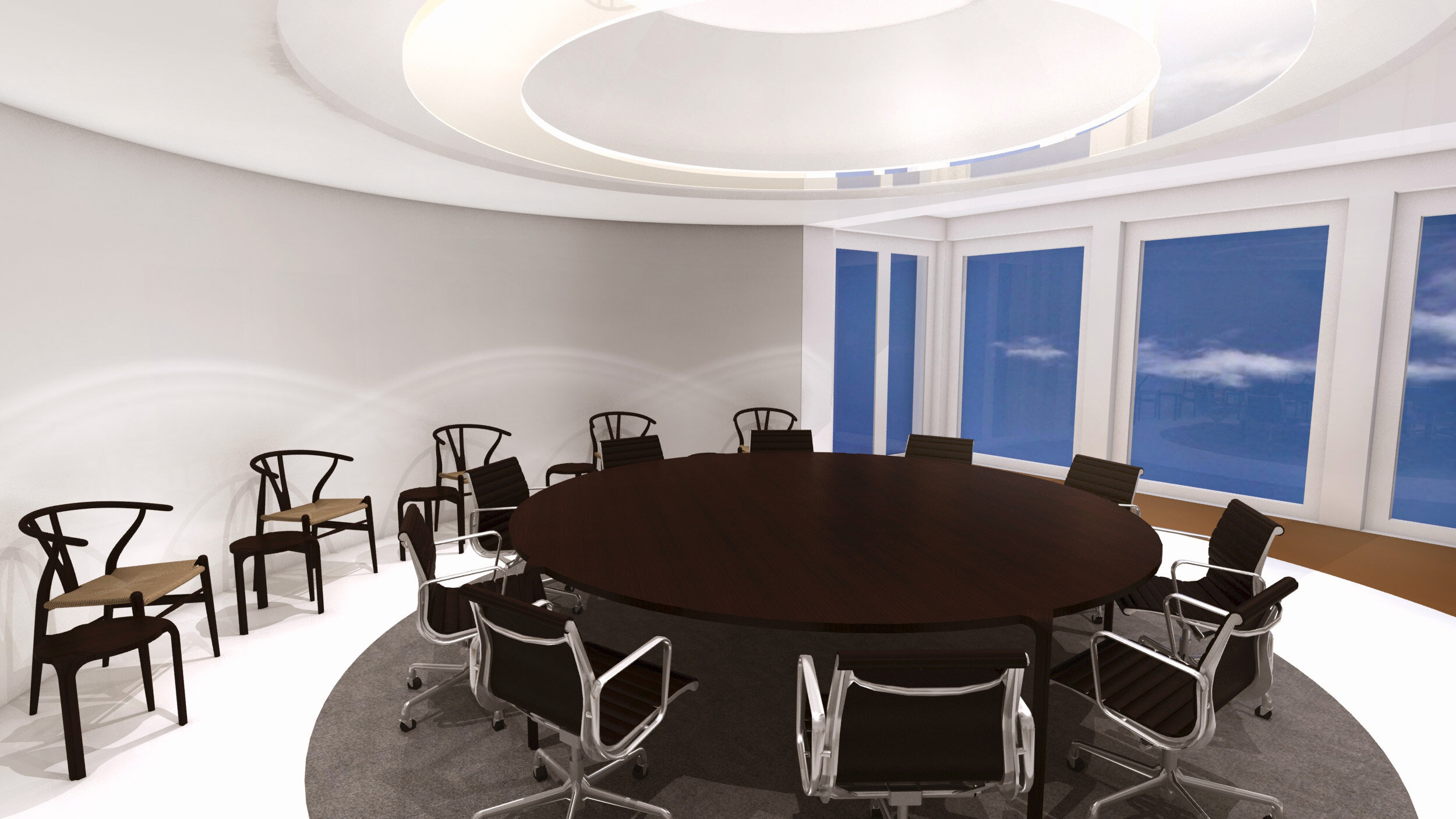
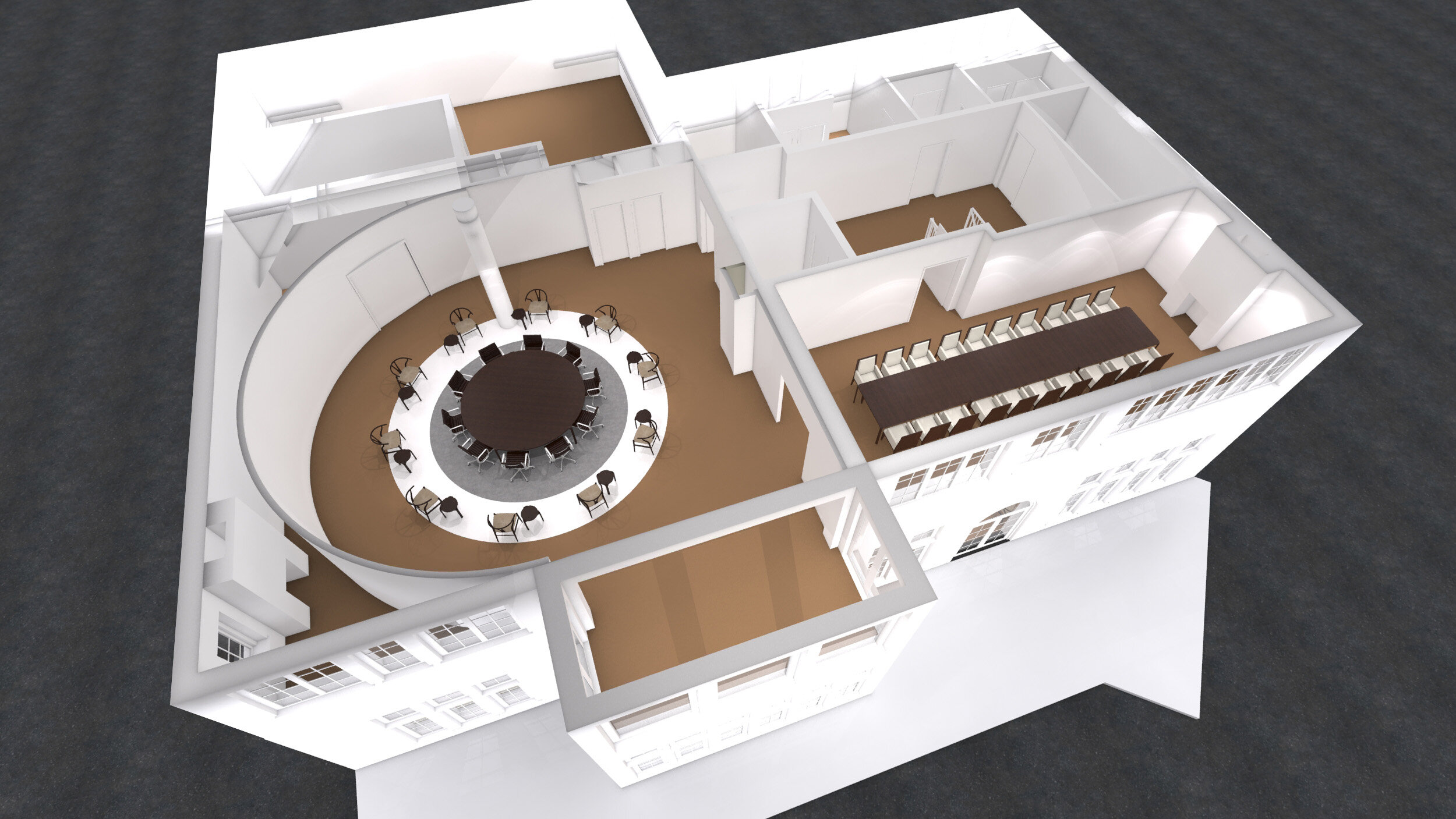
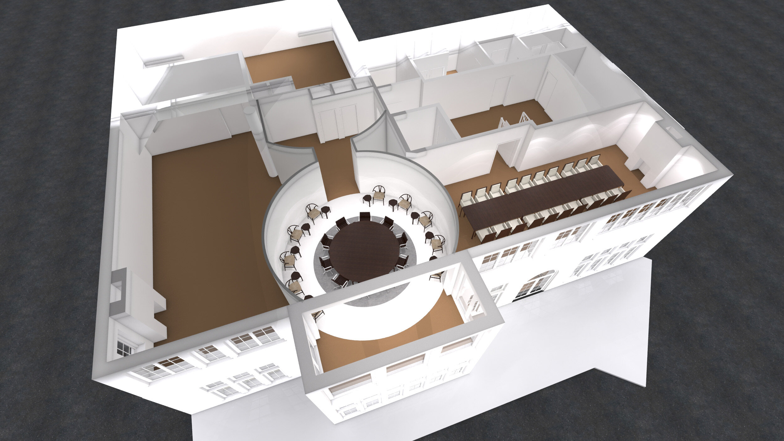
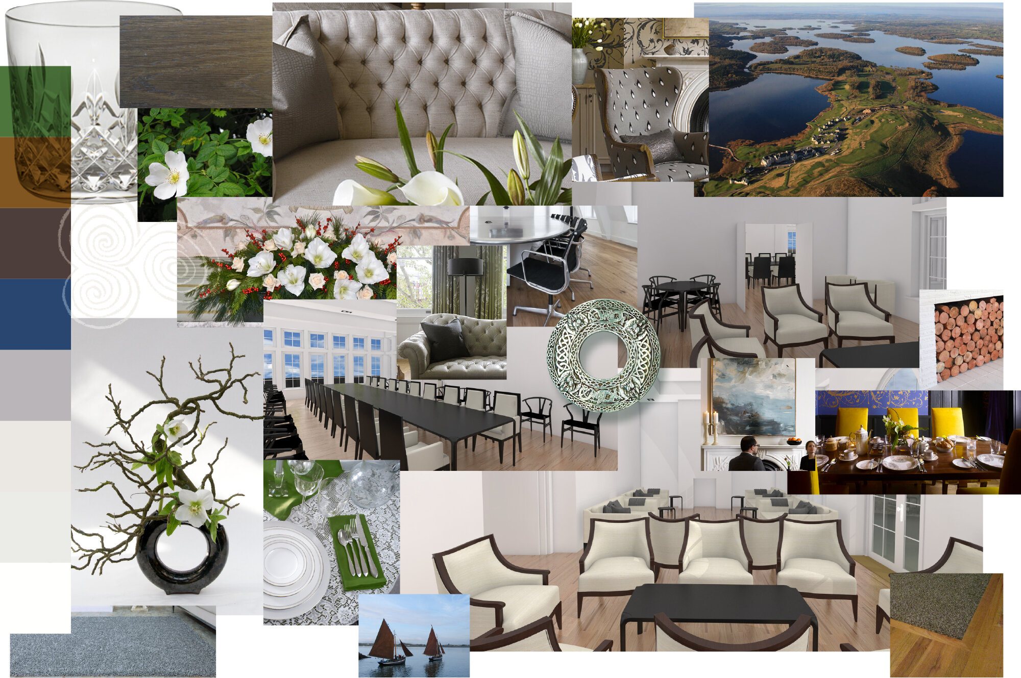
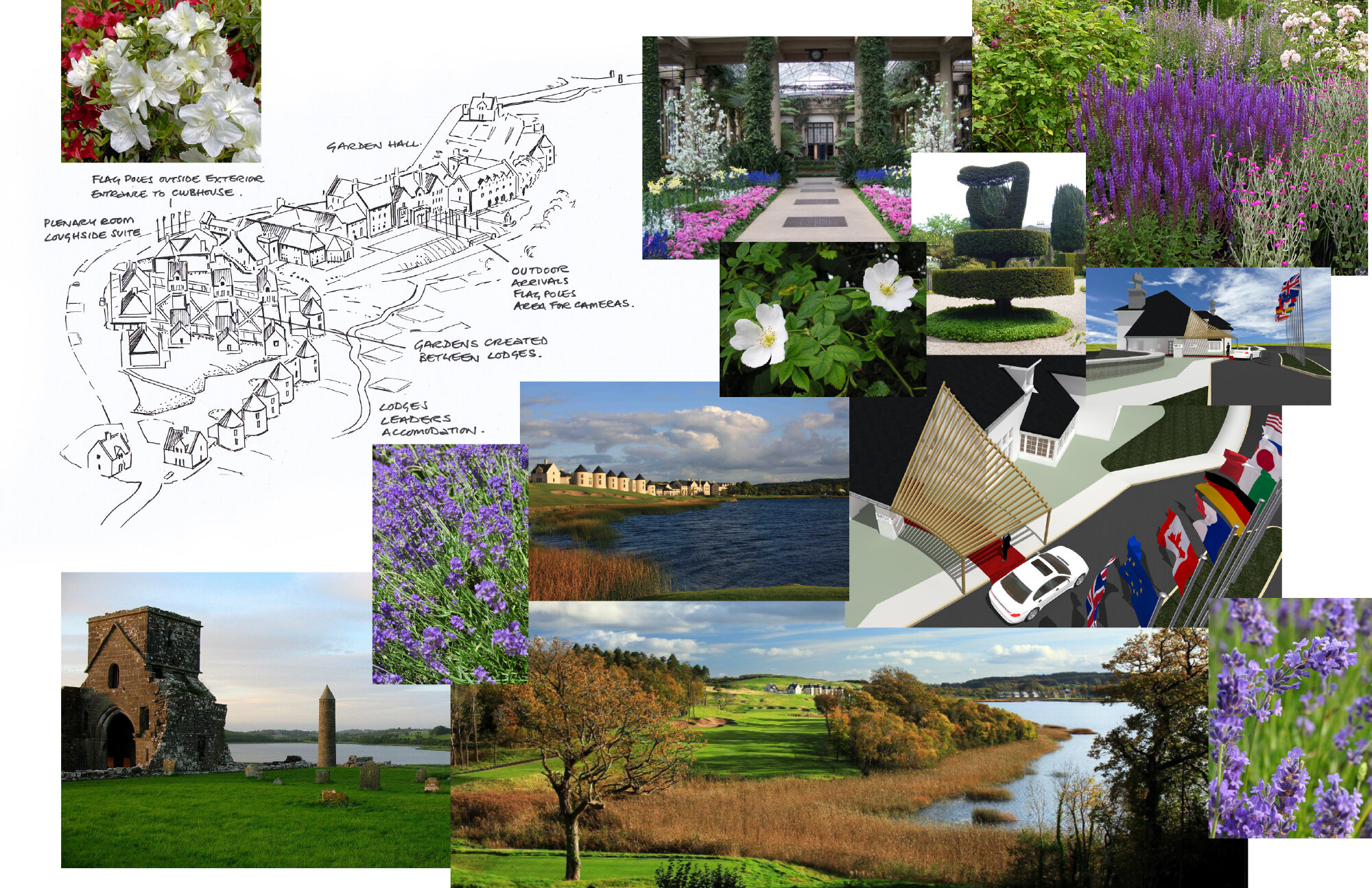
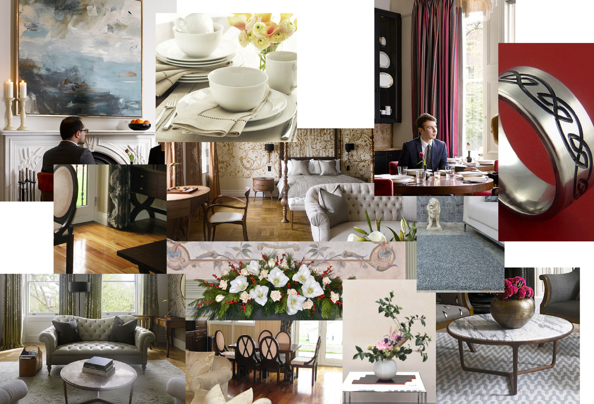
Concepts for the G8 summit held in Enniskillen Northern Ireland.
3D Modelling, Visualisation, Interior design, Master planning.
10 year anniversary of Weill Cornell Medical College, Qatar
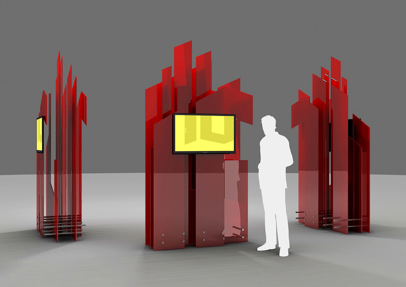
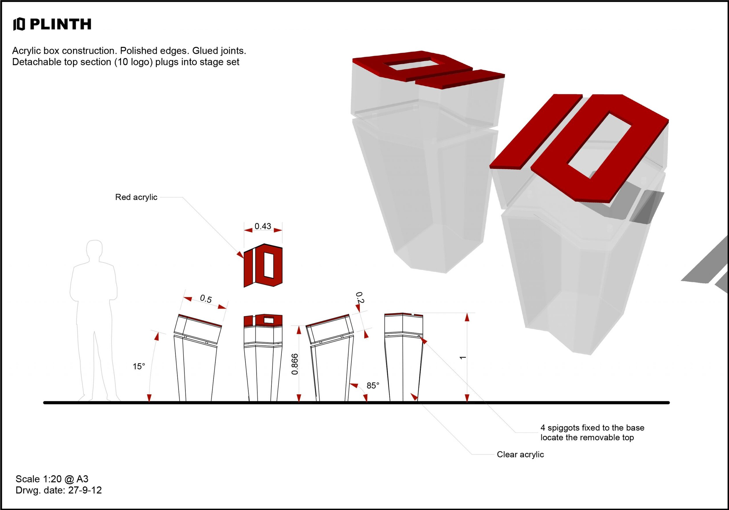
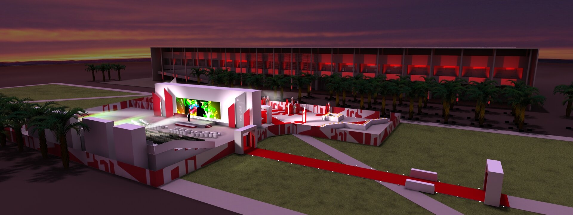
Product design for interactives and stage elements. Visuals
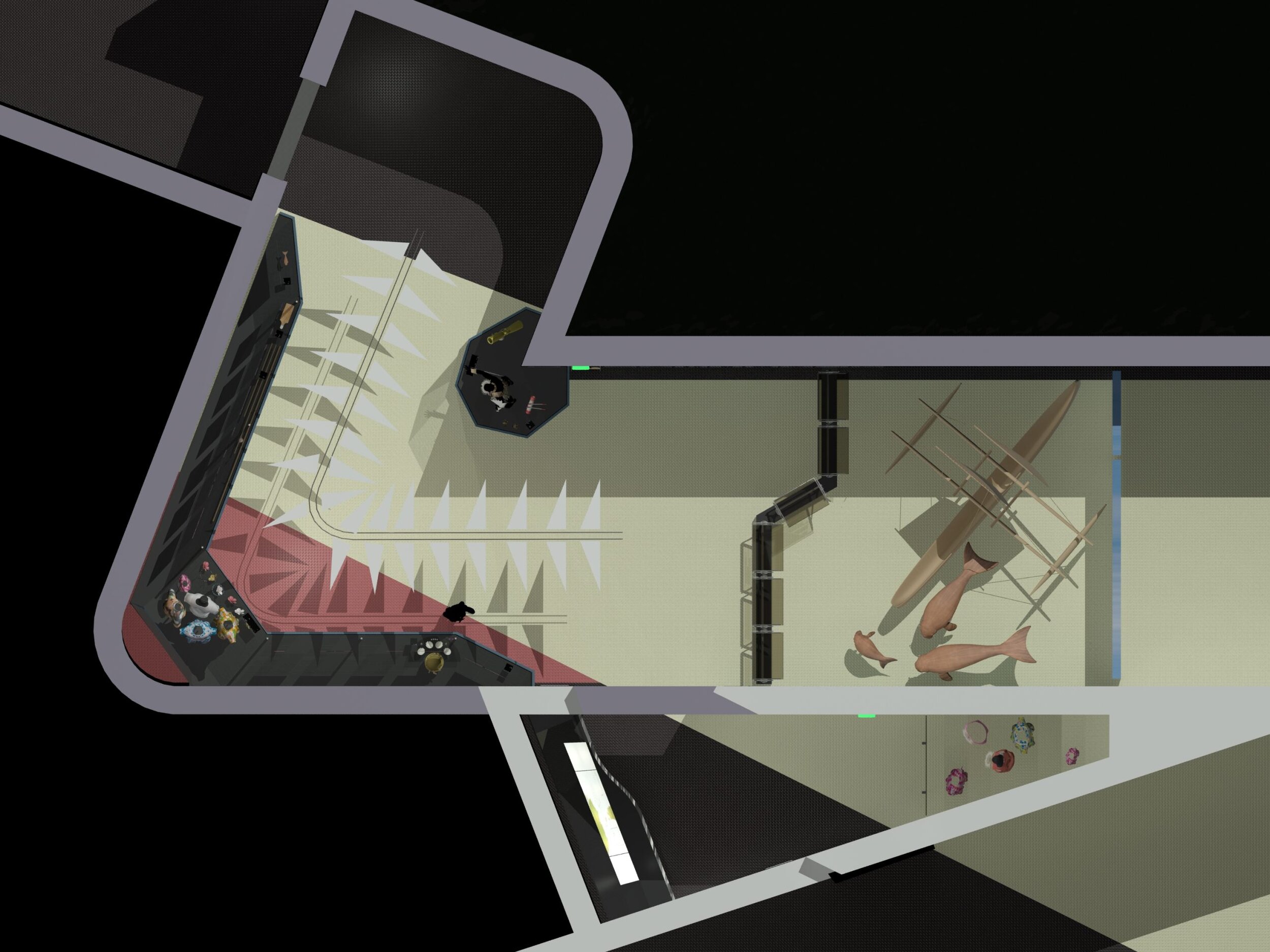
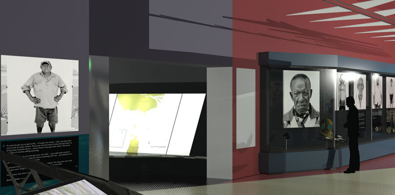
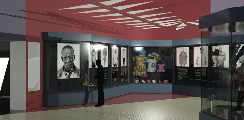
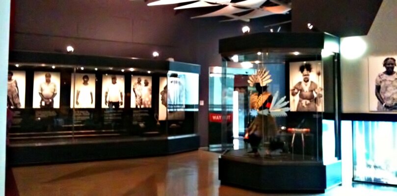
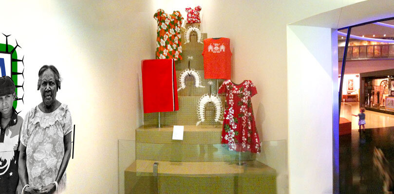
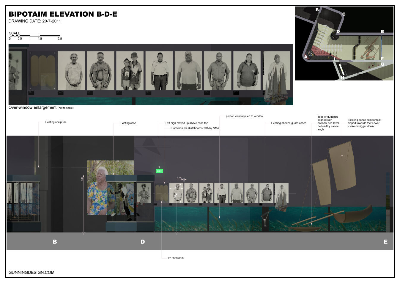
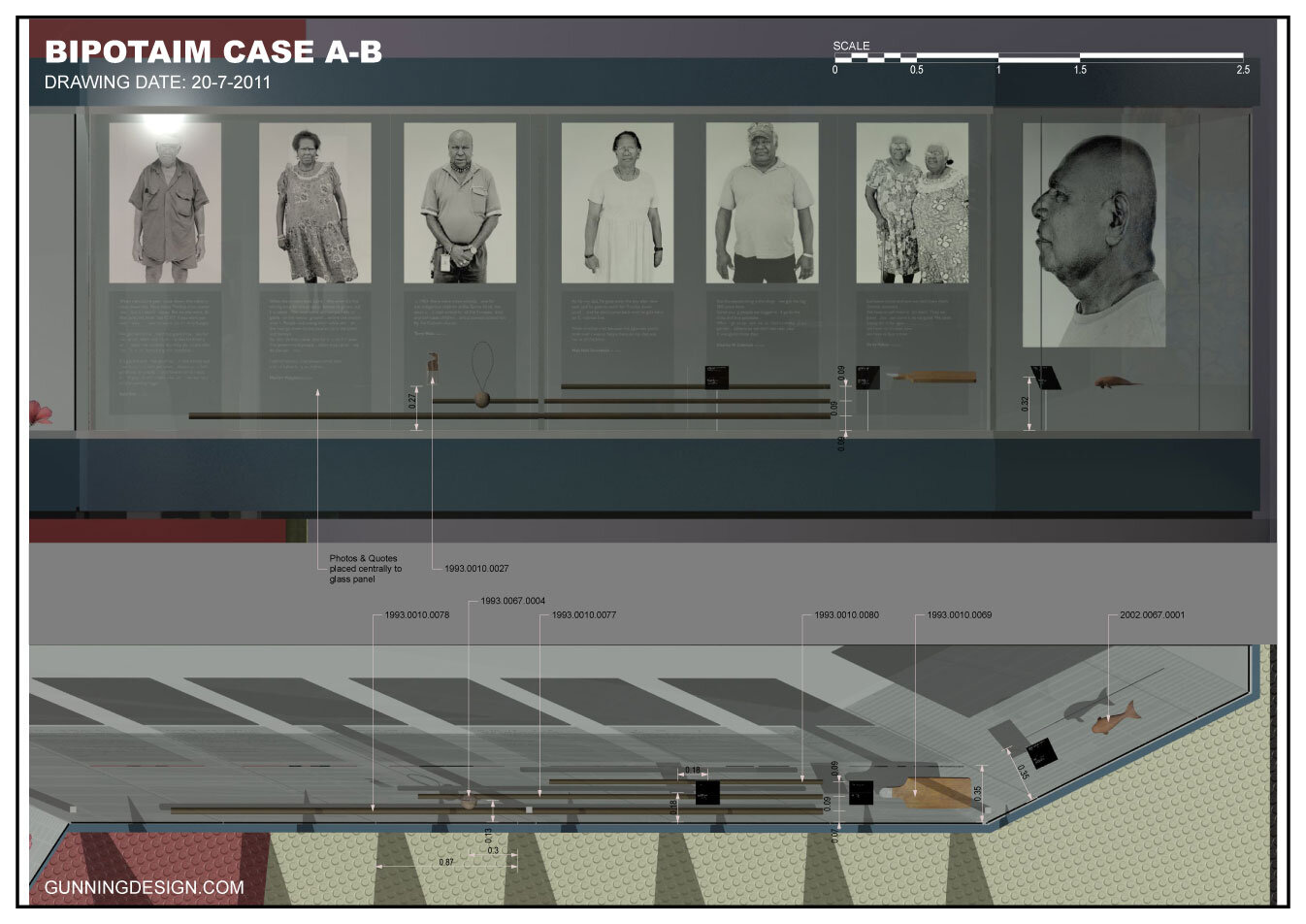
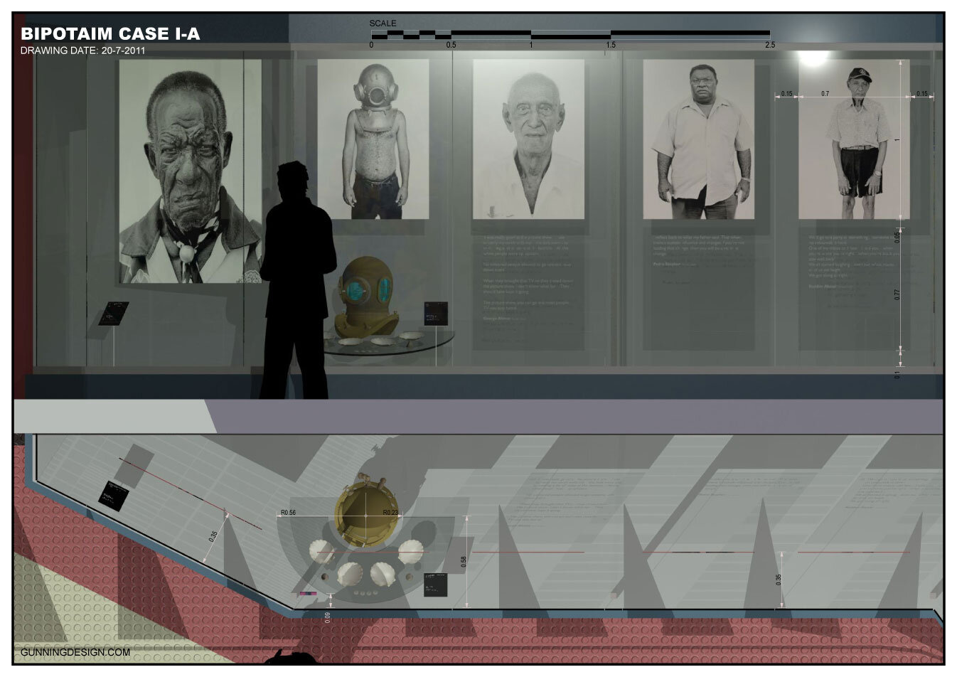
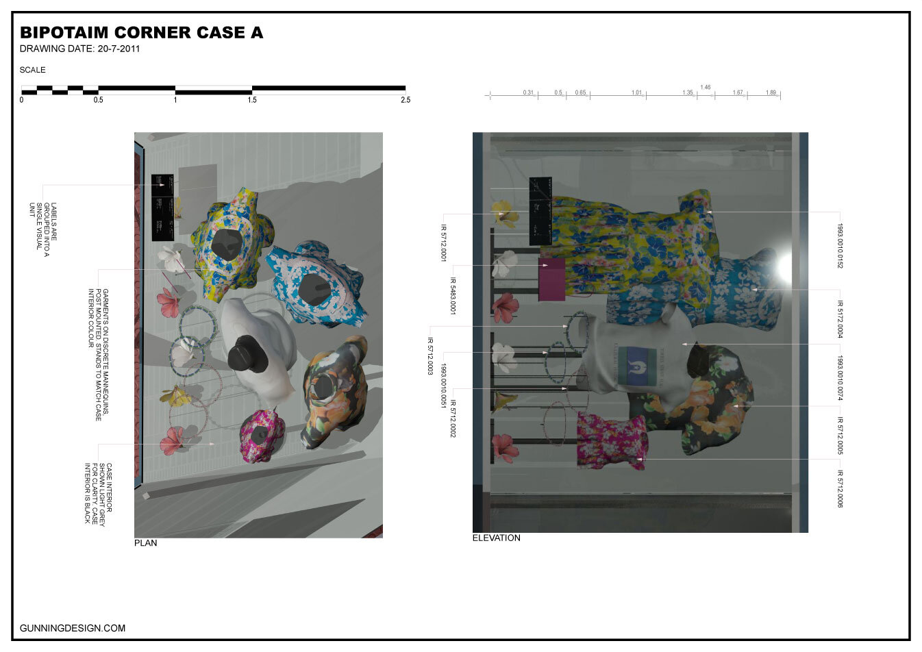
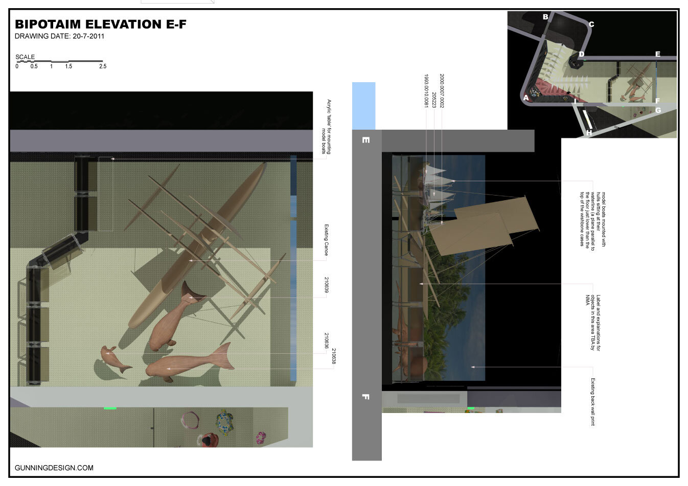
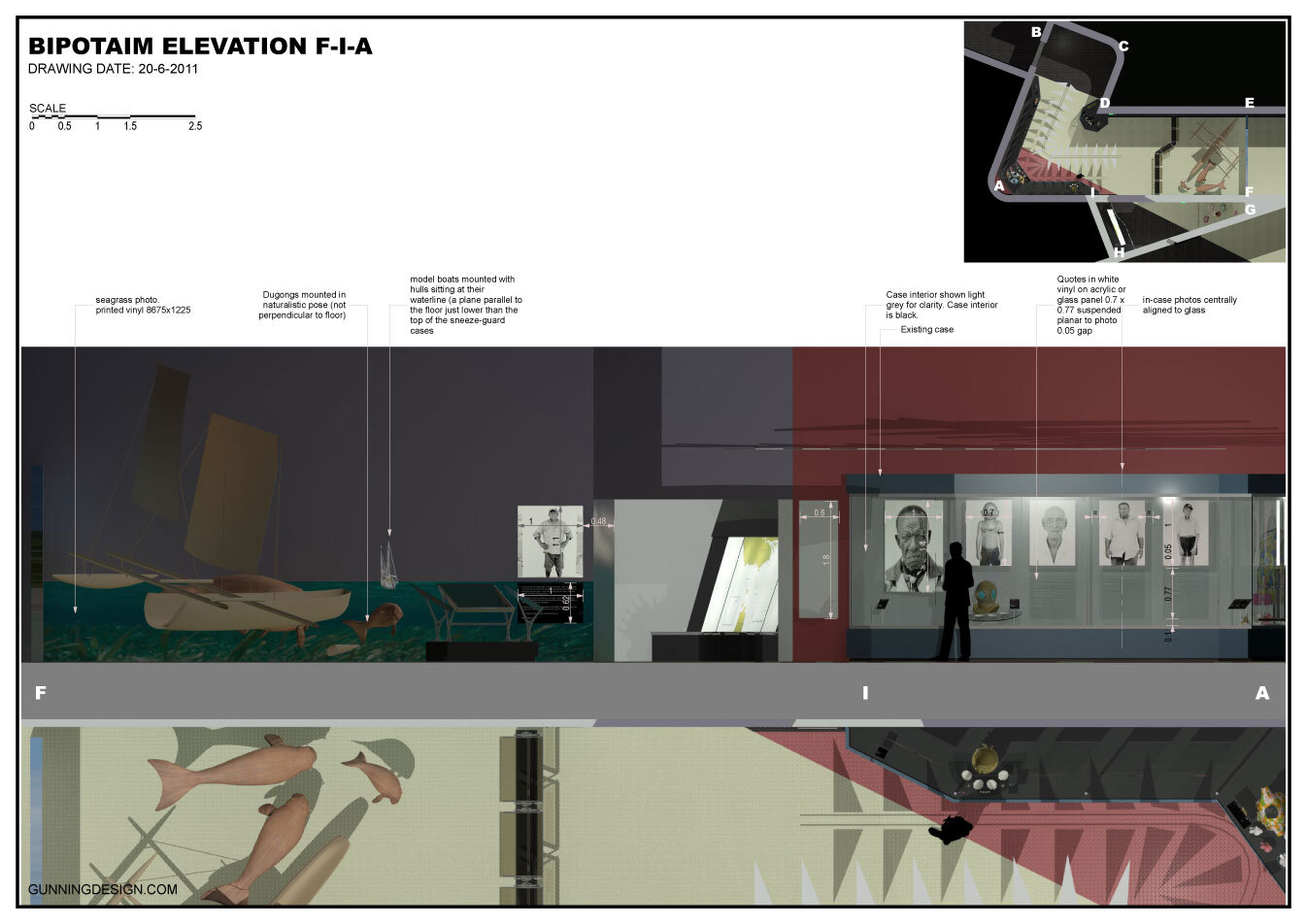
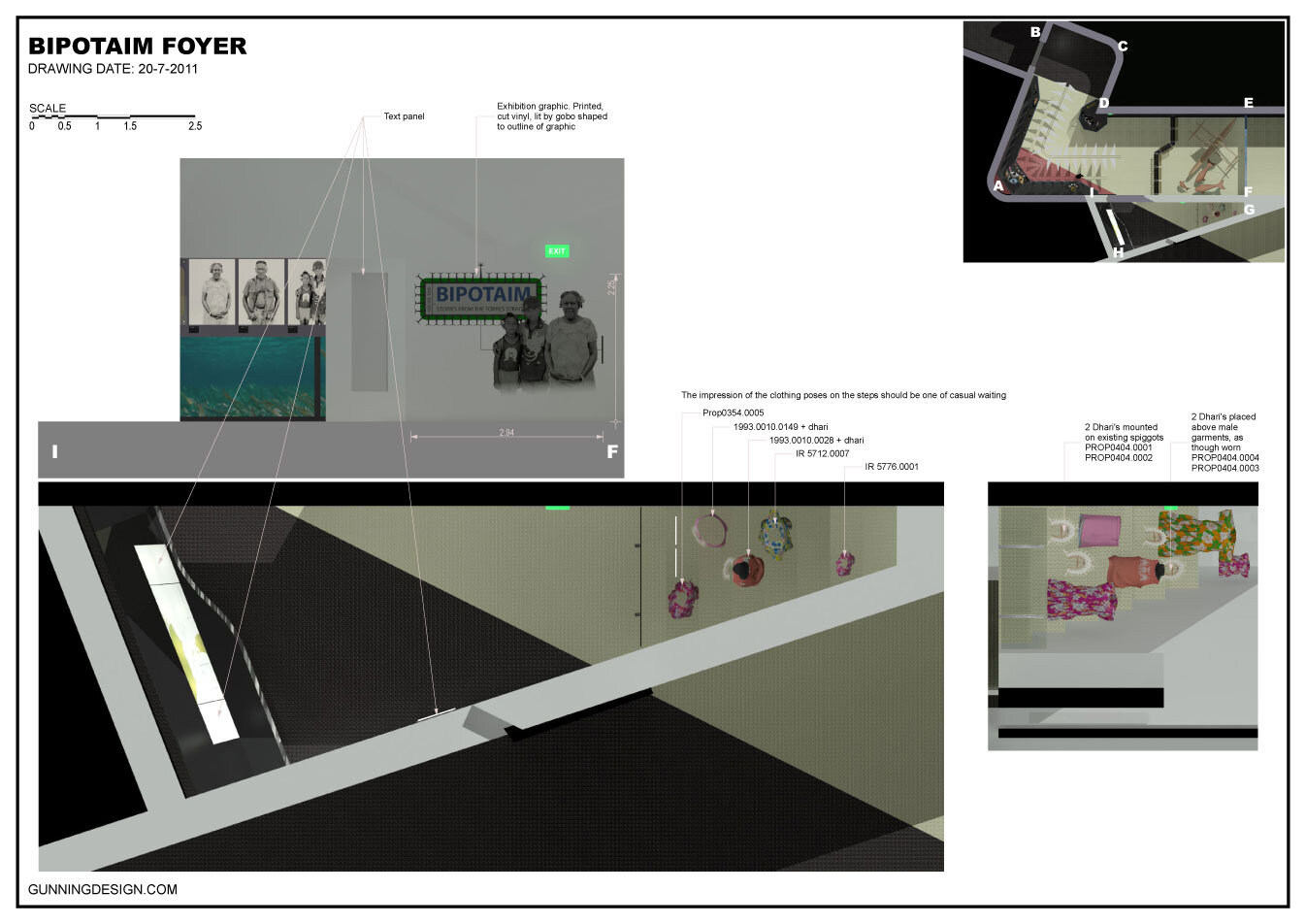
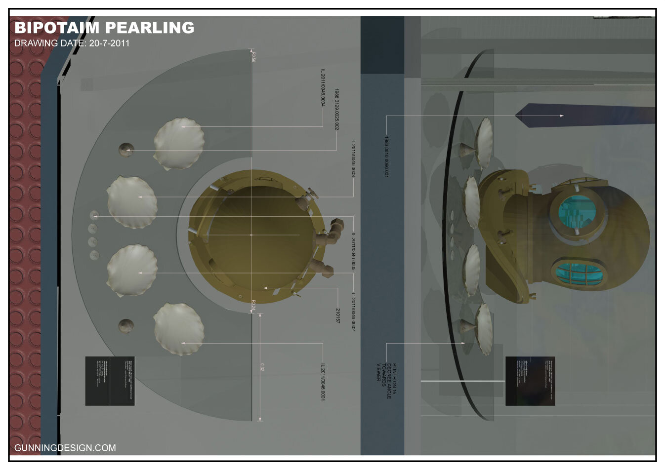
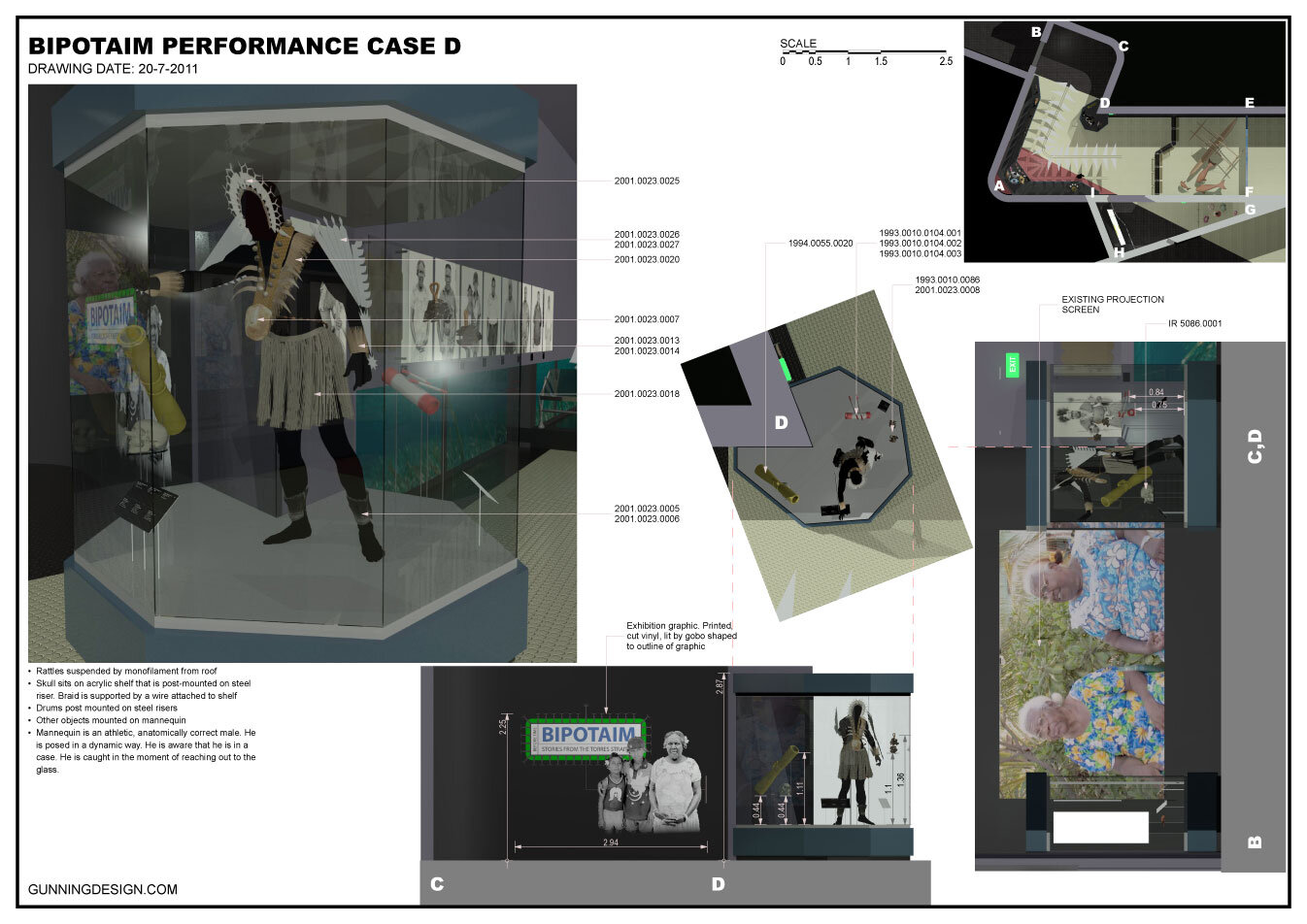
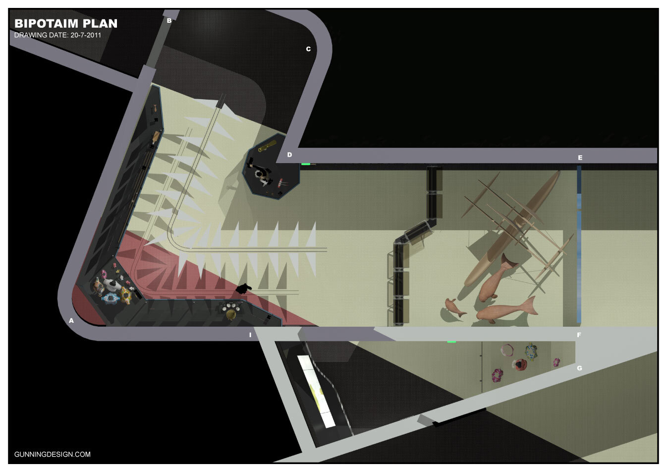
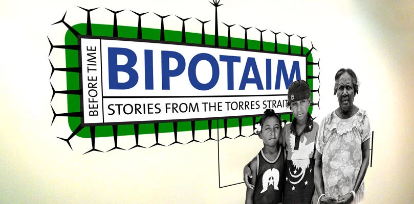
"Bipotaim" exhibit for National Museum of Australia
