Exhibit, Event, Graphic, & Product Design.
I’ve worked on a lot of events, both large and small. Projects include: Diamond Jubilee Pageant, Qatar National Day, RSA Conferences, Centenary of the UK Territorial Army, and multiple horse based extravaganzas.
Graphic Design is an element present in most of my projects. I have also done projects where Graphic Design was my primary role. I’ve designed books, posters, maps, pitch documents, flyers, set scenery, building wraps, and advertising.
I trained as a product designer so I also do that. Most often developing bespoke parts for exhibitions like object cases, or display plinths.
I’m a multi-skilled designer with 31 years experience. In 2016 I moved from New York City to Sydney Australia. I’ve designed exhibitions ranging from museum exhibits to car launches across the UK, Europe, Middle East, Australia, China, and the USA.
I’ve worked on projects for the Queen of England, the Emir of Qatar, Microsoft, Intel, Ford, Nissan, Toyota, Audi, Volkswagen, Acura, Citroën, Skoda, Nokia, Bonhams, UK National Motor Museum, The Wallace Collection, the National Museum of Australia, and the Australian Museum, to name a few.
Scroll down or choose a category of work to view:
Exhibition stand for McLaren
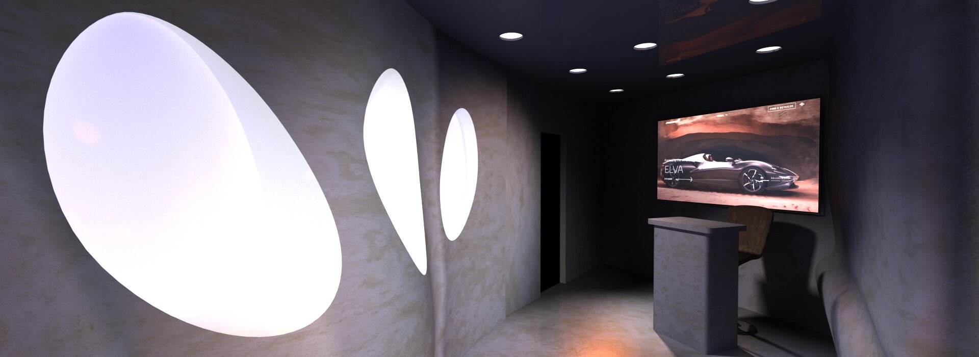
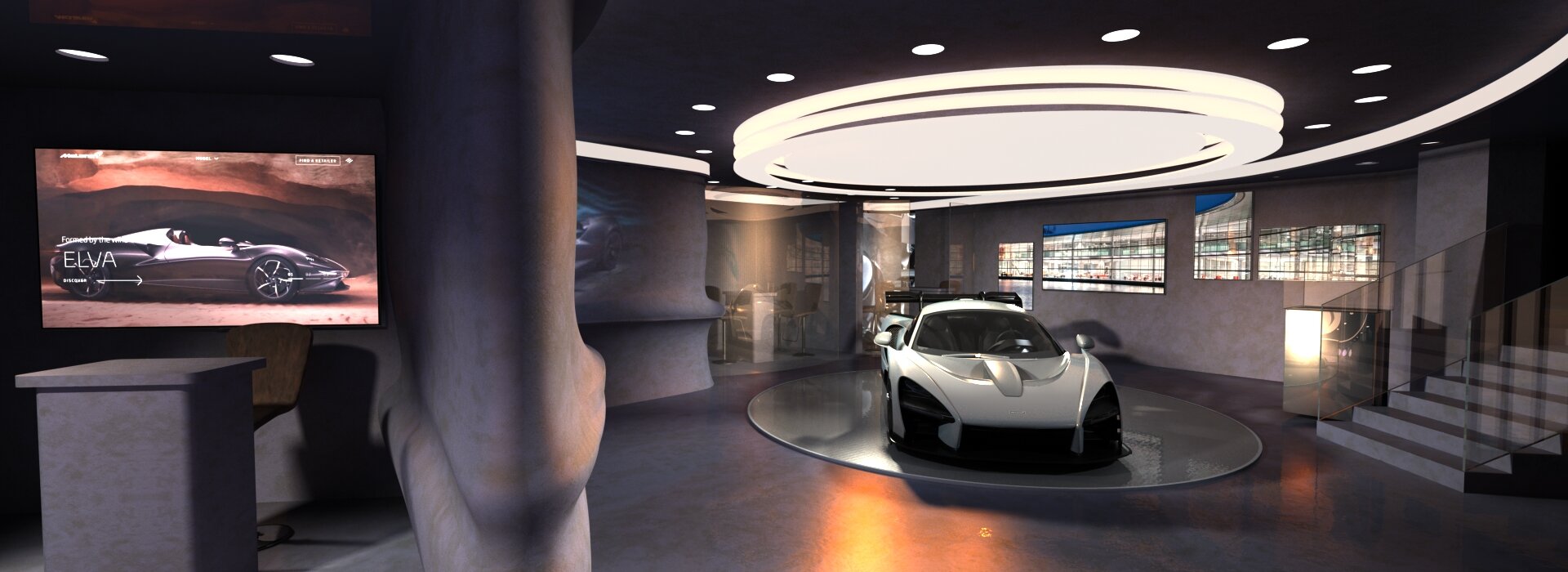
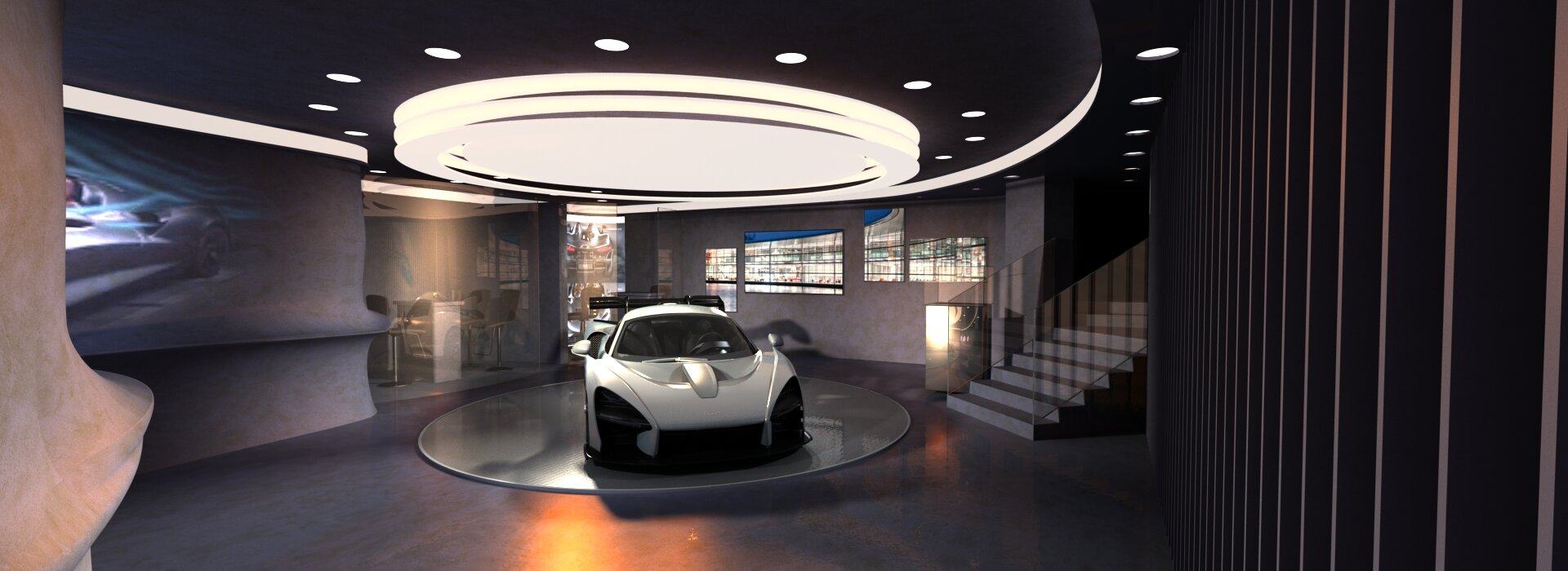
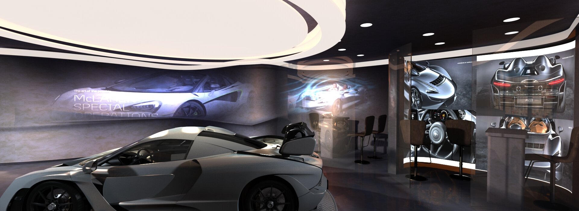
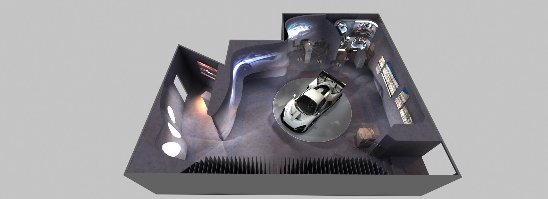
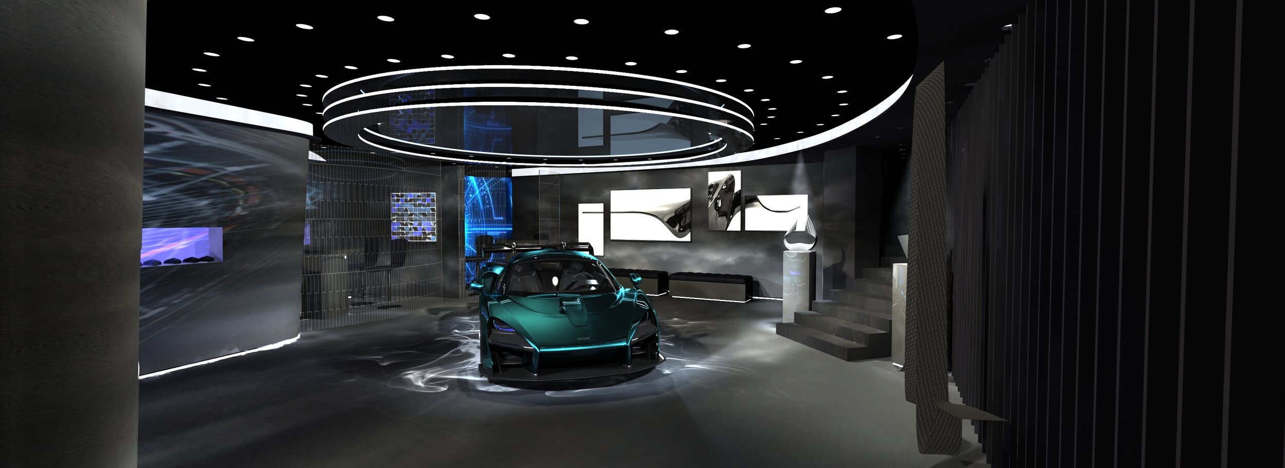
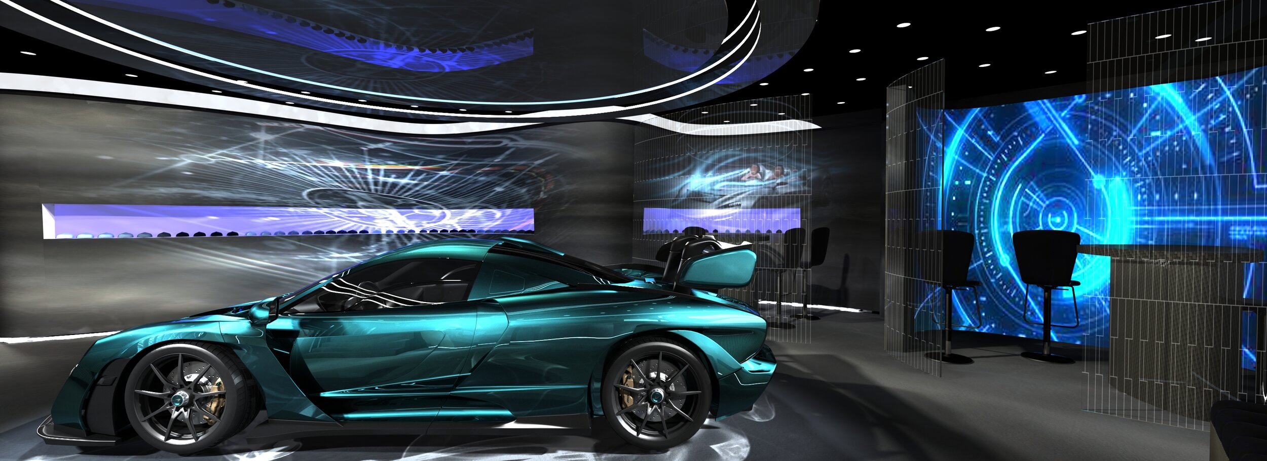
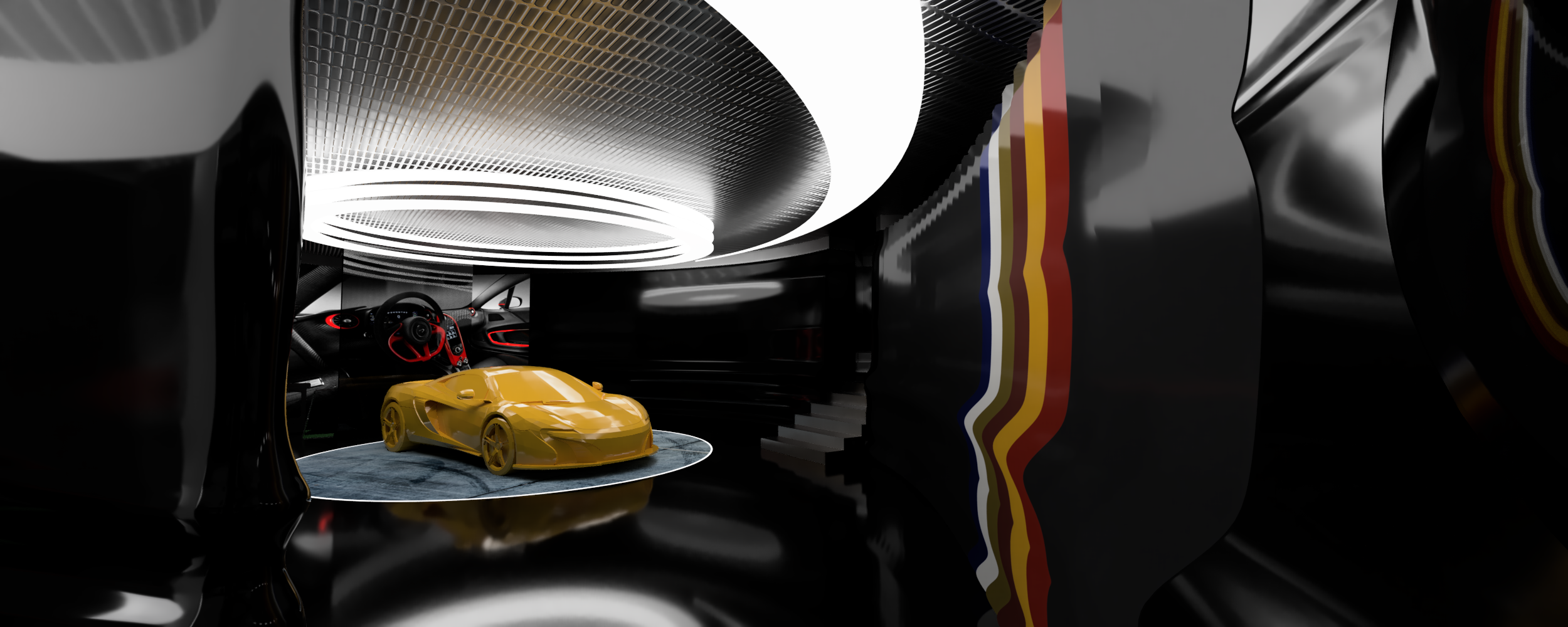
Exhibition stand for McLaren. Notionally, this was for the Geneva motor show. It’s an exclusive VIP zone. The forms took their queues from the very streamlined cars. The project went through many iterations. The visuals show various snapshots along the way.
Activation for Samsung
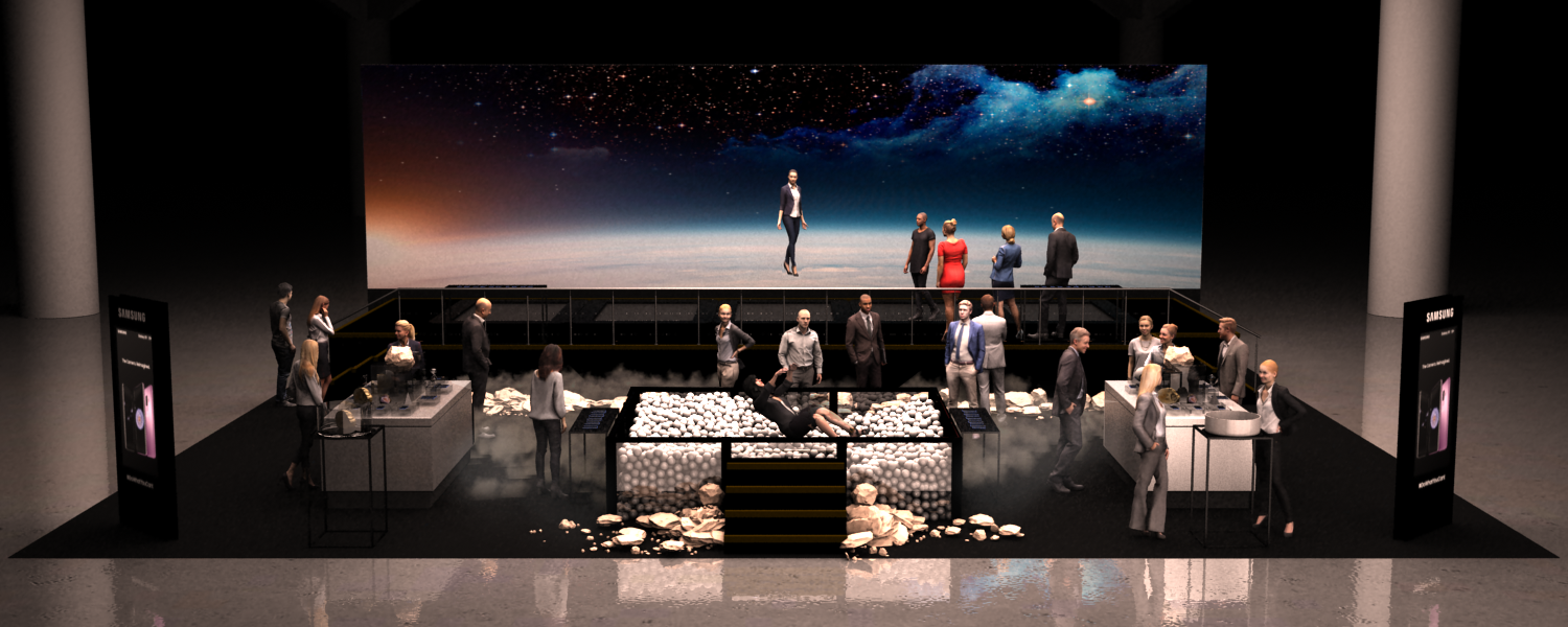
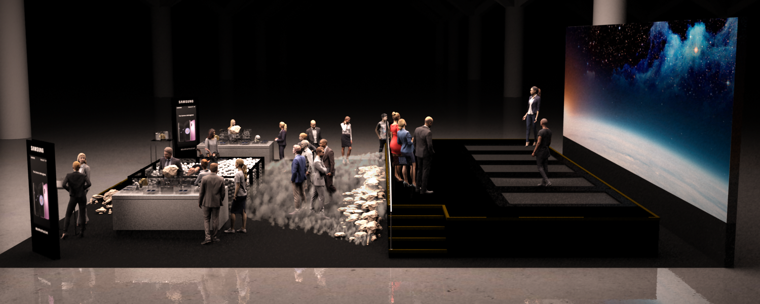
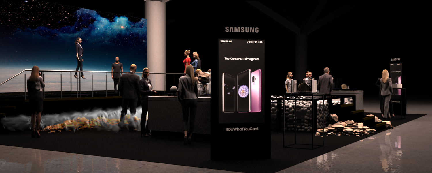
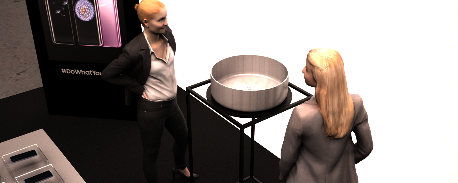
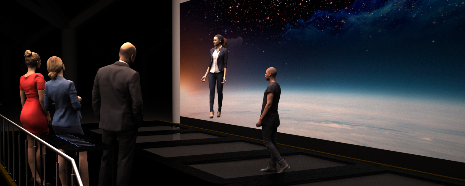
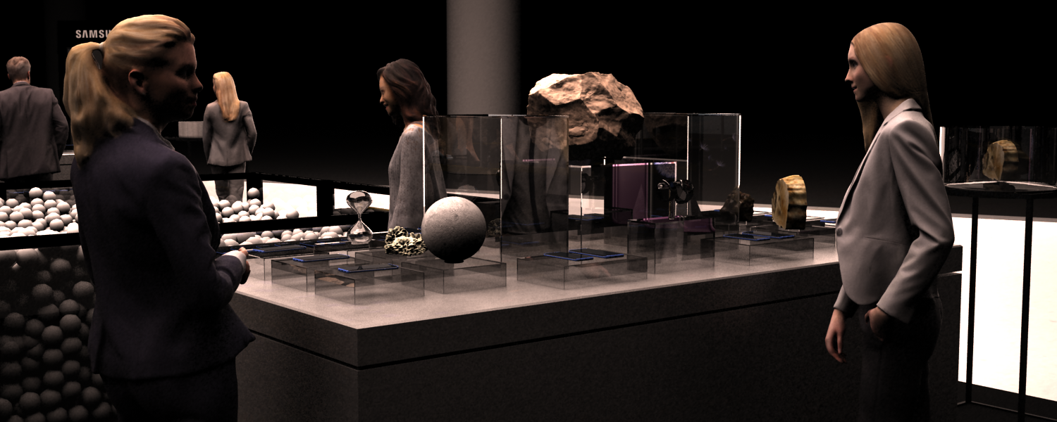
Activation for Samsung via the Projects, Sydney.
Samsung was launching a phone with a camera that had a frame rate so fast that everything was like it was filmed in slow-mo. it reminded everyone of the videos from moon landings. So, this is a moon-themed exhibit, with a ball pit, and trampoline stage. It’s set up for taking selfies with the new tech in slow-mo!
Activation for James Squire
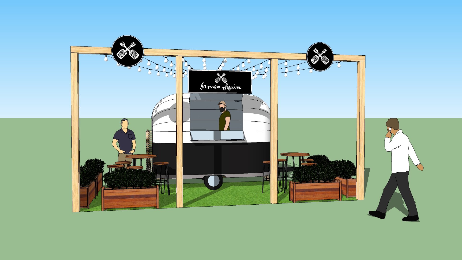
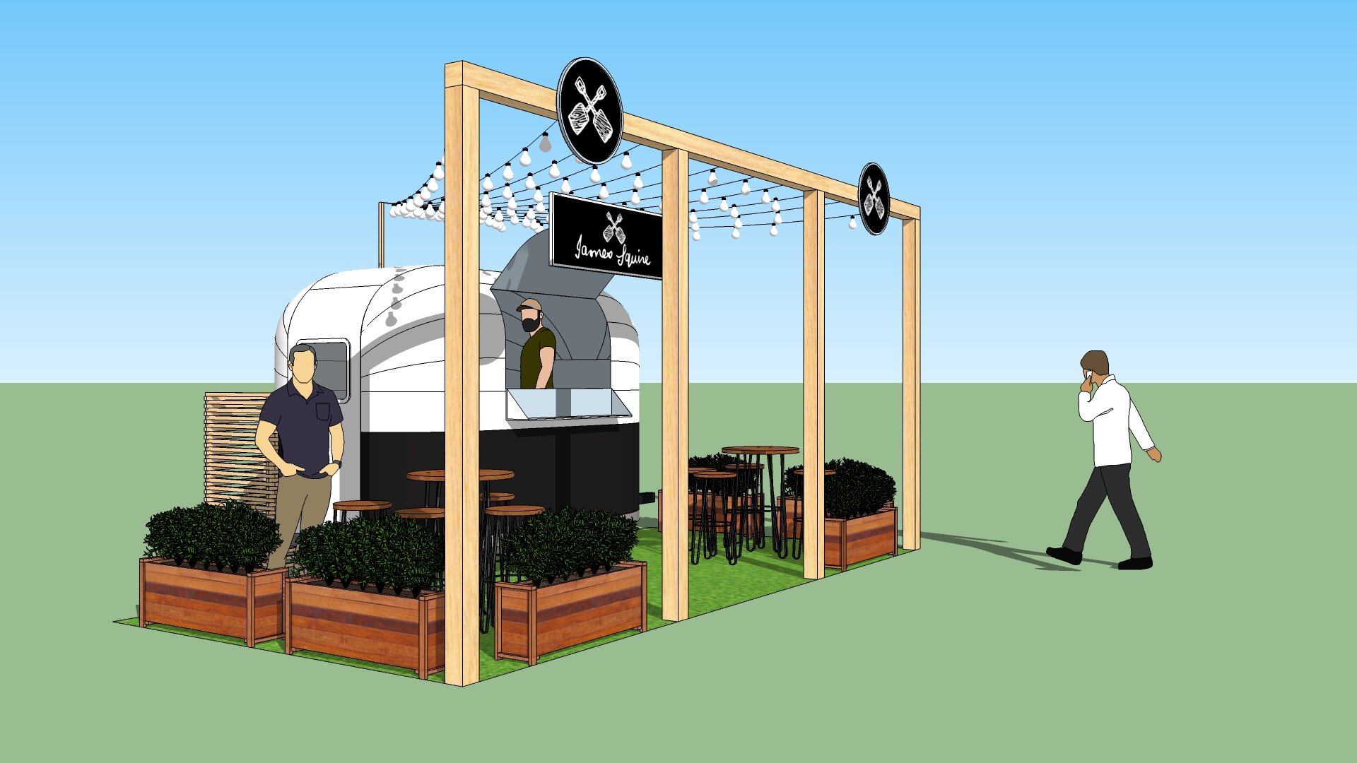

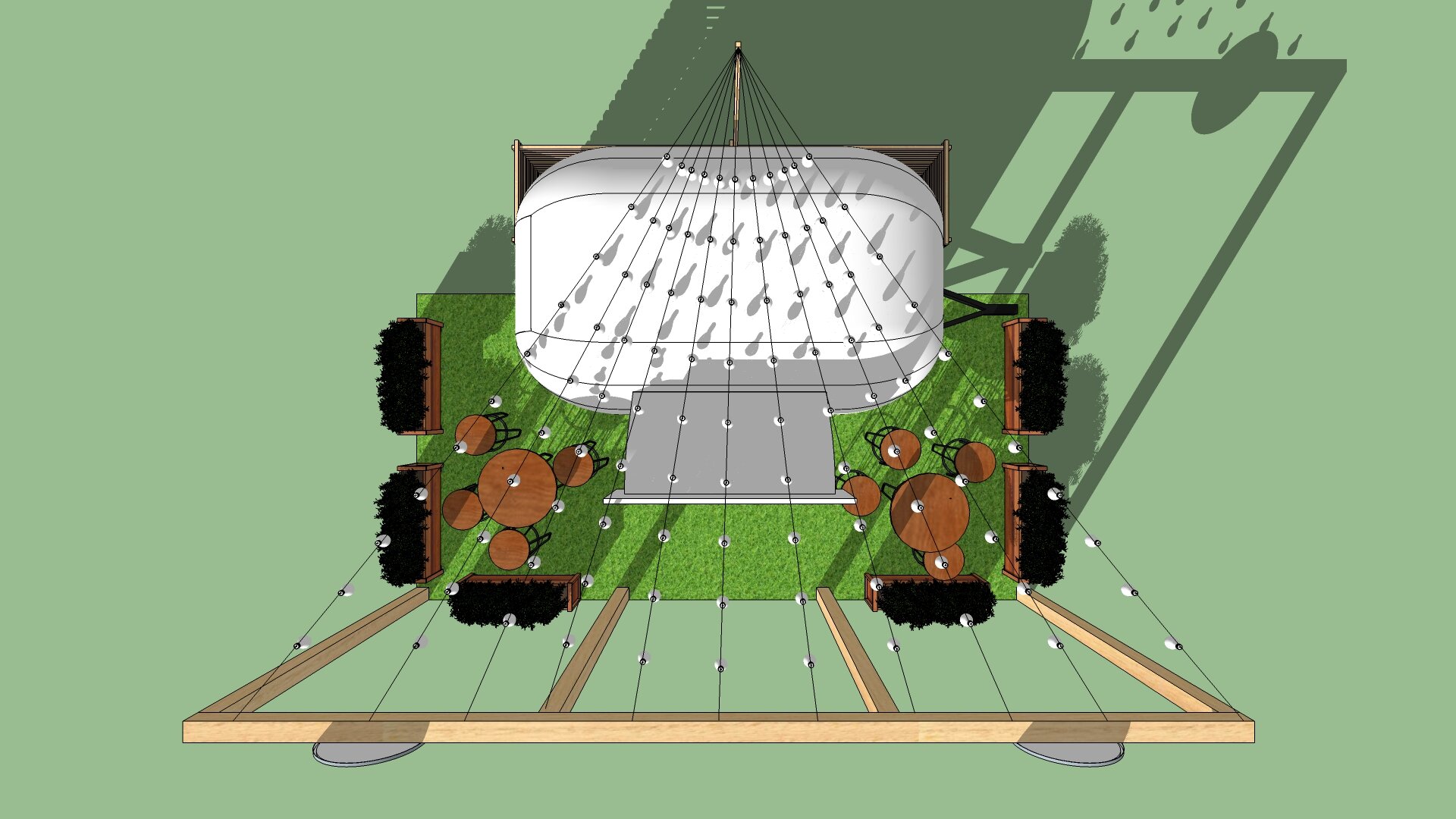
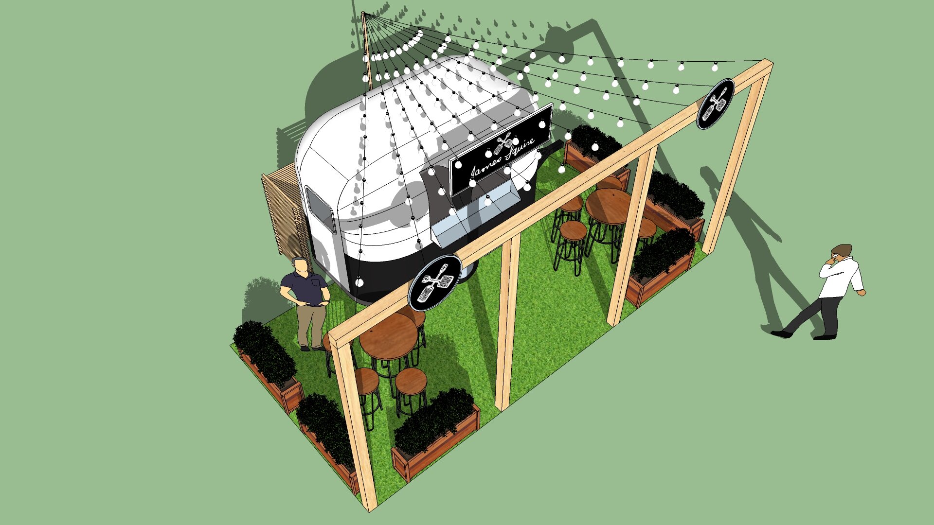
Activation for James Squire via the Projects, Sydney. Small activation for James Squire at a Sydney festival. The stand embodies elements from the brand but keeps build costs to a minimum.
Activation for Milo
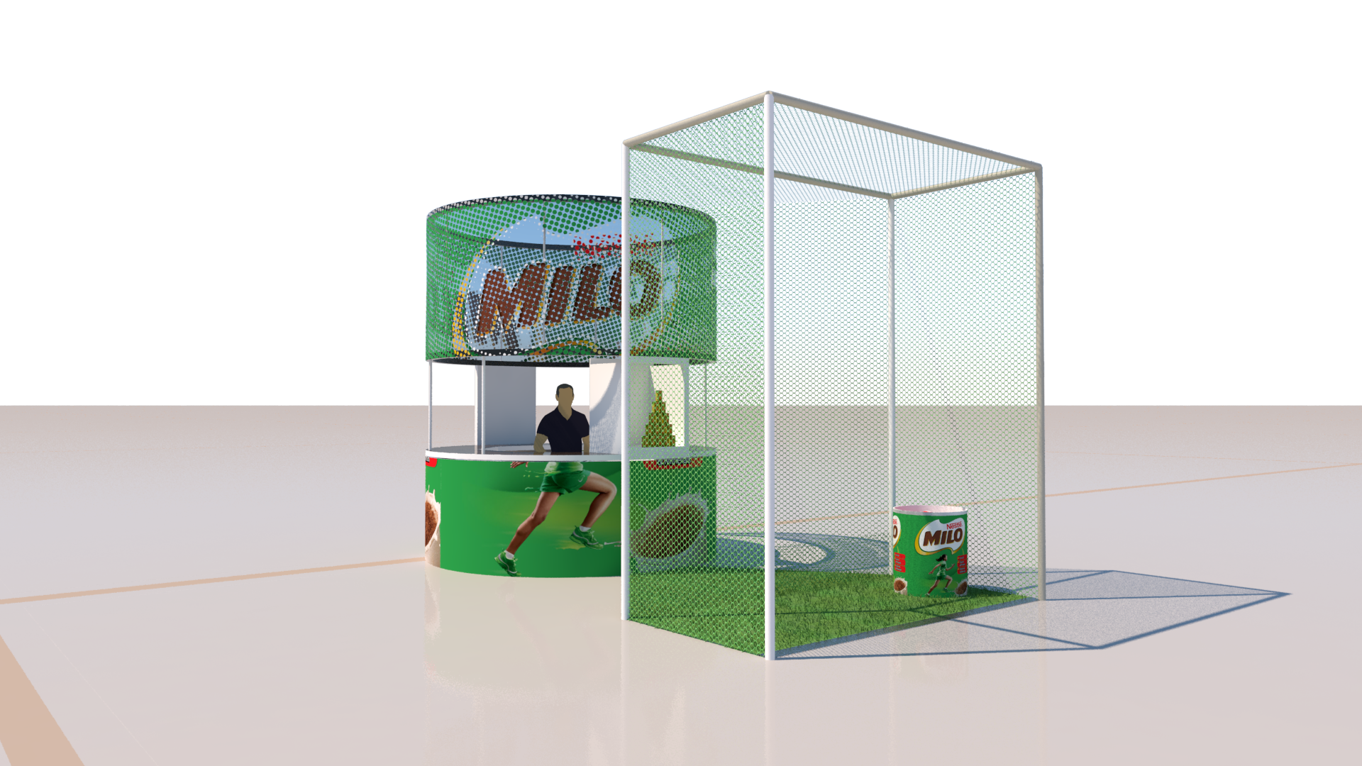
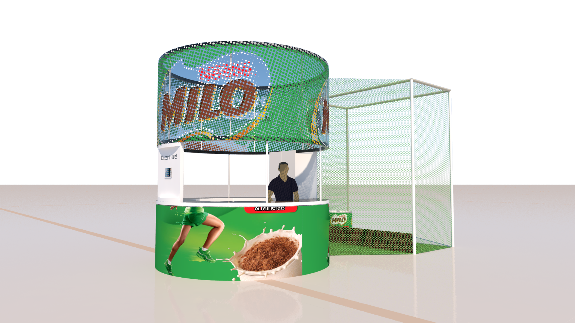
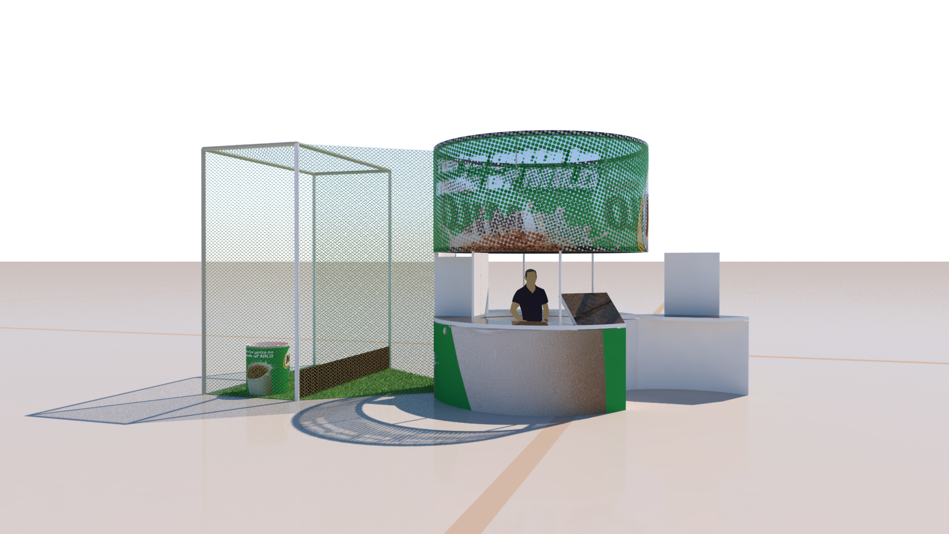
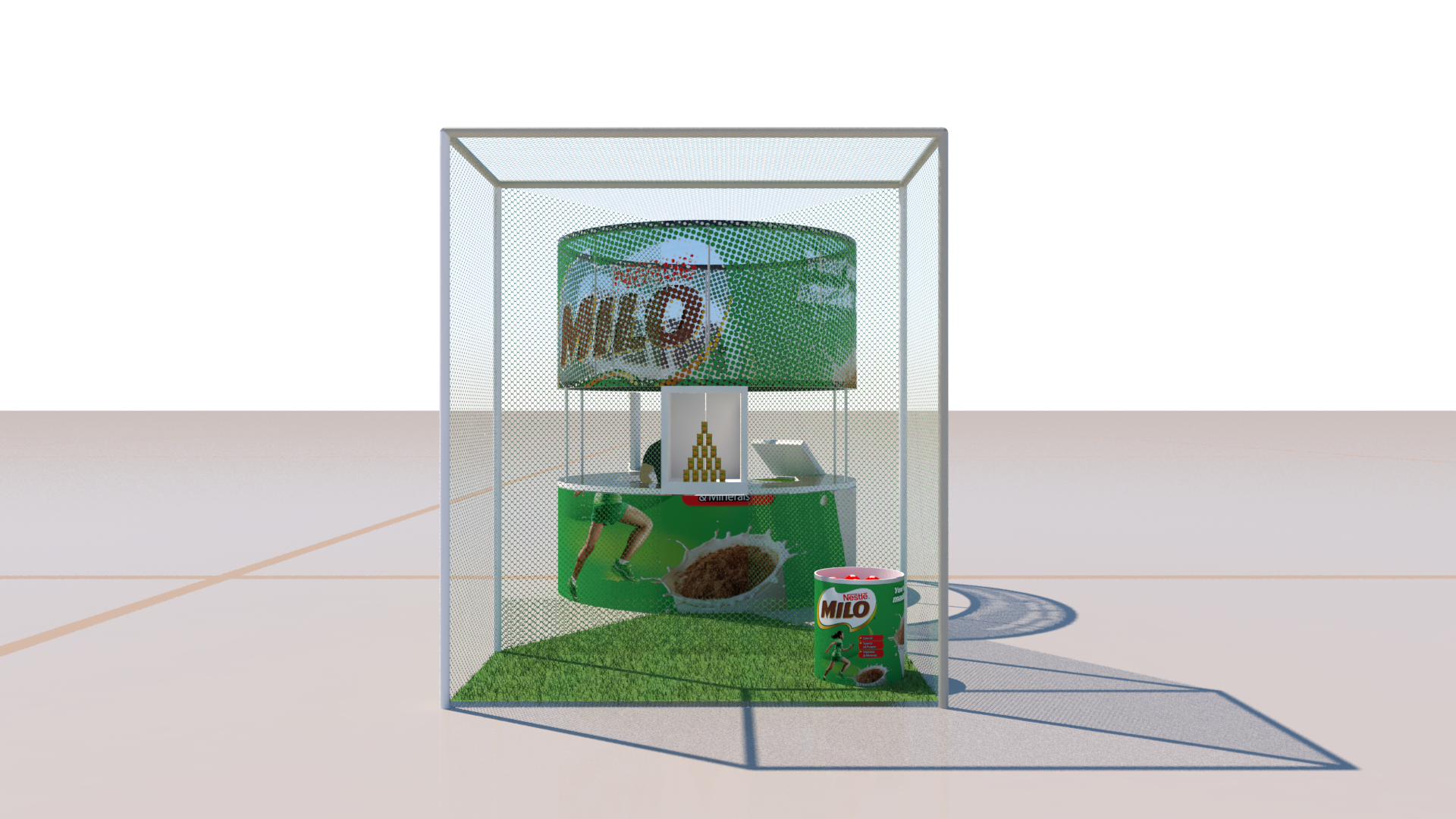
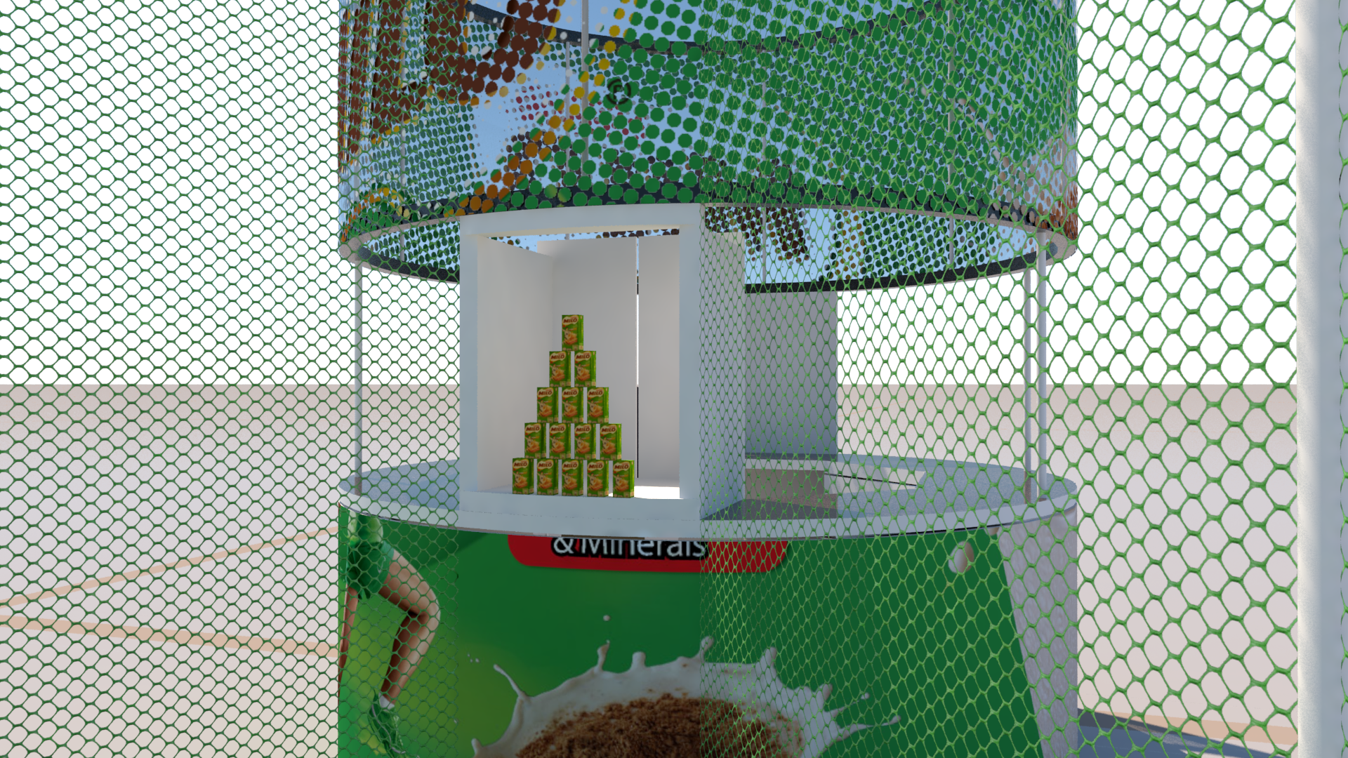
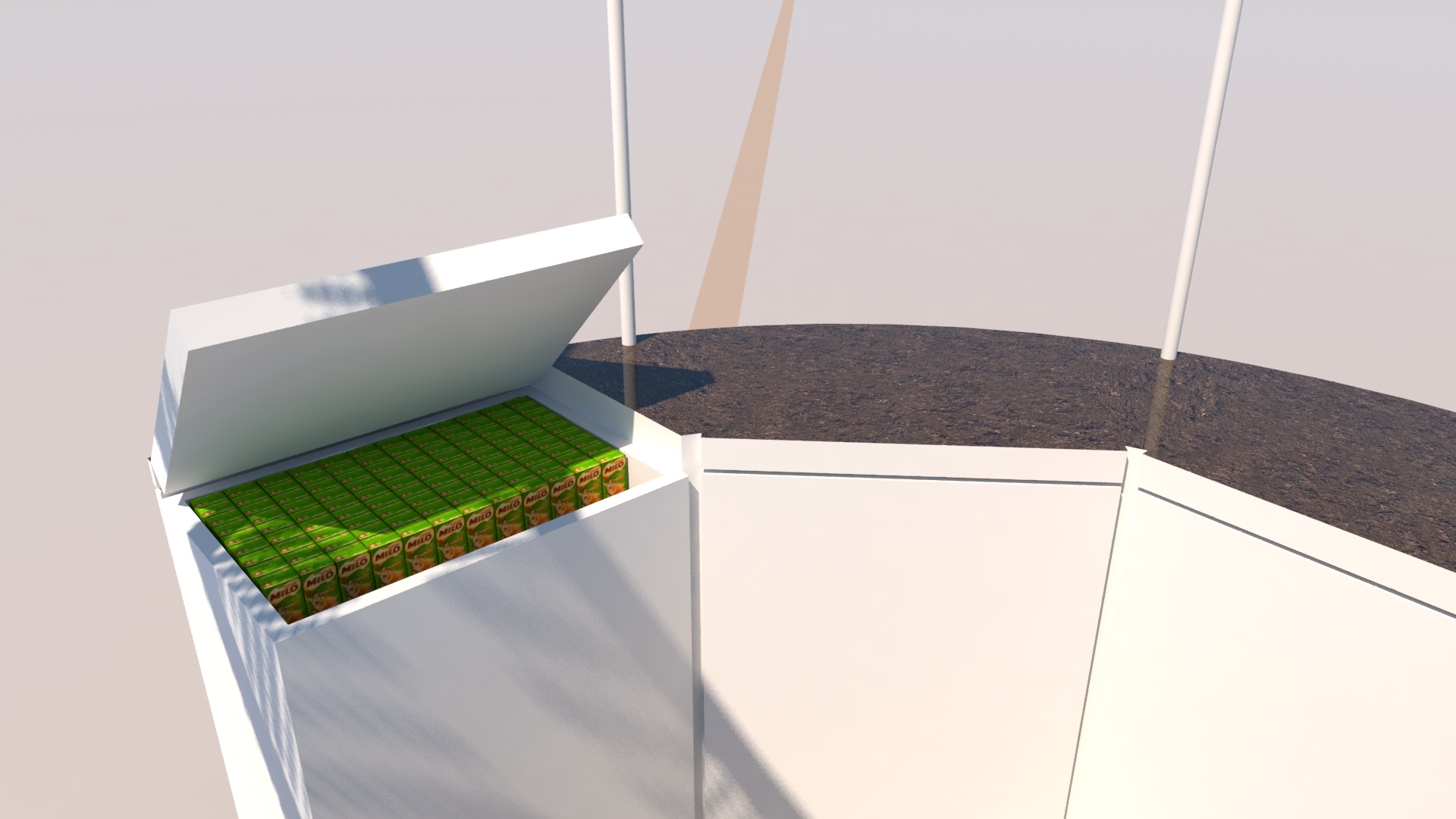
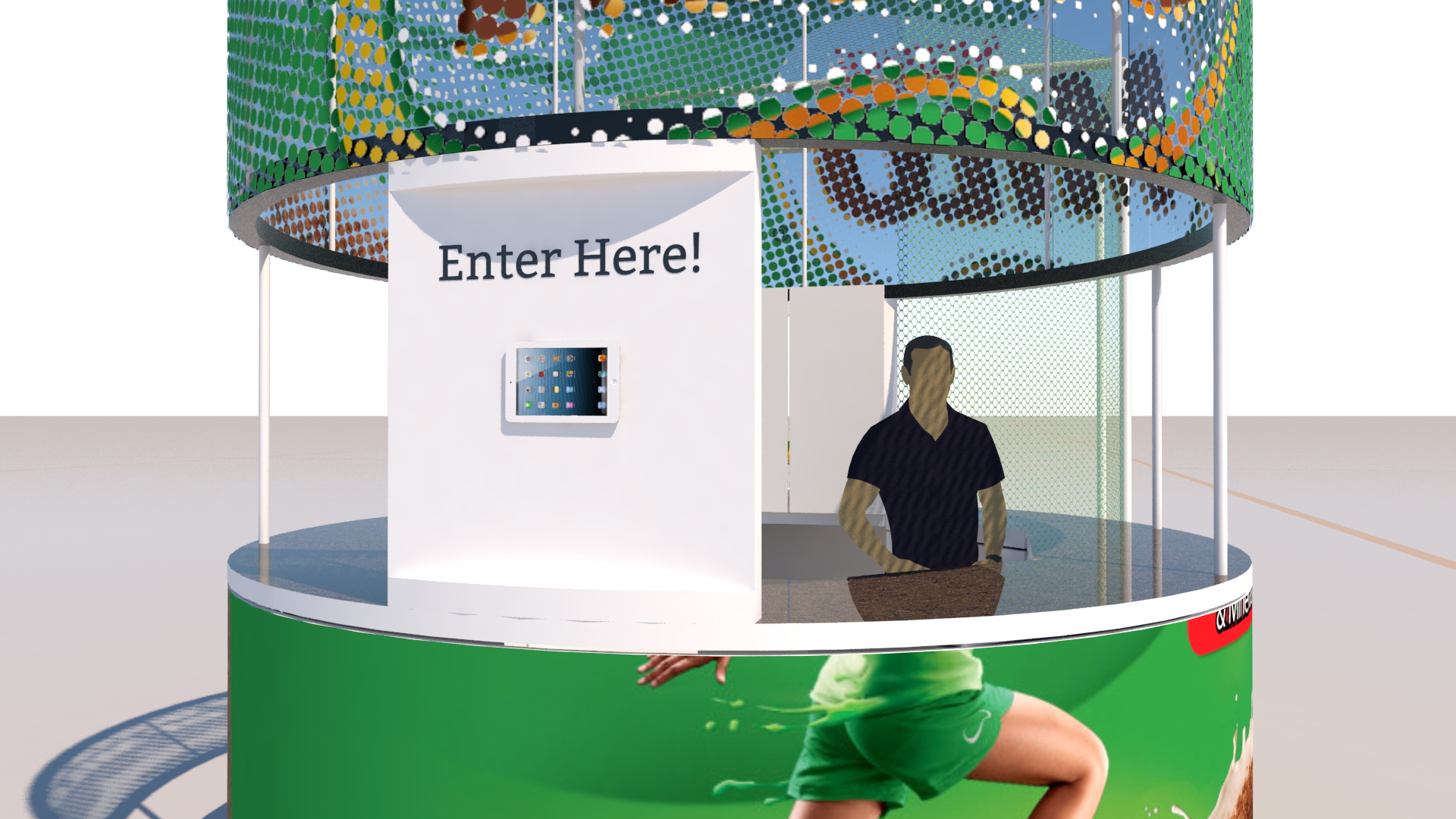
Activation for Milo via XPO brands Sydney. This is the result of a One-day concept to visuals project. It’s for a staffed exhibit in a shopping mall. It includes a knock-down-the-Milo-boxes game. The pyramid arrangement included a quick reset system using the back panel of the display box and cables attached to each prop-milo-box.
Exhibit concept, Australian Museum
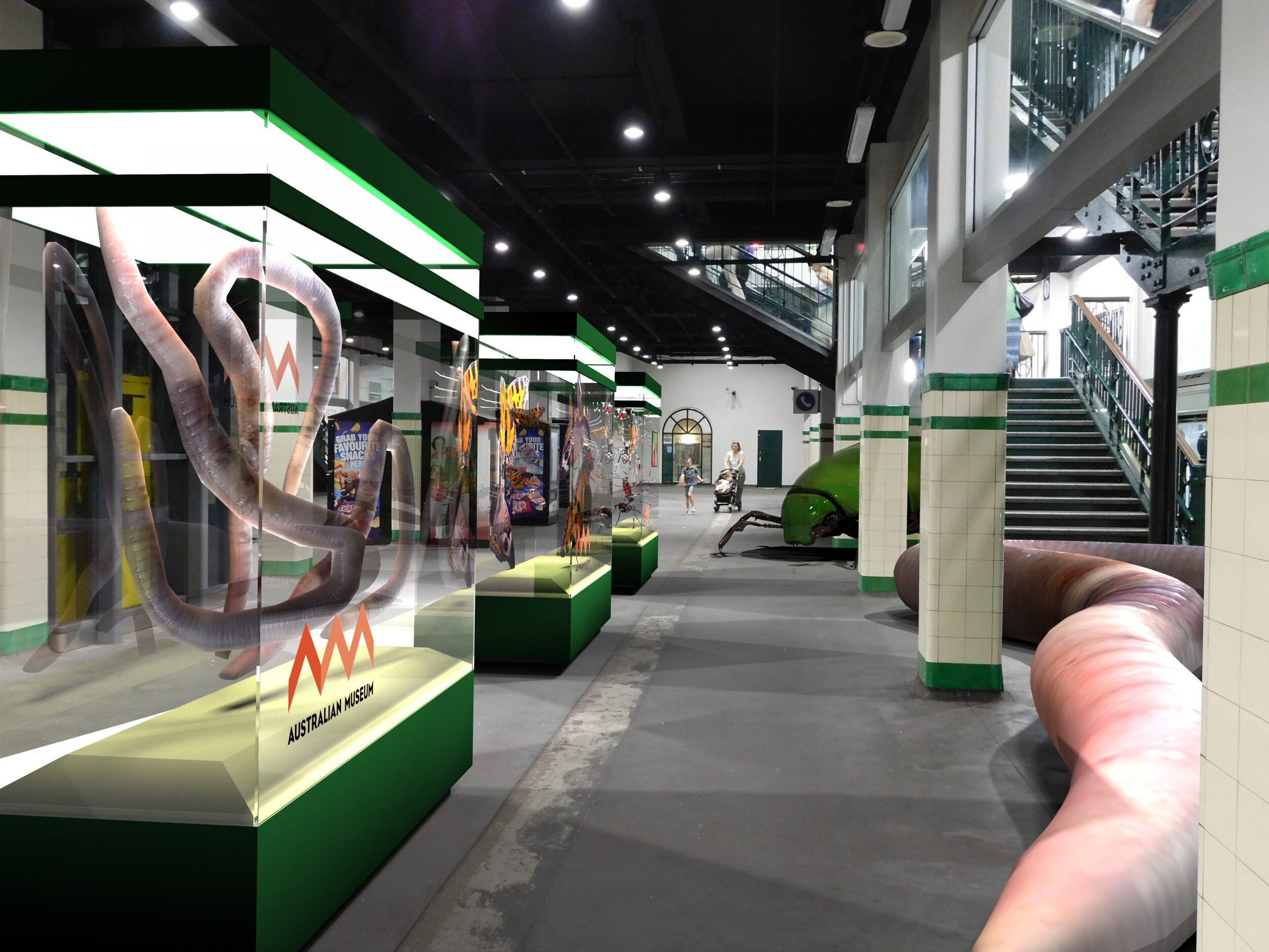
With an extremely loose creative brief, and very tight deadline, this was an exercise in making something that looked like it could be a considered museum exhibit, without considering it very much at all… Heavy lighting effects and unsubtle images evoke a mood of the exhibit without getting bogged down in details.
Exhibit visualization, Australian Museum
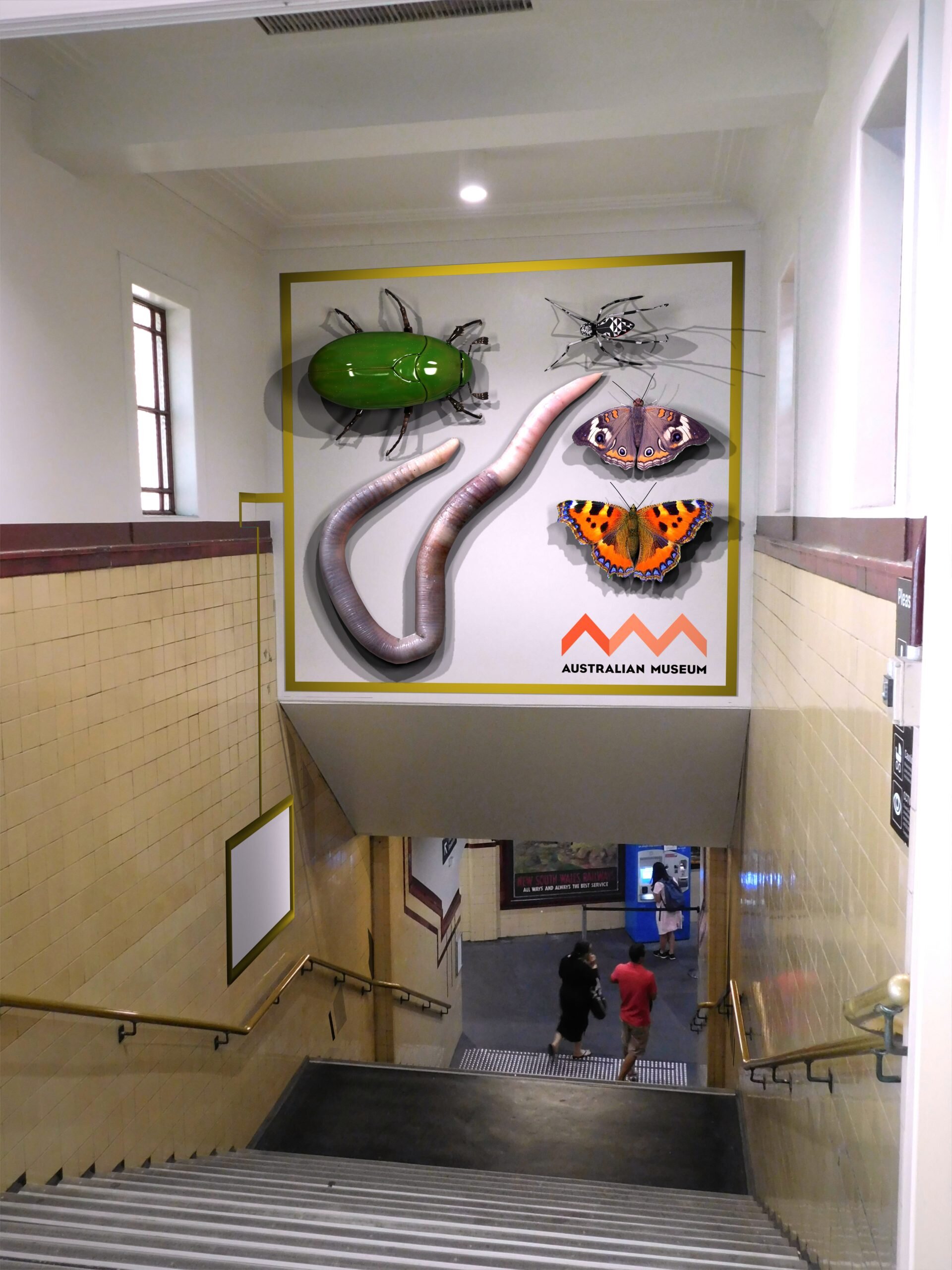
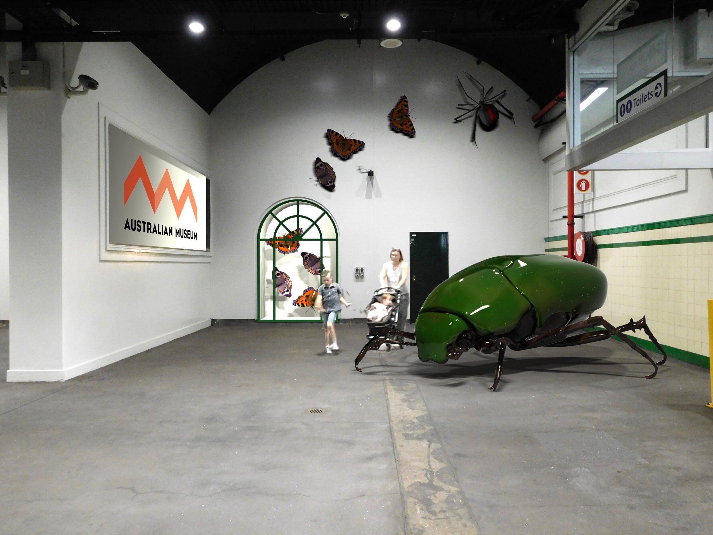
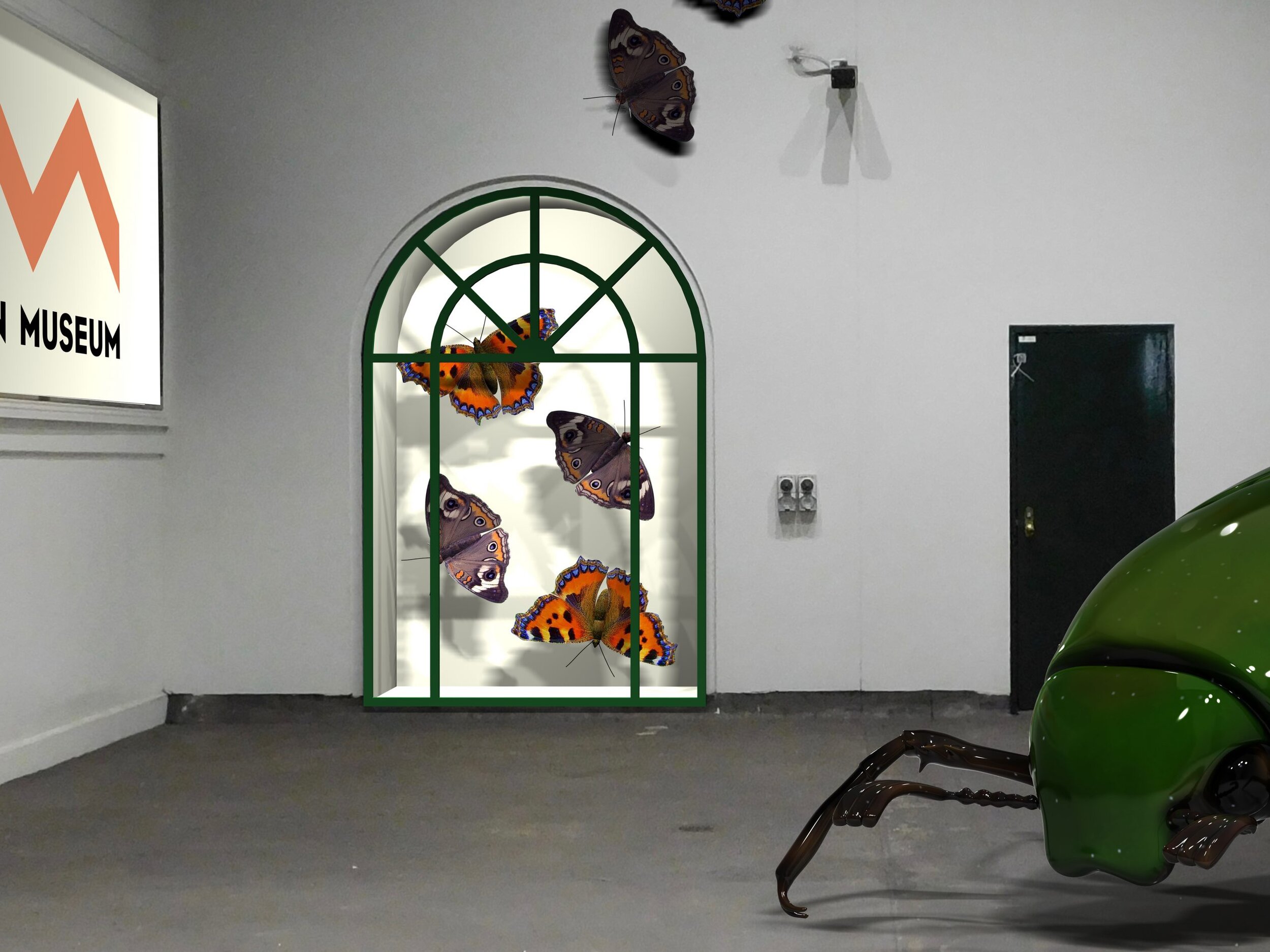
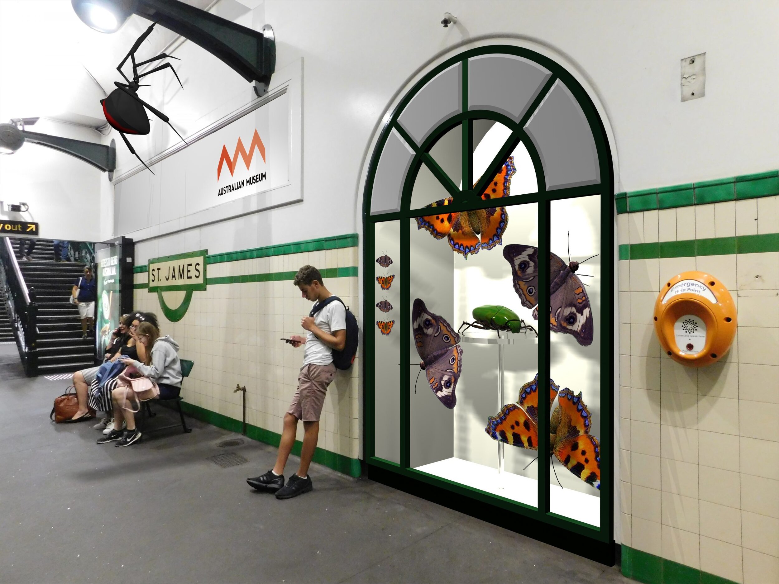
Pre-visualization for a pitch document:
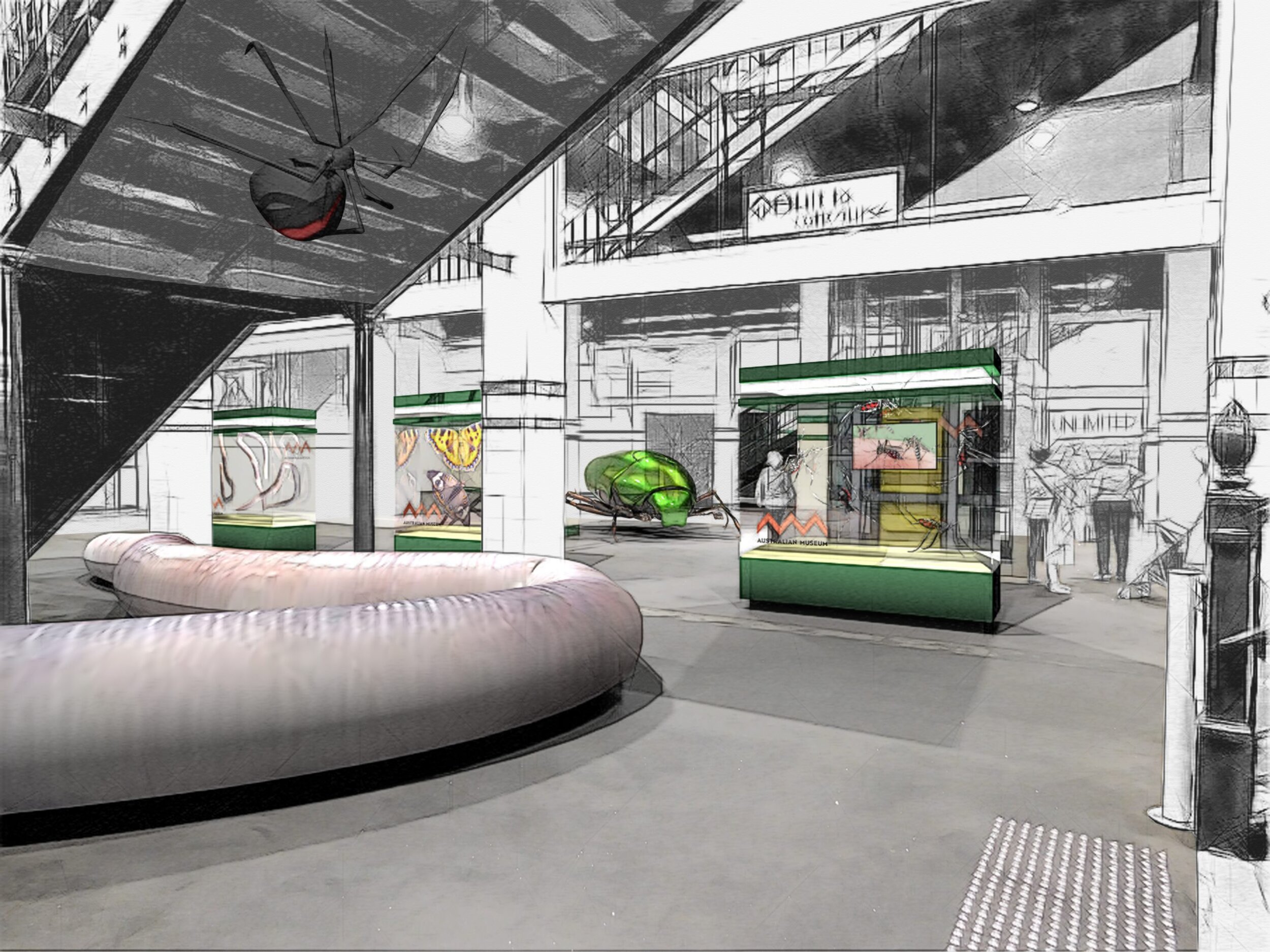
With a very loose creative brief and tight deadline, this was an exercise in what might be. The images are perspective matched renders overlaid on photographs. As per the brief, I used a sketch photoshop plugin to loosen the result.
Exhibit for Australian Museum

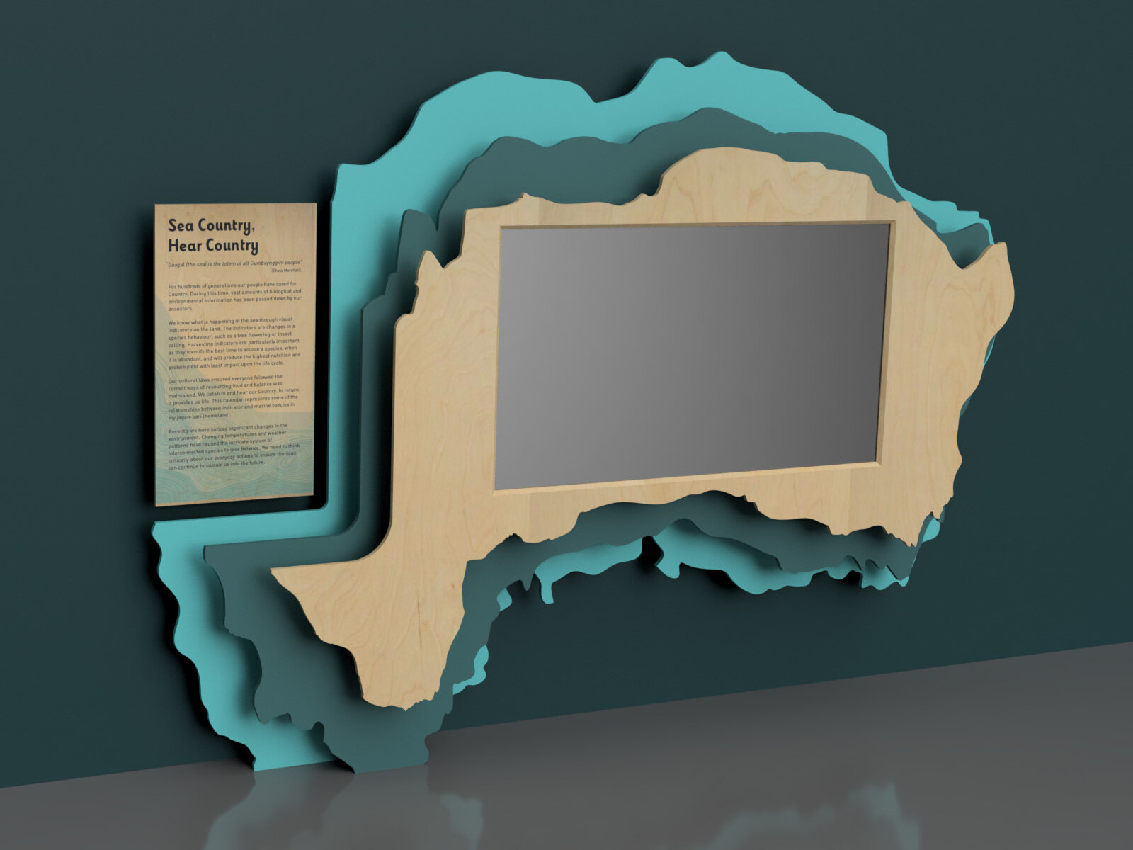
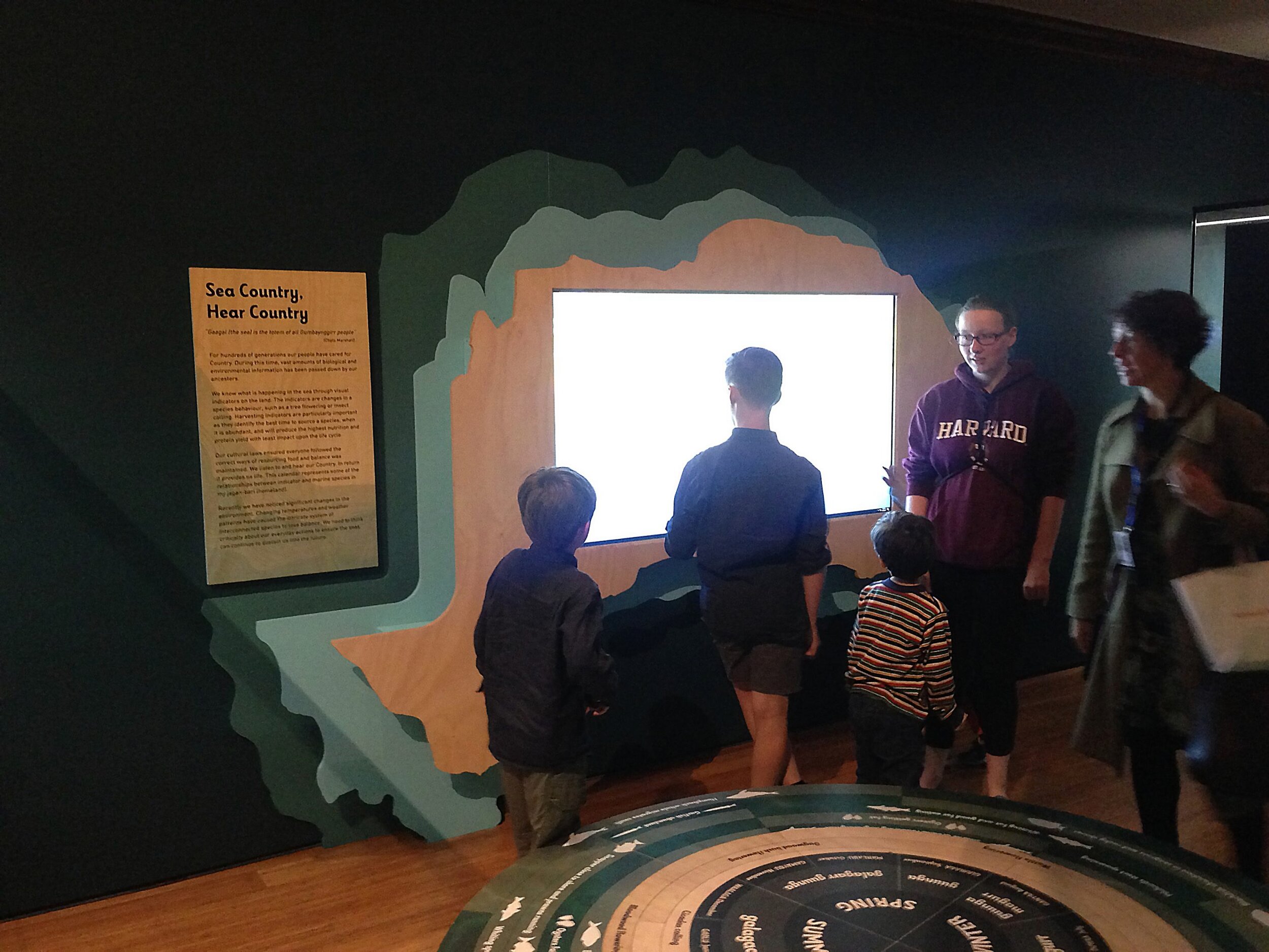
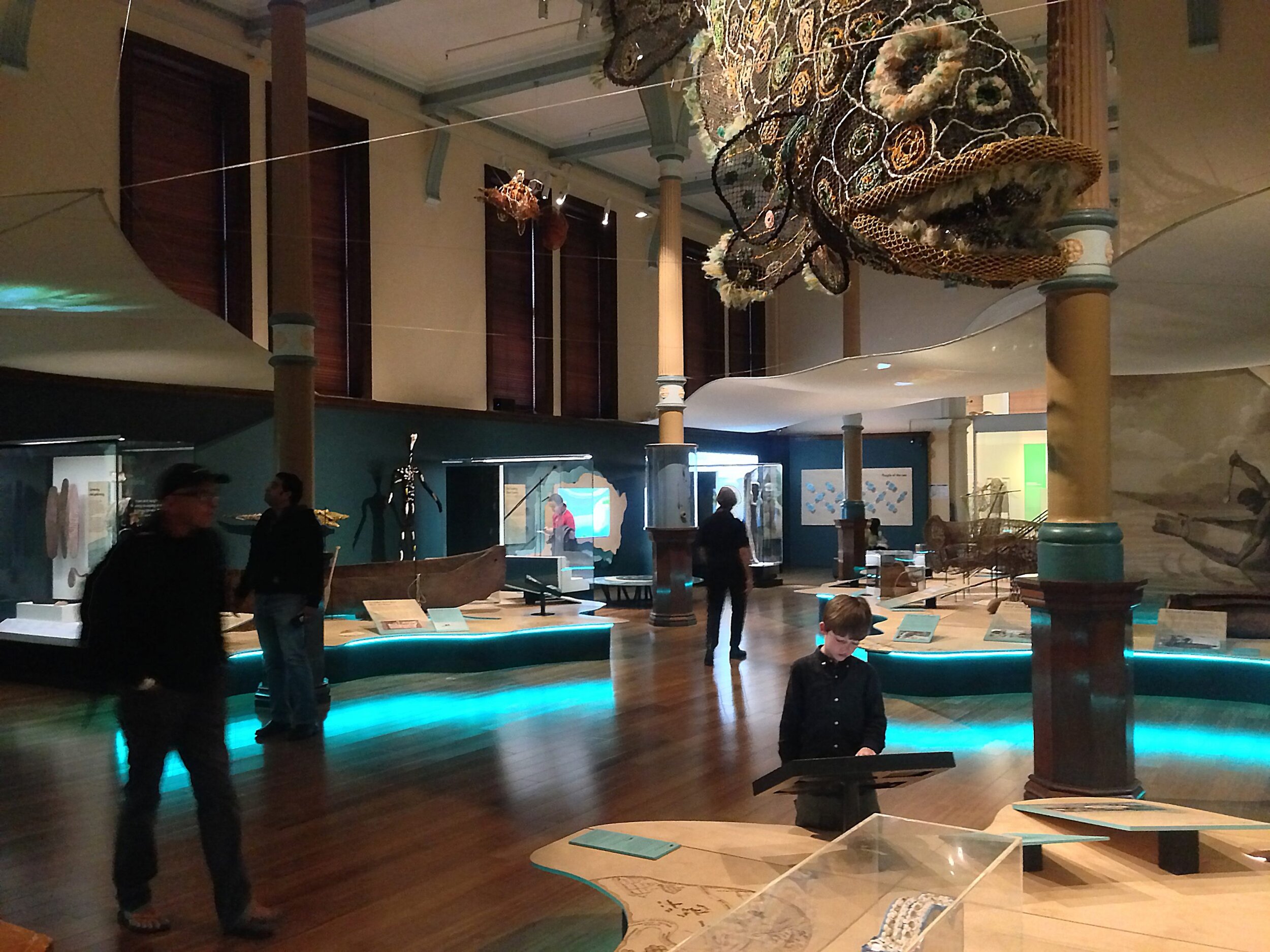
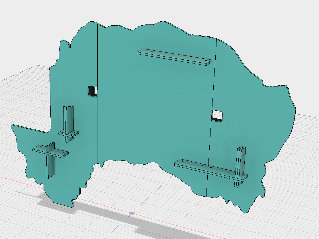
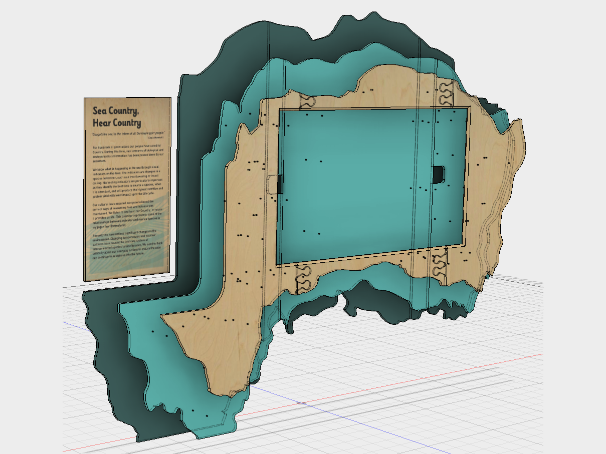

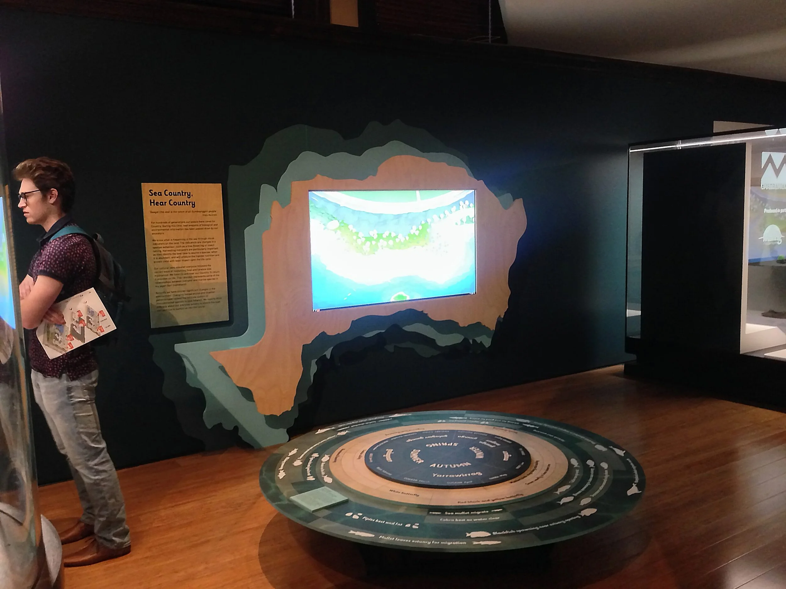
Calendar touchscreen interactive housing
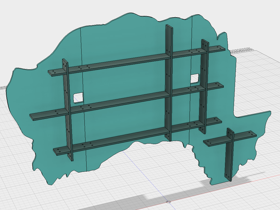
The shape is based on Muttonbird island, Coffs Harbour, NSW. Muttonbird island holds a special significance for some of the Aboriginal collaborators on the project. The three planes are derived from contours of the island. The island was 3D modelled, sliced into three planes, then detailed for CNC routing. A grid of battens hold the planes in space. The touchscreen is mounted to the middle plane.
Concept development, 3D modelling, Construction drawings, CNC toolpath linework.
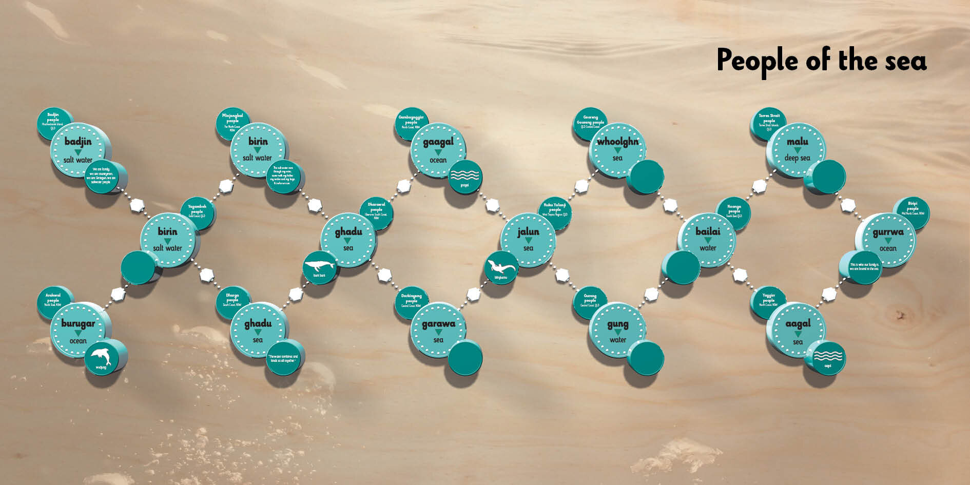
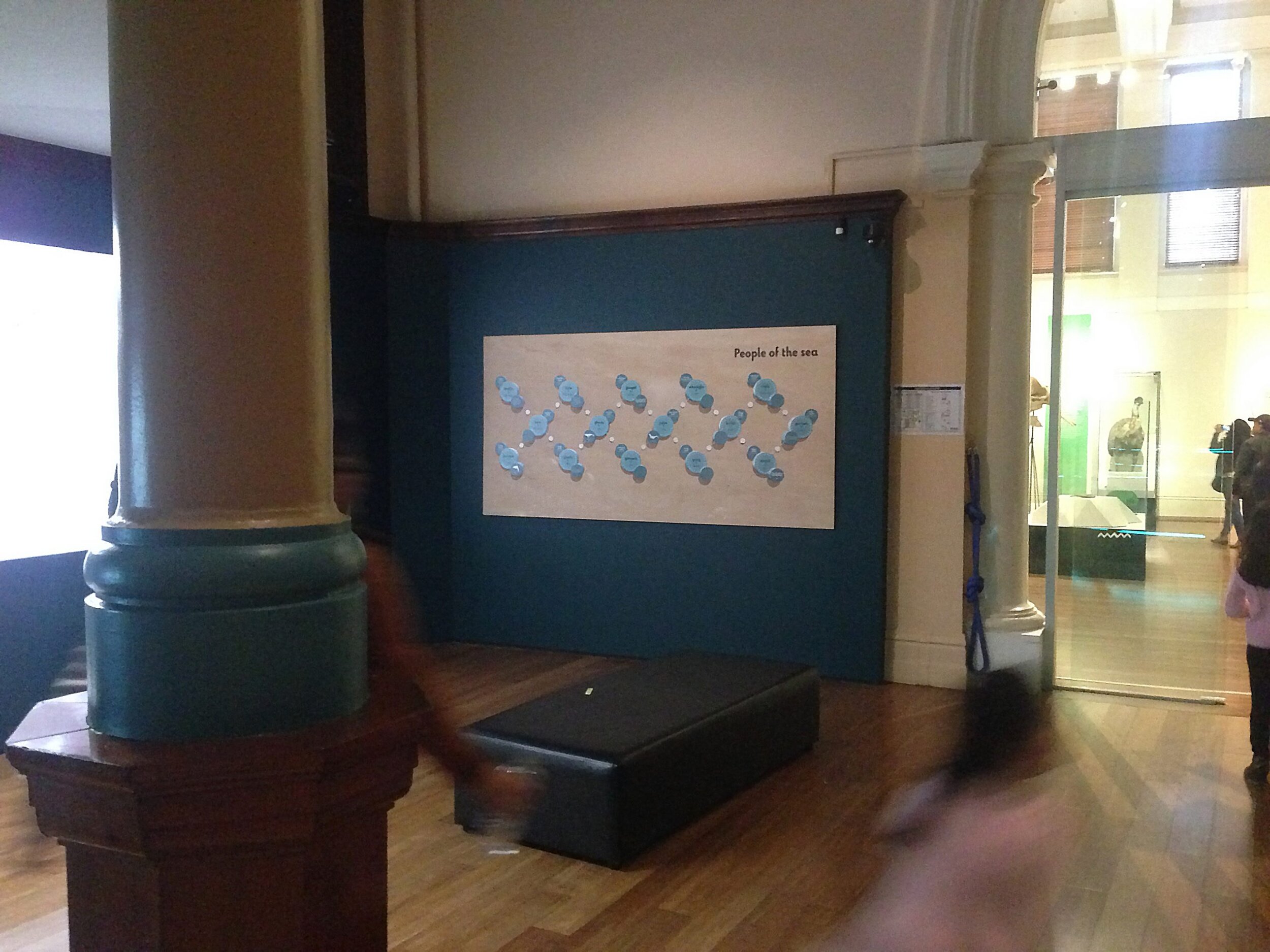
People of the sea graphic
This was a redesign of an existing gallery element that was displaced by the new interactive. The original element was made physically from multiple cnc routed parts and stuck on the wall. For budgetary and real-estate reasons, the new element is 2D. In order to preserve the original elements look as much as possible. The parts were 3D modelled and rendered to achieve a 2.5D result. Further, the piece is all about people’s connection to the sea, so a sea-scape water-mark image has been used to evoke that context for the original ‘DNA’ graphic. It’s direct printed onto hoop pine. The hoop pine plywood helps to tie it into the rest of the gallery.
"Bipotaim" exhibit for National Museum of Australia
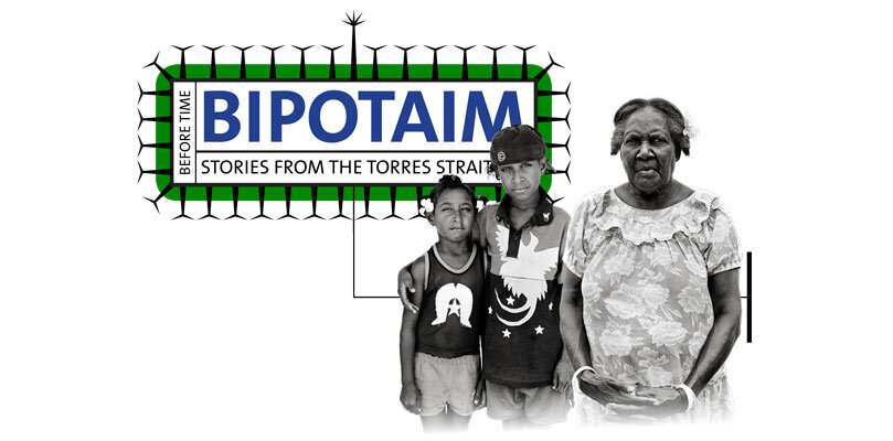
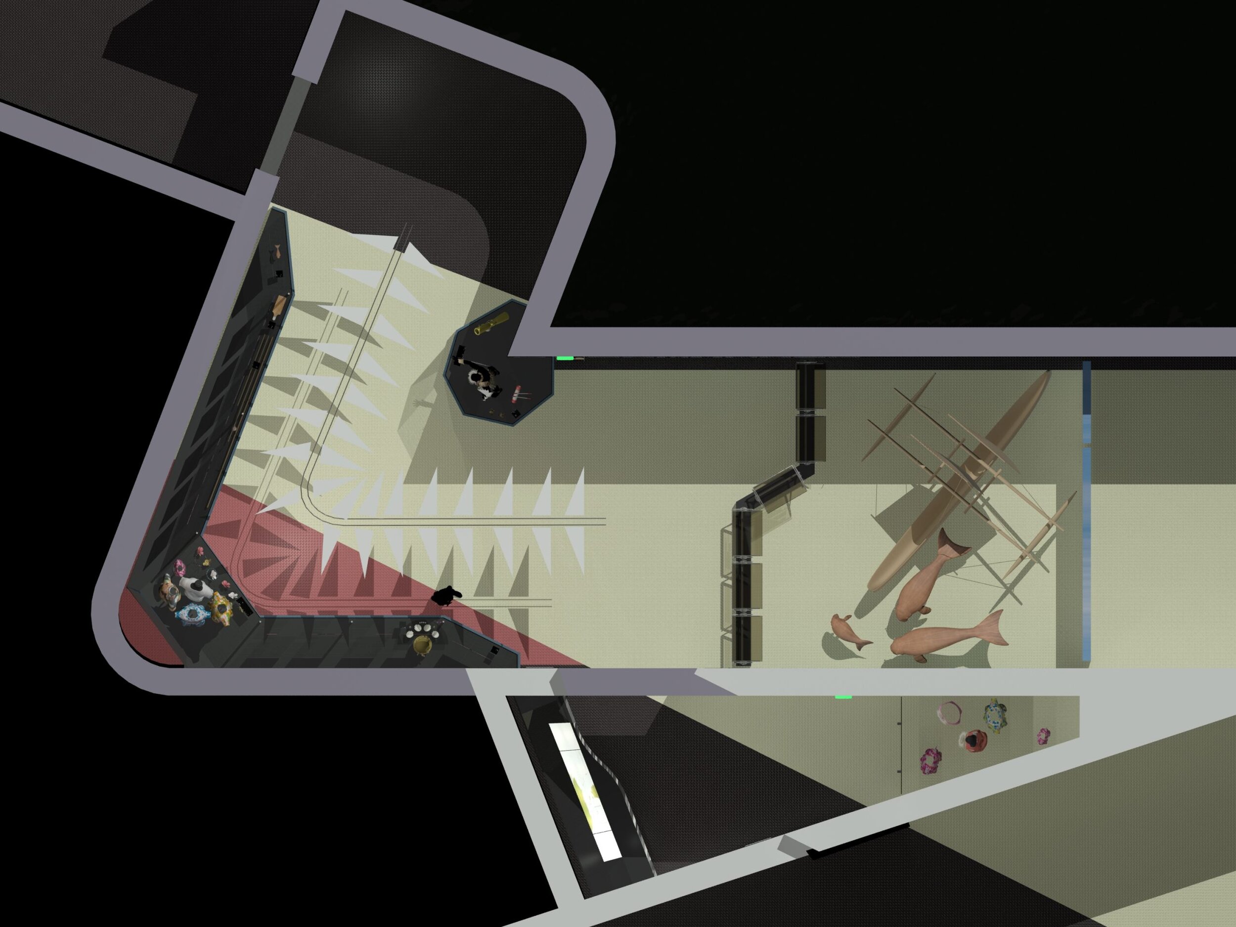
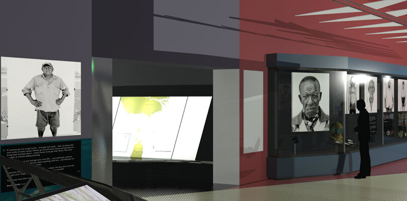
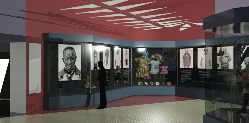
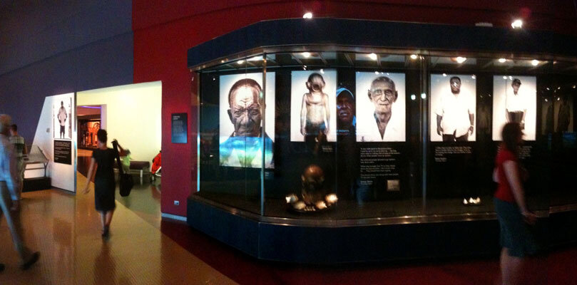
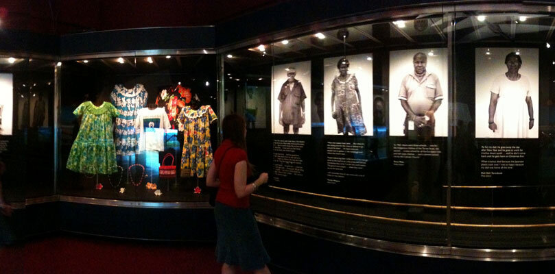
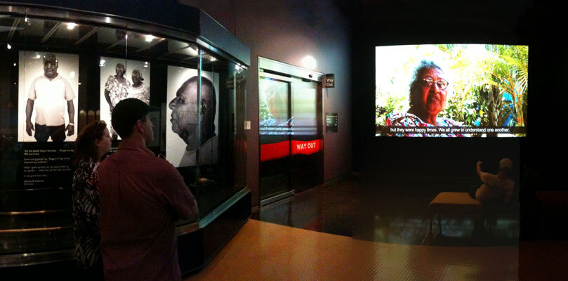
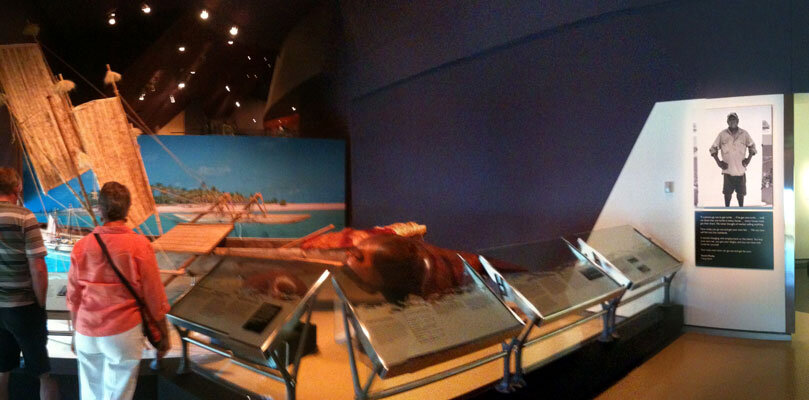
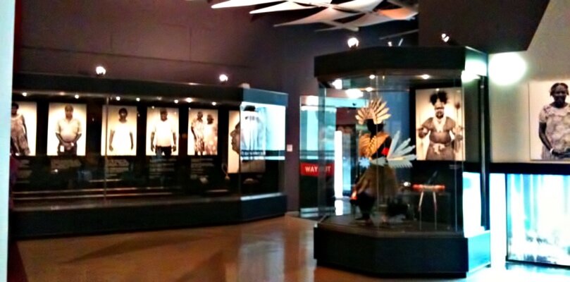

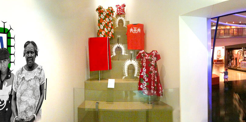
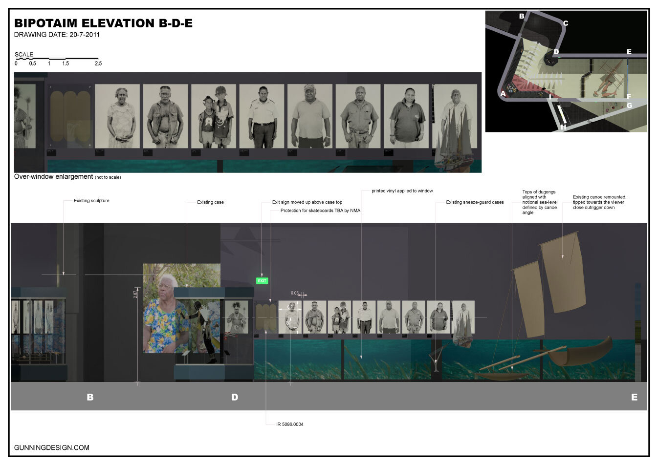
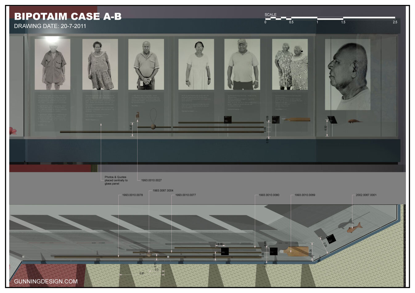
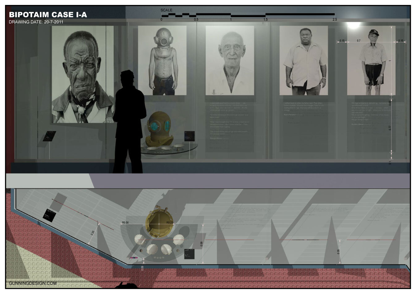
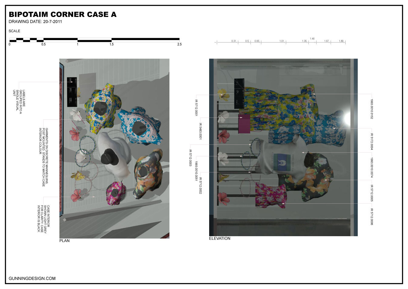
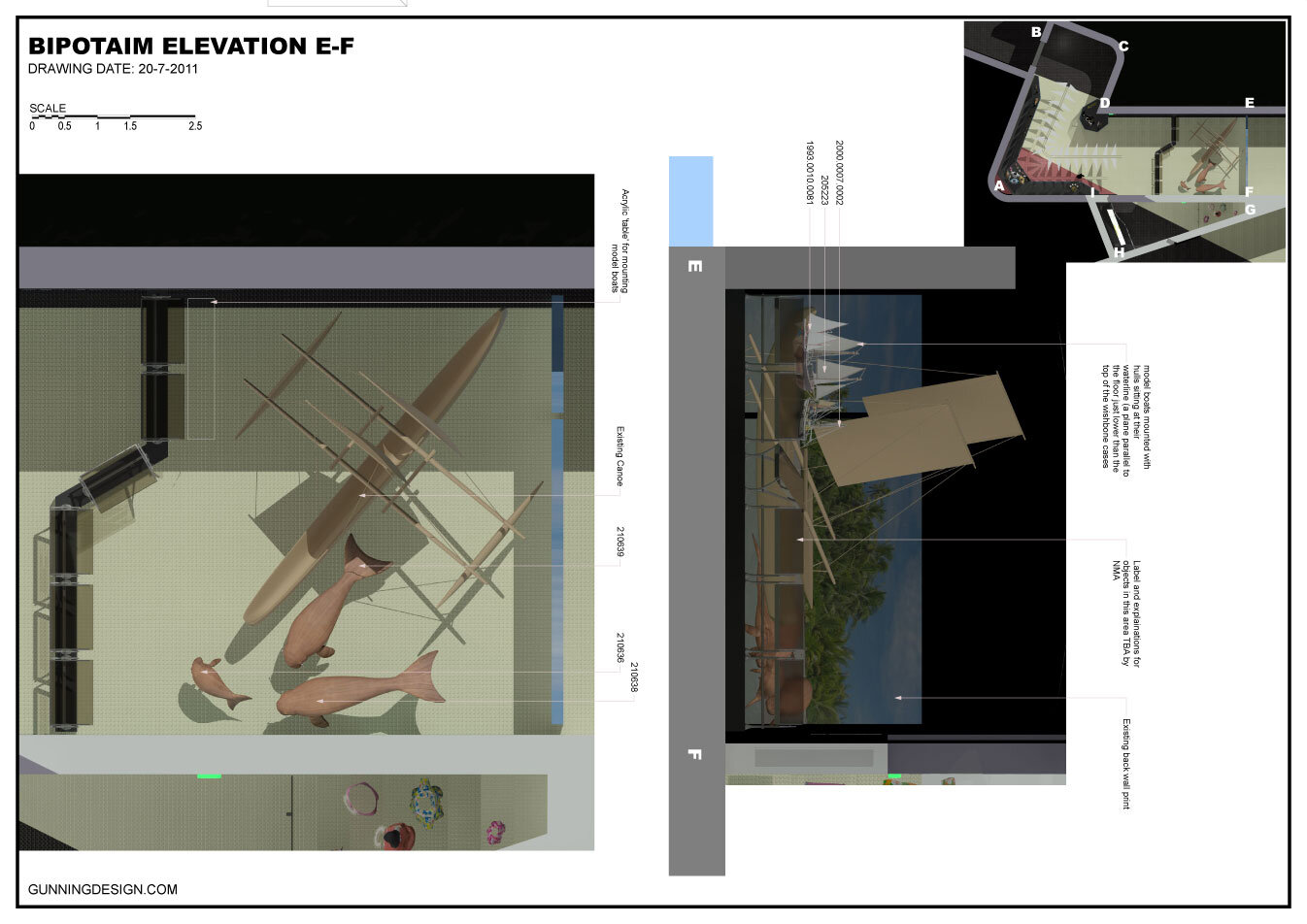
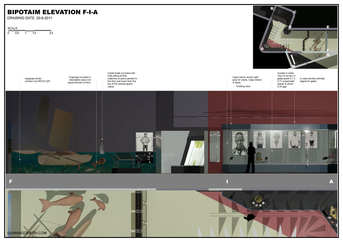
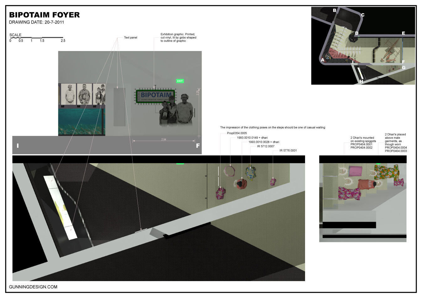
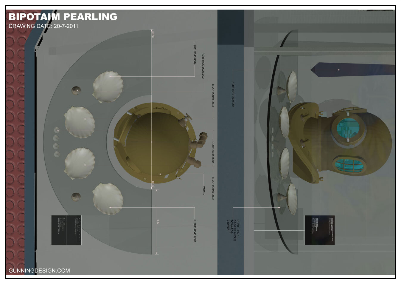
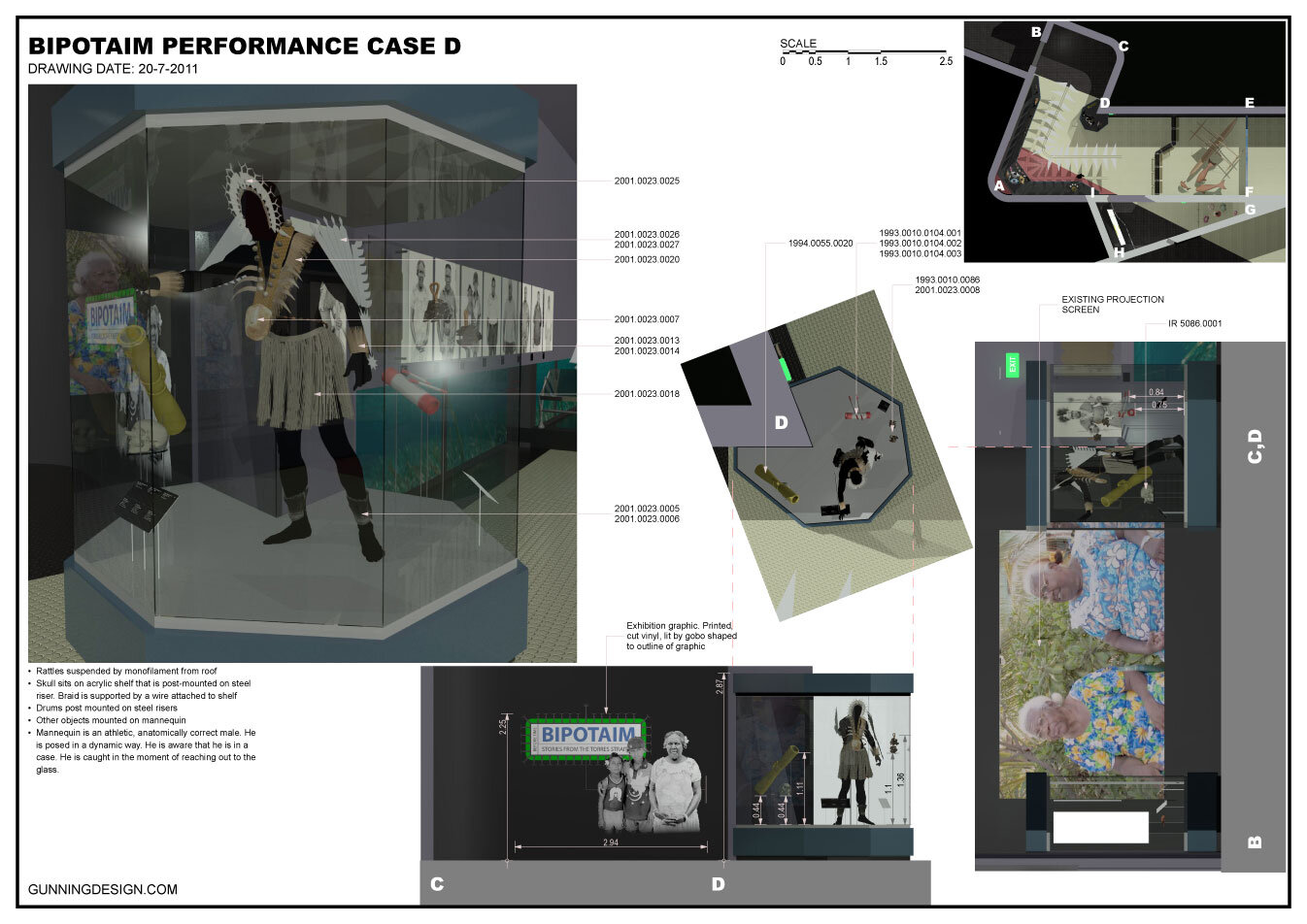
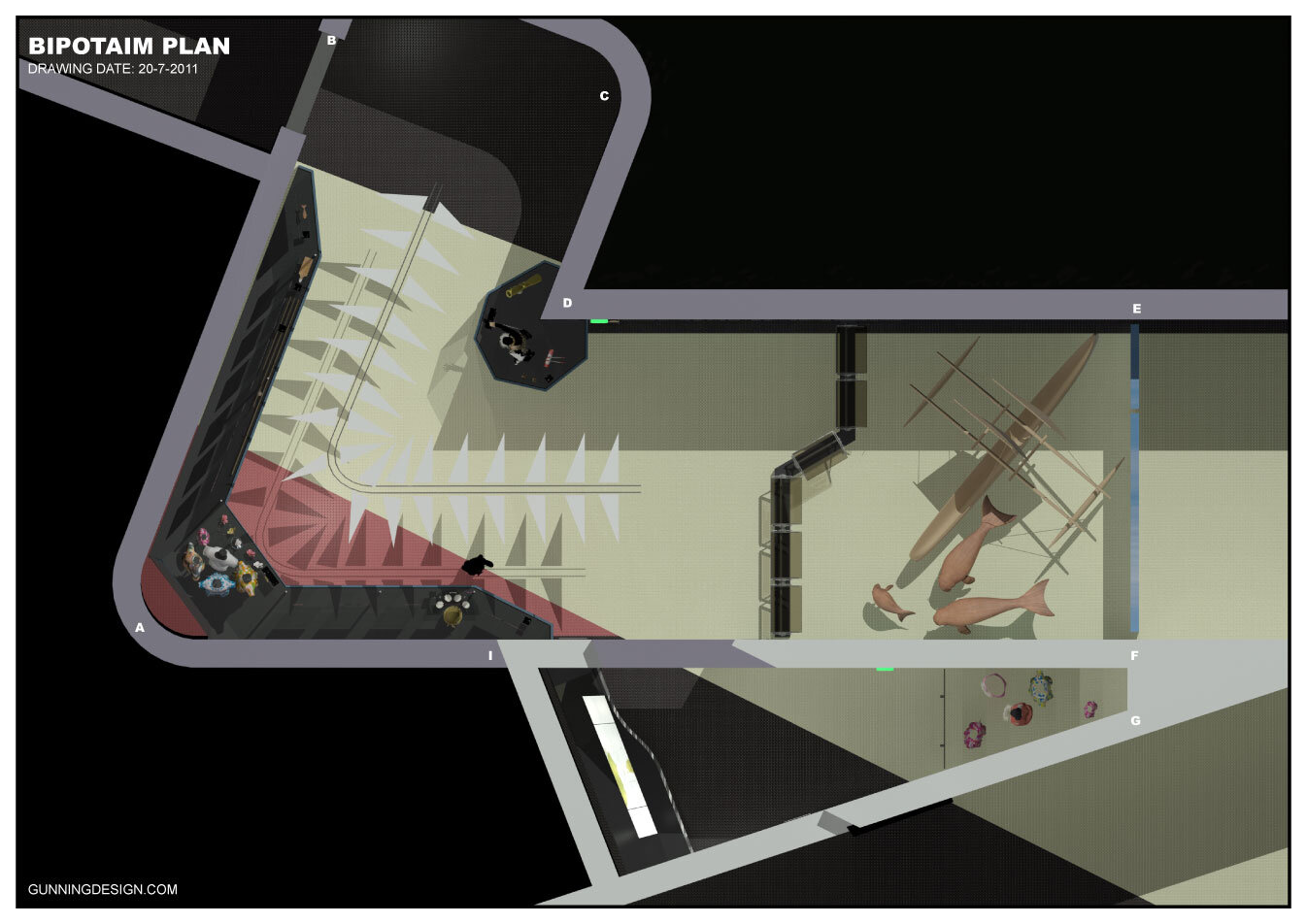

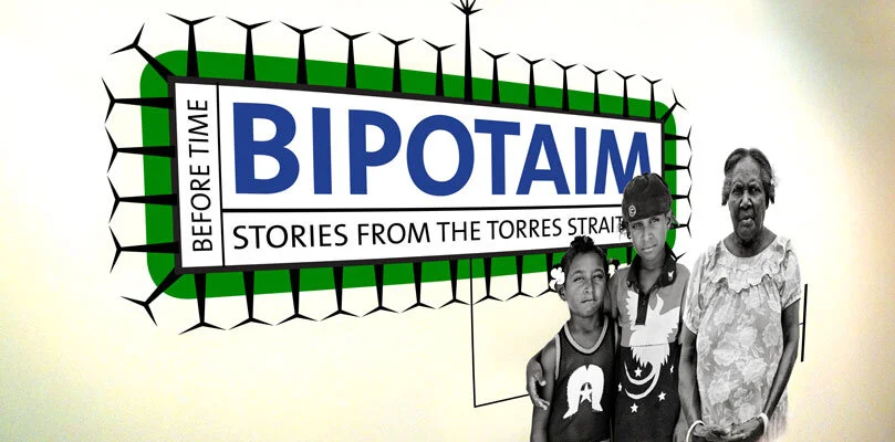
Design for a permanent Museum exhibit for the National Museum of Australia, Canberra. Bipotaim: Stories from the Torres Strait is an exhibition of striking photographs, stories and objects about the lives, culture and identity of Torres Strait Islanders.
Bipotaim means ‘before time’ in Torres Strait Creole and refers in a general way to ‘olden times’.
People from islands across Australia’s northern frontier are depicted in David Callow’s portraits. They compare current and traditional ways and practises and reflect on changes that have occurred in the Torres Strait during their lives.
The photographs in Bipotaim are complemented by objects from the National Museum’s Torres Strait Islander collections.
I did the whole process in 3D so all stakeholders could easily visualize the proposals. Because all the display objects were modelled in 3D to scale, and placed in the accurate 3D virtual exhibit space we could be very confident that the final result would have no surprises. One of the very useful moments in this process came when early renders demonstrated strong reflections from a window on the display cases. I was able to include a window treatment in the final design to cut down the light entering, and to enhance the context of the display objects. The result was exactly as per the renders. It was easy to justify the cost of the window treatment to the museum by showing renders with and without the window treatment.
Toyota Paris exhibit on the Champs-Élysées
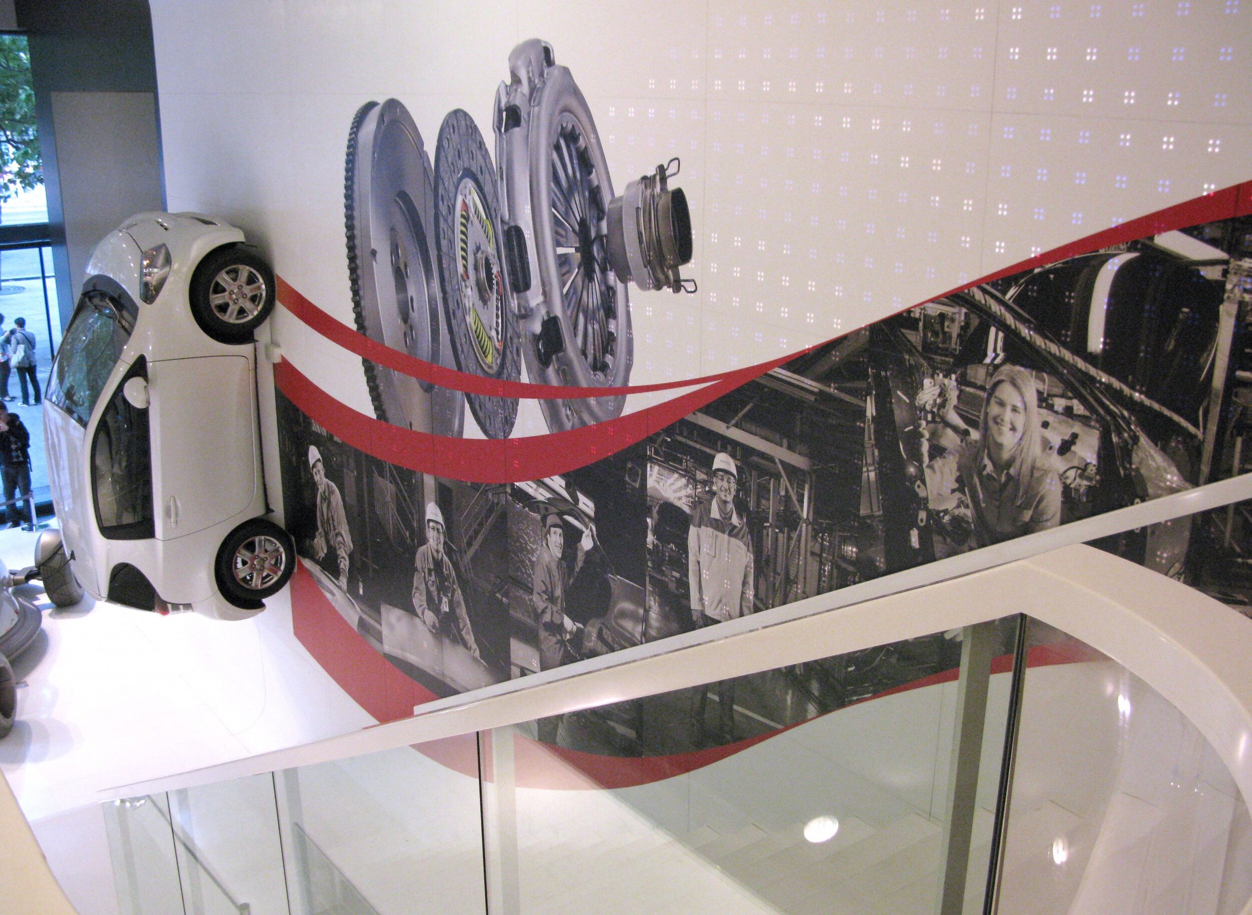
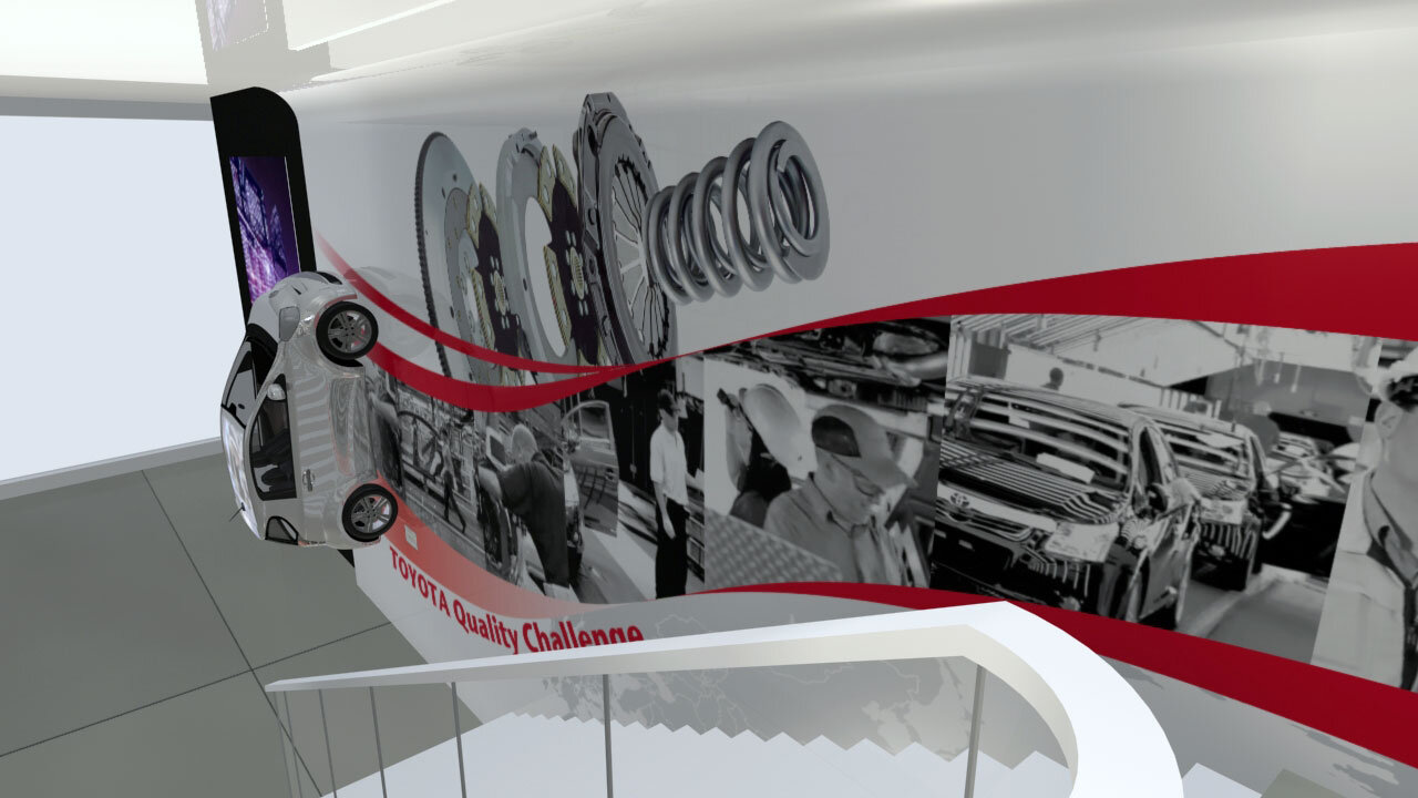
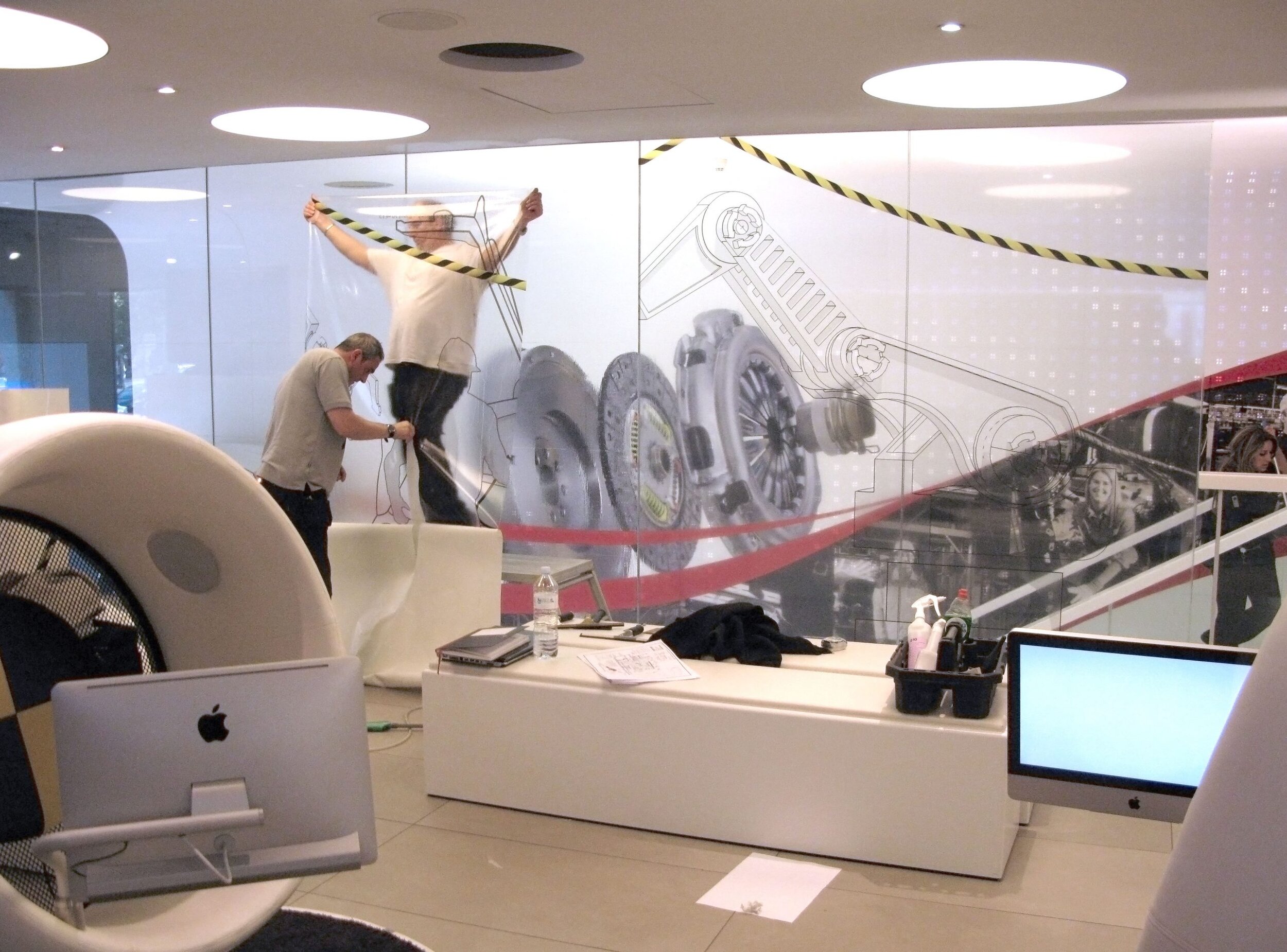
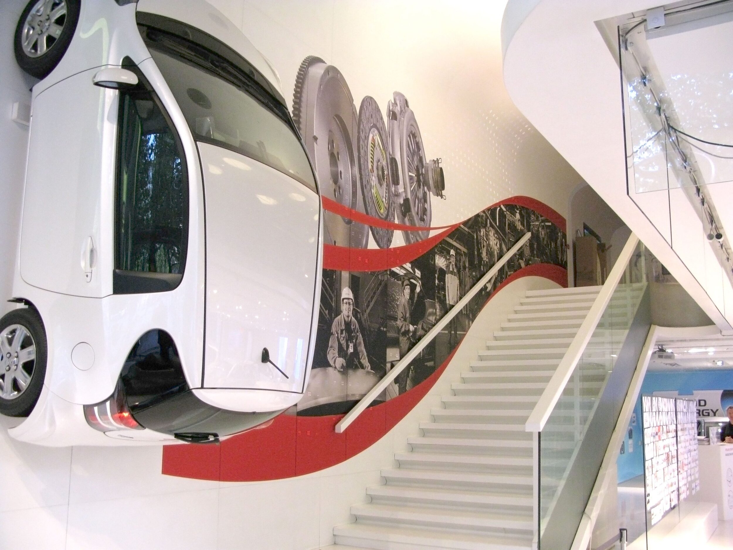
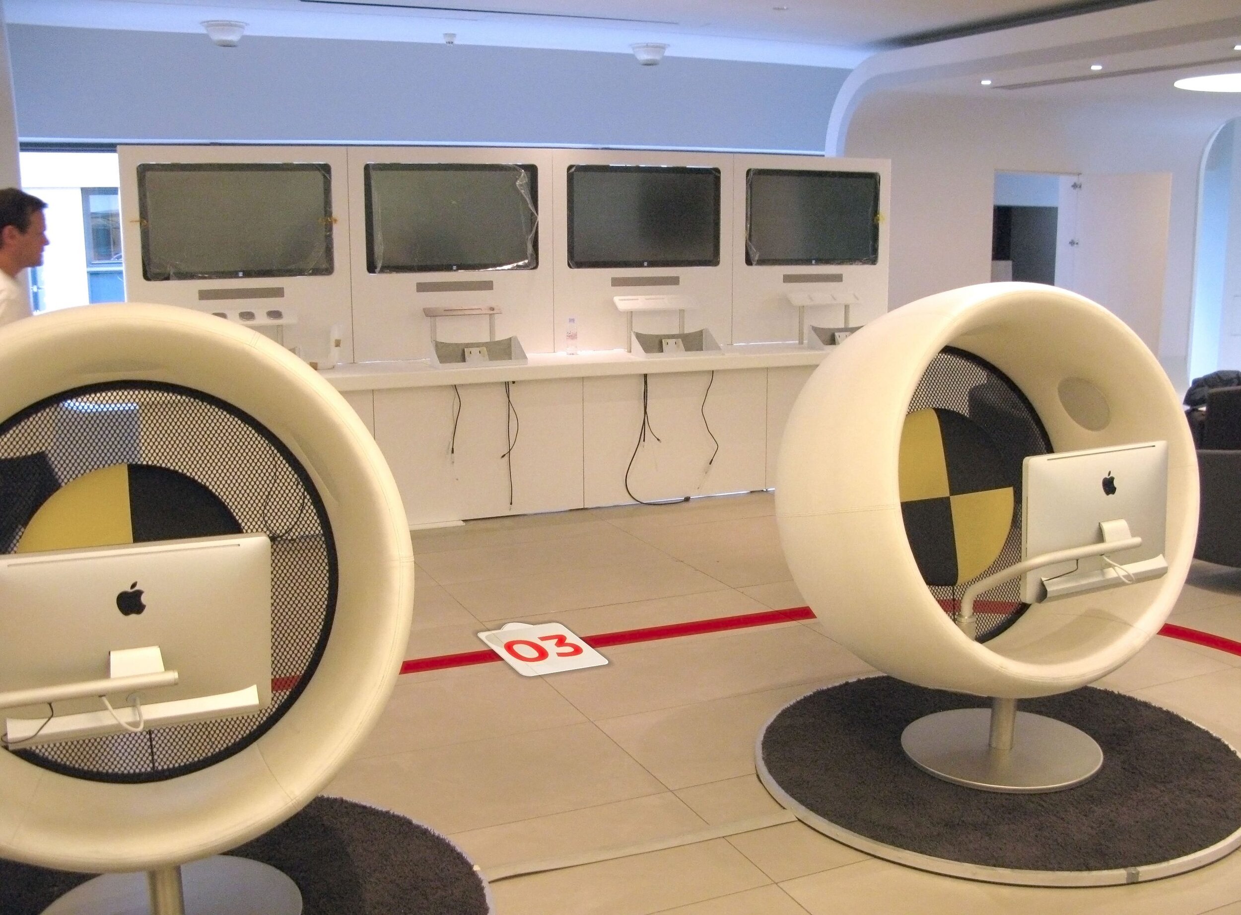
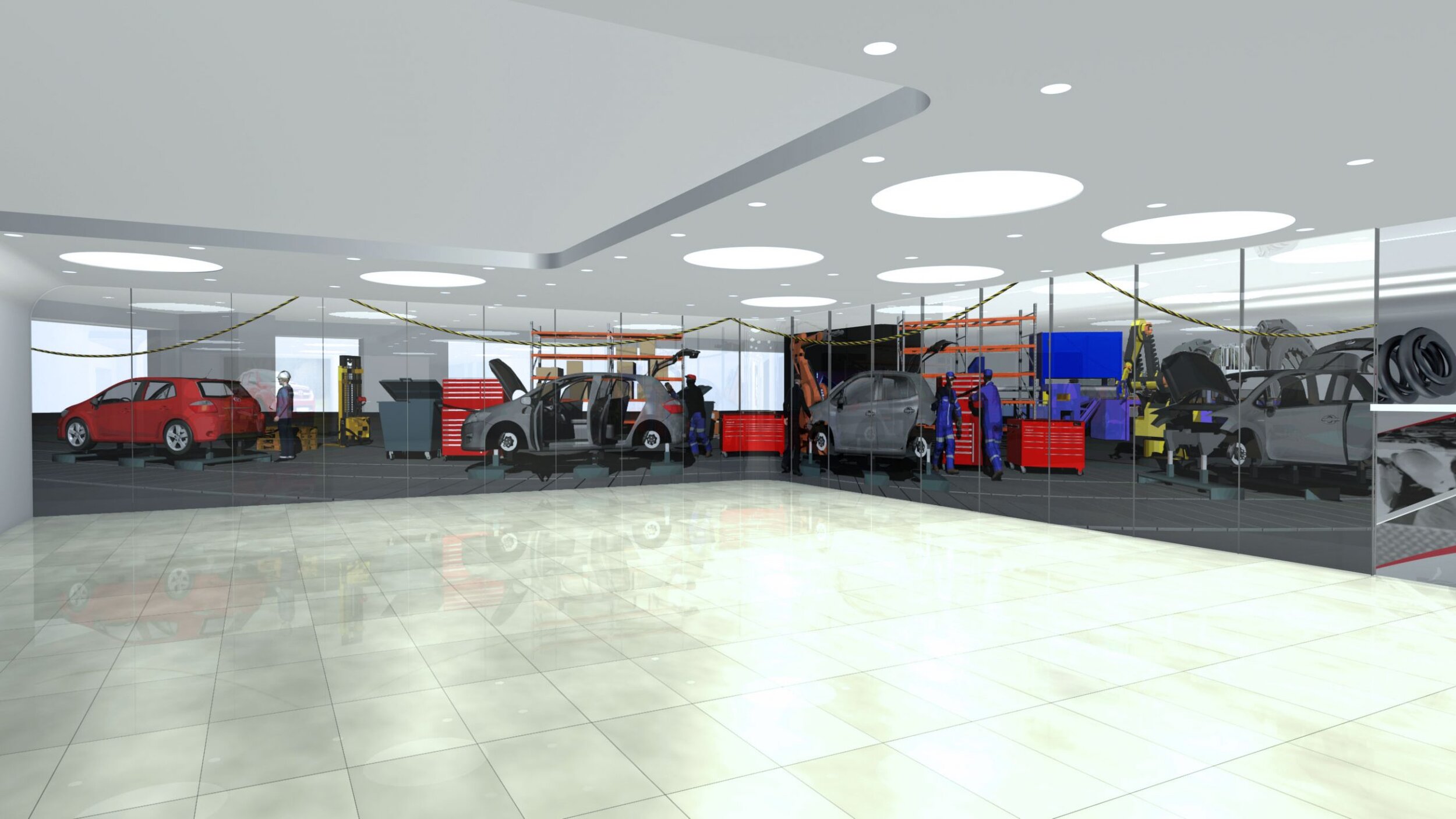
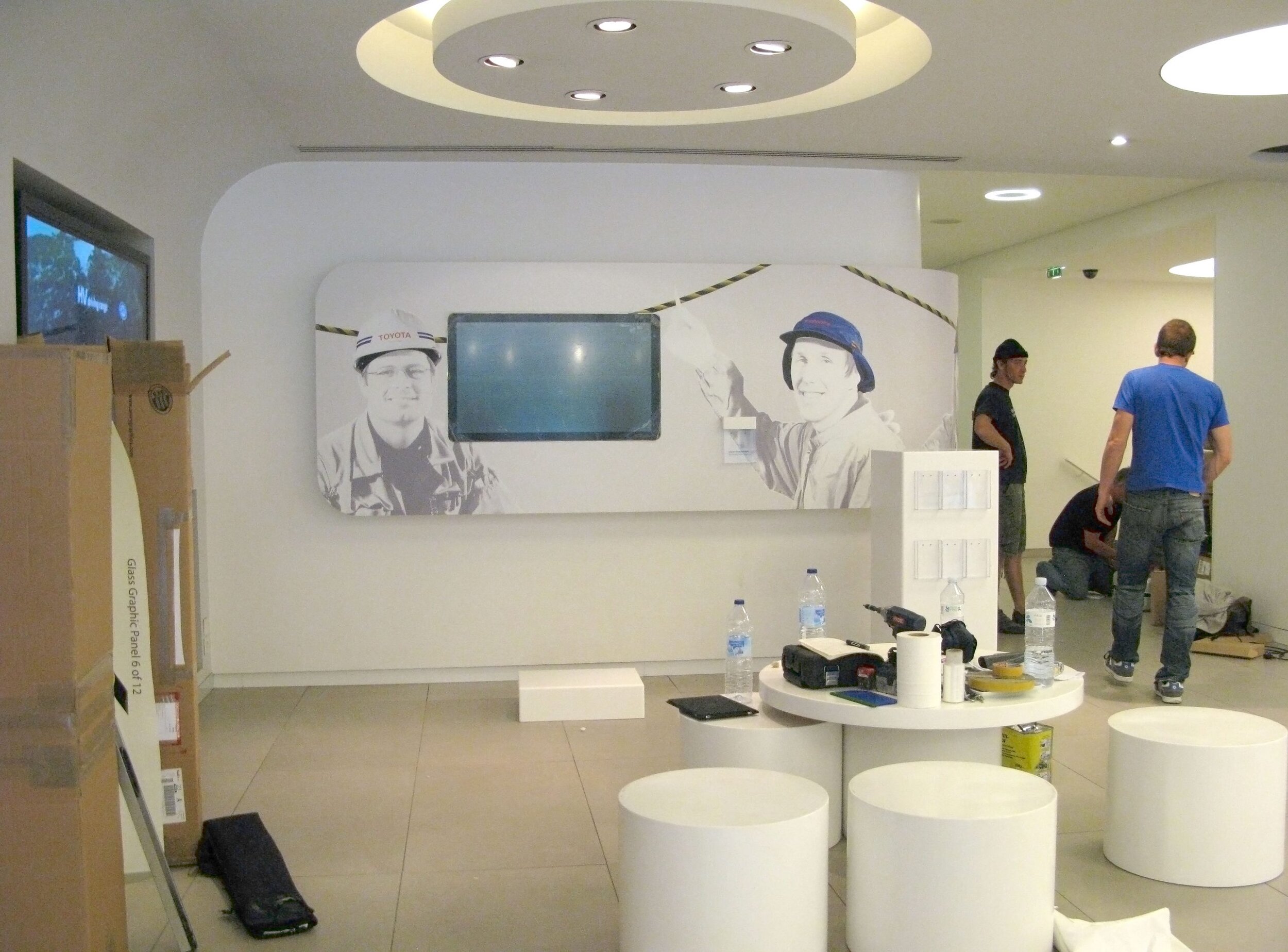
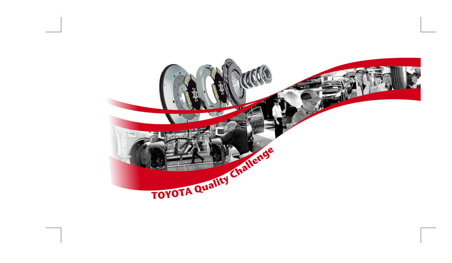
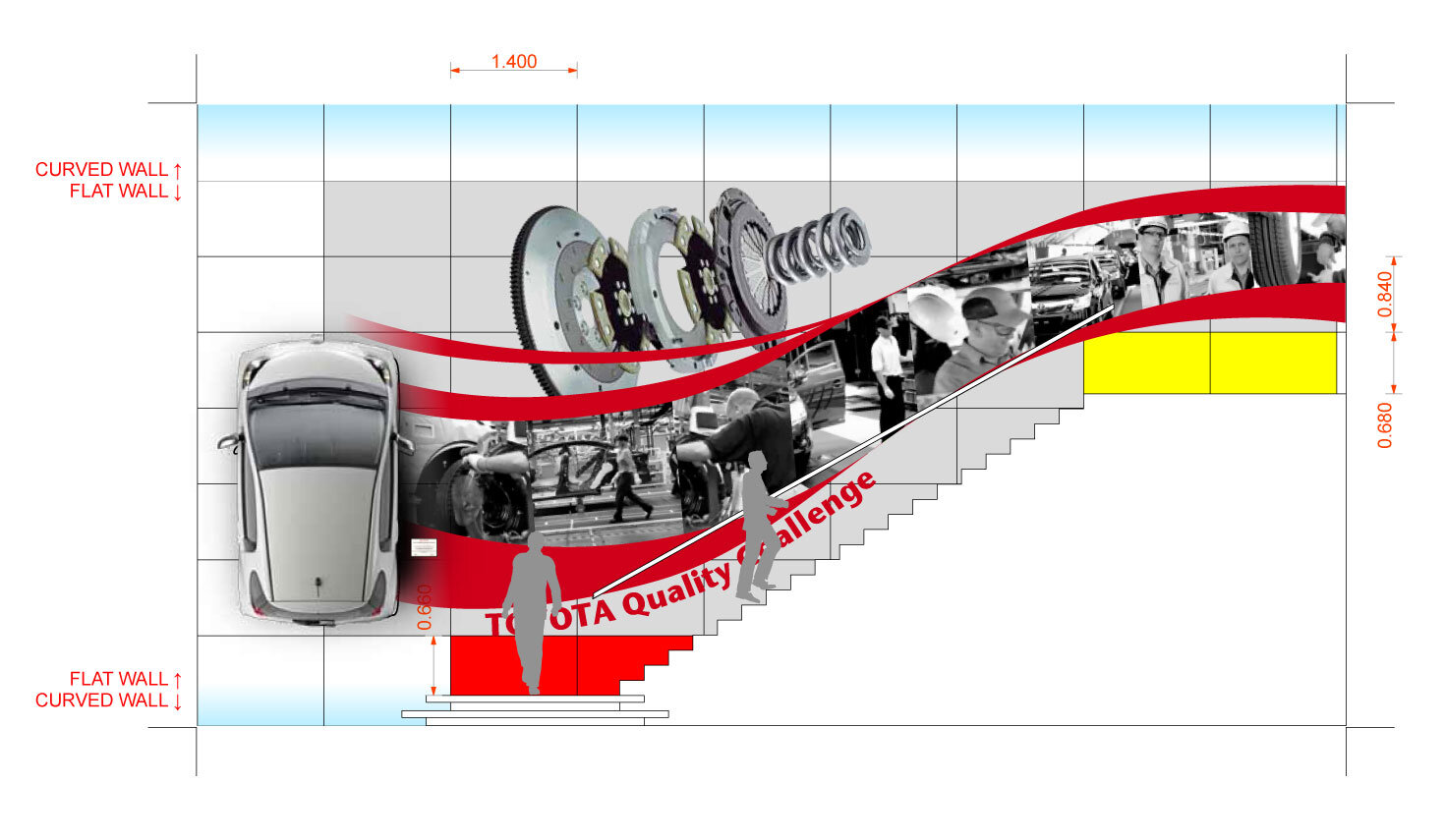
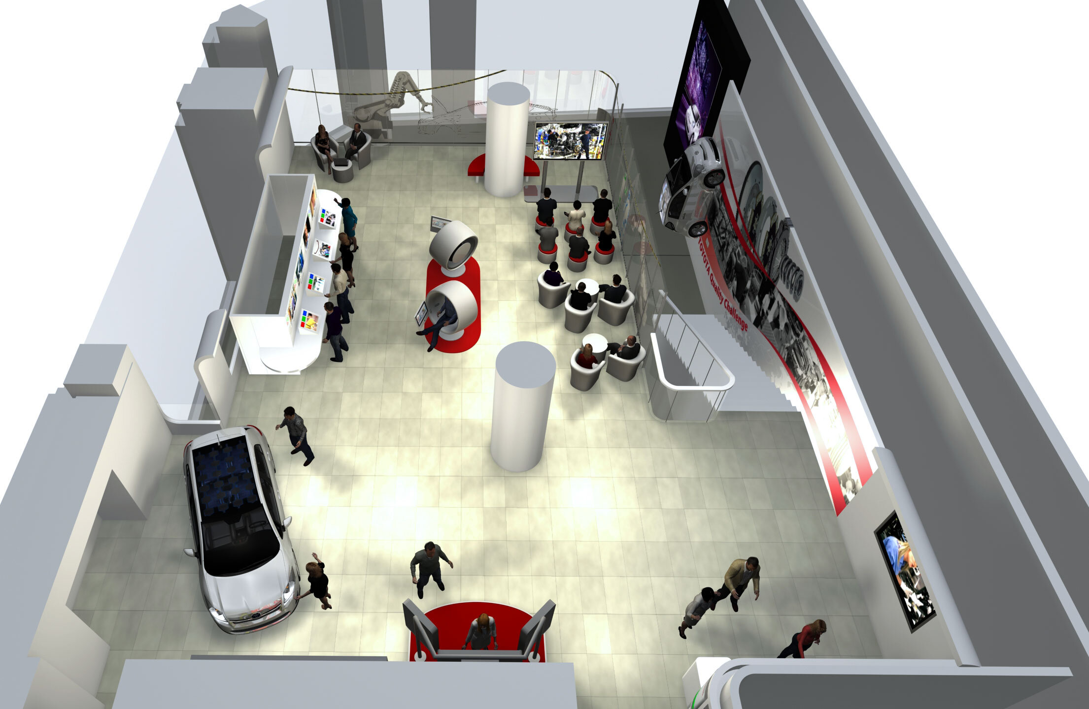
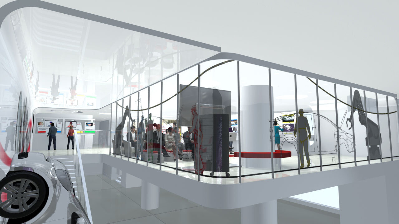
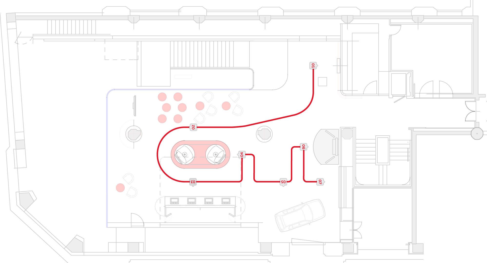
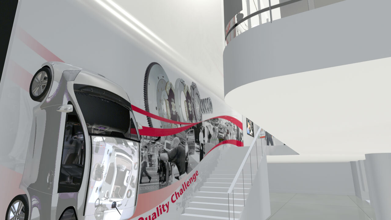
In its flagship location Le Rendez-Vous Toyota on the Champs-Élysées, Paris, Toyota wanted to create an exhibition that 'brings the Toyota quality story to life'. The exhibition space is upstairs so there is a prominent graphic on the stairs to lead the audience up there. The stair graphic reflects both the Toyota corporate style and the exhibition aim. View from the top of the stairs showing the installed stair graphic. The graphic incorporates bespoke very high-res photography of Toyota car parts to show their build quality.
Stair graphic: Beyond leading the audience upstairs, the graphic aims to showcase the Toyota quality story by displaying photographs of very large 'hyper-real' car parts and the people who make them. Appropriate car parts were obtained from Toyota for very high-res studio photography to take place. Toyota empowers its employees, to take pride in their work and output. One of the ways it does this is by use of an 'Andon cord' strung throughout their production line. The Andon cord can be pulled by any assembly technician any time they find a fault. Pulling the cord causes the whole assembly line to stop while the problem is analysed and rectified. The idea is if you can solve a problem at its source, that lifts the overall quality of the lines' output. The Andon cord is used repeatedly throughout the exhibit. It is one of Toyota's unique-selling-points. The swoosh is an appropriate element here because its overall shape fits the stairs, but its graphic dynamism is important for drawing the audience onward and upward.
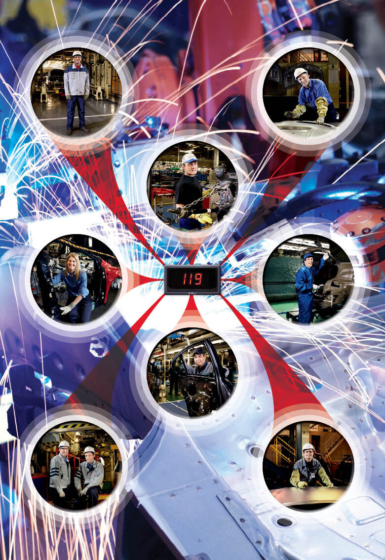
Window Graphic: The window graphic went through various iterations. The final was much more understated than earlier versions. It evokes the Toyota assembly line, shows skilled people at work, and references the Toyota factory Andon cord. (see 'stair graphic' for an explanation of the Andon cord) It also remains transparent so that the lightness of the glazed mezzanine is preserved.
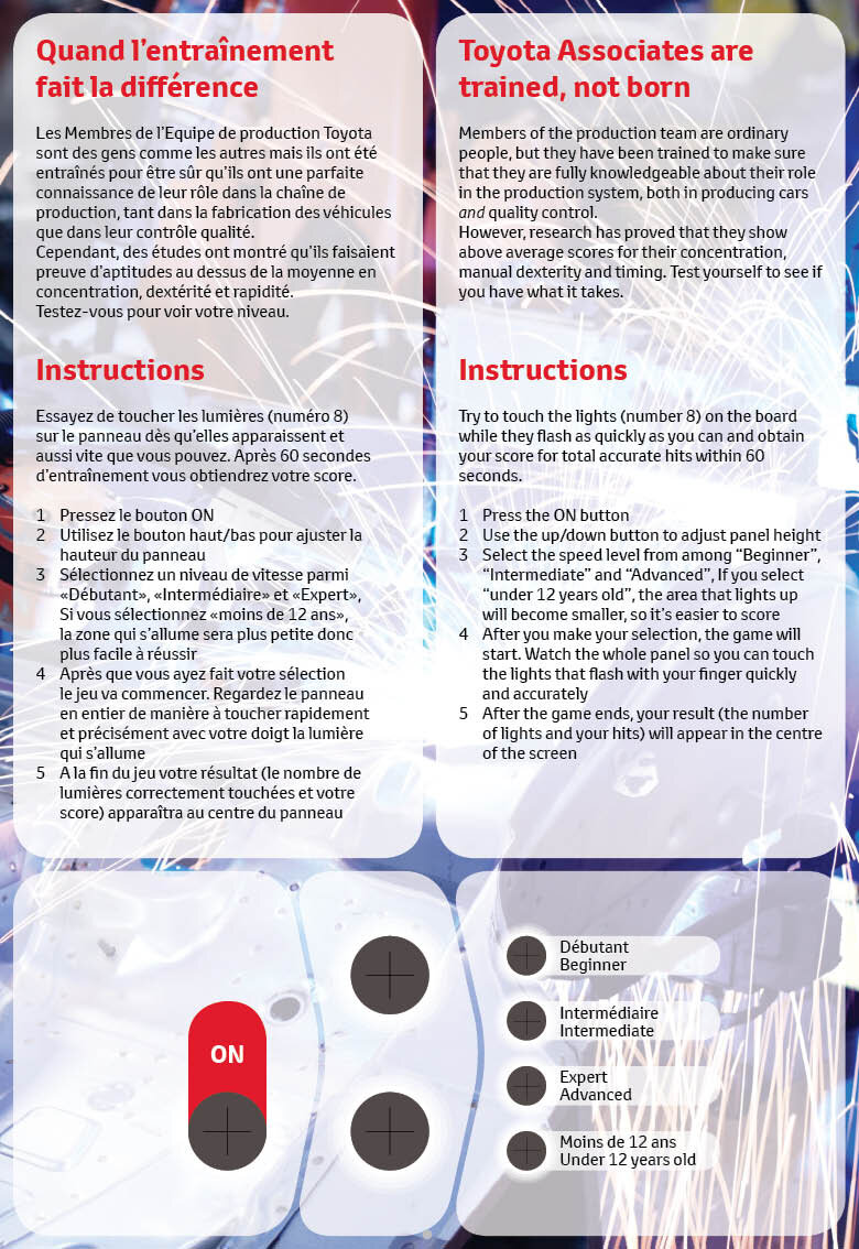
Interactives: graphics for the various interactives were done. Due to the location of Le Rendez-Vous Toyota on the Champs-Élysées, all text is displayed in French and English
Directional Signage: Although it is not really required, the exhibit does have a narrative or a direction based on the flow of the production line. To make the flow more obvious for visitors, floor graphics were conceived.
Qatar National Theatre Photographic Exhibit
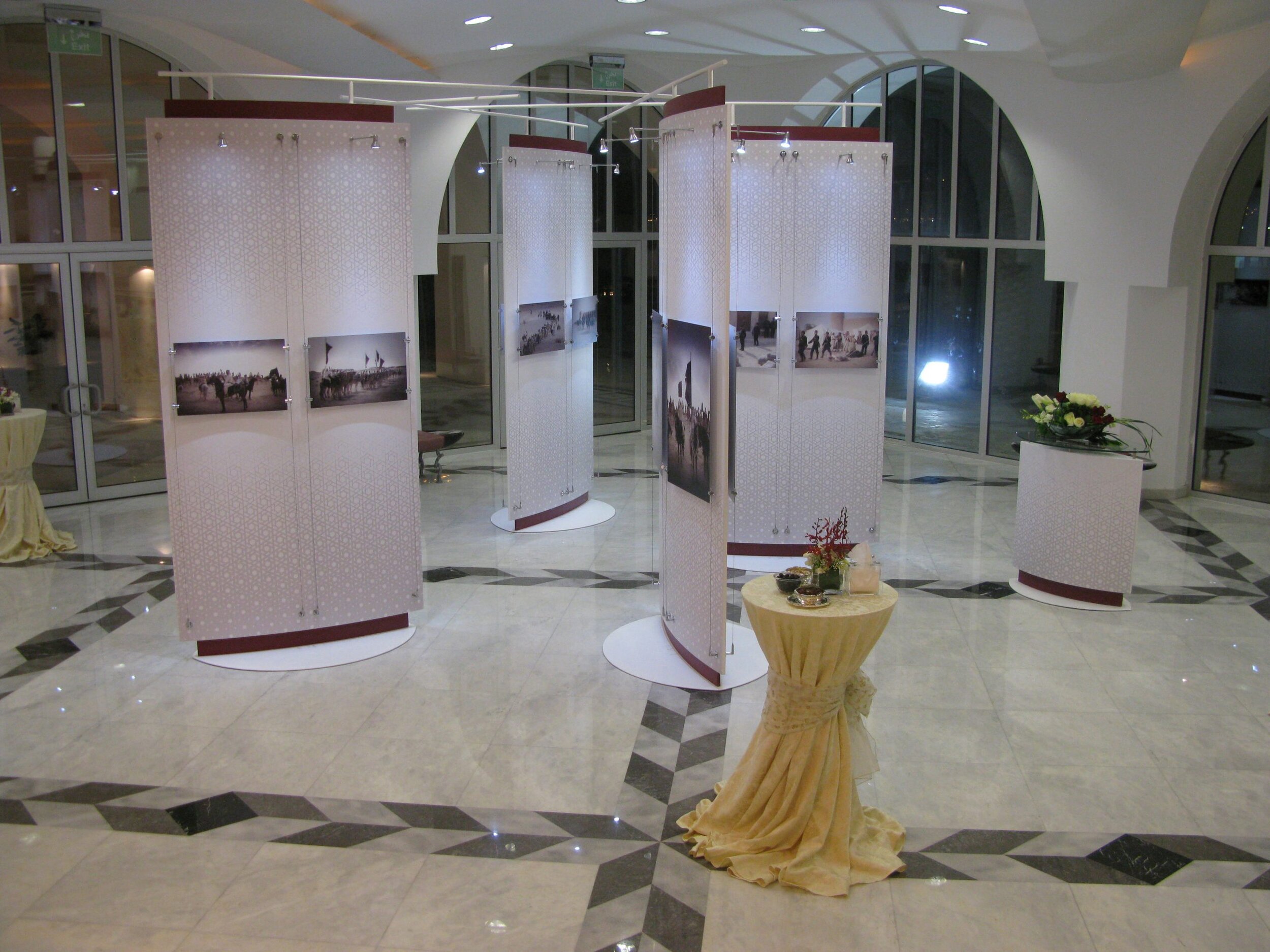
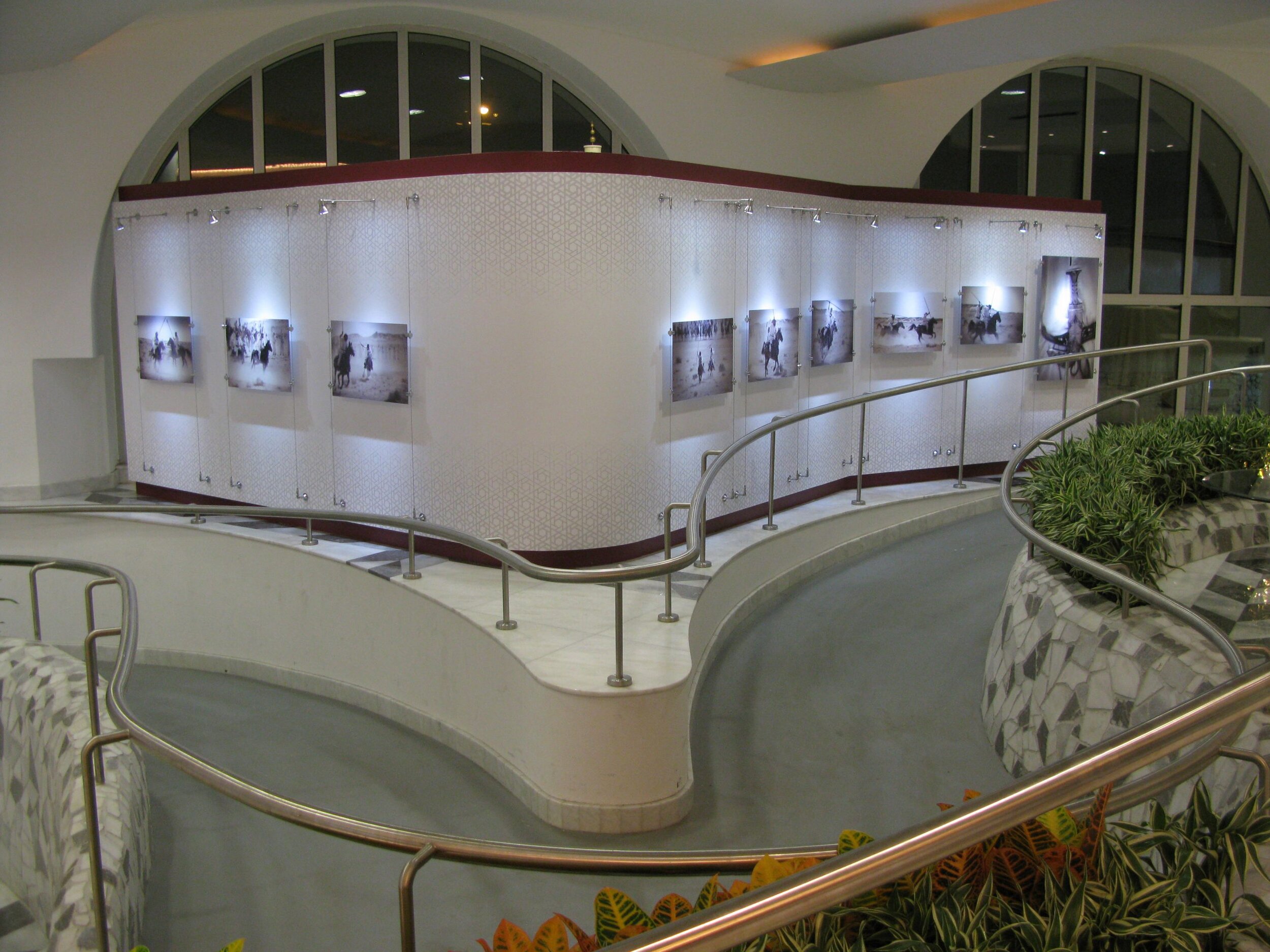
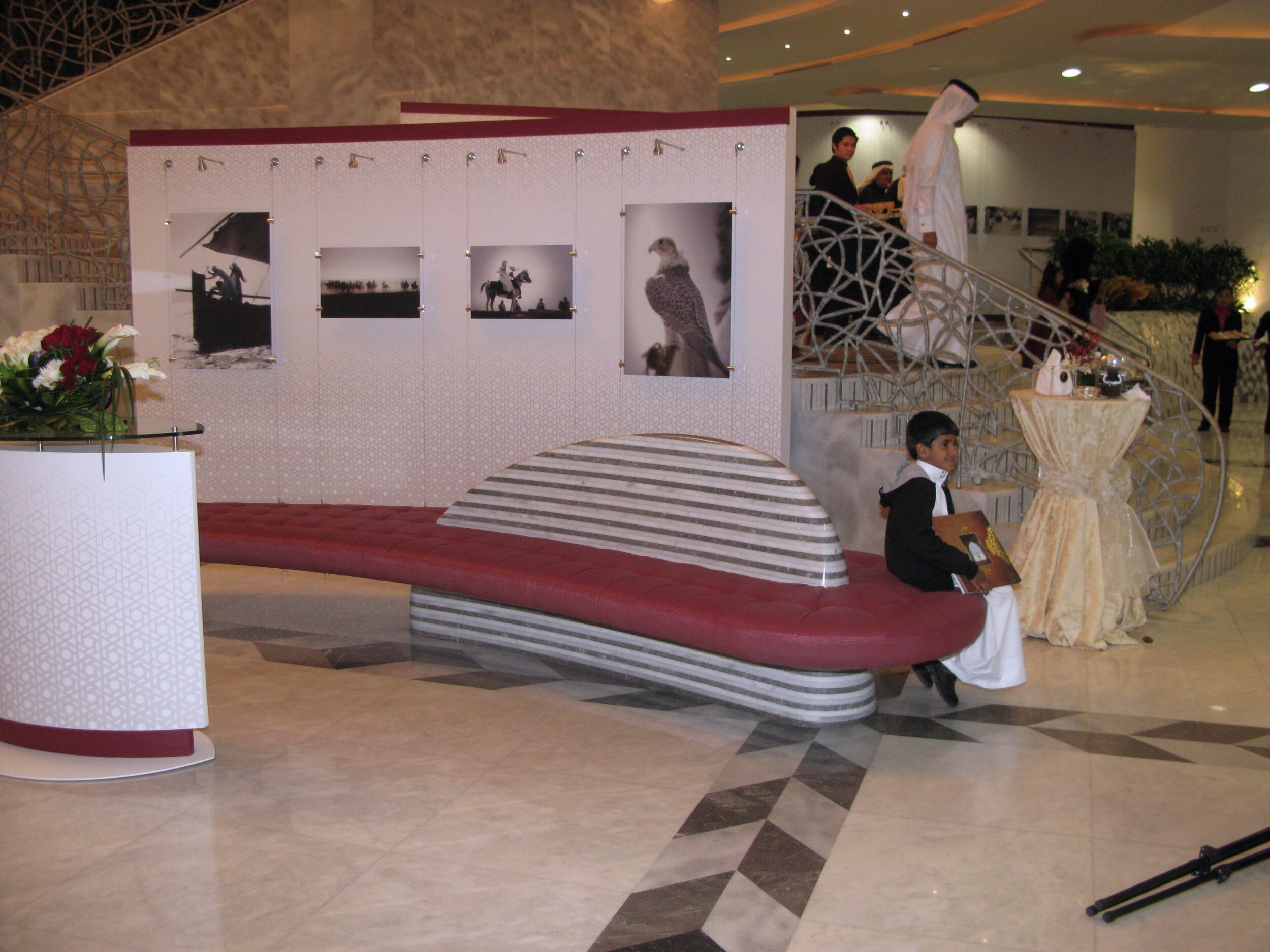
An exhibit of photographs at the Qatar National Theatre, as part of the Qatar National Day Celebrations.
The Art of Citroën
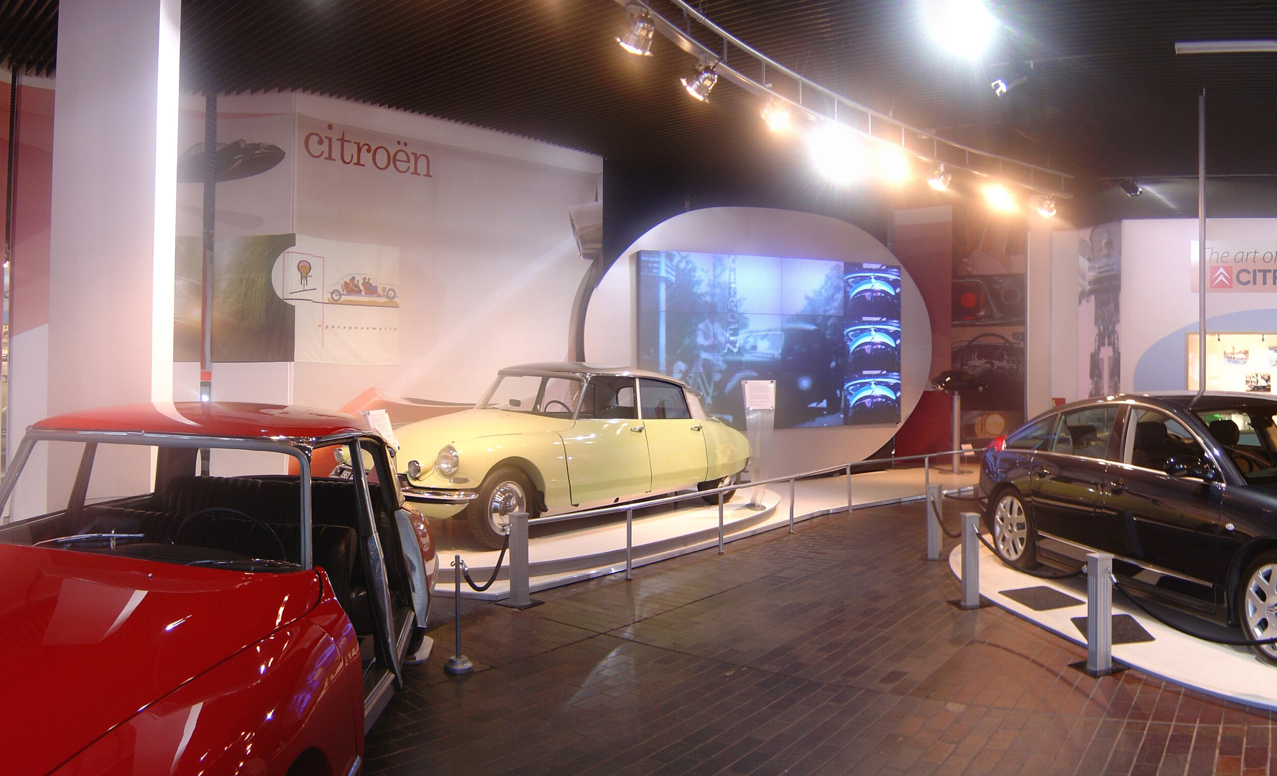
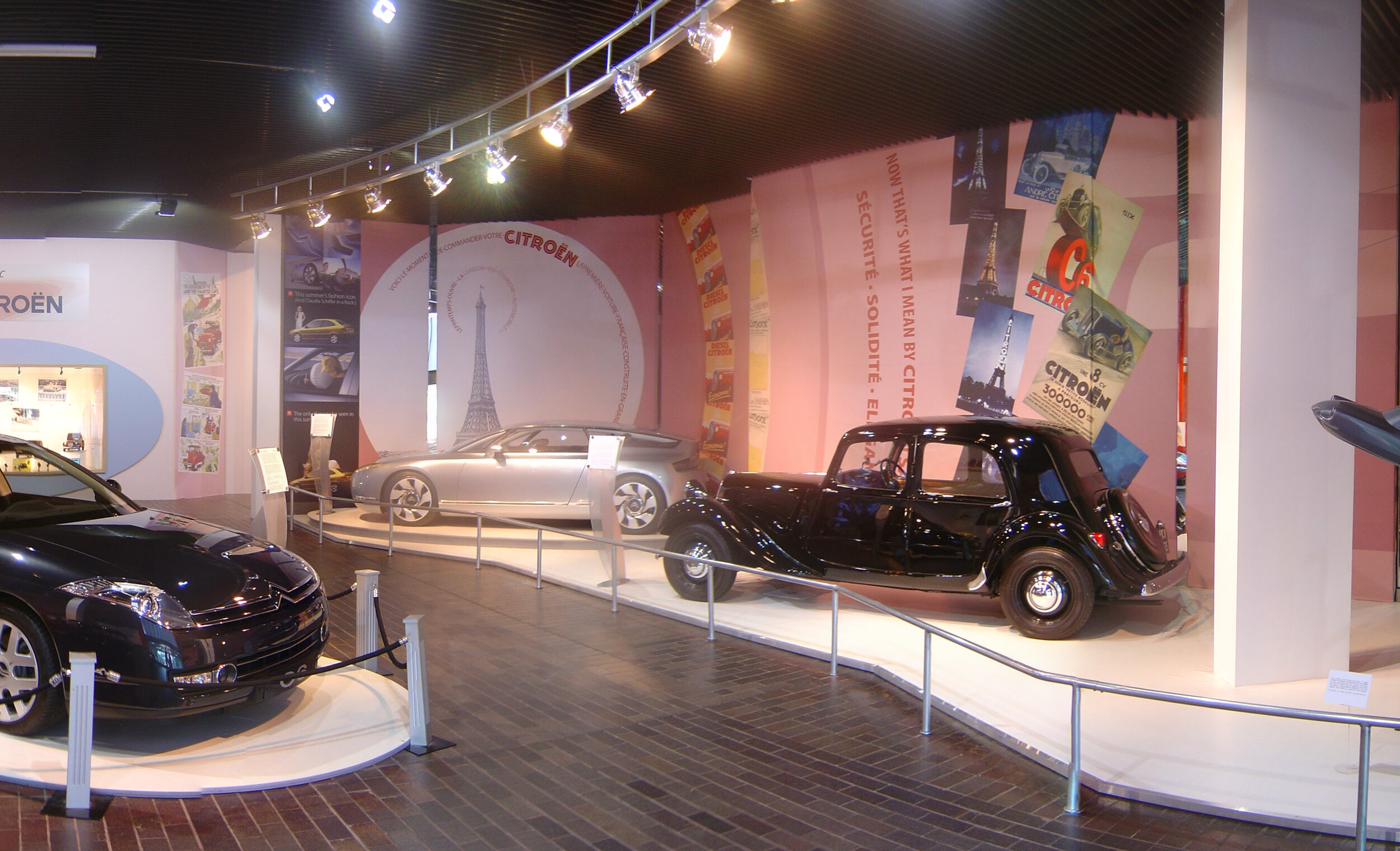

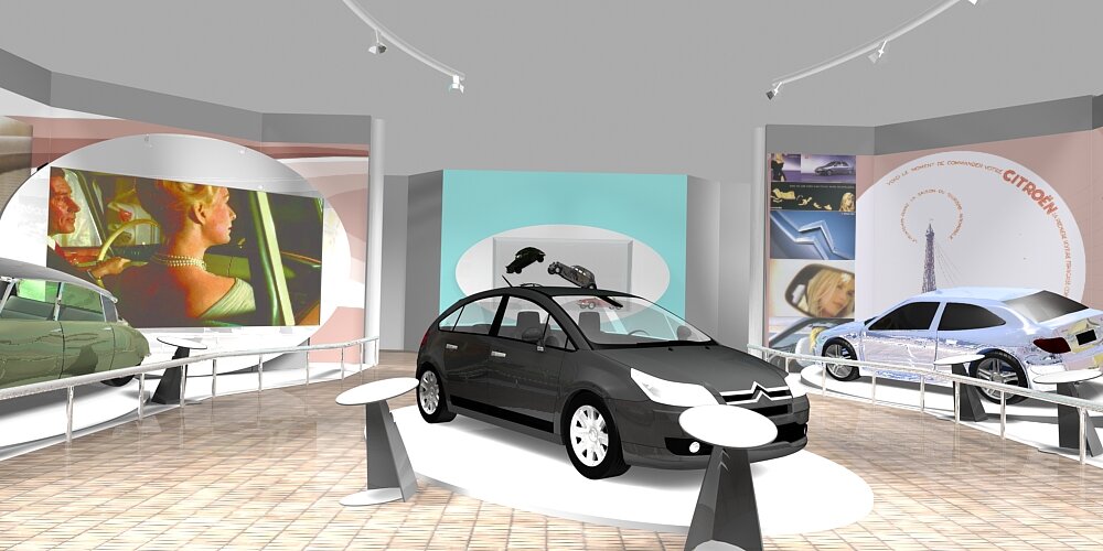
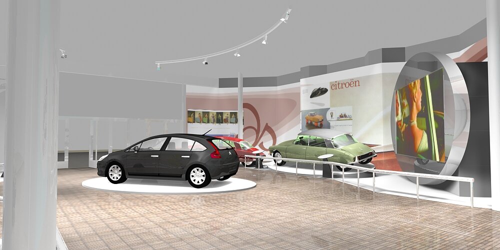

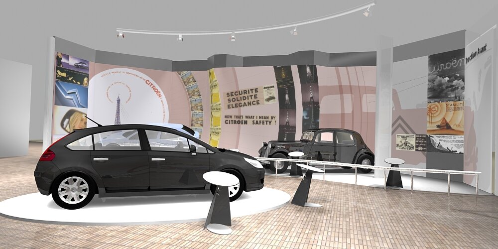
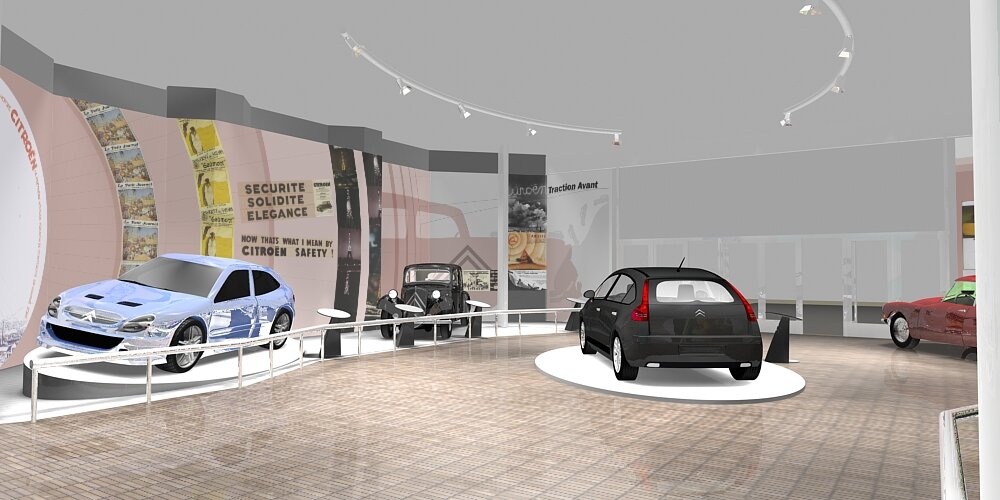
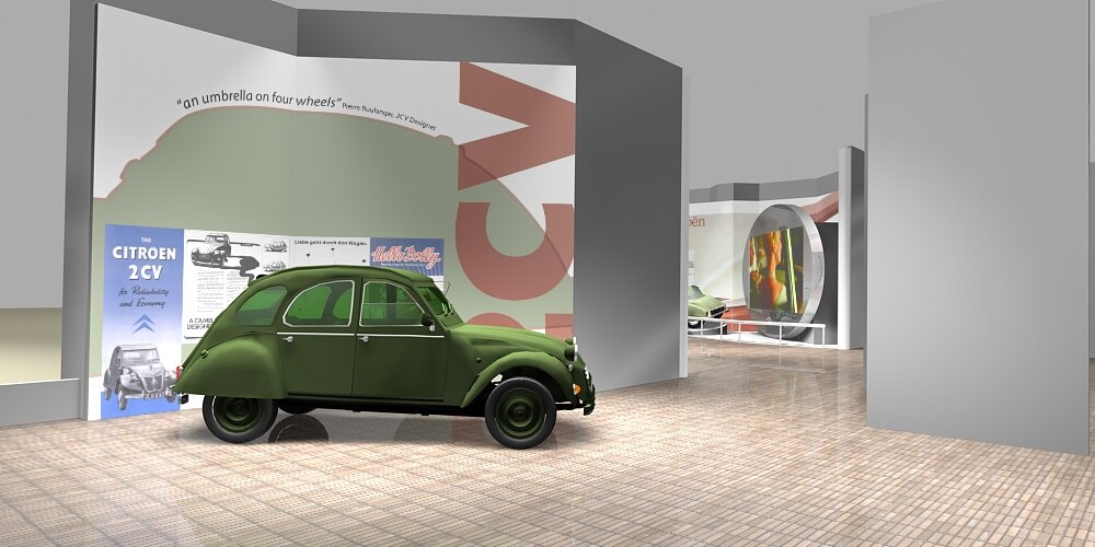
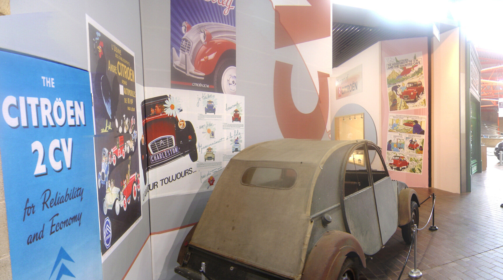
The Art of Citroën, was a special exhibition at the National Motor Museum, Beaulieu, in collaboration with the Citroën Conservatoire in Paris showcasing the history of Citroën, to the present day. The display was carefully crafted to realise the potential of the brief while keeping in mind the technical and budgetary requirements.
I was part of a three person team on the project. My primary role was to design the graphic backdrops for the exhibition, which were essential story telling elements for the exhibit’s theme.
Museum referee: Steve Lanham, Exhibitions Officer, National Motor Museum, Beaulieu
Workshop Drawings
Because we are already working to scale in 3D during the concept phase, the transition to fully detailed workshop drawings is an easy one. With these, contractors can very accurately quantify materials and costs.
Client review points
Built into all our projects is a process of client review. It’s very important for everybody that there be no surprises in a project. Regular client review at project milestones ensures that good communication happens.
Program of Build
Prototype 2CV
In the technical delivery phase of a project it is very important to have a clear idea of the critical path. Being aware of project element dependencies is vital for a high quality exhibit to be opened on time and on budget. For example In the case of The Art of Citroën, it was necessary to give the large format digital printing used for the backdrop to the show, sufficient time to dry before transporting to site. This meant the artwork for the printing had to be complete weeks before the show opened. The backdrops were installed on a timber framework as the first part of the build. Another level of complication to the on-site build was the museum remained open throughout. temporary structures were erected to allow the public access to the Museum safely compartmentalised from the work.
Onsite supervision
In the interests of excellent results, it is very important to communicate with contractors on site. Especially if a snag is encountered. The Art of Citroën build on site went very smoothly mostly due to our accurate 3D appreciation of the space.
Object conservation
Most of the objects on display in The Art of Citroën were reasonably hardy form a conservation perspective. That is not to say visitors were encouraged to touch most of them. Barriers, tensor ropes, and a glass case were used to protect sensitive objects from the public. The two exceptions to this were the centrepiece C6 and one of the DS’ which visitors could sit in.
Artwork
The artwork created for the backdrop panels is originated primarily from archival marketing material from the Citroën Conservatoire in Paris. The scale of the walls meant that some of the original posters had to be re-worked to allow them to be reproduced with sufficient quality. The backdrops were there to cover the visually disruptive walls, but also to showcase some of the very innovative marketing carried out by Citroën, especially in it’s early years.
Tender package
Our tender package for most projects includes concept renderings, cad plans, and written analysis including budget in an A3 booklet, and a stand up presentation. For this show, we also made a physical scale model because it is such a good vehicle for conveying design intent to a group of people. Sketches, cad drawings and renderings can all be misinterpreted. It’s quite difficult to misinterpret a physical 3D model.
Once the tender has been won, we move swiftly on to client consultation and the more technical aspects of the job.
TECHNICAL:
Concept refinement
Curved wall concept
With client consultation, a phase of refining the concepts into fully detailed studies of the exhibition takes place.
Design development (rendering, card models, presentation panels)
To-scale cad plans are drawn. These are worked up into 3D renderings. The renderings and cad drawings are used to refine the concepts in an iterative process to arrive at reasonably accurate representations of the exhibition concepts.
Marketing role
As is often the case, we came up with the name of the show.
The Project
The National Motor Museum attracts Motoring enthusiasts and their families from all from all over the world. They also attract a large number of students from the UK and Europe. Commercially the Museum is also used for functions.
Physical Environment
The entrance lobby is the primary space for changing exhibitions at the National Motor Museum. Because it’s the entrance to the museum, there is a lot of natural light, due to large windows, and a long row of glass doors. It’s a high visibility area, and creates a first impression for the Museum visitor.
Budget
Like exhibitions at most museums, The Art of Citroën had a very tight budget. Although the budget was a real constraint on the creative side of the project, we delivered a display that enhanced the museum visitor experience, and told engaging, multi-faceted stories about the marque.
The £138,000 project was funded partly by the National Motor Museum, and partly by the Citroën Conservatoire in Paris.
Lighting
lots of natural light due to the glass entrance doors and windows. The space graduates to low levels of natural light towards the back. The objects on display – cars primarily, need a certain amount of theatrical lighting to make them really pop. Hanging points for truss lighting, and lighting circuits were available.
Art Direction
We sourced images and video to support the overall ambiance of the visitor experience.
People flow
Careful consideration of people flow was required due to the siting of the exhibition primarily within the entrance lobby to the museum. Very clear delineation between exhibit space and public space. While providing clear flow for visitors heading further into the museum is important, it is also important that interstitial spaces be provided for visitors to dwell and examine the exhibition.
It was a requirement of the project to allow large groups of French school children to view the exhibition.
Air-conditioning
Heat generated by lighting, visitor numbers and AV equipment were taken into account with the building services.
Assessment of response / other considerations
Client review presentation
The intention here is to fully represent the exhibition so that all players can appreciate exactly what it will look like once complete i.e. there are no surprises.
Education material (brochure, exhibition texts, video, archival advertising material)
We researched, wrote, created artwork for and arranged printing for all the exhibition texts
The educative material included wall texts, the archival material reproduced on the backdrops, a loop video of advertising and technical explanation material, and a print brochure.
Delivery (project management)
CREATIVE:
Preliminary concept drawings
A phase of discussion around the brief and surrounding material, and concept sketches to make real the creative ideas is our usual method of proceeding with a project.
Promising ideas recorded by sketches are taken to the next phase


