Exhibit, Event, Graphic, & Product Design.
I’ve worked on a lot of events, both large and small. Projects include: Diamond Jubilee Pageant, Qatar National Day, RSA Conferences, Centenary of the UK Territorial Army, and multiple horse based extravaganzas.
Graphic Design is an element present in most of my projects. I have also done projects where Graphic Design was my primary role. I’ve designed books, posters, maps, pitch documents, flyers, set scenery, building wraps, and advertising.
I trained as a product designer so I also do that. Most often developing bespoke parts for exhibitions like object cases, or display plinths.
I’m a multi-skilled designer with 31 years experience. In 2016 I moved from New York City to Sydney Australia. I’ve designed exhibitions ranging from museum exhibits to car launches across the UK, Europe, Middle East, Australia, China, and the USA.
I’ve worked on projects for the Queen of England, the Emir of Qatar, Microsoft, Intel, Ford, Nissan, Toyota, Audi, Volkswagen, Acura, Citroën, Skoda, Nokia, Bonhams, UK National Motor Museum, The Wallace Collection, the National Museum of Australia, and the Australian Museum, to name a few.
Scroll down or choose a category of work to view:
North Sydney Art Prize installation at the Coal Loader
I helped two artists, Annelies Jahn & Jane Burton Taylor with their installation titled ‘Bed Chamber’. I designed and built a square hanging system for the artists works. The space was challenging to work in because it had a very high ceiling and earth floor and rough rock wall. I started by lidar scanning the room to give us an accurate base 3d model to scale everything to. I designed and printed bespoke corner junctions for the hanging system. The system was designed so we could work on lighting and installing the drapes near ground level, and then raising the hanger to it’s 6m display height.
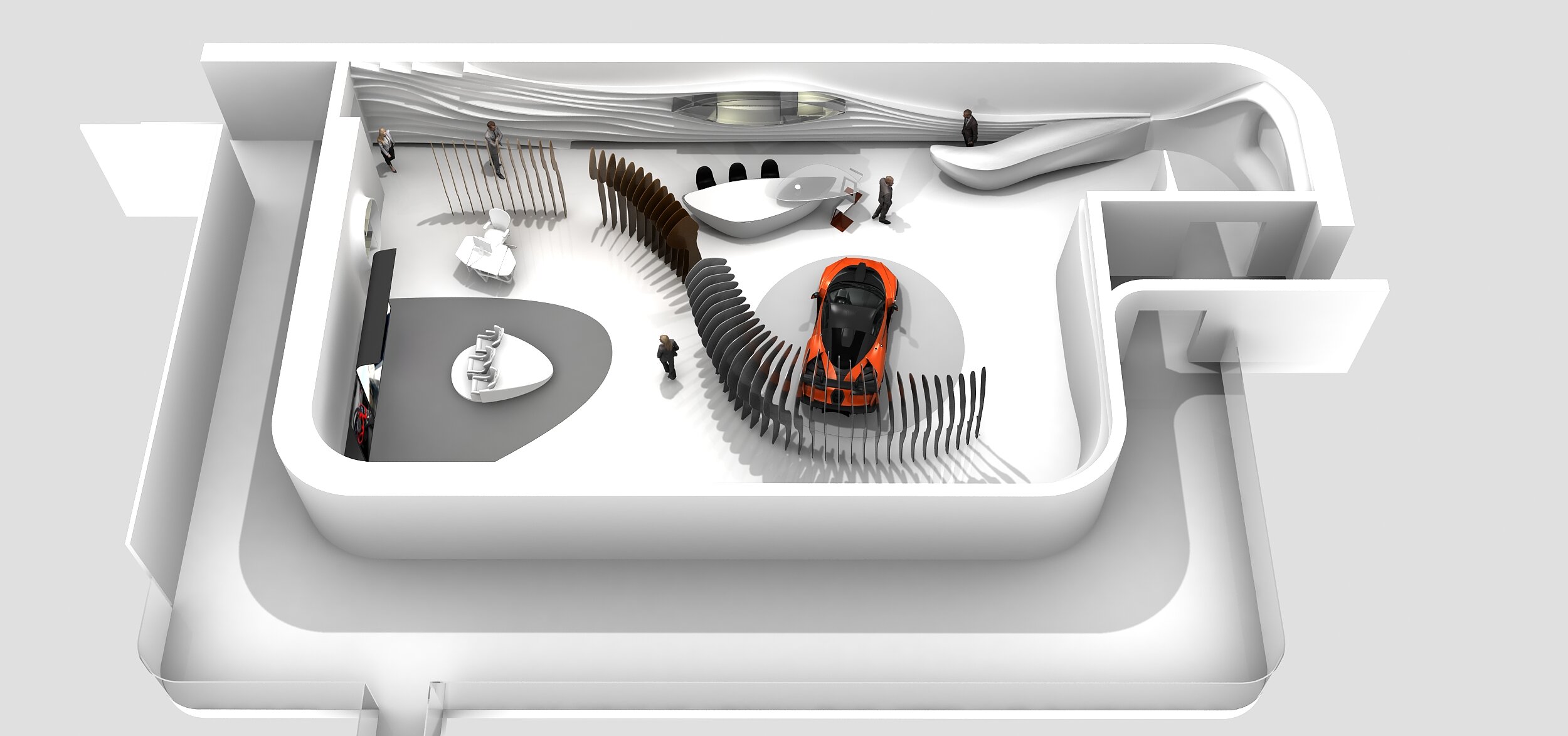
Exhibition stand for McLaren
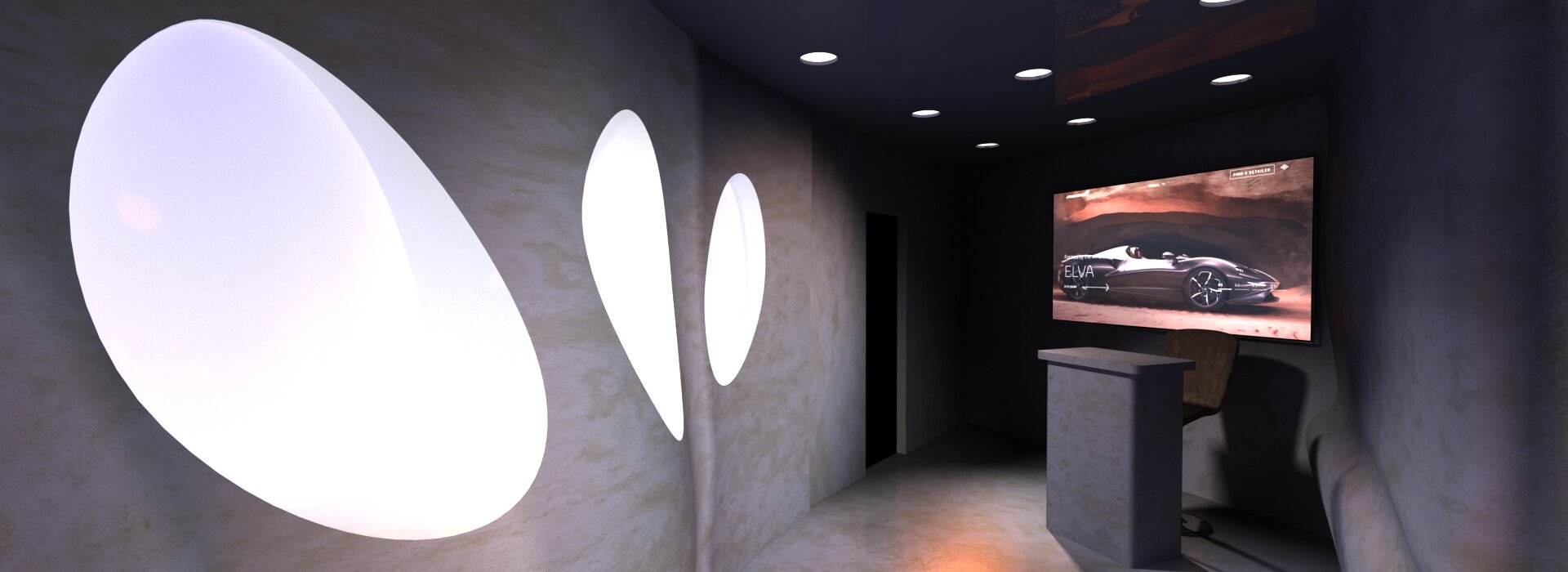
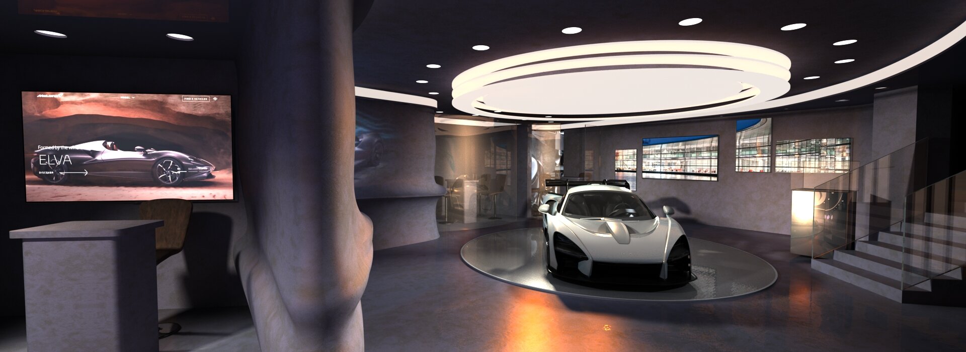
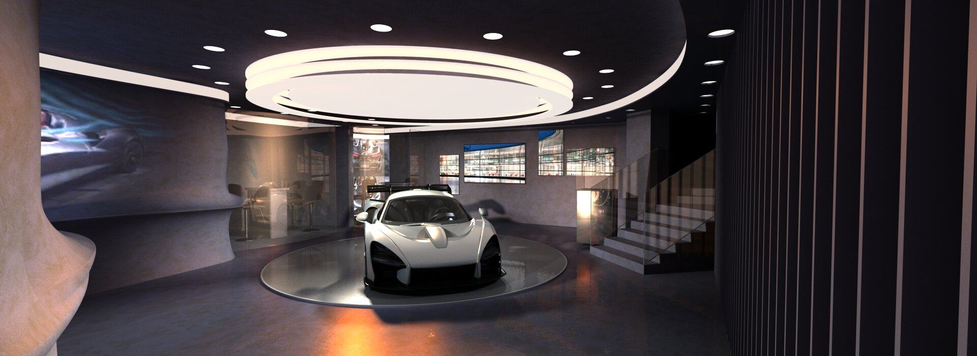
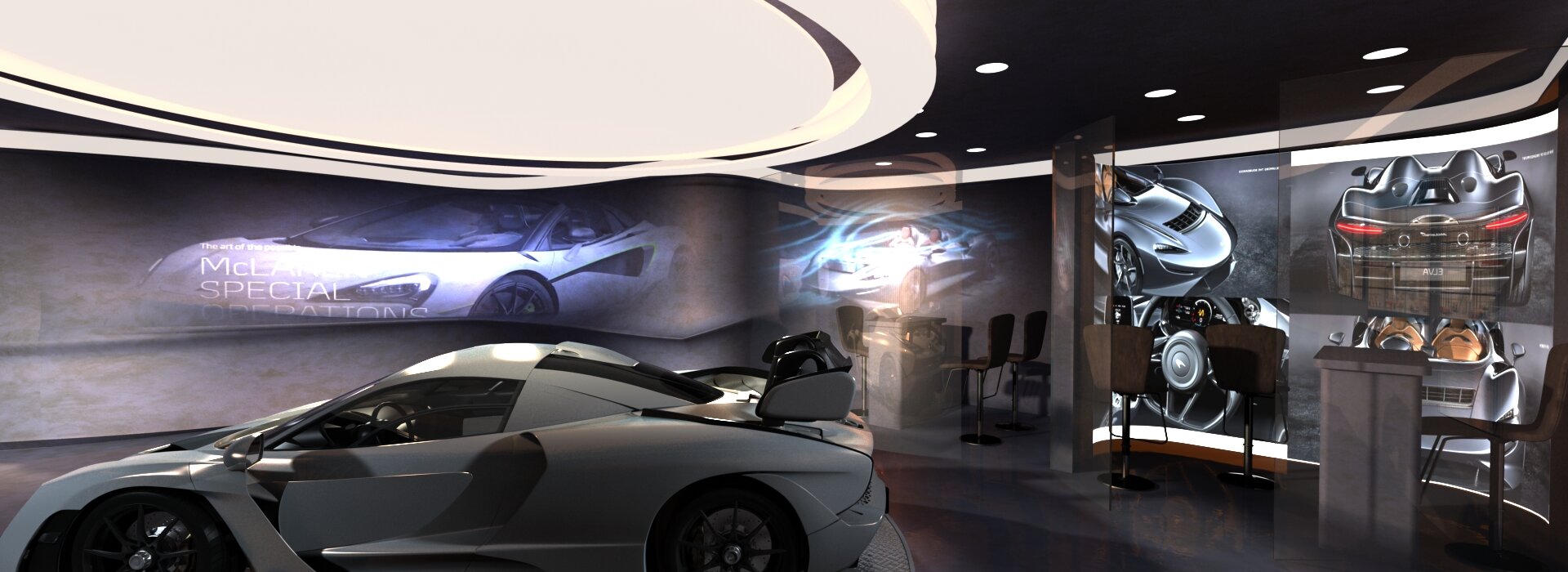
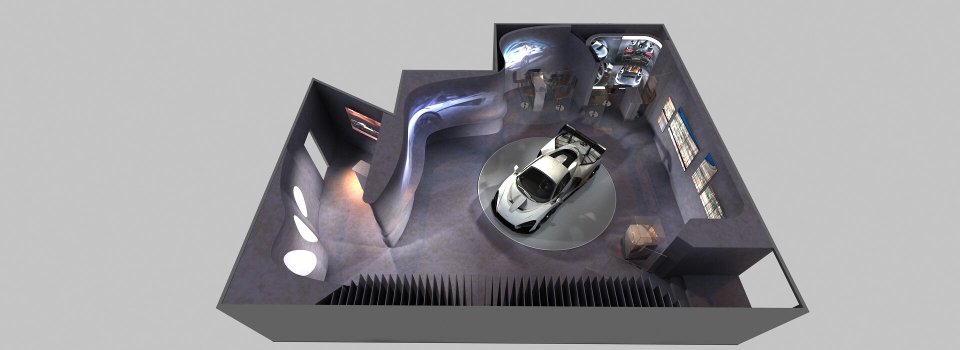
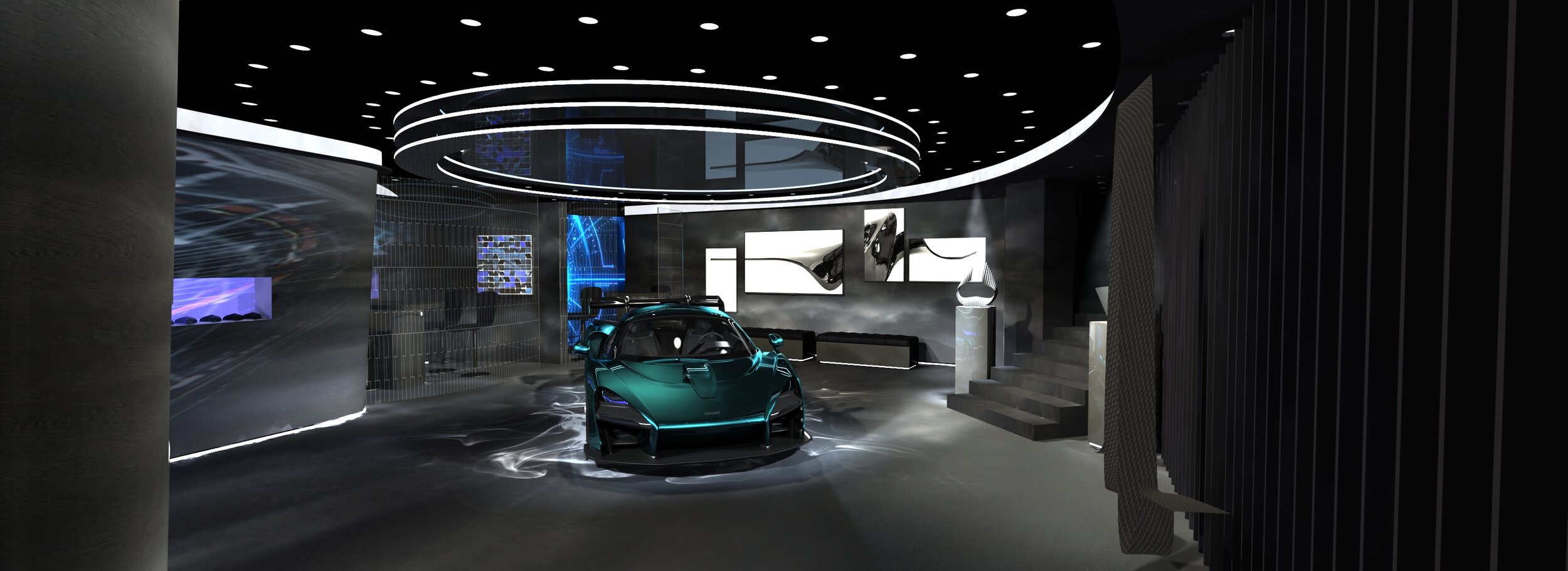
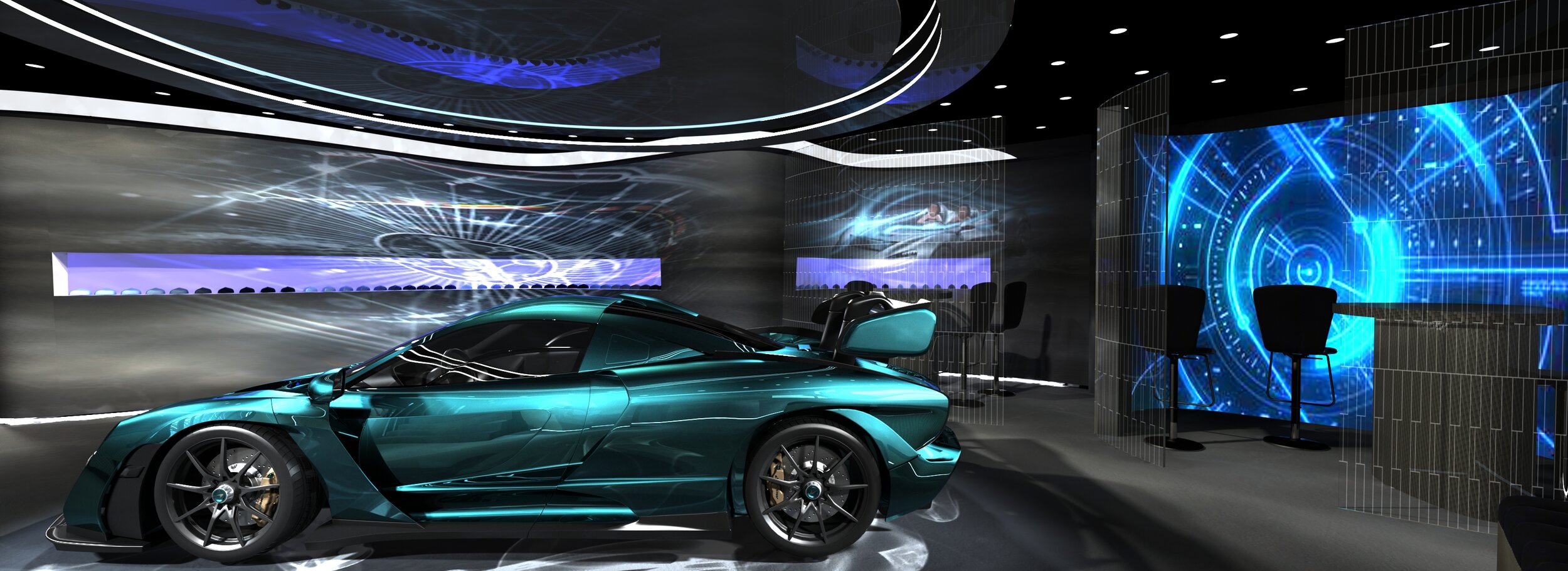
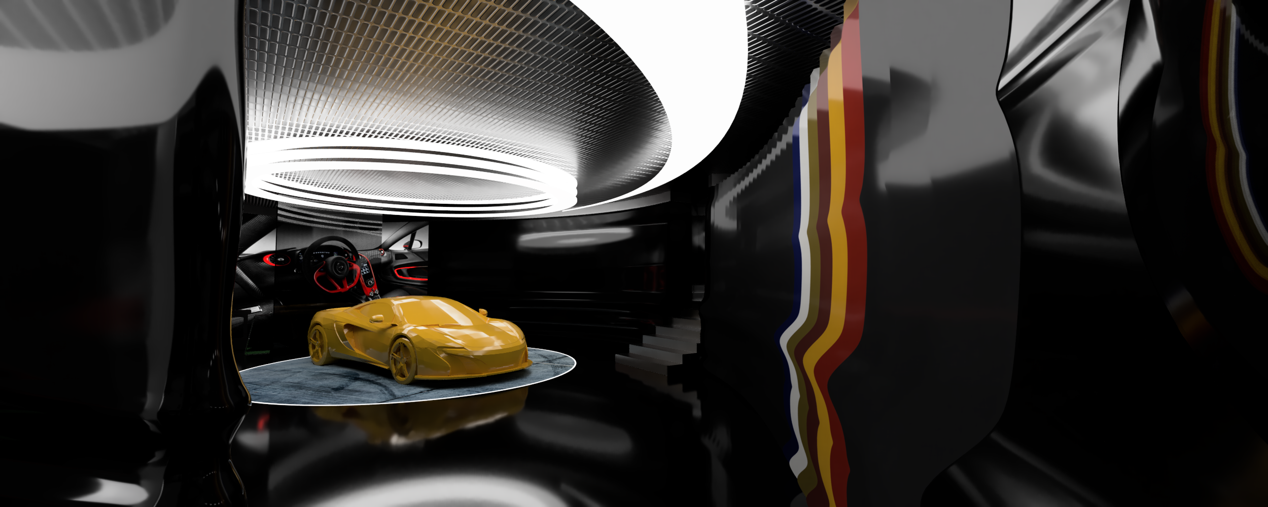
Exhibition stand for McLaren. Notionally, this was for the Geneva motor show. It’s an exclusive VIP zone. The forms took their queues from the very streamlined cars. The project went through many iterations. The visuals show various snapshots along the way.
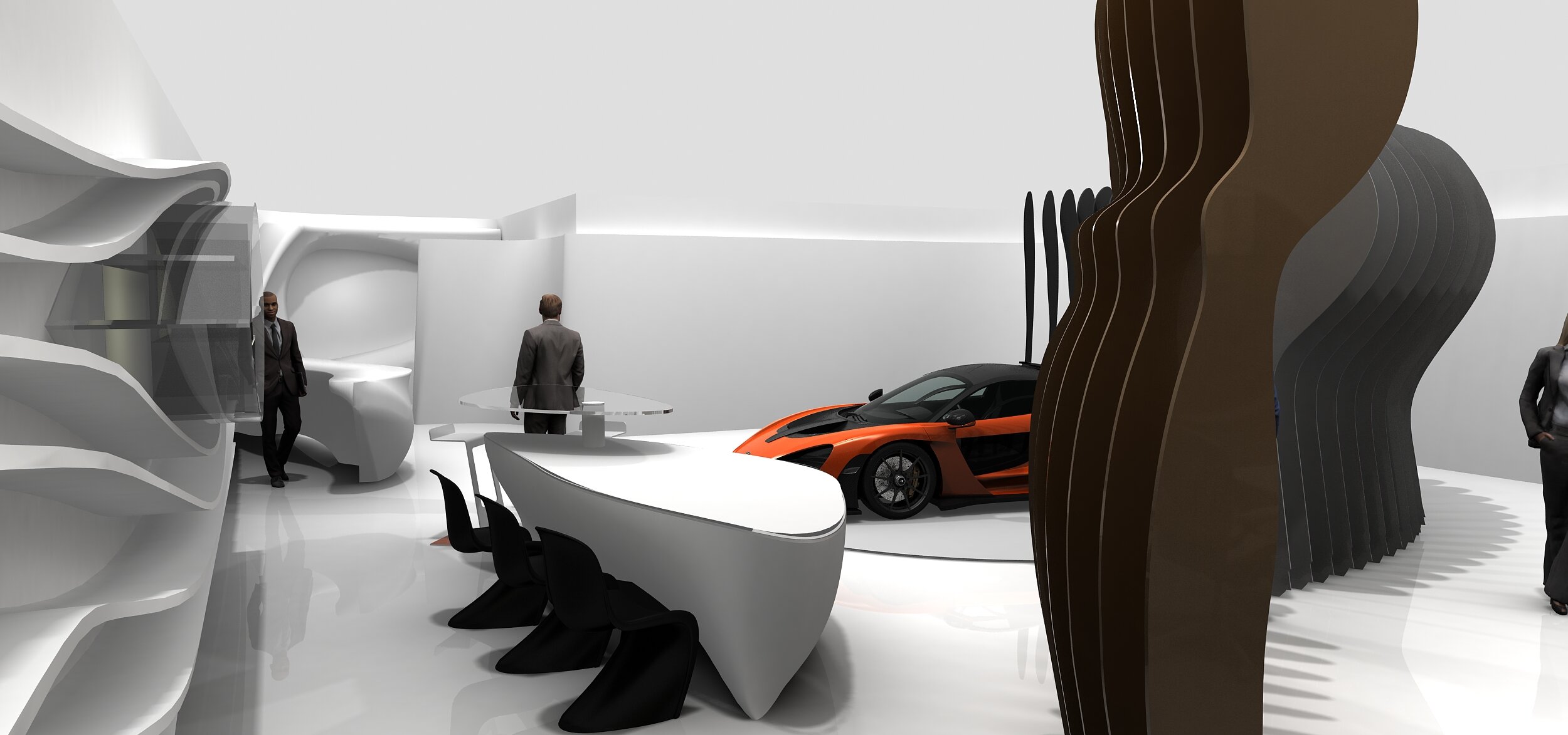
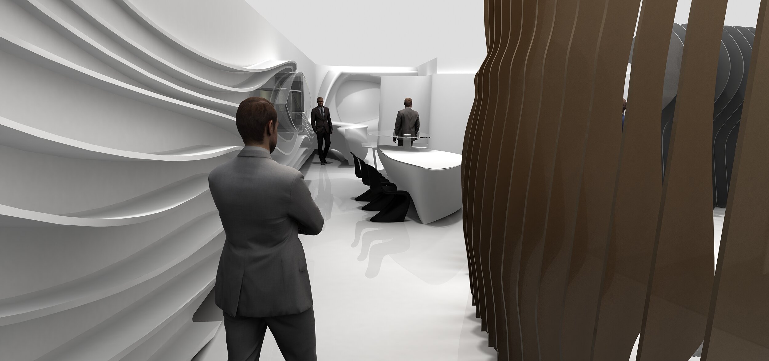
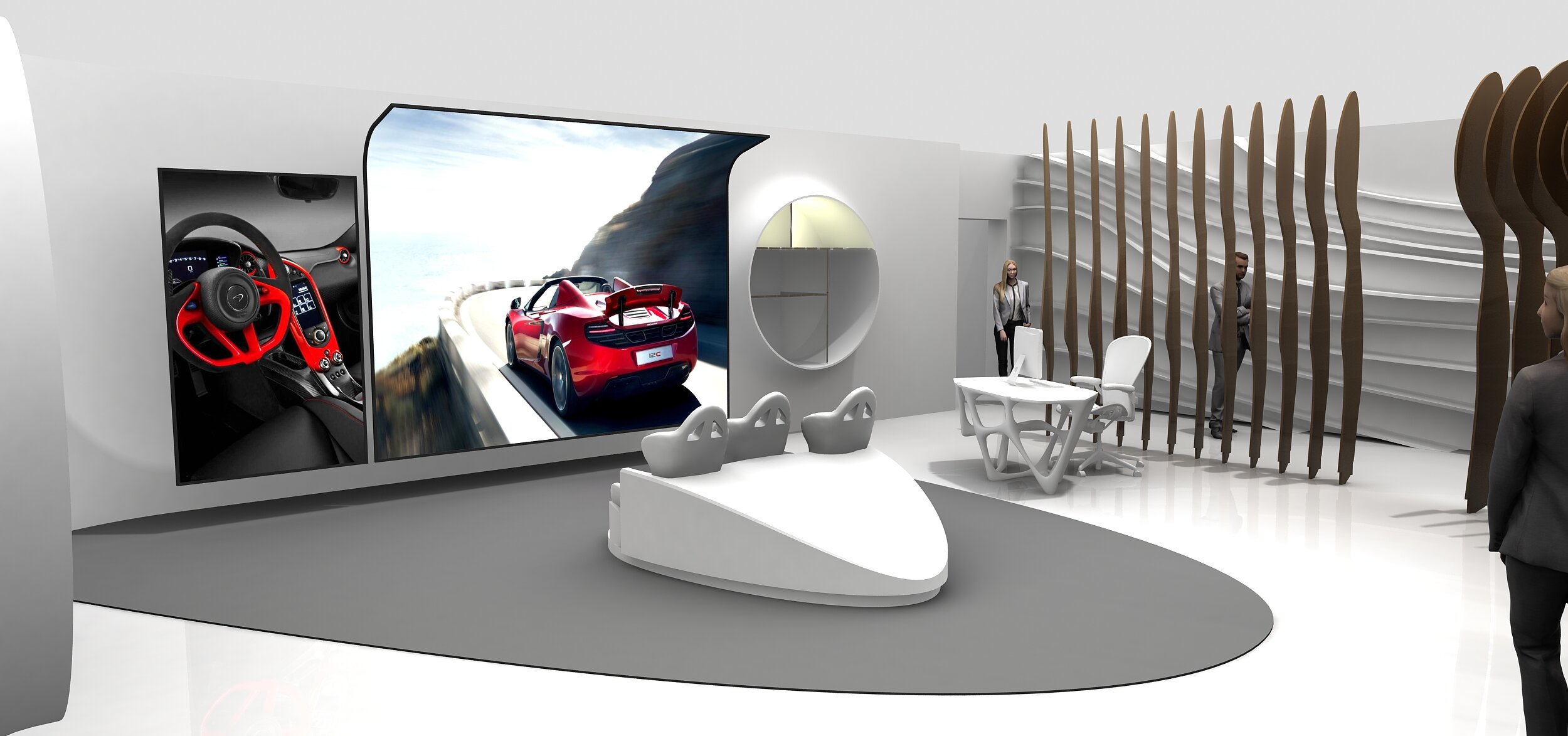
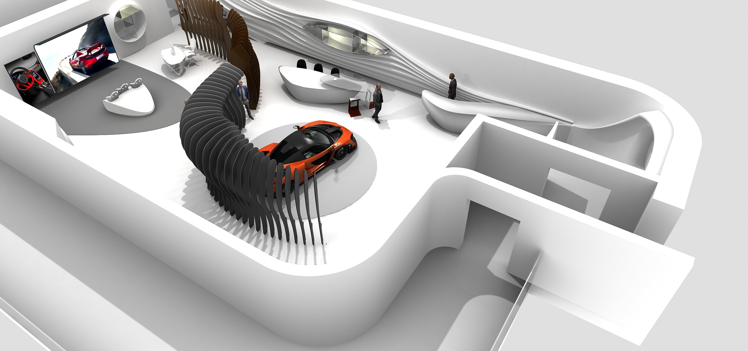
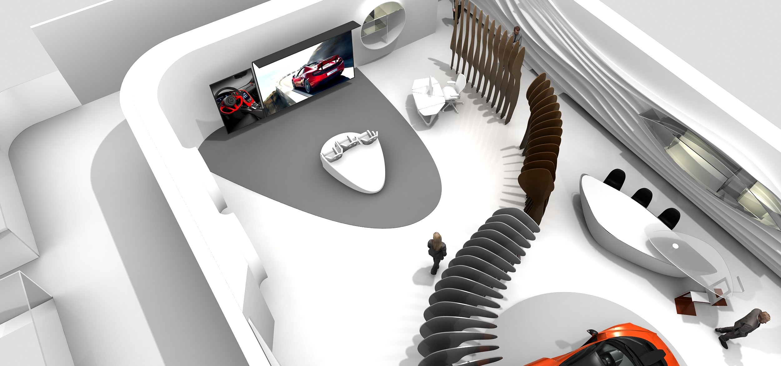
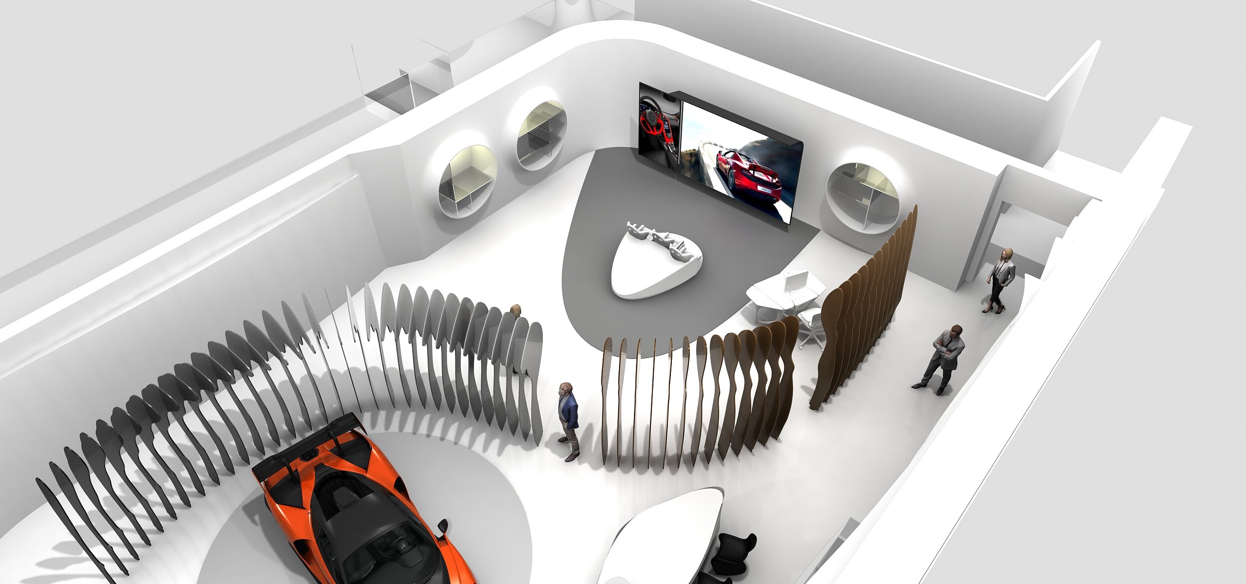
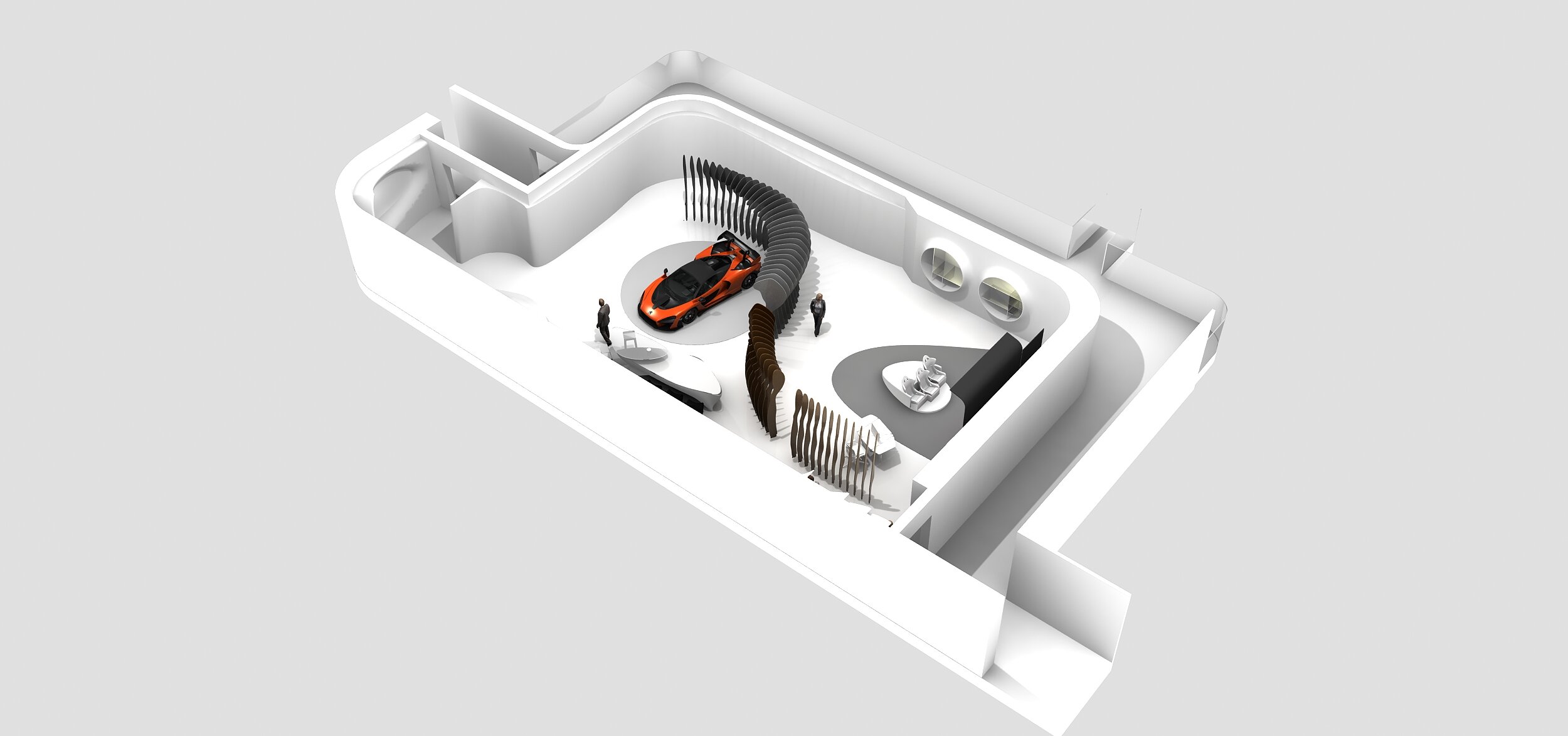
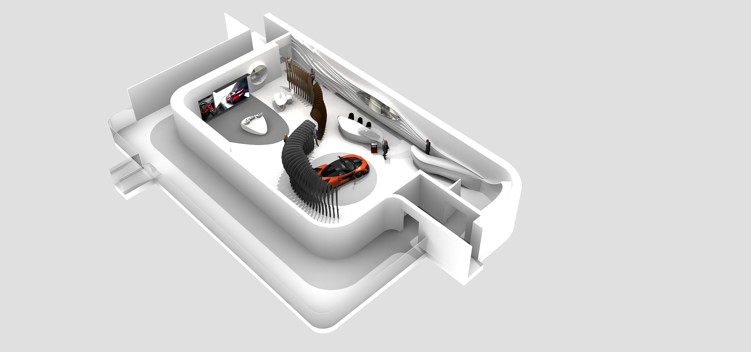
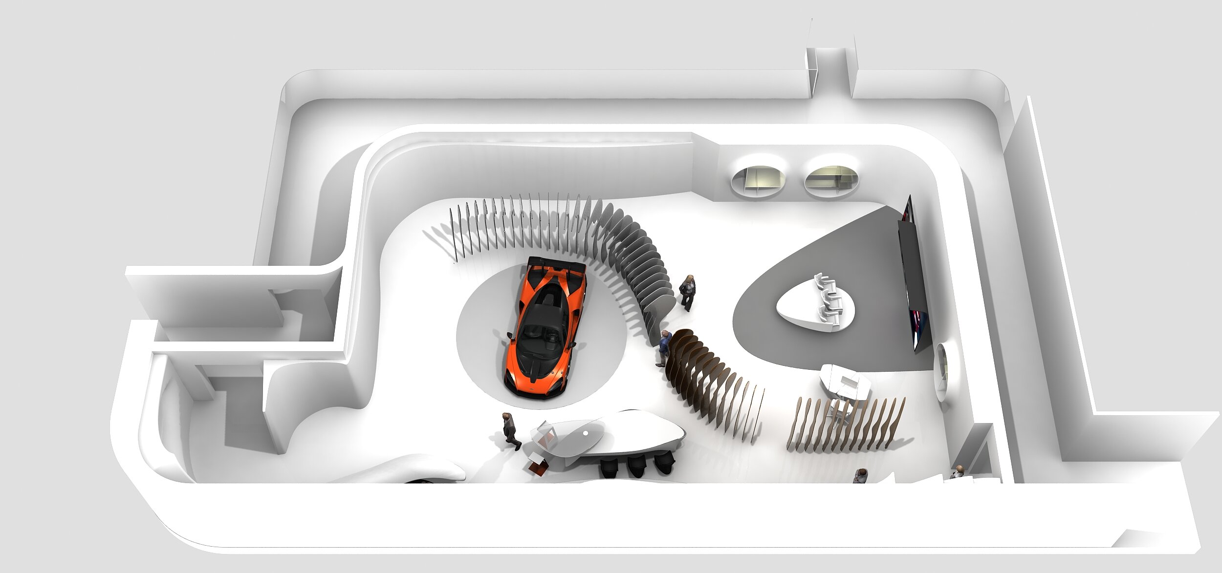
Interior for McLaren, UK


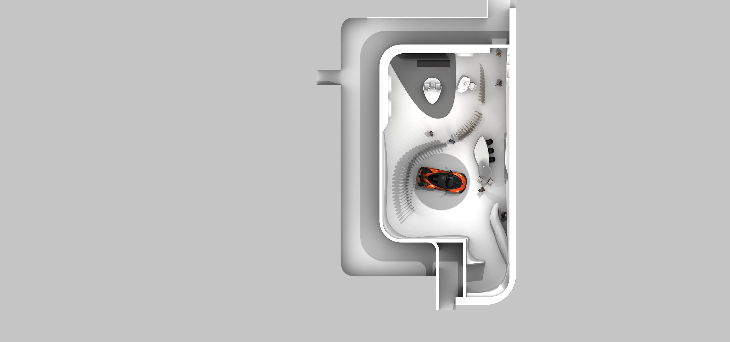
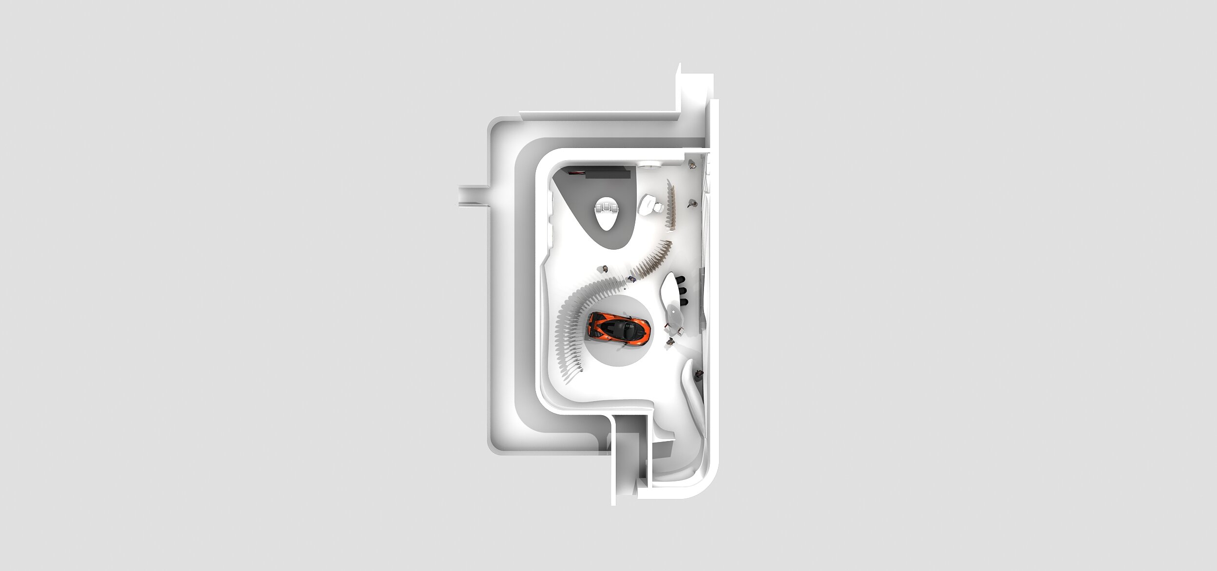
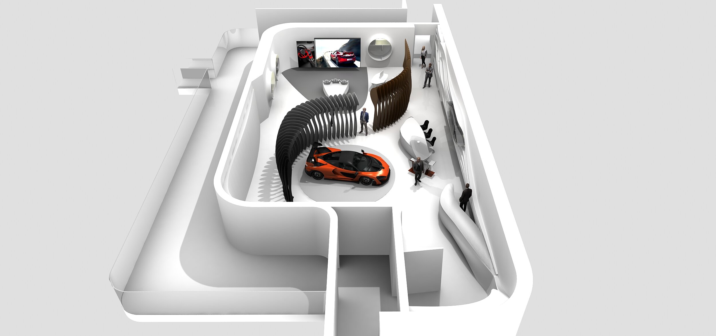
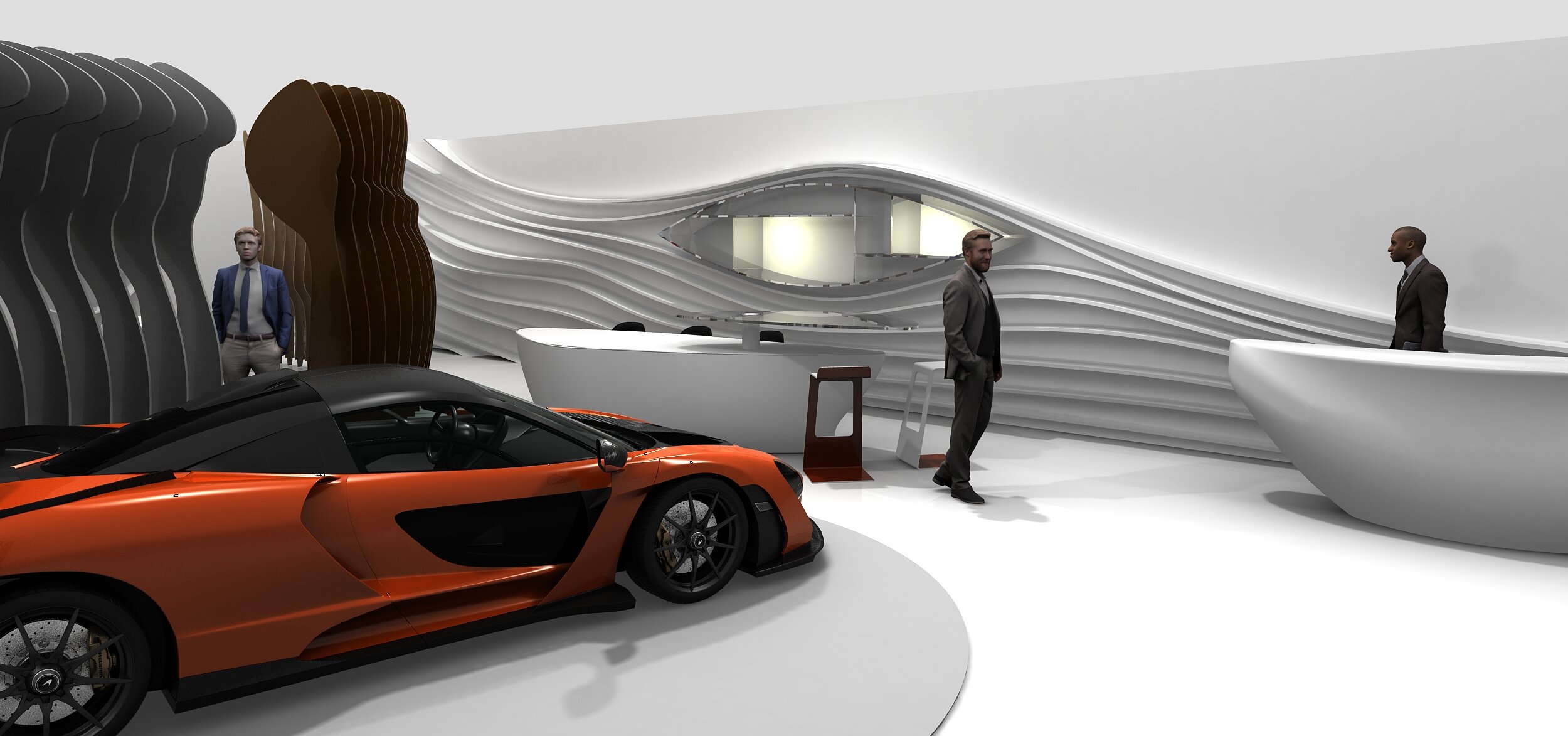
Interior for McLaren. The space is for customers to see the options and configure their cars. This project coincided with the release of the McLaren Speedtail. The forms took their queues from the very streamlined car. As usual the project considered different rooms, and went through many iterations. The visuals show two snapshots.
Pitch for G8 Summit in Northern Ireland
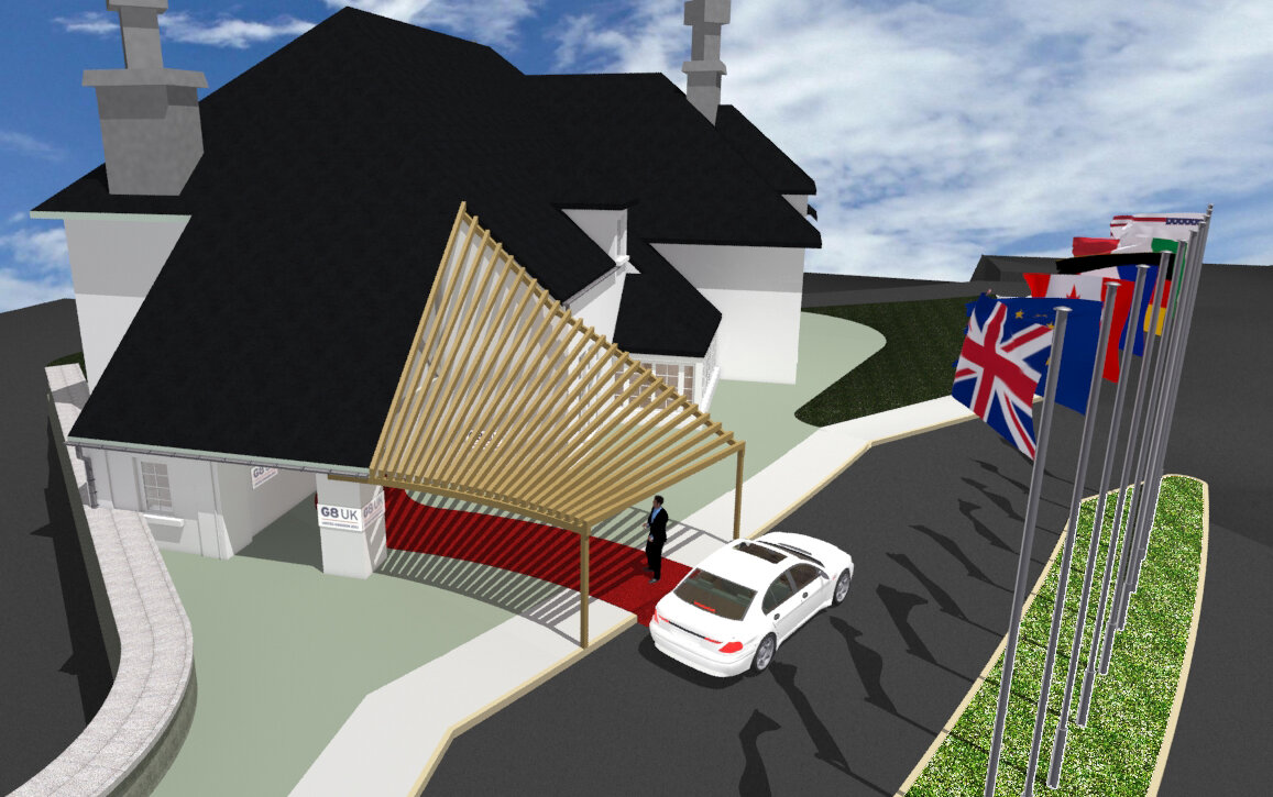
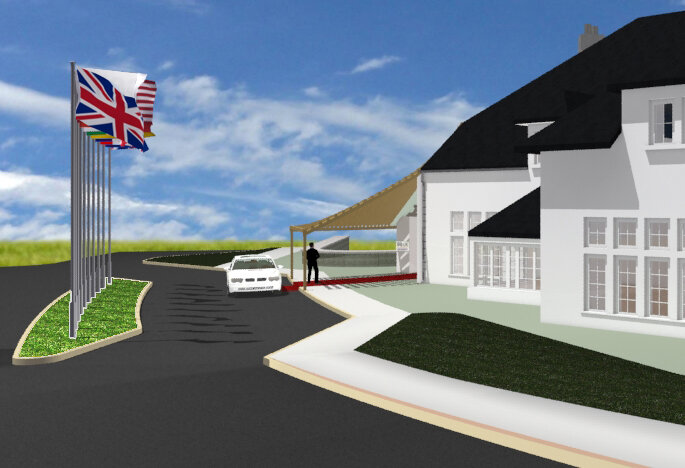
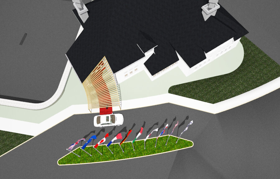
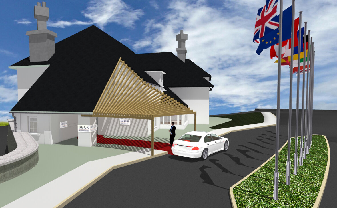
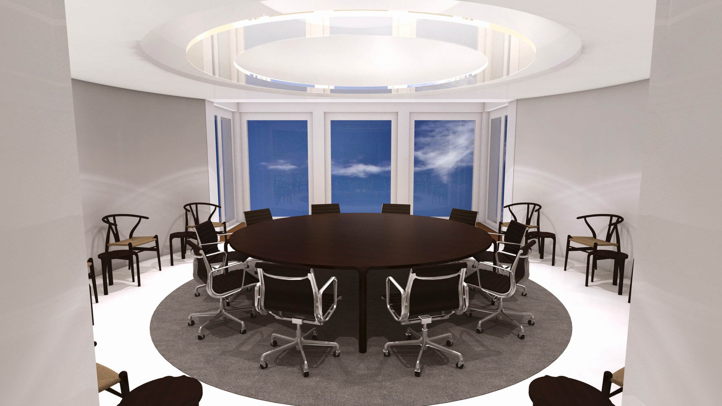
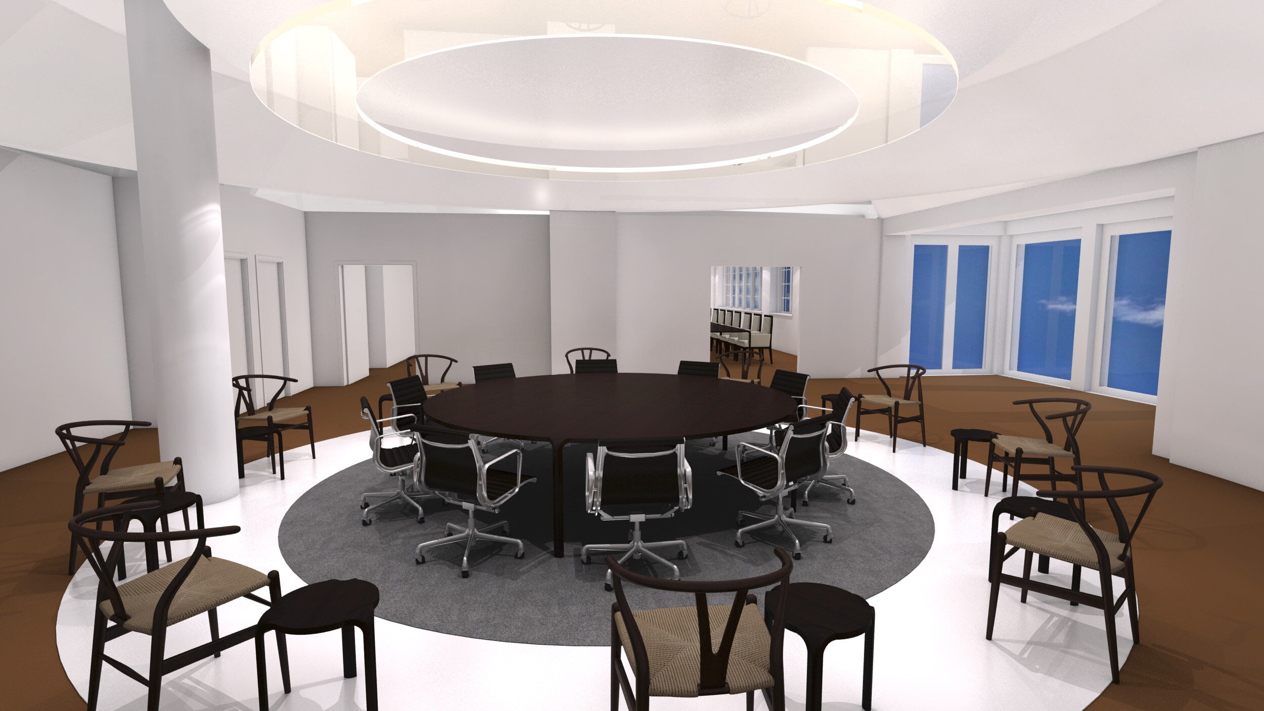
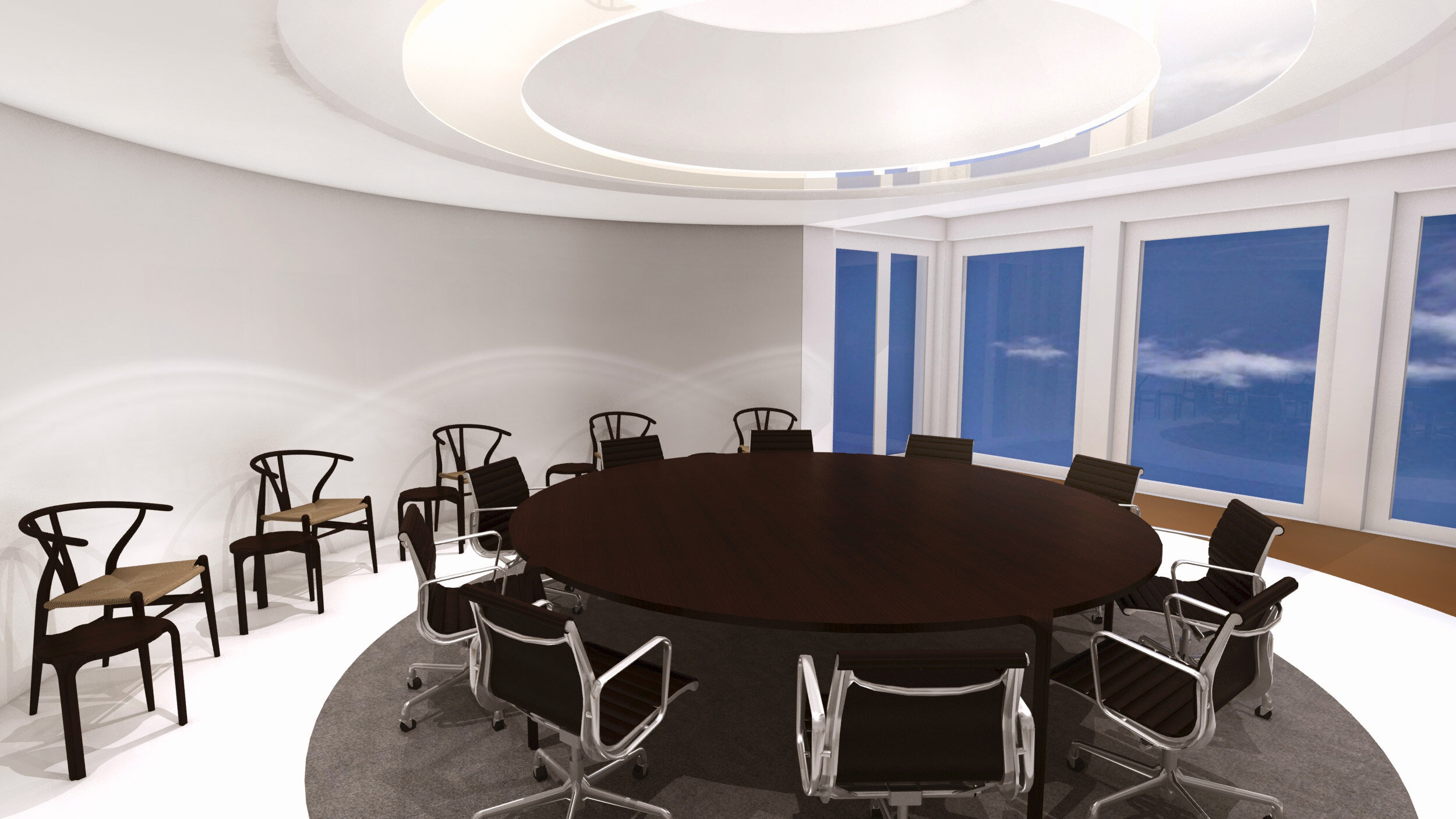
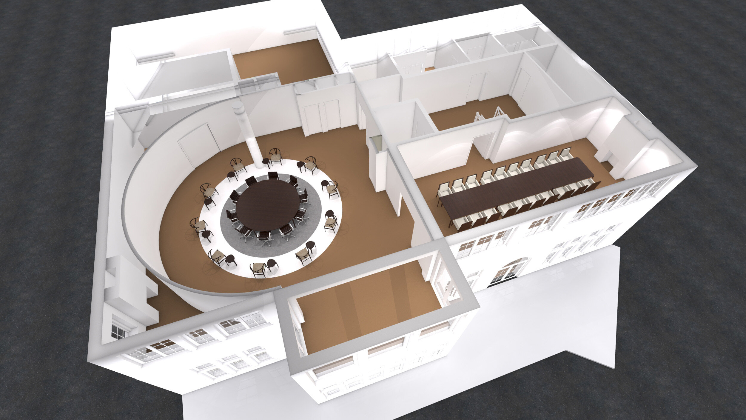
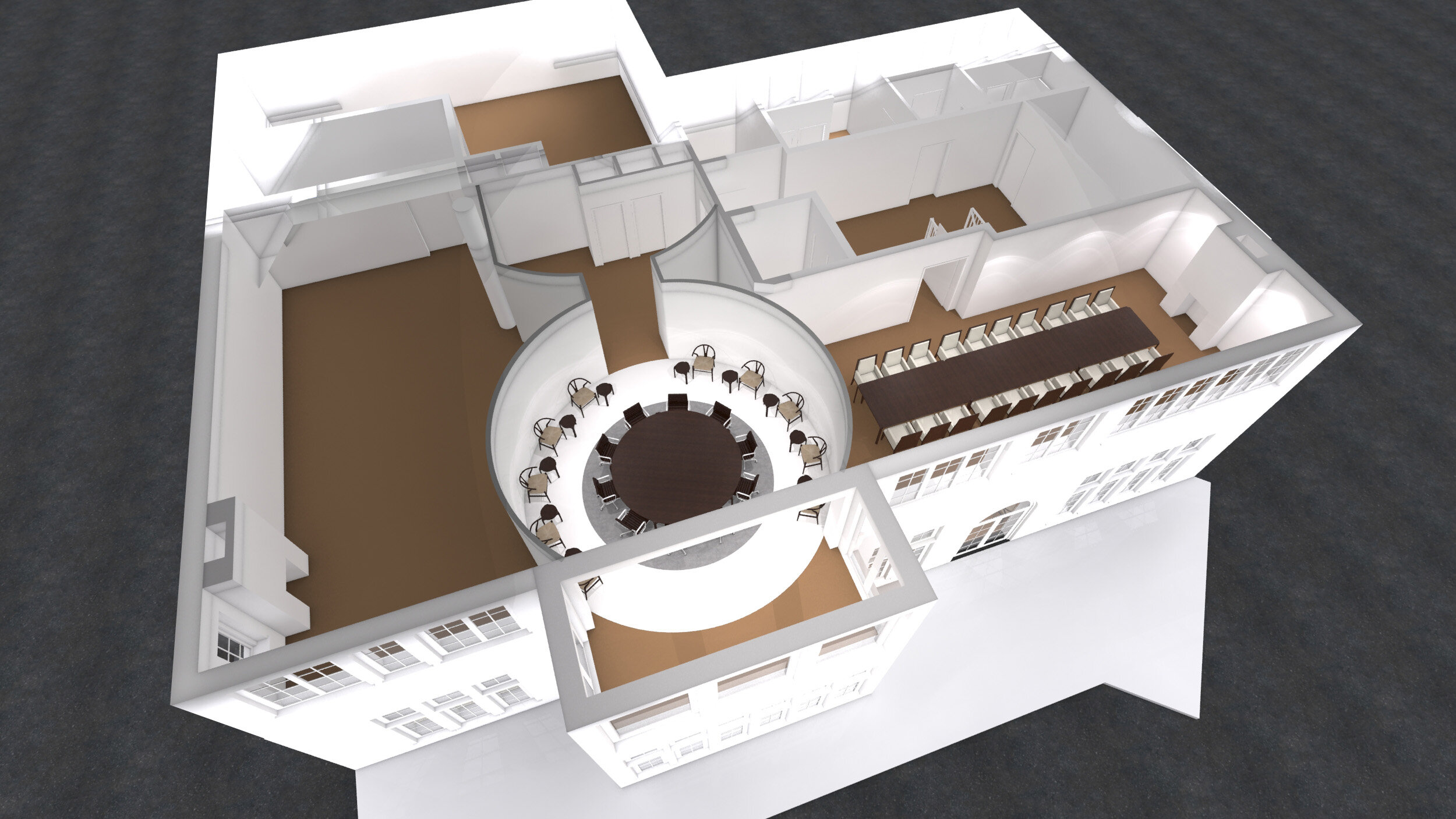
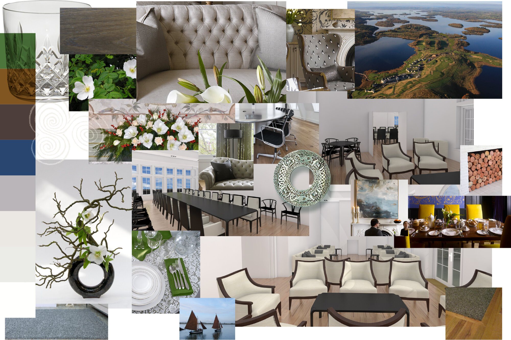
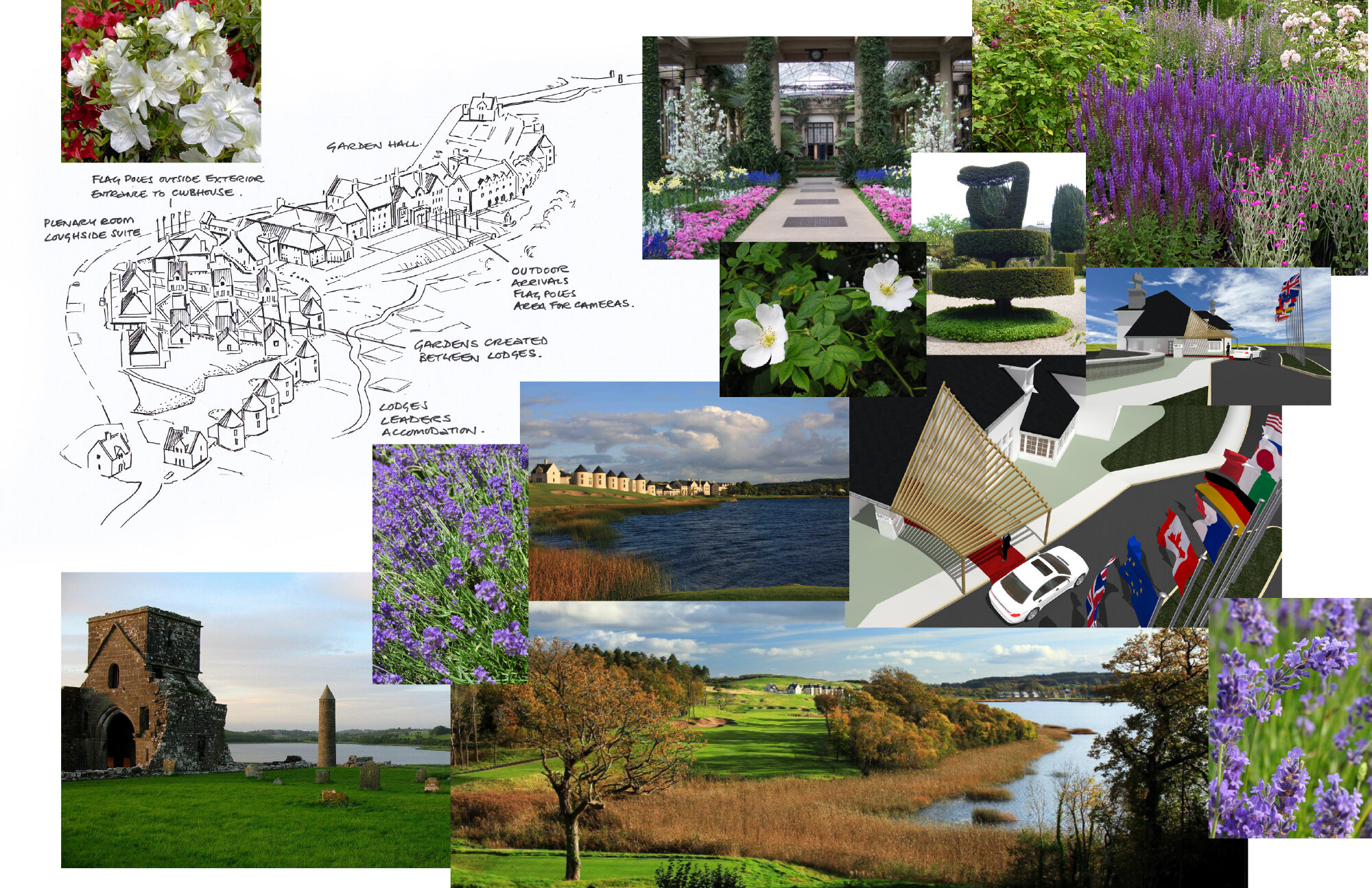
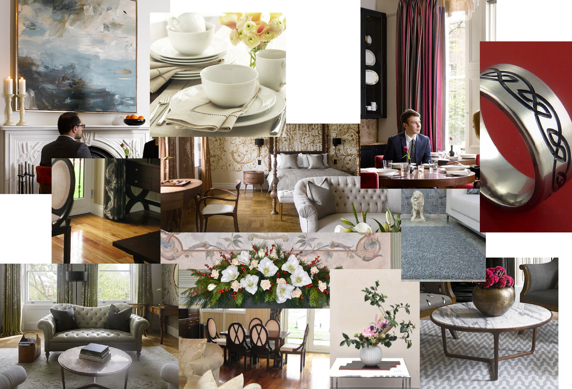
Concepts for the G8 summit held in Enniskillen Northern Ireland.
3D Modelling, Visualisation, Interior design, Master planning.
Toyota Paris exhibit on the Champs-Élysées
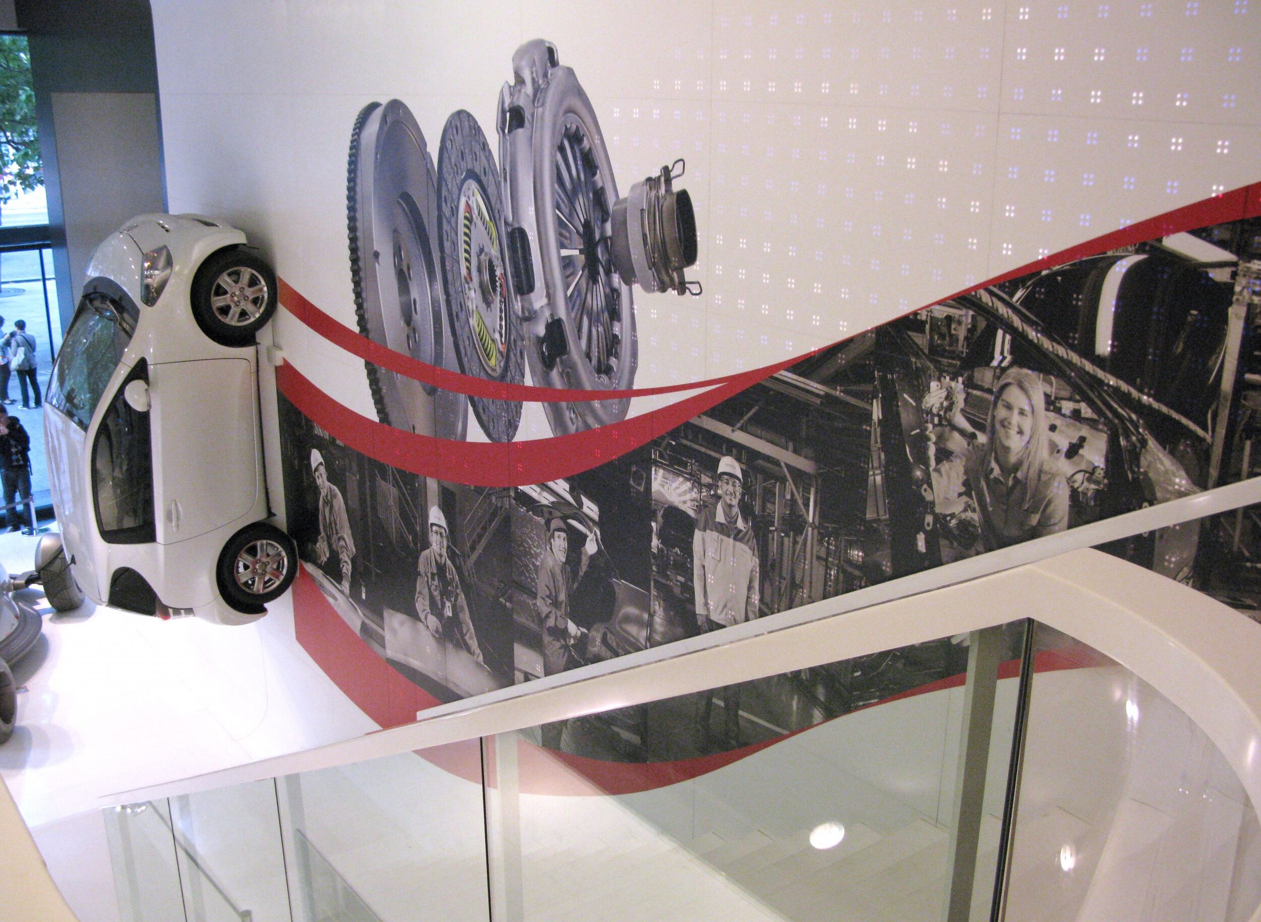
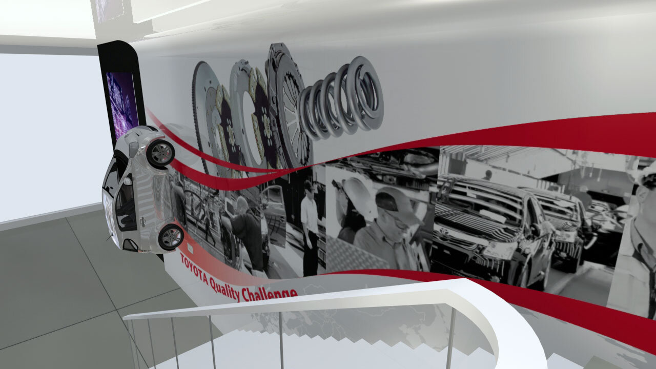
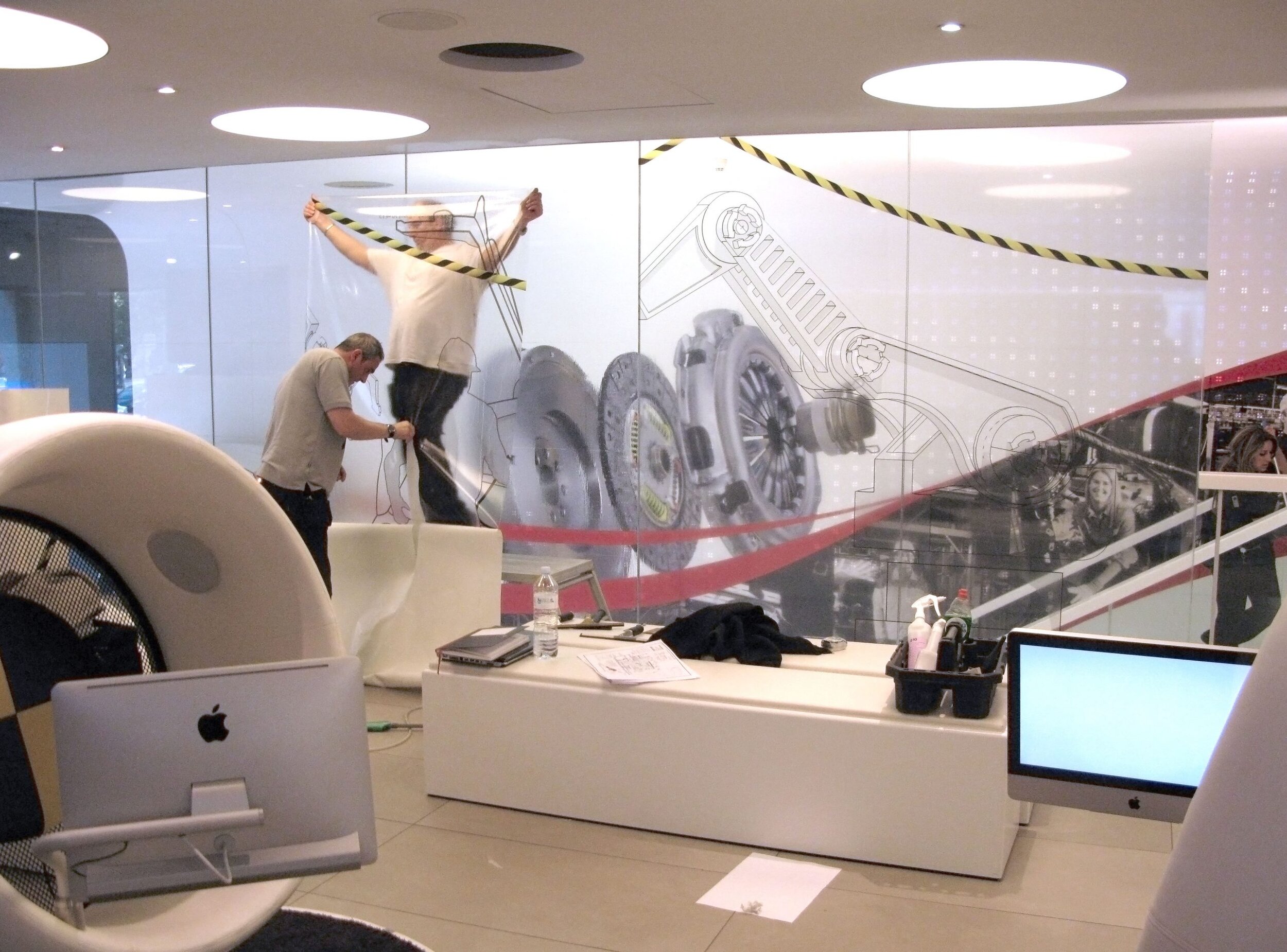
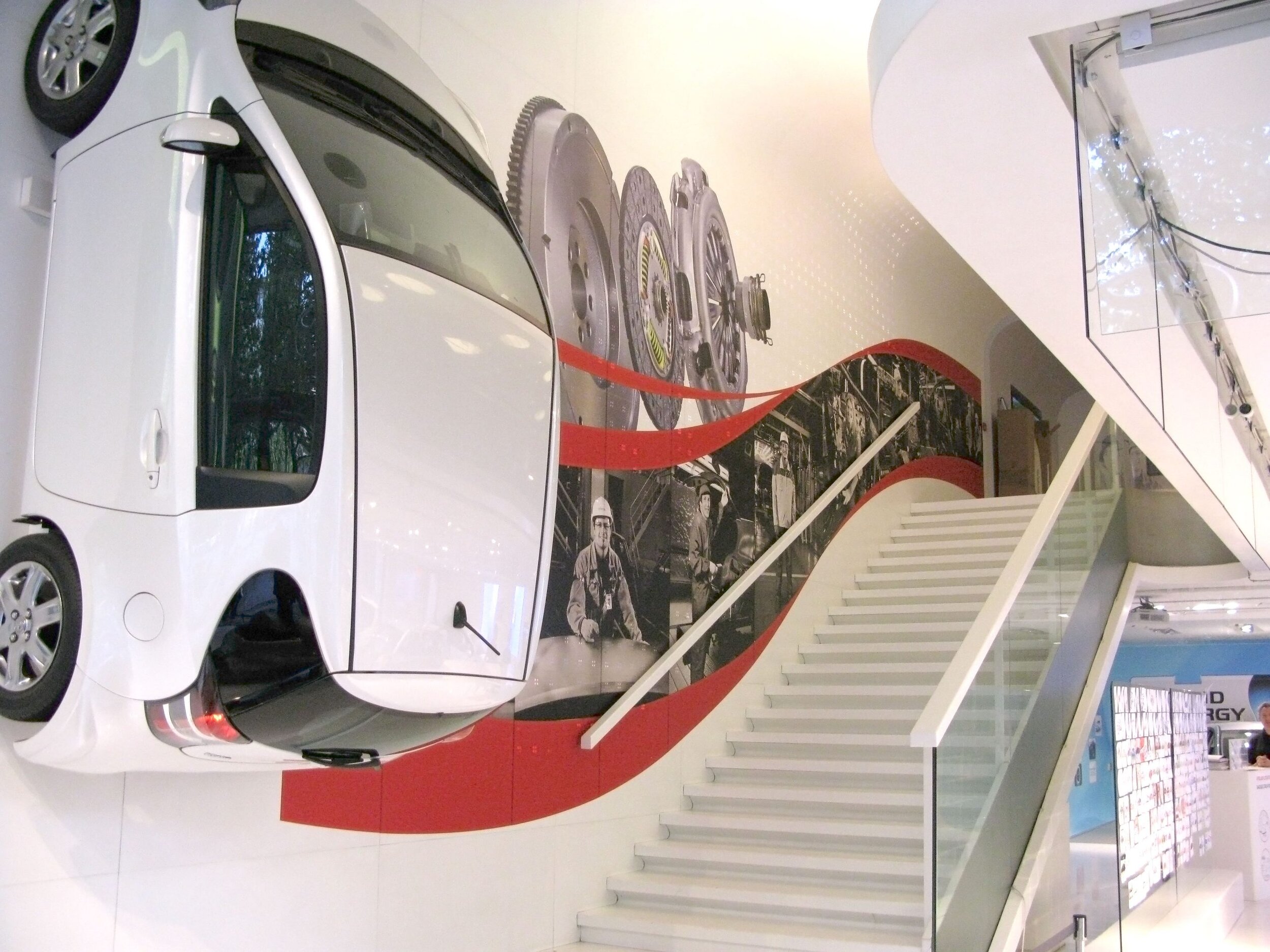
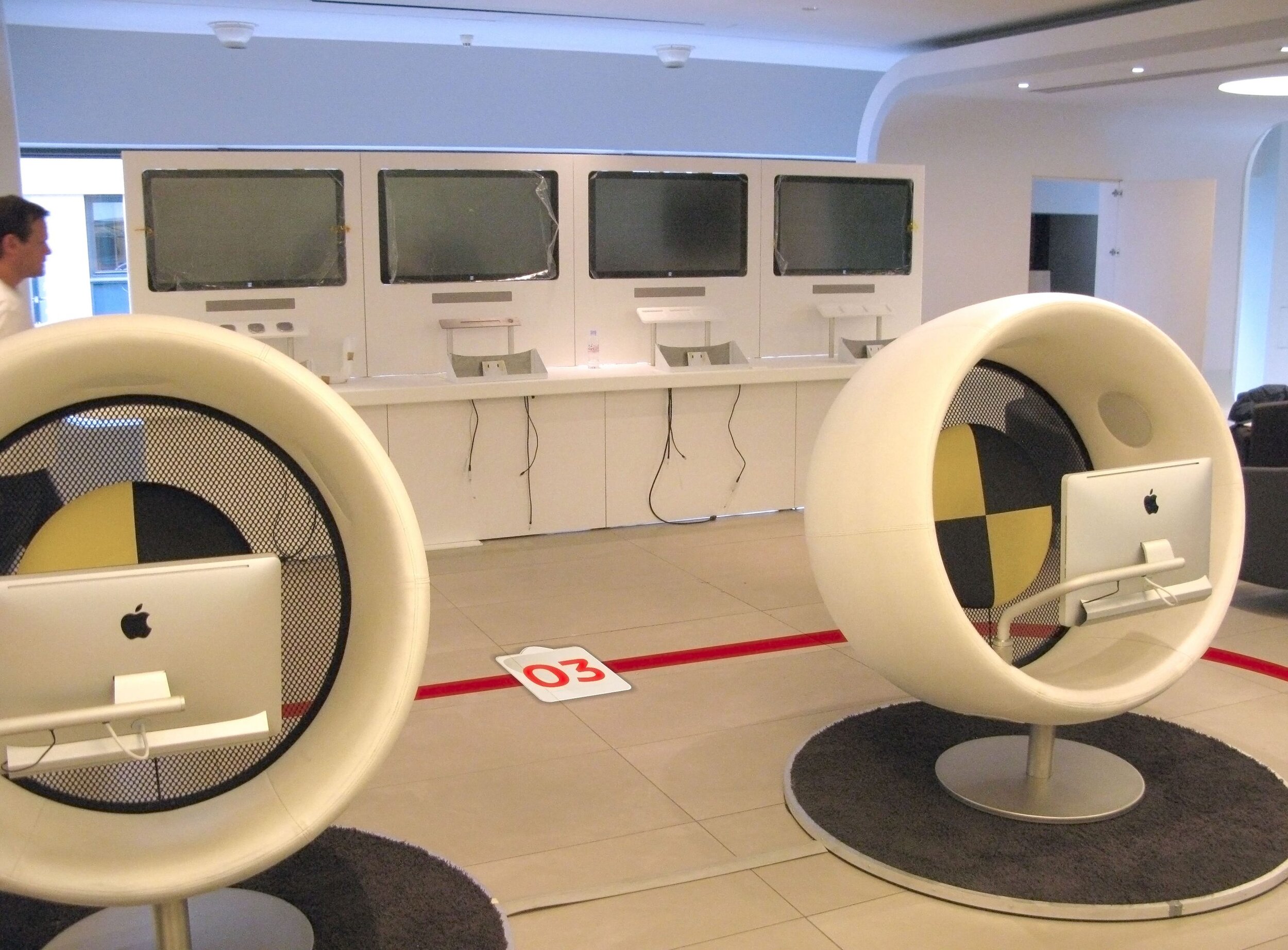
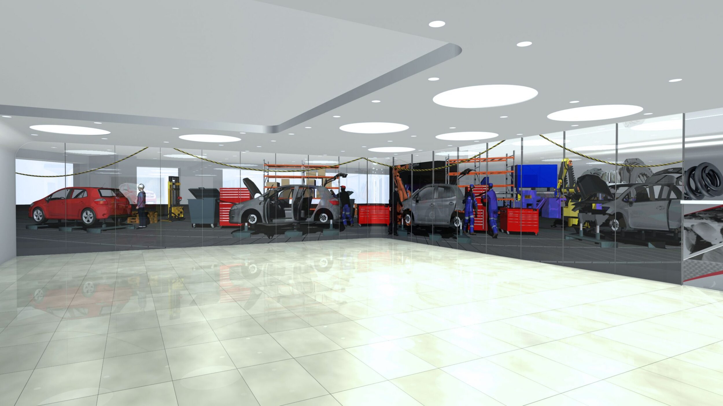
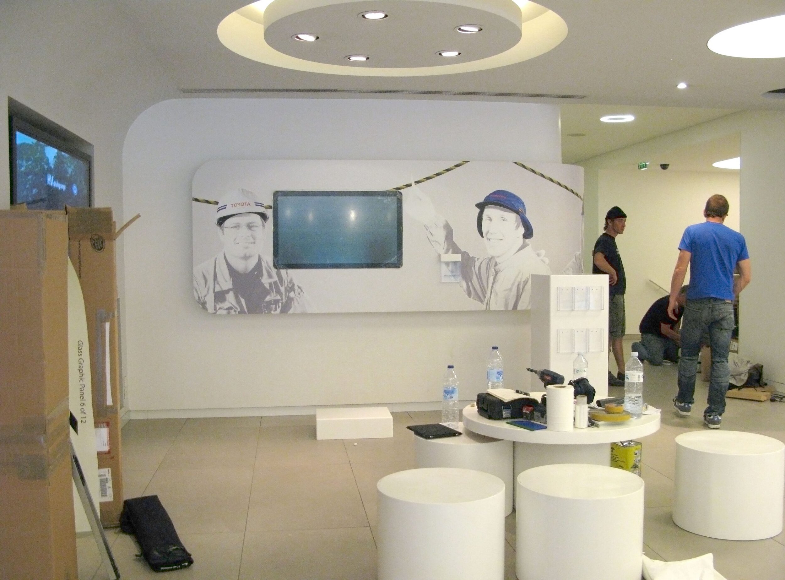
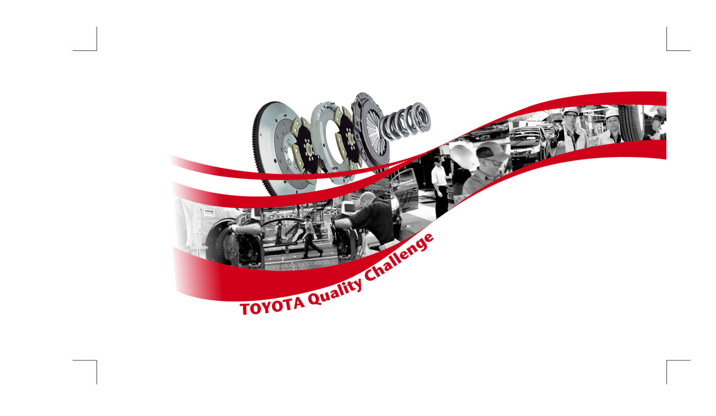
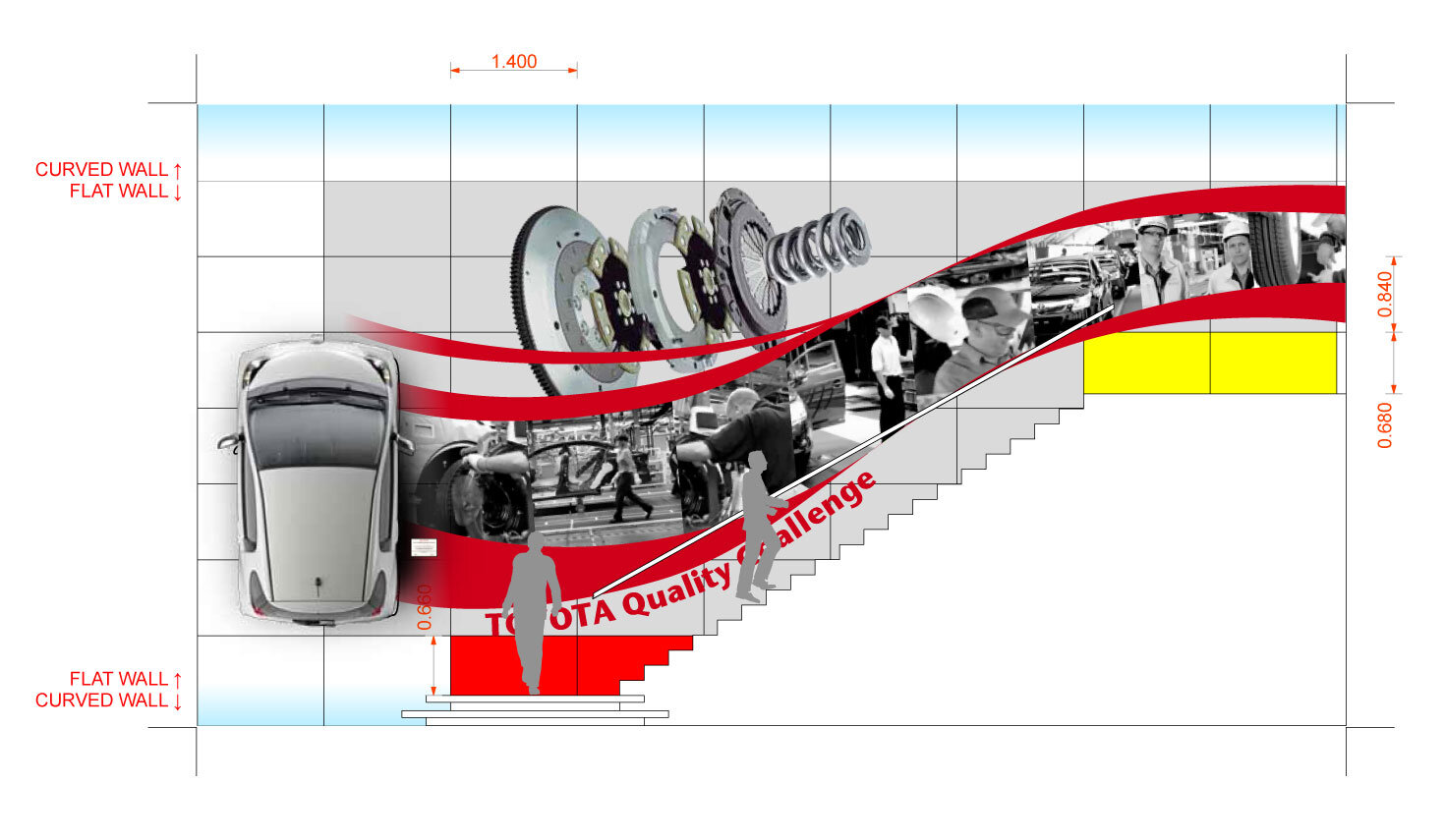
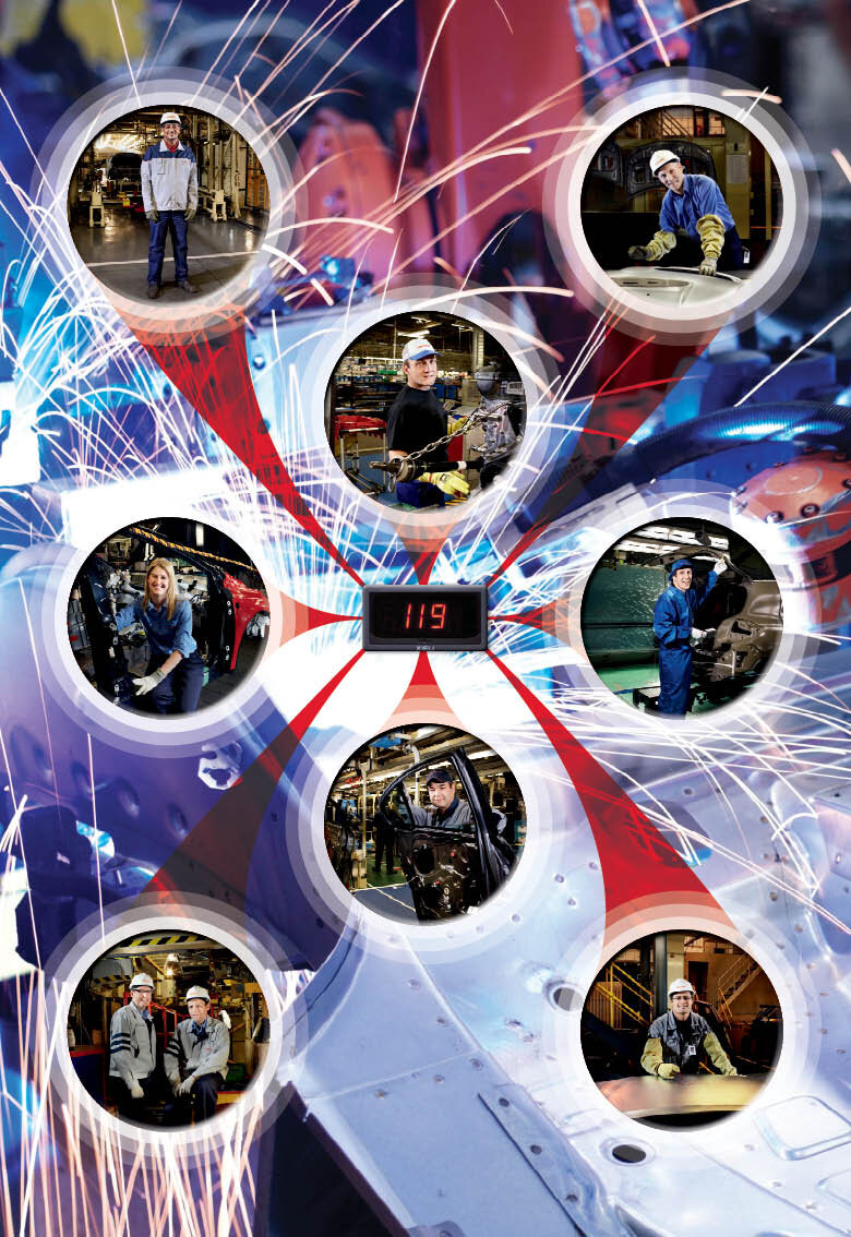
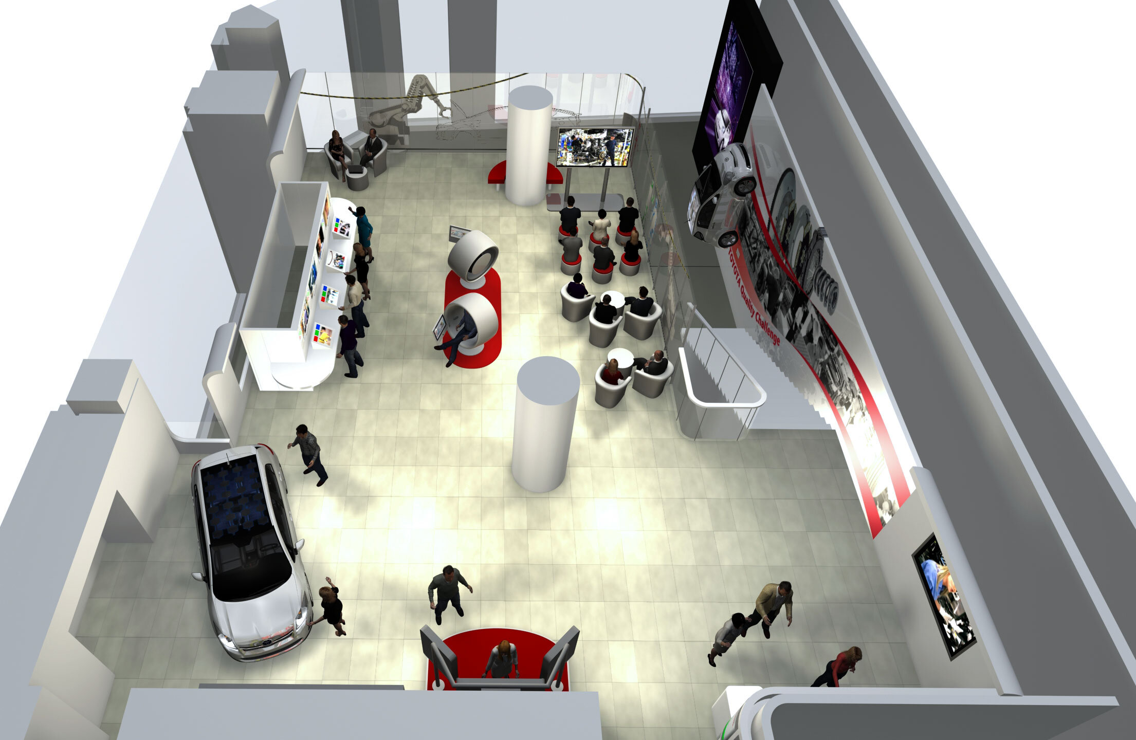
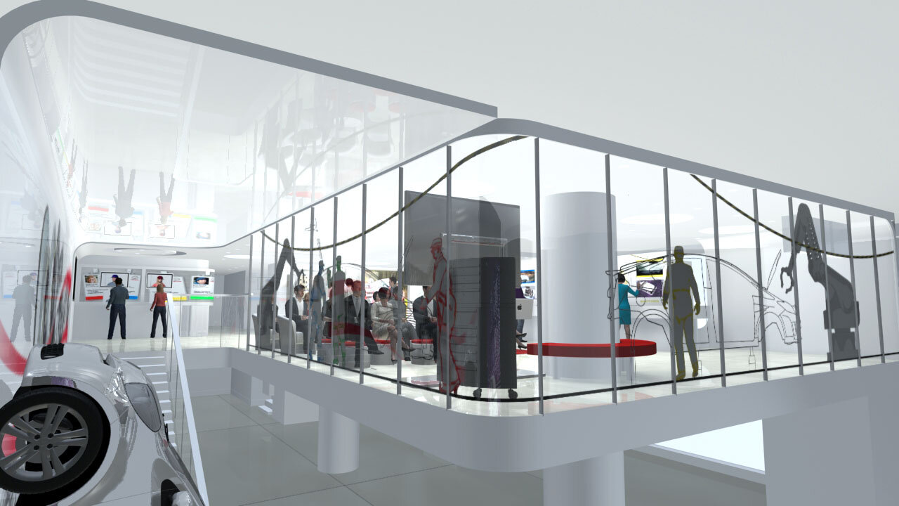
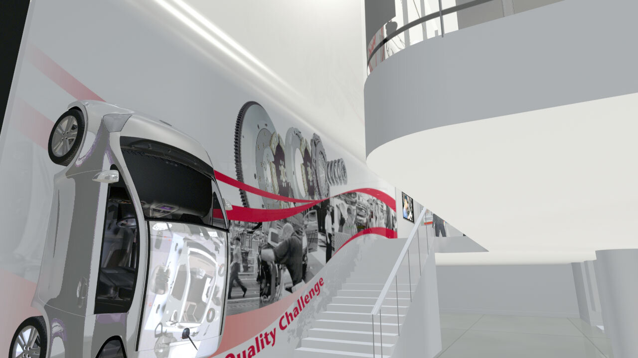
In its flagship location Le Rendez-Vous Toyota on the Champs-Élysées, Paris, Toyota wanted to create an exhibition that 'brings the Toyota quality story to life'. The exhibition space is upstairs so there is a prominent graphic on the stairs to lead the audience up there. The stair graphic reflects both the Toyota corporate style and the exhibition aim. View from the top of the stairs showing the installed stair graphic. The graphic incorporates bespoke very high-res photography of Toyota car parts to show their build quality.
Stair graphic: Beyond leading the audience upstairs, the graphic aims to showcase the Toyota quality story by displaying photographs of very large 'hyper-real' car parts and the people who make them. Appropriate car parts were obtained from Toyota for very high-res studio photography to take place. Toyota empowers its employees, to take pride in their work and output. One of the ways it does this is by use of an 'Andon cord' strung throughout their production line. The Andon cord can be pulled by any assembly technician any time they find a fault. Pulling the cord causes the whole assembly line to stop while the problem is analysed and rectified. The idea is if you can solve a problem at its source, that lifts the overall quality of the lines' output. The Andon cord is used repeatedly throughout the exhibit. It is one of Toyota's unique-selling-points. The swoosh is an appropriate element here because its overall shape fits the stairs, but its graphic dynamism is important for drawing the audience onward and upward.
Window Graphic: The window graphic went through various iterations. The final was much more understated than earlier versions. It evokes the Toyota assembly line, shows skilled people at work, and references the Toyota factory Andon cord. (see 'stair graphic' for an explanation of the Andon cord) It also remains transparent so that the lightness of the glazed mezzanine is preserved.
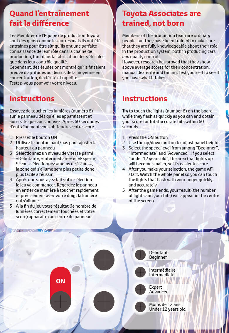
Interactives: graphics for the various interactives were done. Due to the location of Le Rendez-Vous Toyota on the Champs-Élysées, all text is displayed in French and English
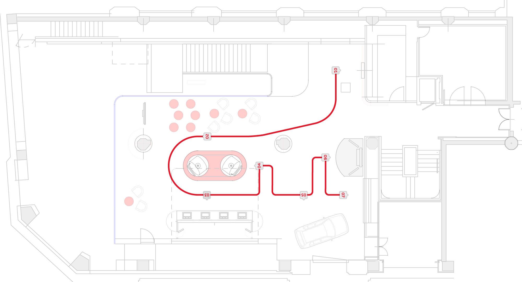
Directional Signage: Although it is not really required, the exhibit does have a narrative or a direction based on the flow of the production line. To make the flow more obvious for visitors, floor graphics were conceived.
Audi, Kings Place, London
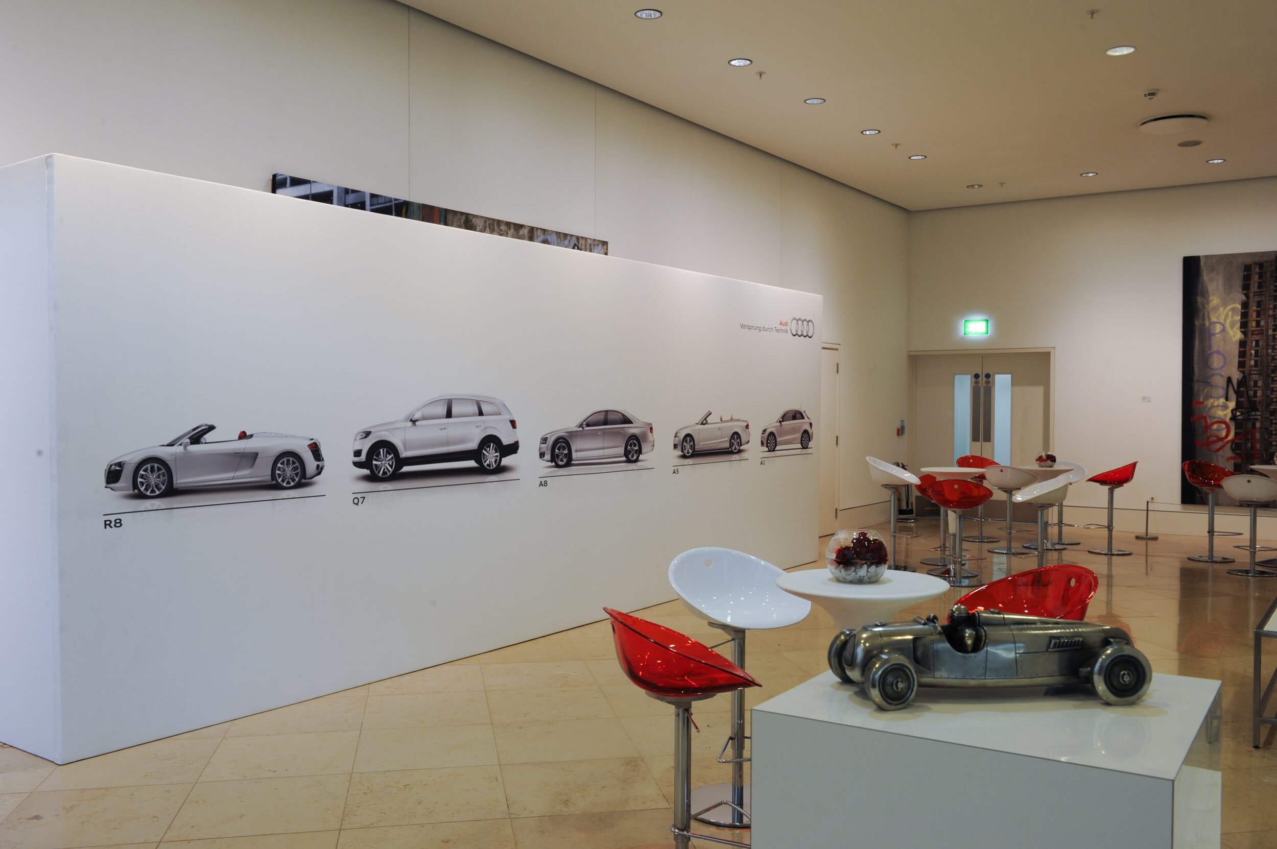
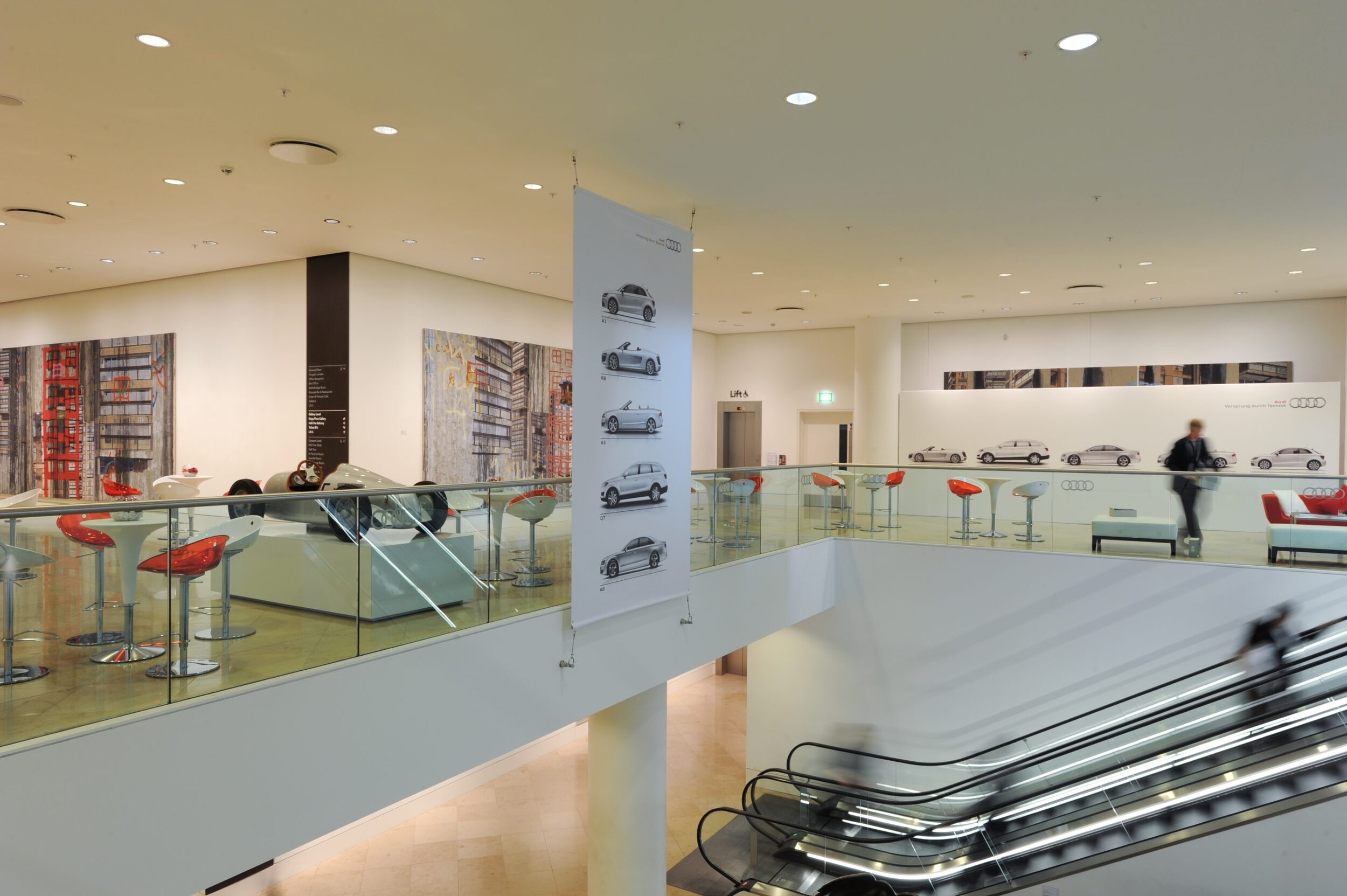
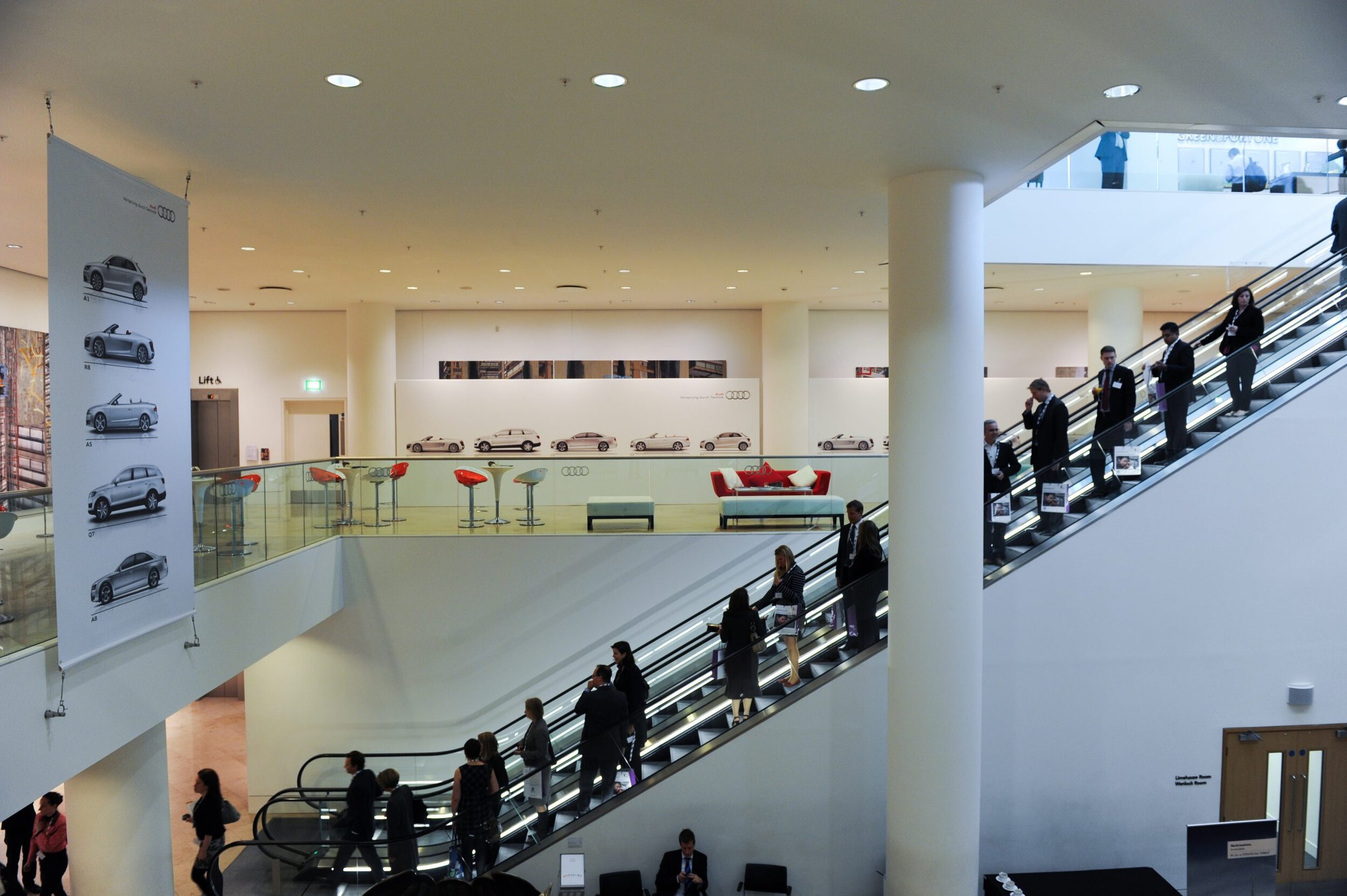
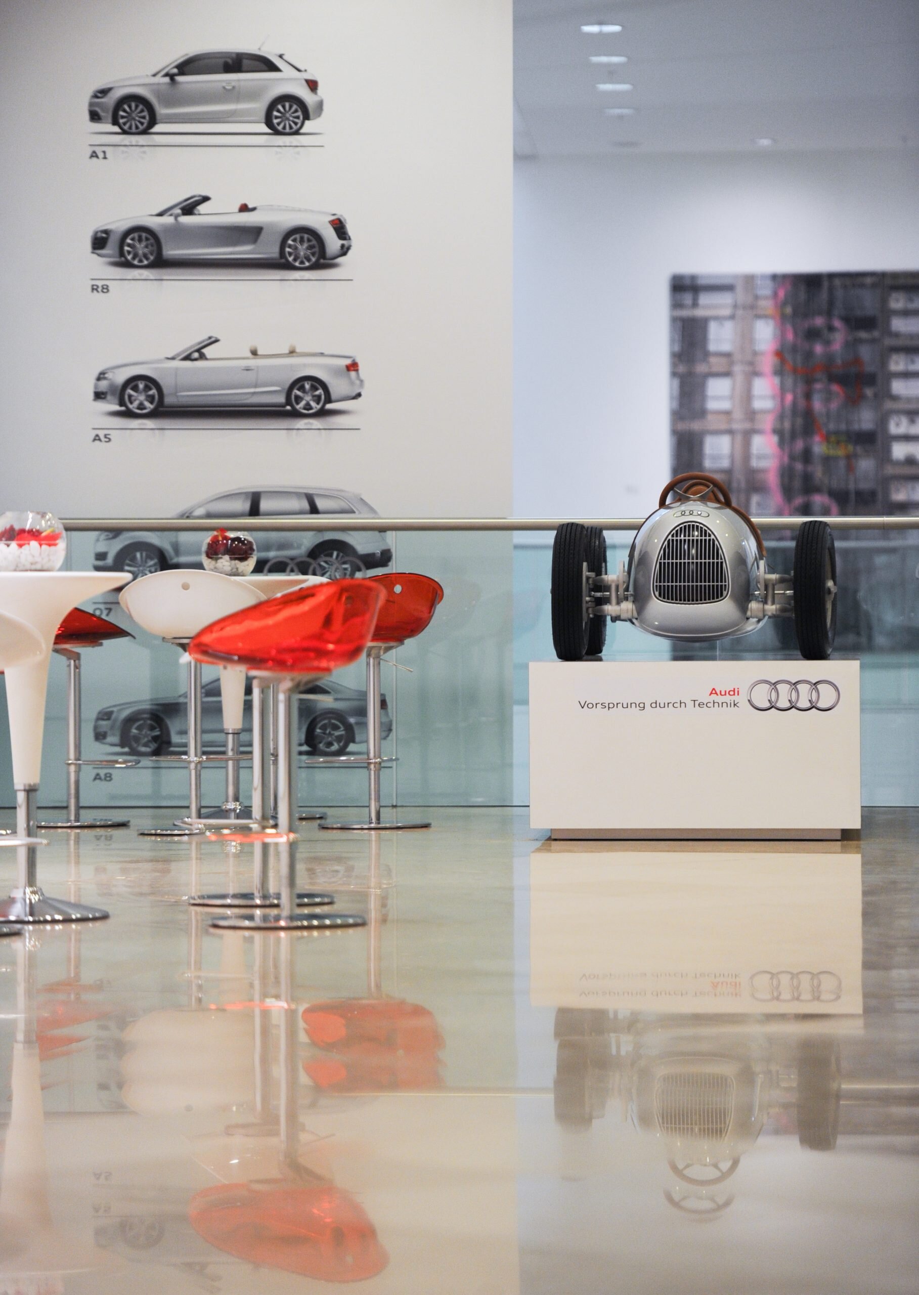
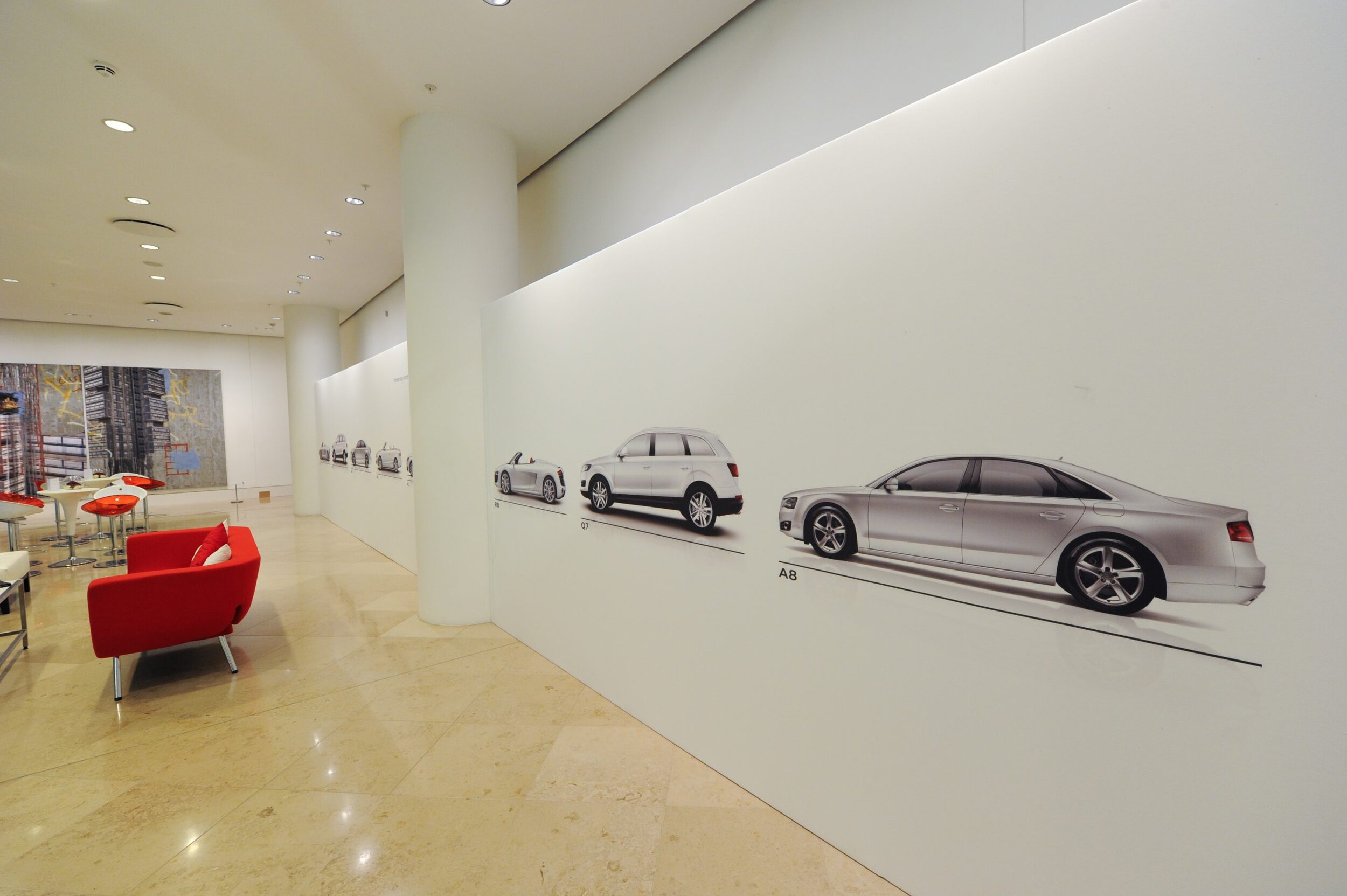
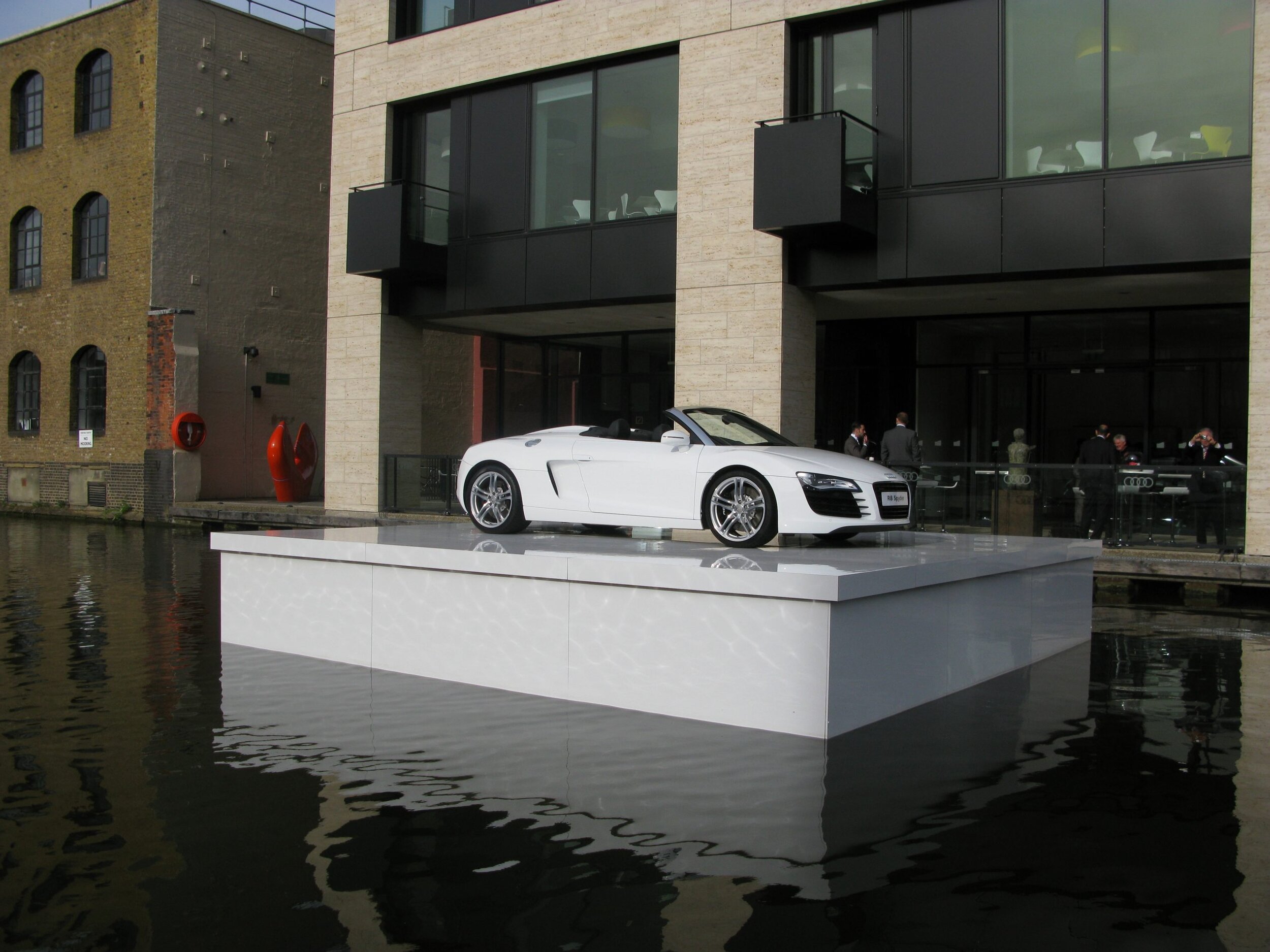
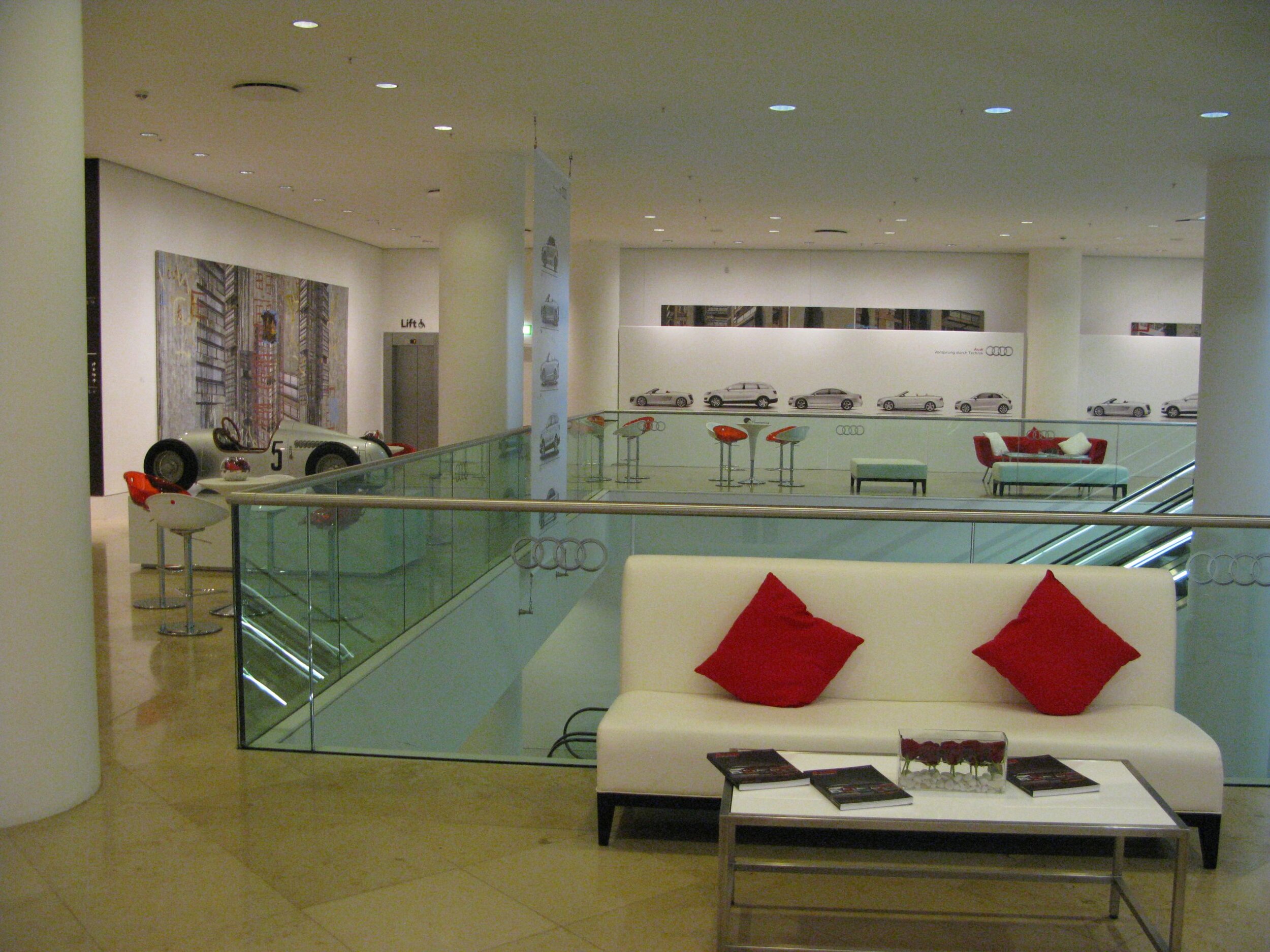
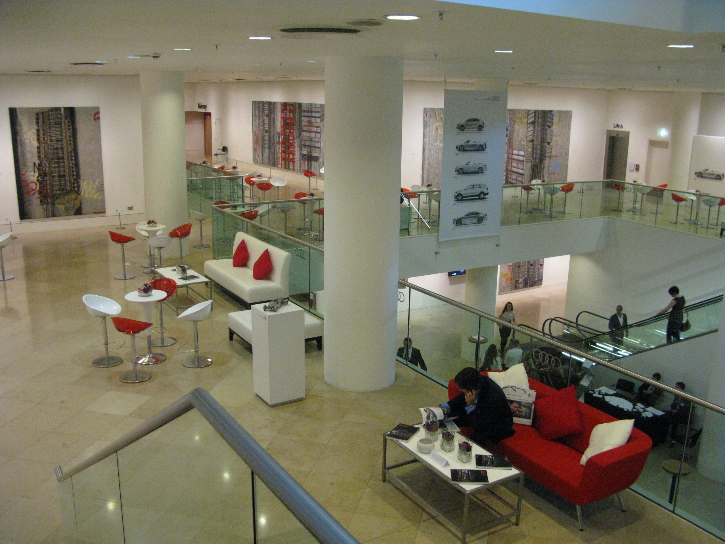
Cad Drawings & Artwork for Audi event at Kings Place, London. The project included a floating stage for an Audi R8 Spyder which was in reality a clad barge.
Church crypt re-modelling visualization
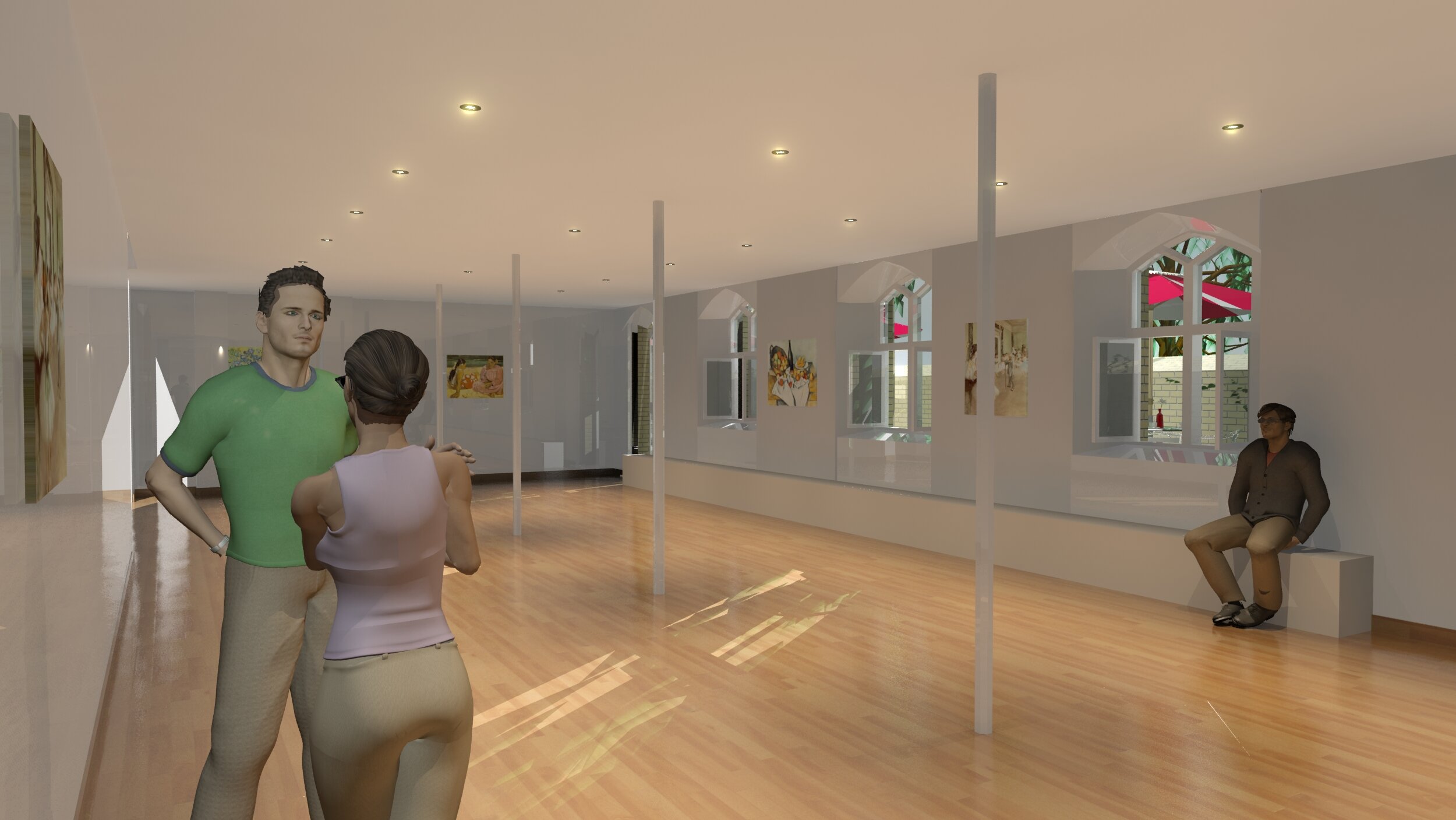
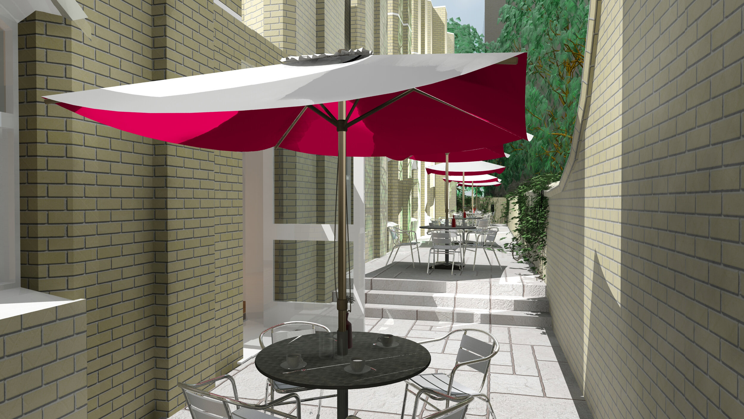
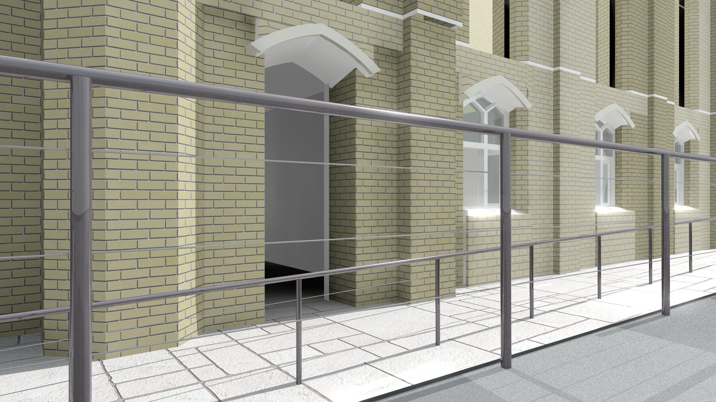
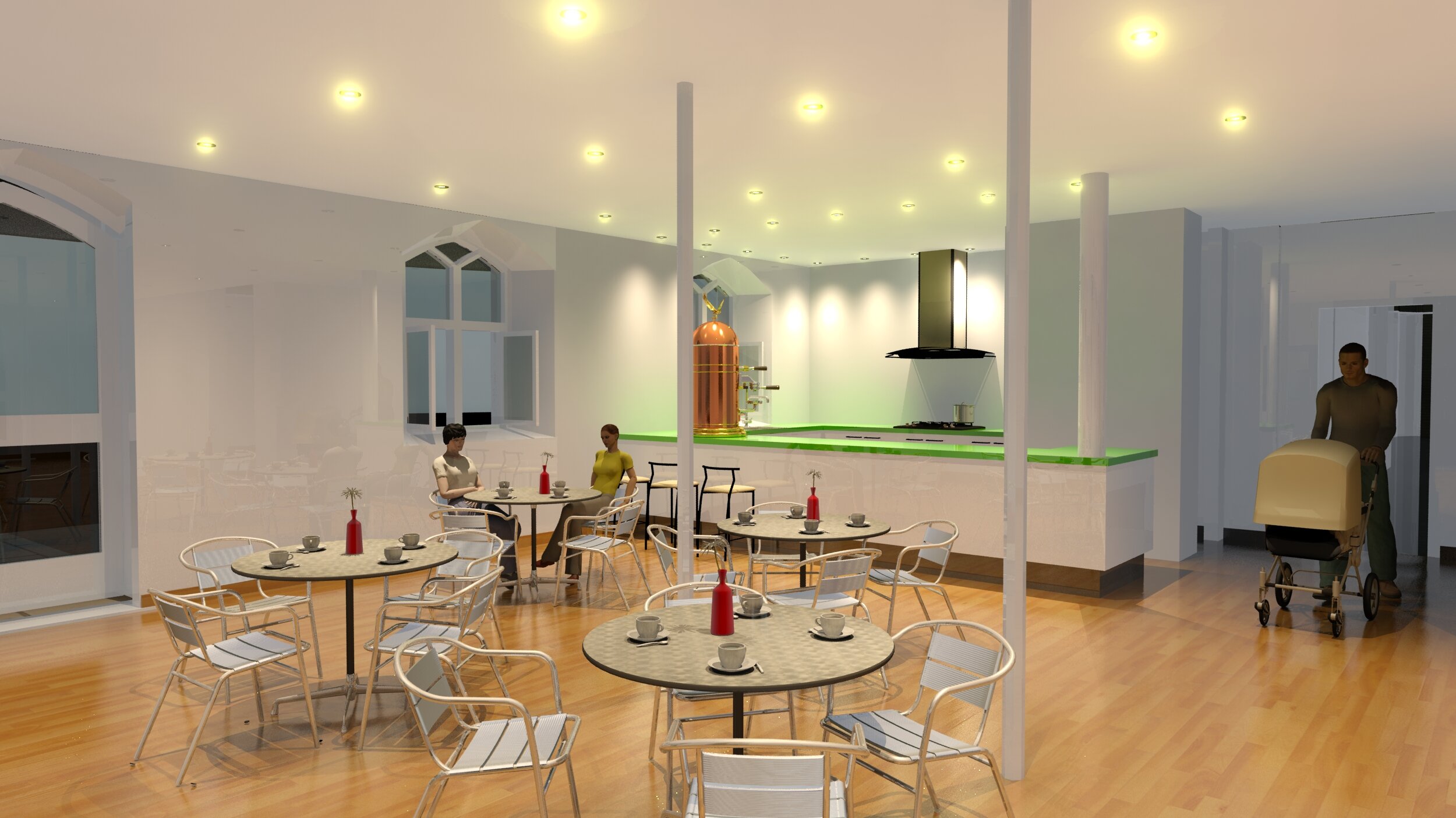
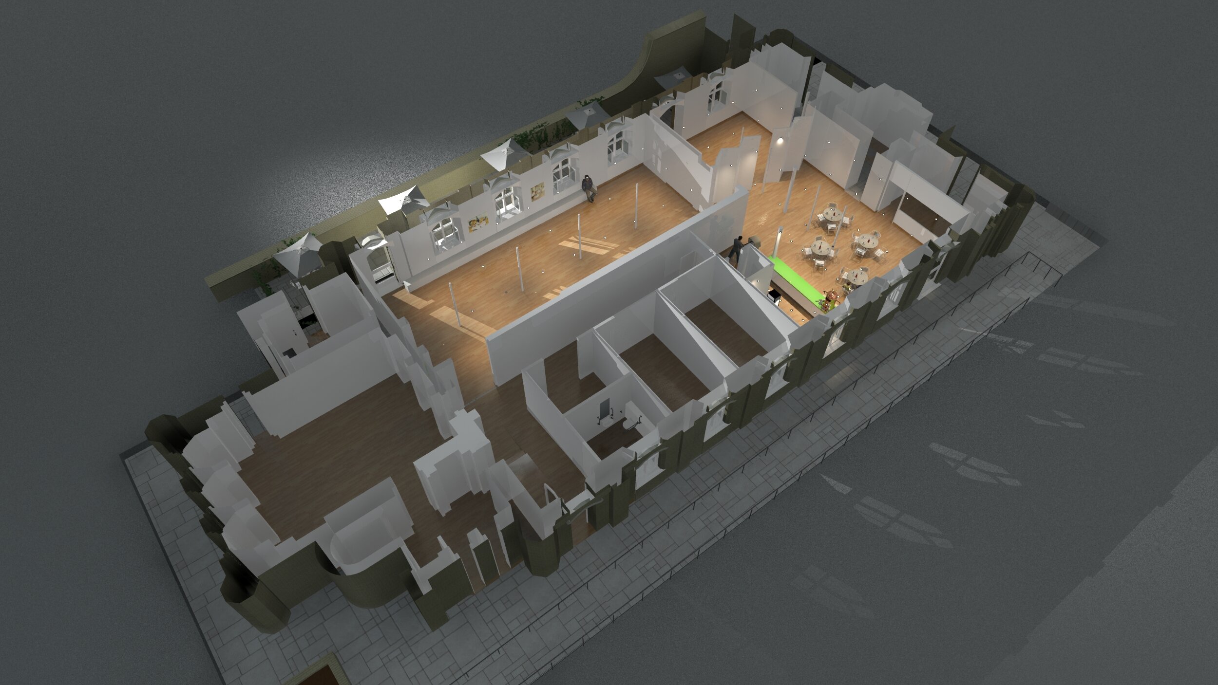
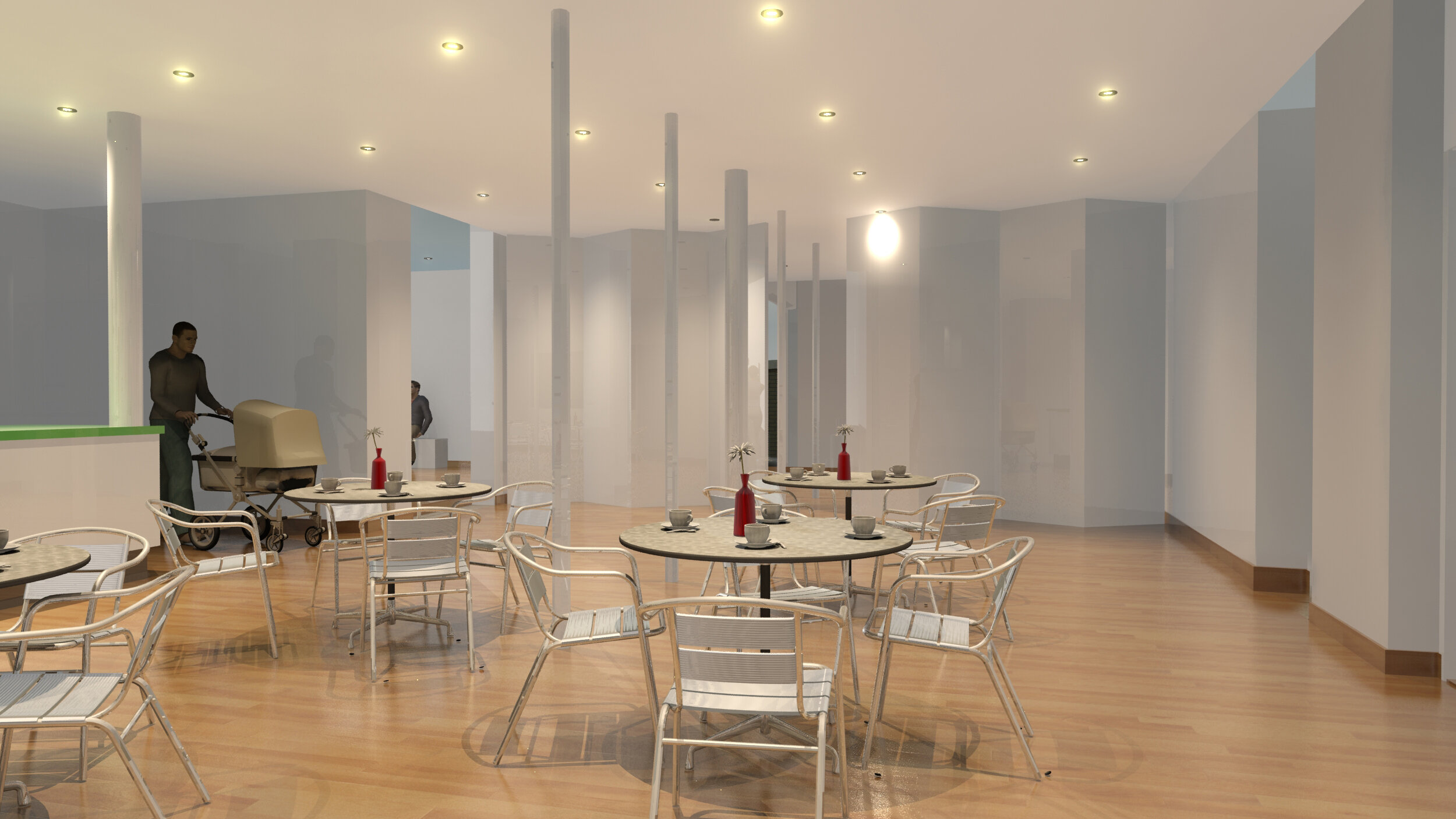
Visualization of a re-modelled church crypt in London.
Bonhams Interior, Madison Ave, New York

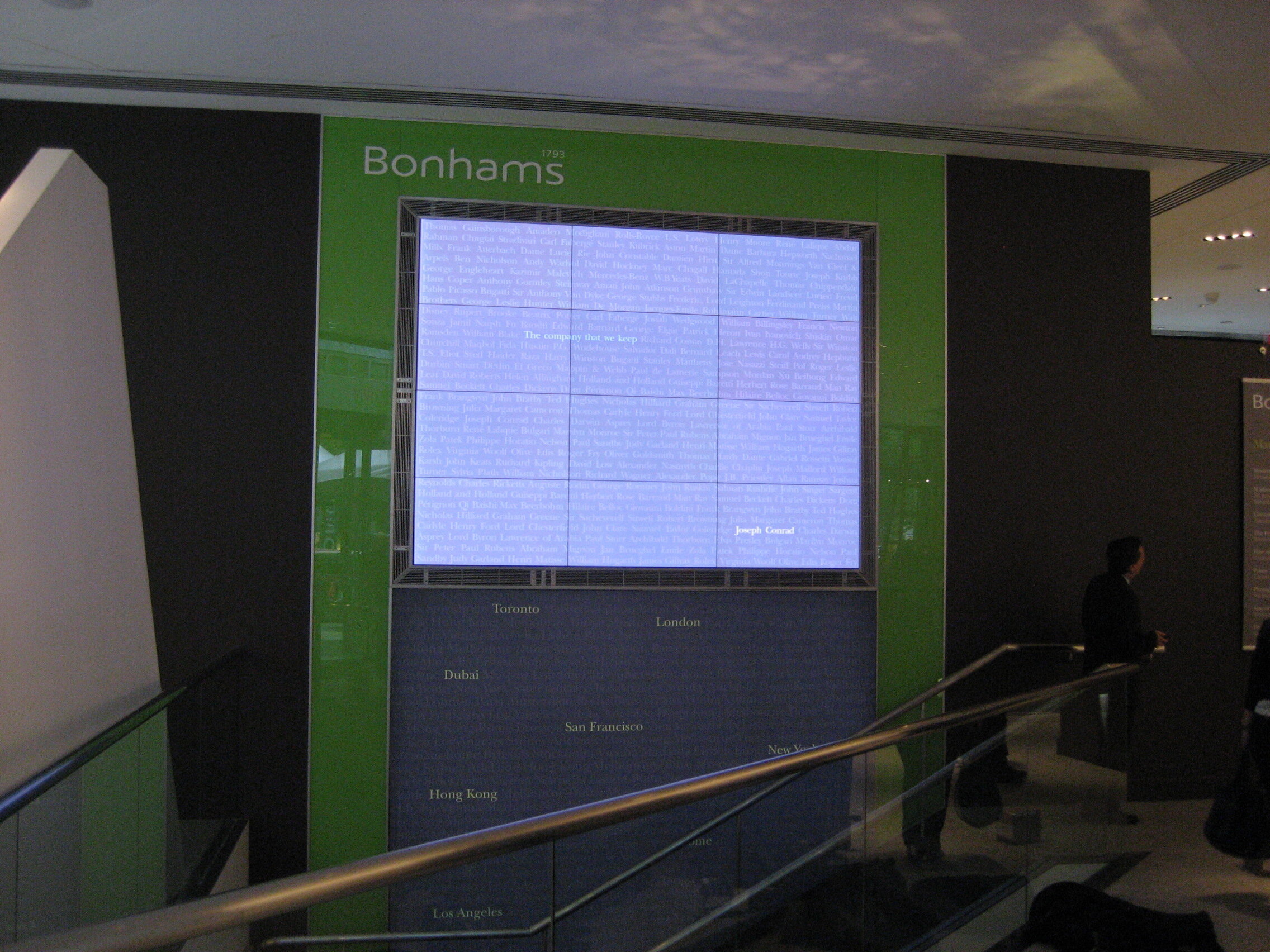
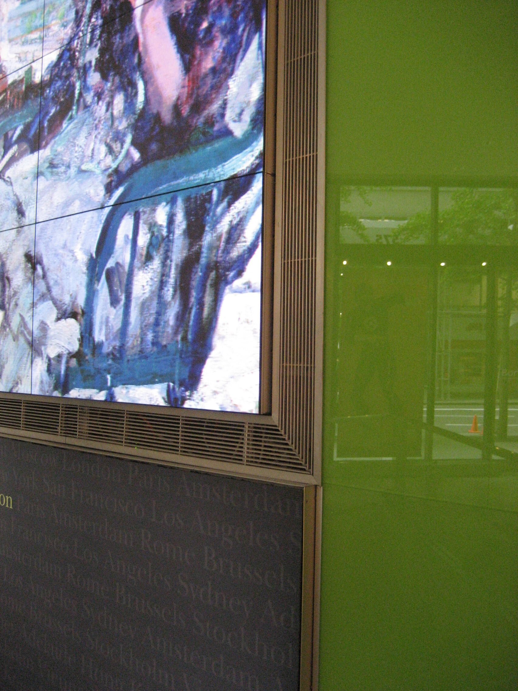
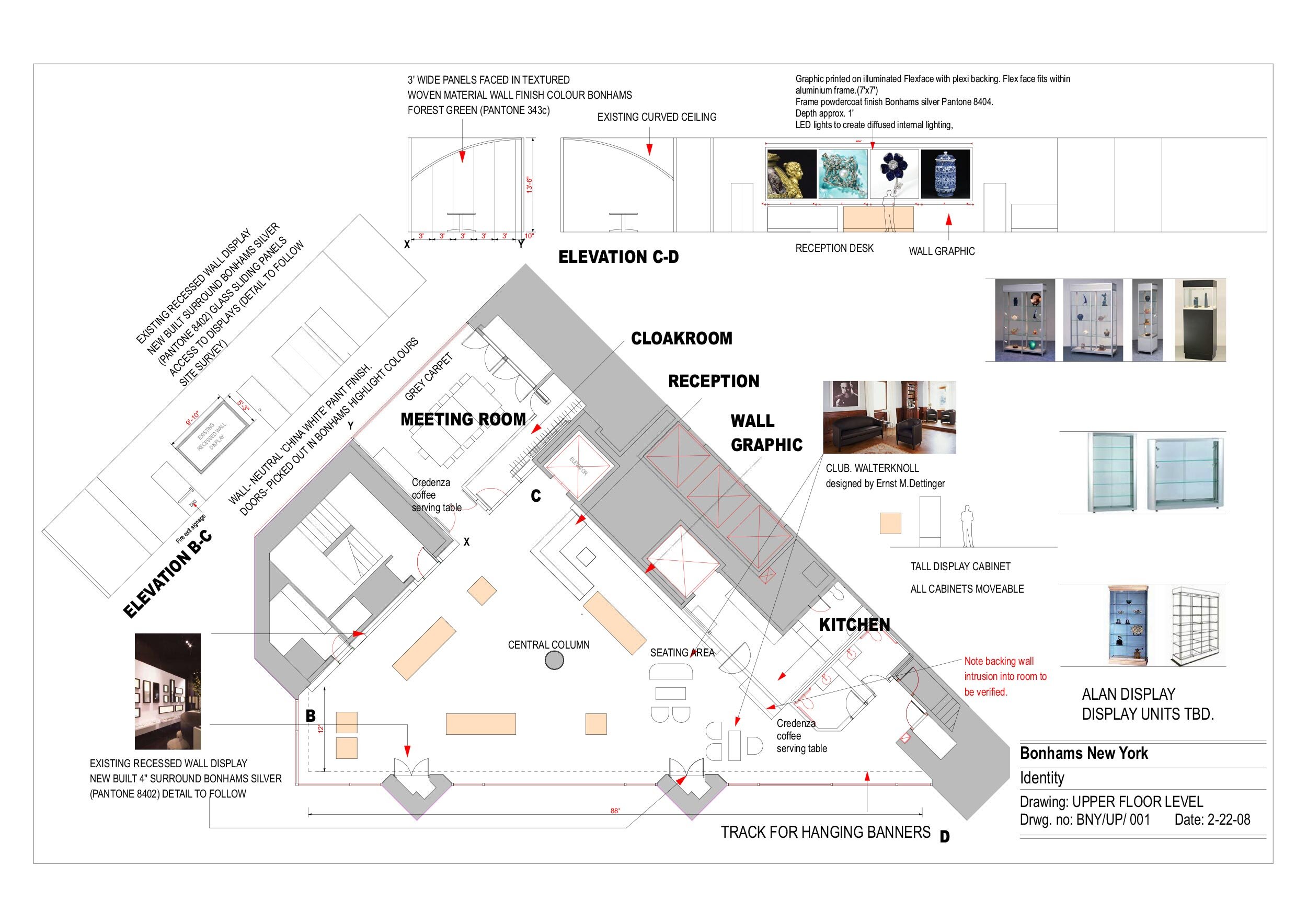
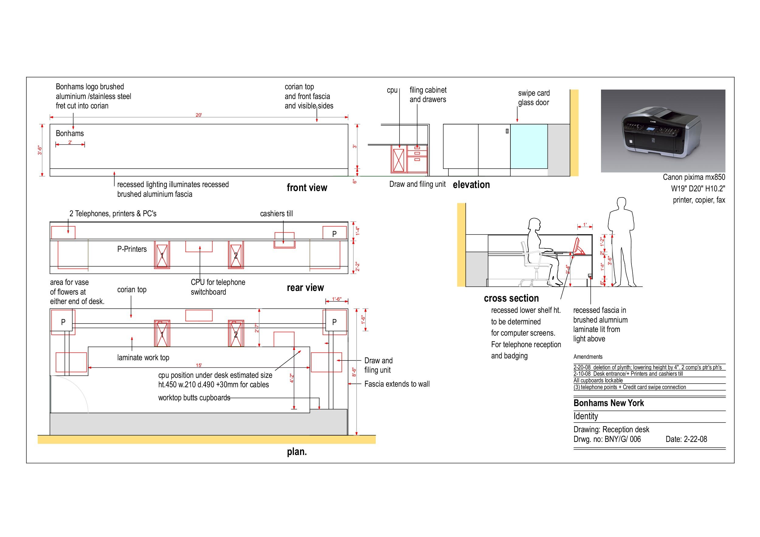
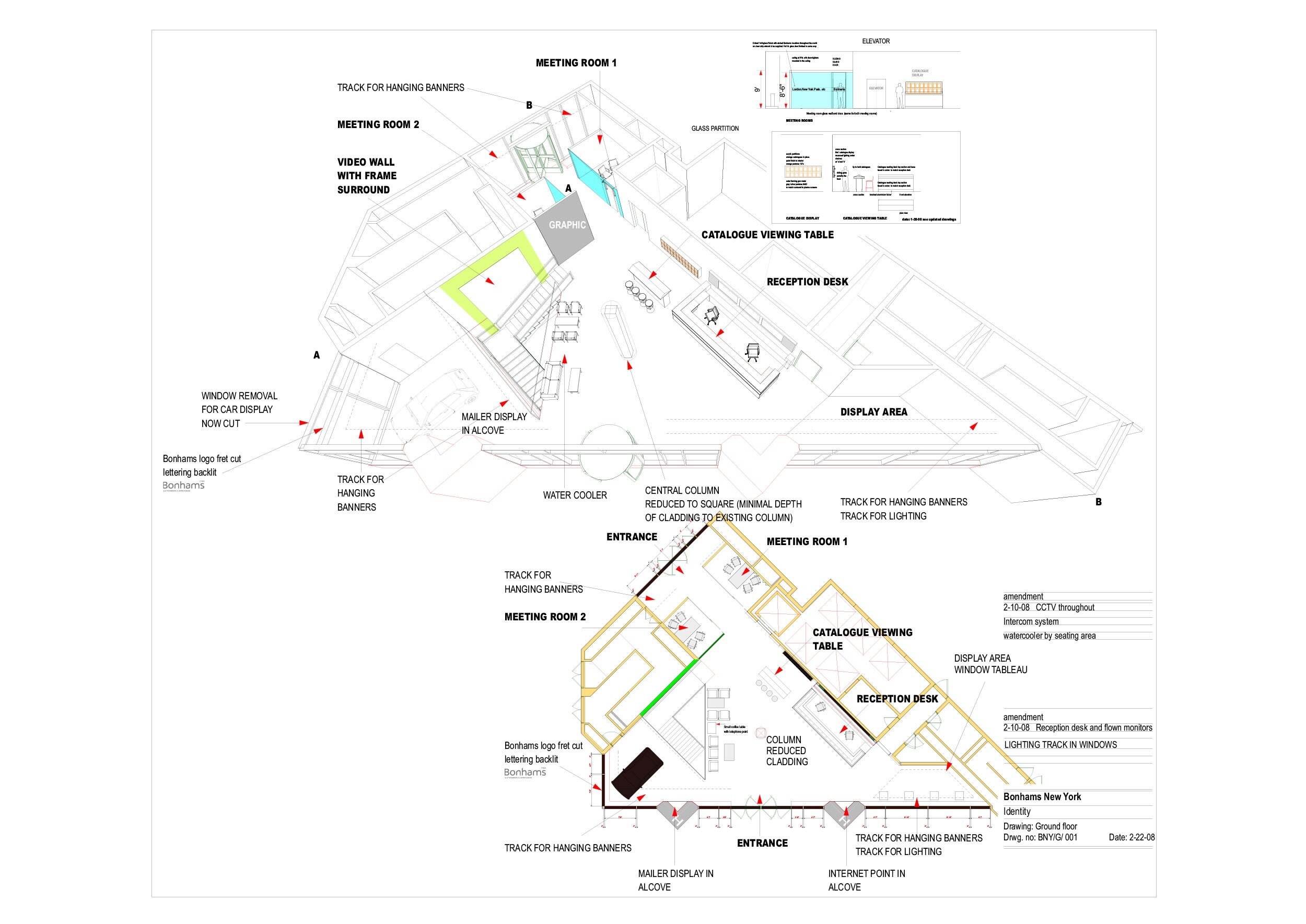
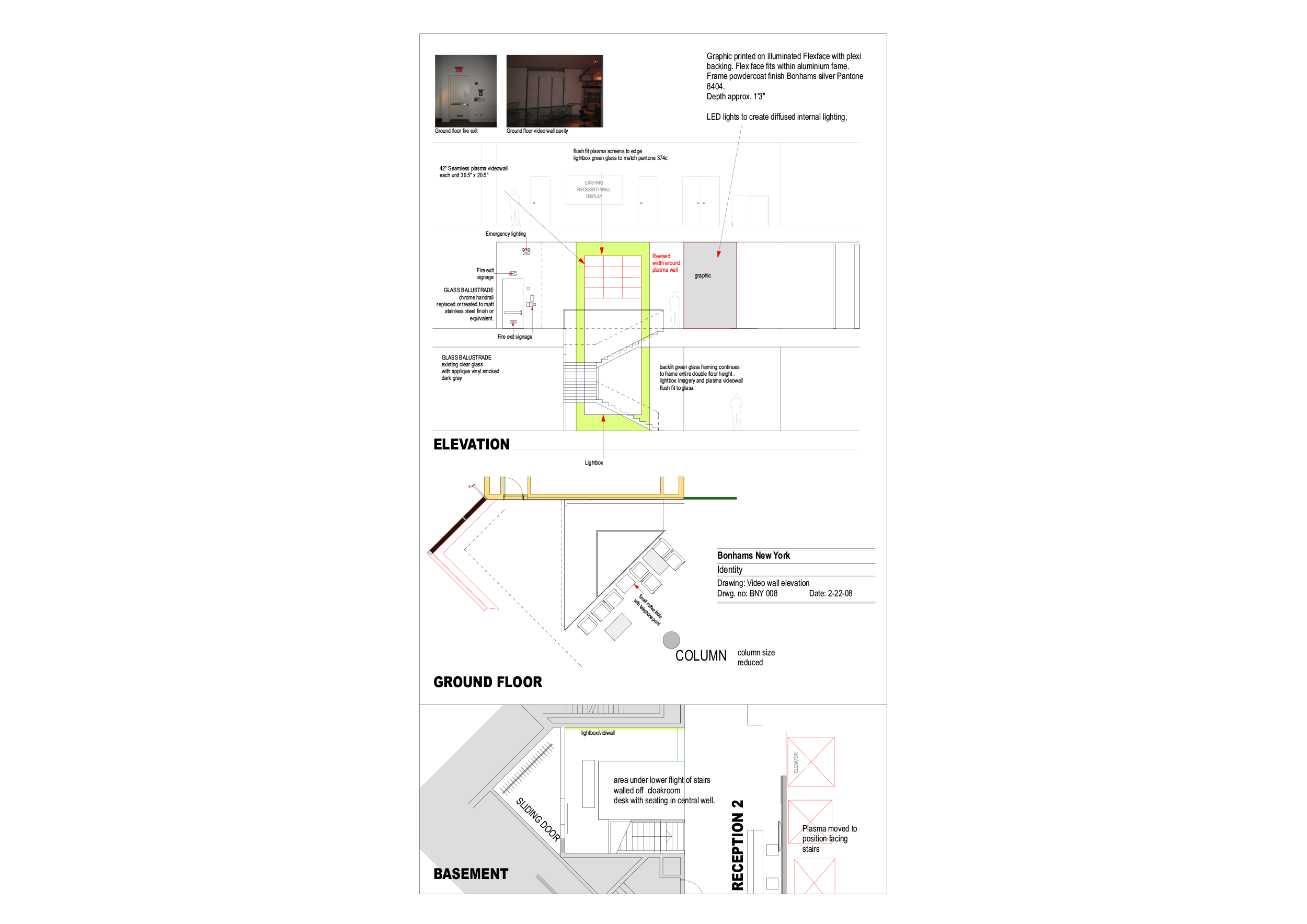
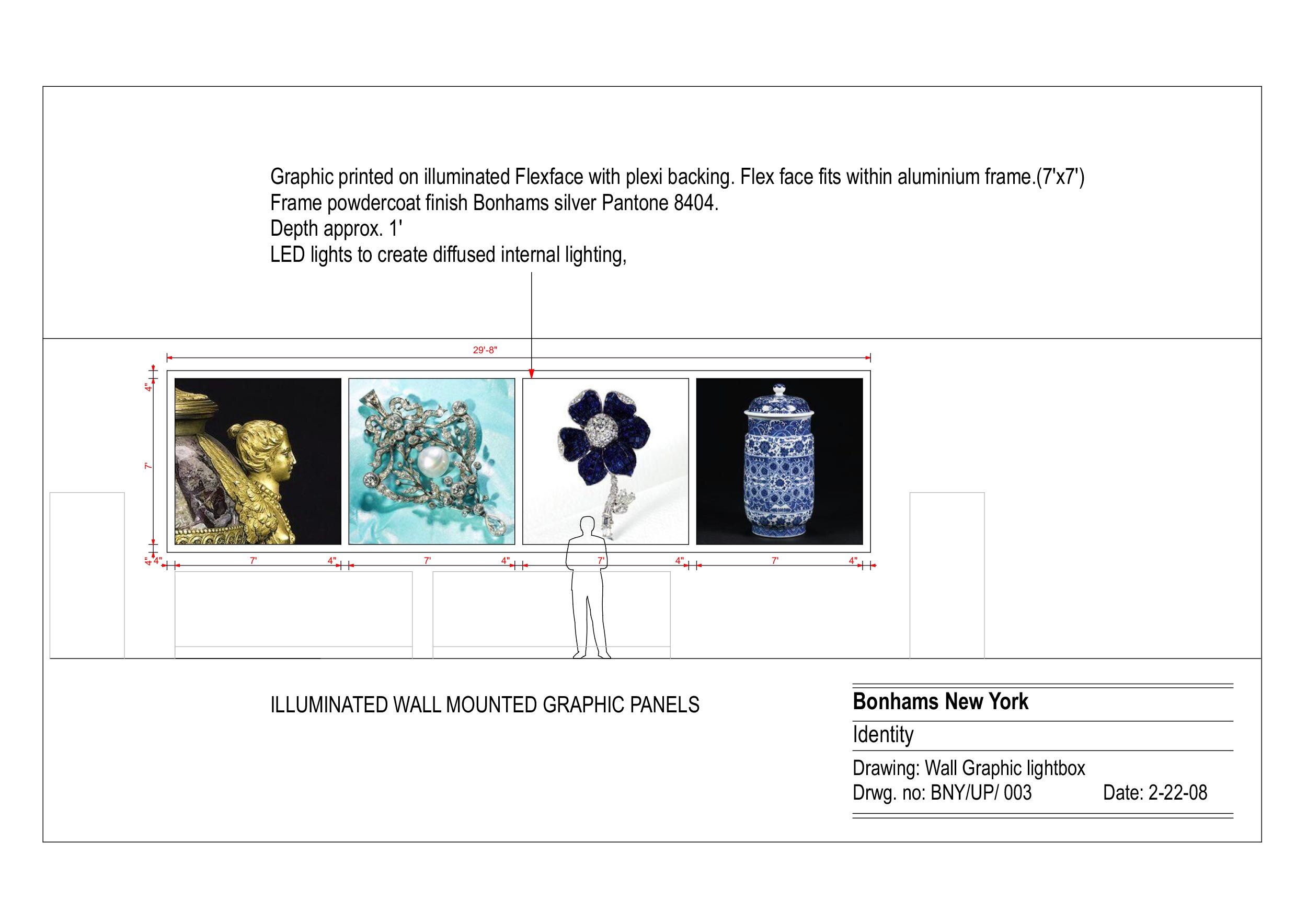
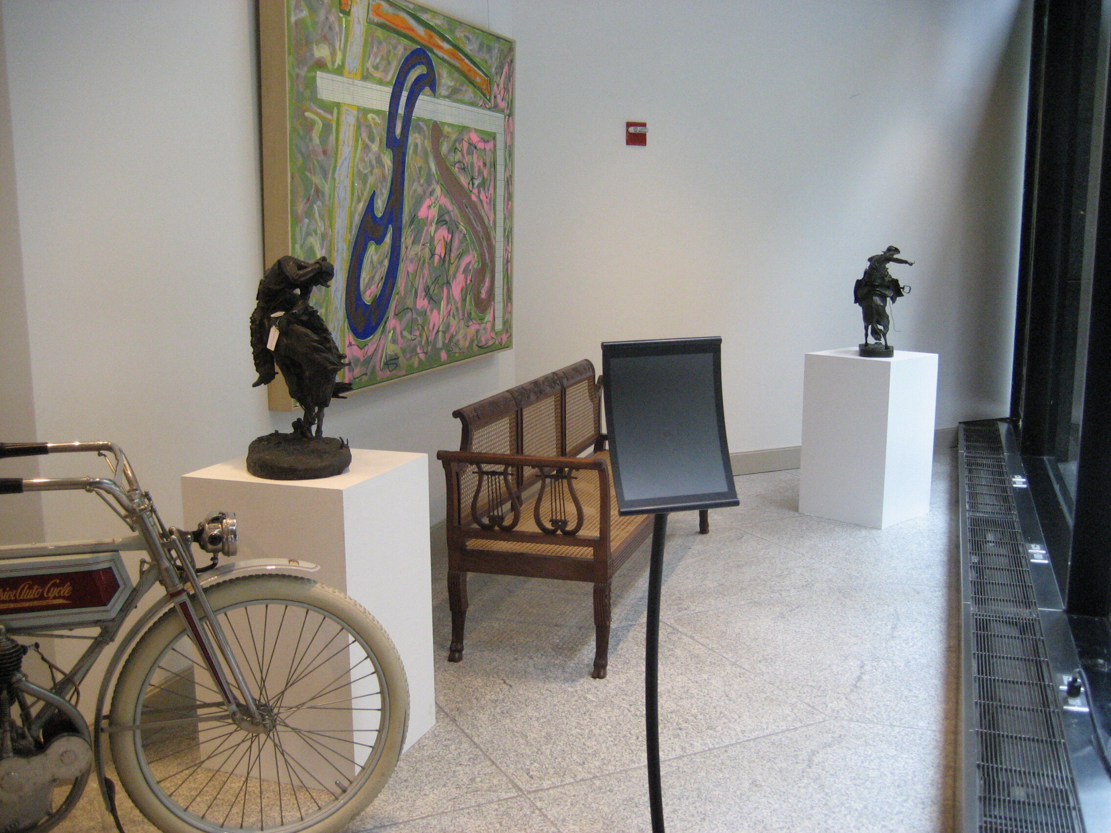
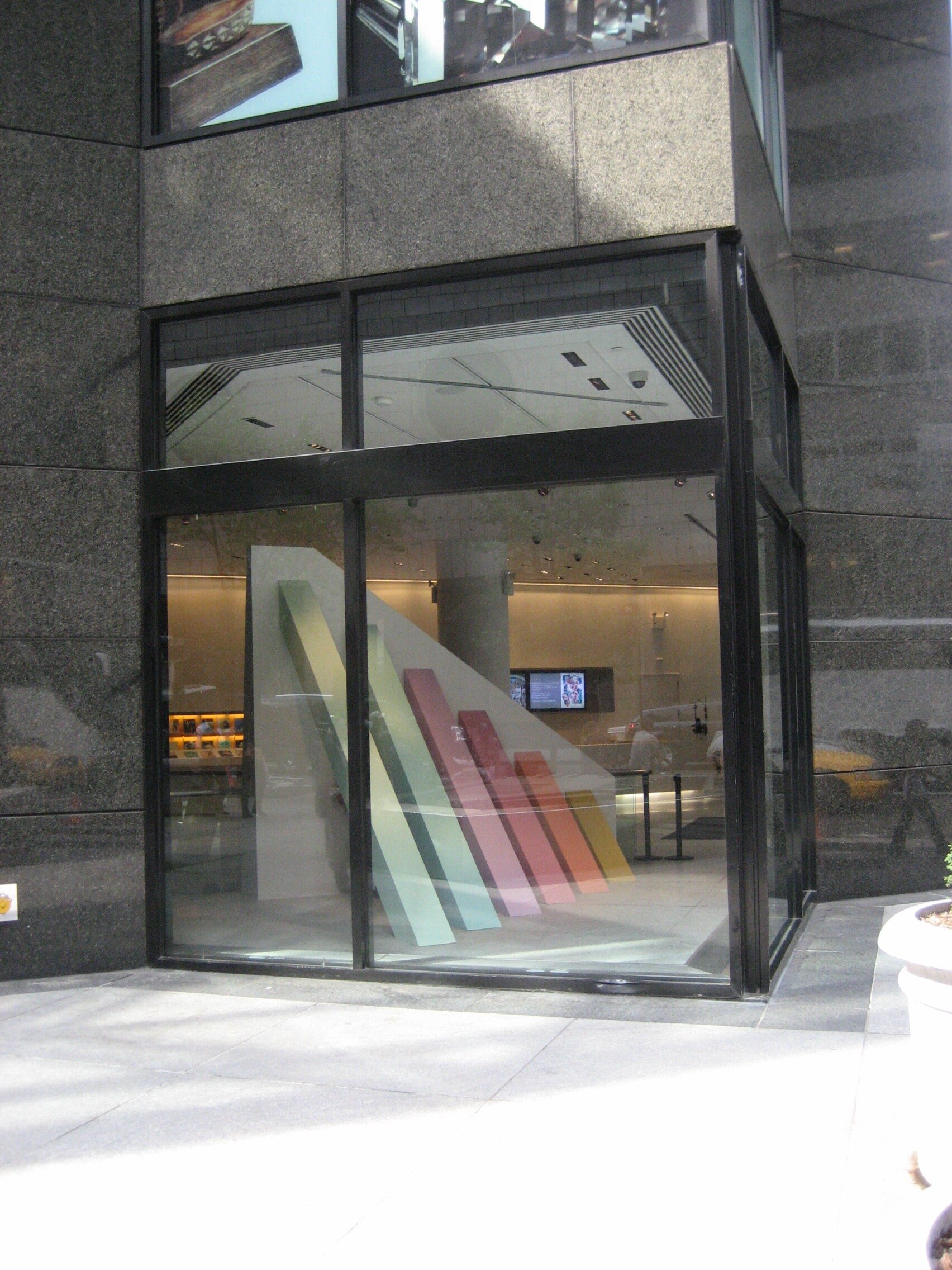
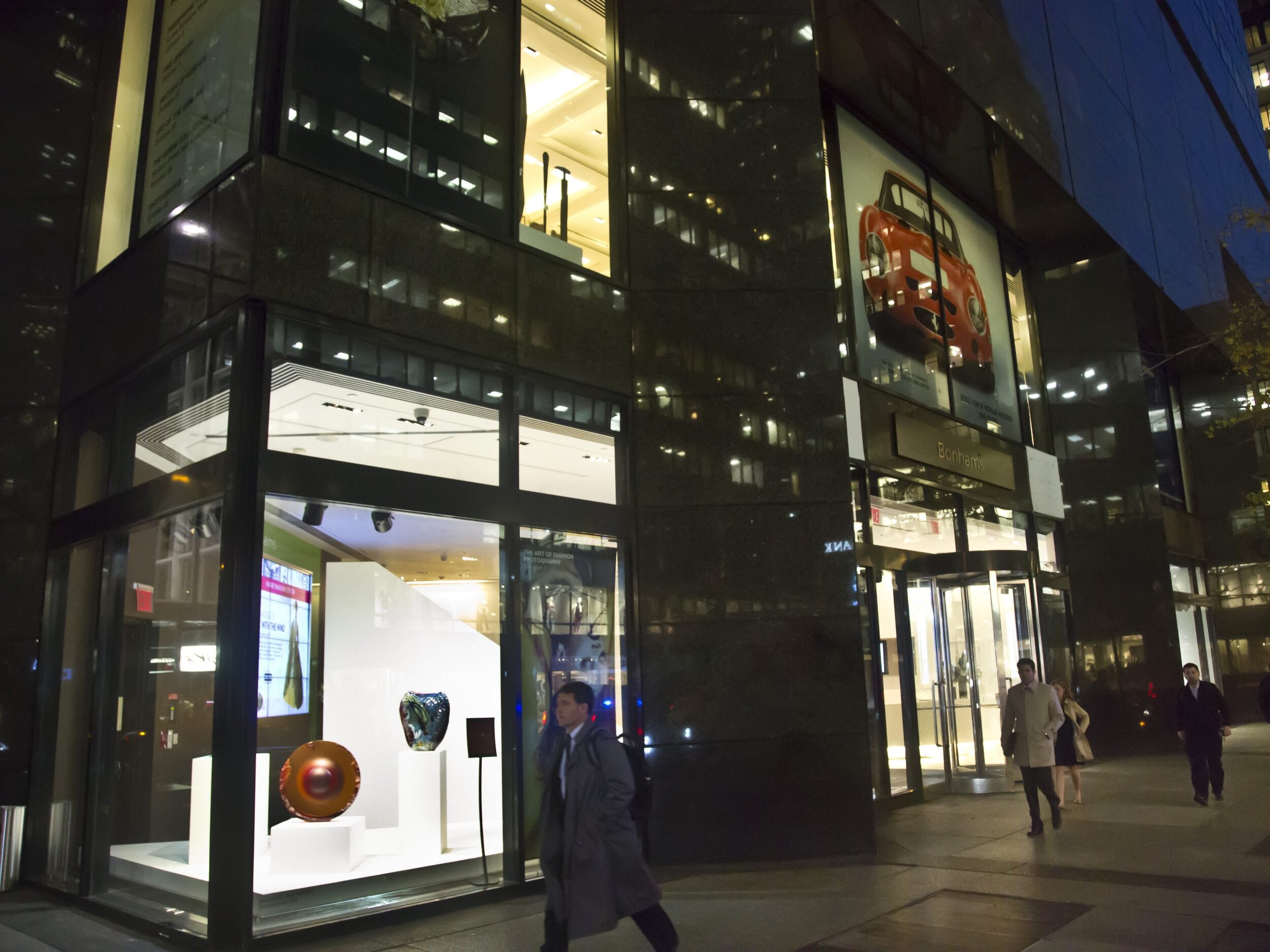
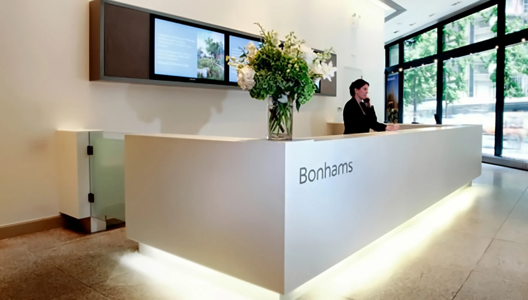
Interior design for Bonhams New York headquarters on Madison Avenue.
Bonhams is a privately owned British auction house. It’s one of the world’s oldest and largest auctioneers of fine art jewellery, cars, and antiques.
Three storeys of complete redesign including a two storey video wall, bespoke furniture, exhibition spaces, office spaces, & multimedia theatre.
Respect TV Set
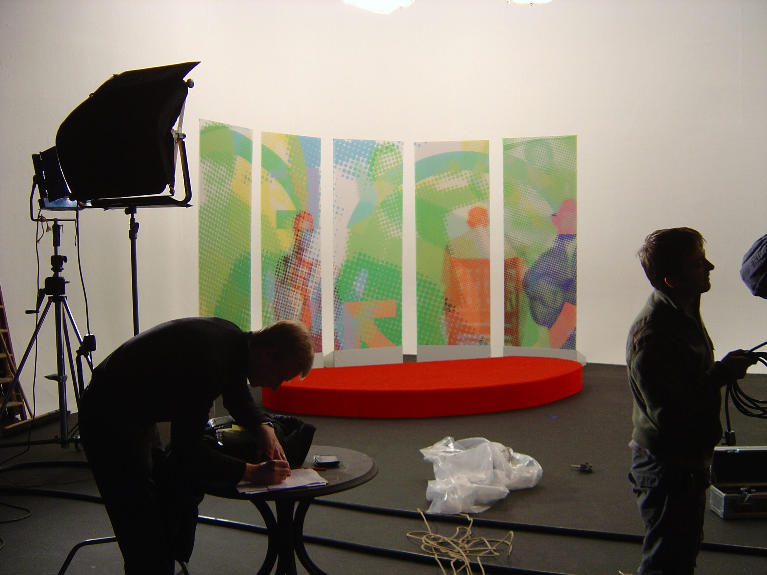
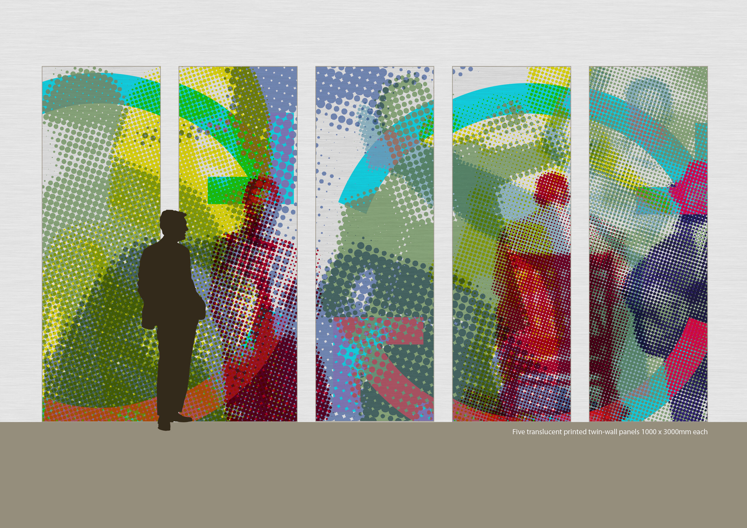
Inexpensive TV set for part of the Blair Government ‘Respect Taskforce’.
Collage made of colorised half tones. Printed on vinyl film and applied to polycarbonate twin wall flats.
Visualization, Graphic design.


